See How Gorgeous 'The Mandalorian' Concept Art Compares To The Actual Scenes In The Series
Right now, we're in-between seasons of the Star Wars series The Mandalorian. The second season is slated to arrive this fall after the first season was a huge success for the launch of the Disney+ streaming service late last year. While you wait for new episodes, why not take a look back at some of the stunning concept art used in planning the Star Wars spin-off and see how the artwork compares to the final scenes we saw in the series? Check out The Mandalorian concept art comparison video below.
The Mandalorian Concept Art Comparison
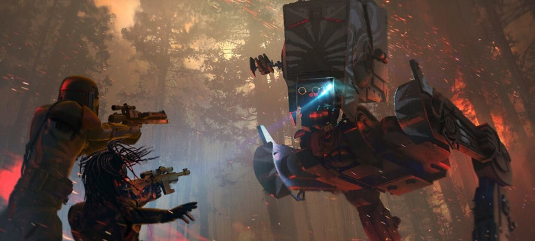
Two of the sequences in question feature artwork from "Chapter 4: Sanctuary," in which Mando and his new ally Cara Dune help a village that is being terrorized by raiders who are in possession of an Imperial AT-ST walker. The first piece comes from Ryan Church, the concept design supervisor at Lucasfilm, while the second comes from Christian Alzmann, a concept artist and art director at Lucasfilm.
While the series captured these moments nicely as far as the action is concerned, one can't help but notice that the scenes don't look quite as cinematic in the show when compared to the concept art. That's not uncommon since these pieces are often much more artistic and epic than what is able to be captured in the lens of a camera. Even a show with a big budget like The Mandalorian can't do it perfectly, especially when the series isn't meant to be as stylized as the concept art typically is.
Meanwhile, the second piece of art (also created by Christian Alzmann) featured in the video above is a simple one that shows Mando exiting his ship with The Child (AKA Baby Yoda) shuffling behind him. Even the most basic of shots needs to be planned out with concept art so the crew can make the scene work, especially with the Stagecraft technology they're using to bring this show to life.
The Mandalorian returns with a second season on Disney+ sometime this fall.
