The 20 Best Movie Posters Of 2018
Now that we're officially in 2019, the /Film team wanted to take a look back at the year in film that was 2018, and that includes some of the best marketing we saw. Often times, even before a trailer arrives online, we'll see a poster announcing the arrival of any given movie. And while most posters are forgettable and lack any remarkable style, movie posters are still very much an artform, and a lot of studios know how to do them right. That's why yours truly took the time to round up what I have deemed the 20 Best Movie Posters of 2018.
Before we get to the countdown, let's establish the ground rules for consideration. In order to be considered for the list, each poster had to be an officially sanctioned movie poster released in conjunction with a film released in 2018. There are also no Mondo prints, screen prints, or giclées, but you may find posters that were created as official IMAX or promotional posters for theatrical or online marketing. Foreign posters also qualified.
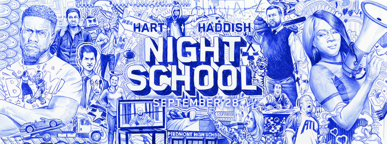
20. Night School
The level of detail in this banner poster is incredible. This could have easily just been a collection of floating heads in the traditional, glossy Photoshop style we've come to expect from movie posters. But it takes the signature style of high school notebooks drawings and uses it to recreate a bunch of moments and characters from the movie.
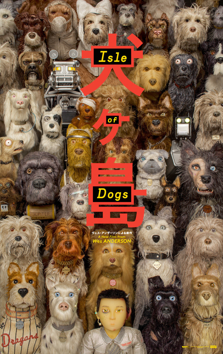
19. Isle of Dogs
The symmetry of Wes Anderson's traditional visual style helps make this poster stand out, not to mention the ensemble of dogs with all their unique traits and nametags, including the two robot dogs. It's just an eye-catching assembly of good dogs.
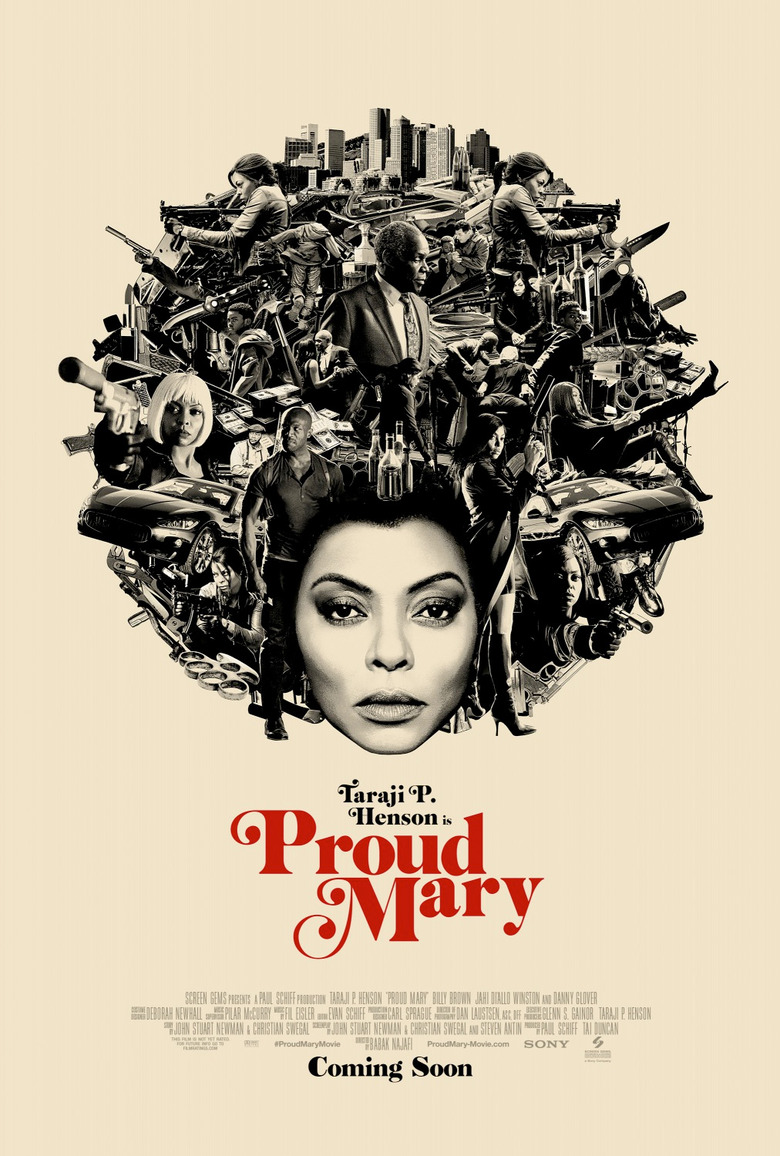
18. Proud Mary
Another poster with some symmetrical style feels like it's taking a cue from the art of Tyler Stout in some ways. Using a silhouette to contain images is a common movie poster design, but it's not common to see characters, weapons, and settings from the movie forming the afro of the titular character.
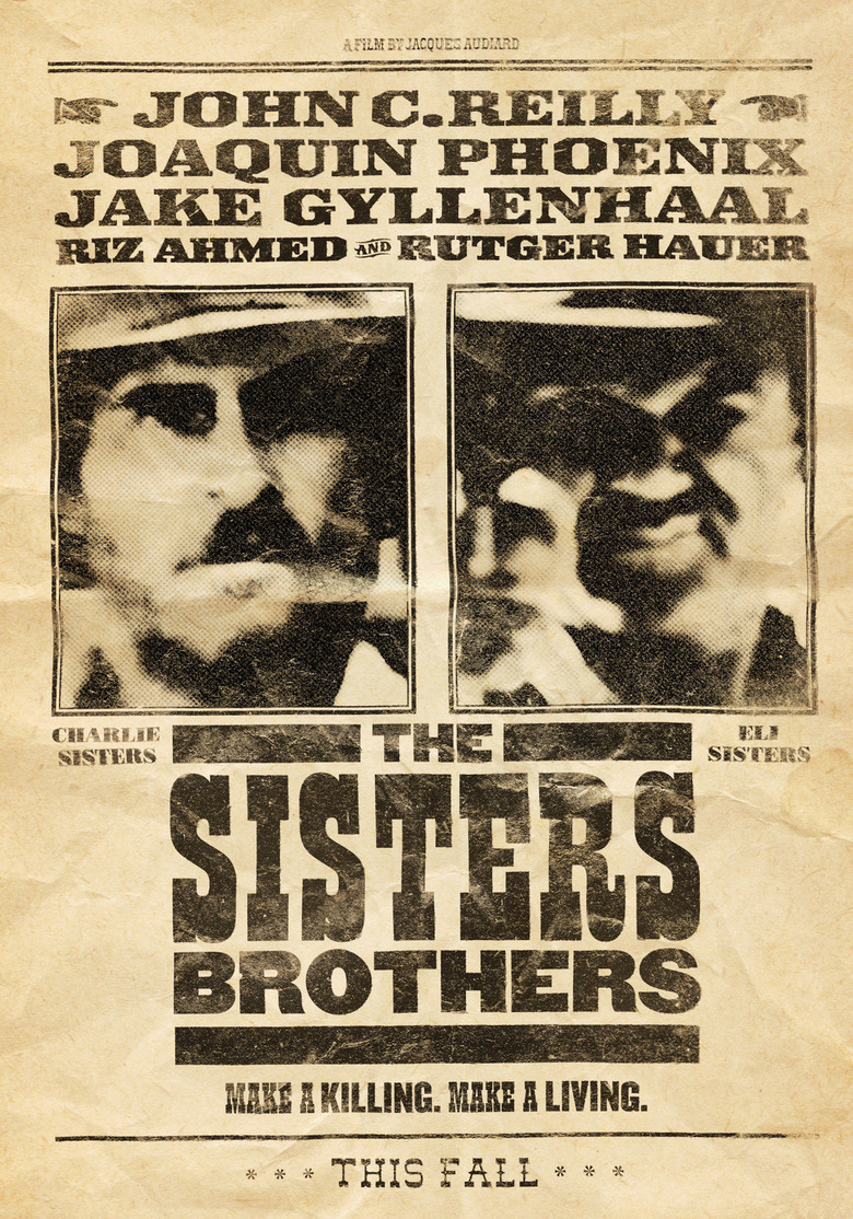
17. The Sisters Brothers
How is it that more westerns haven't used the wanted poster as inspiration for a movie poster? I love that the photos of John C. Reilly and Joaquin Phoenix aren't particularly clear, adding to the authentic feel of the wanted poster aesthetic. It's simple, but it works so well.
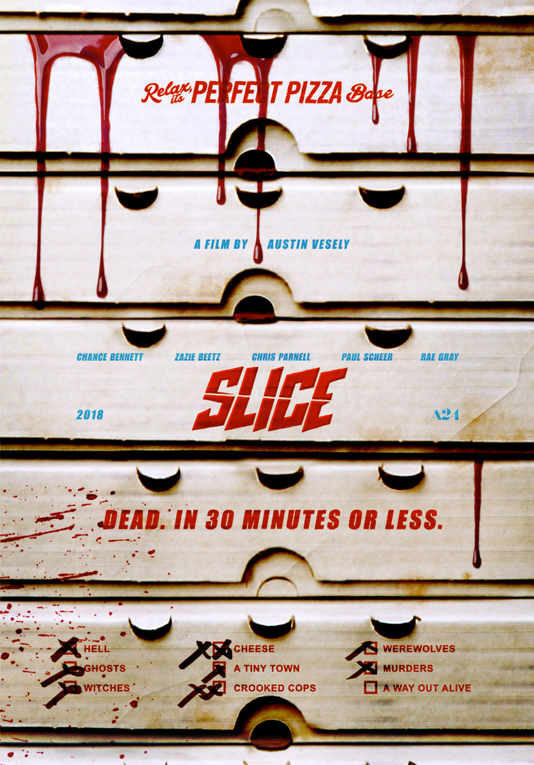
16. Slice
What I love most about this poster is that it feels like it has real texture to it. The pizza boxes look so worn and stained. The blood splatters and drips look real. And the tagline works in conjunction with the checked boxes at the very bottom, emulating the topping checkboxes on a real pizza box.
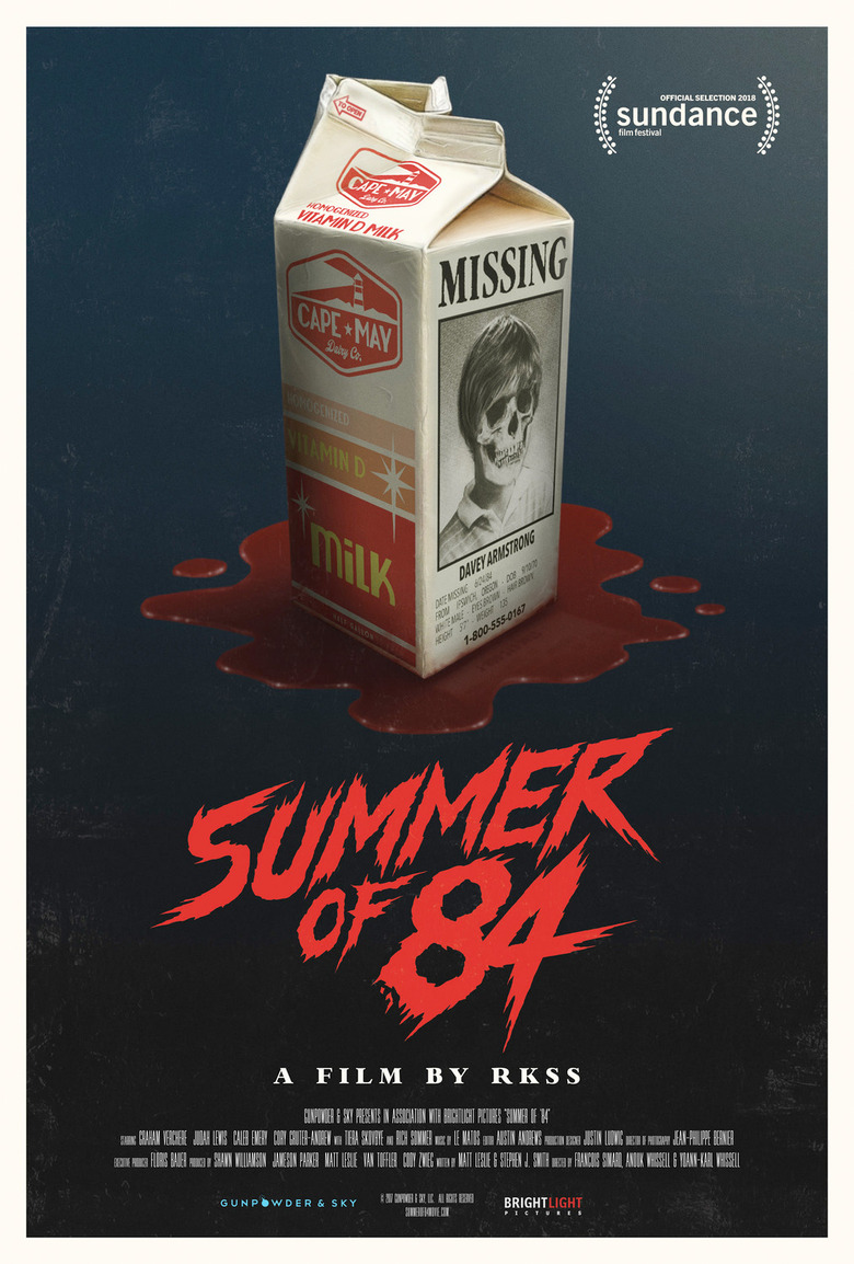
15. Summer of '84
Much like the movies that Summer of '84 is trying to emulate, this poster calls back to the horror imagery of the 1980s, whether it's from movie posters or teen horror novels. The blood under the milk carton, which has a skeleton face in place of the missing boy, feels reminiscent of a Goosebumps book, especially since it's an illustration instead of a real photo.
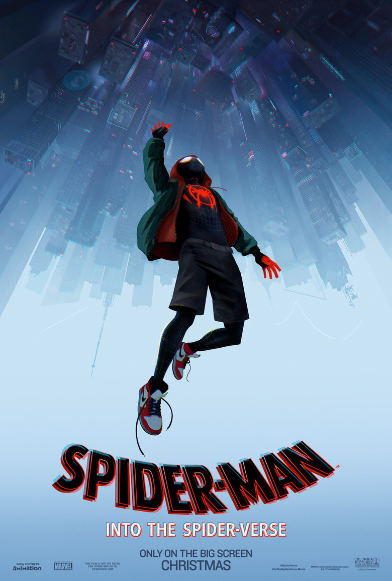
14. Spider-Man: Into the Spider-Verse
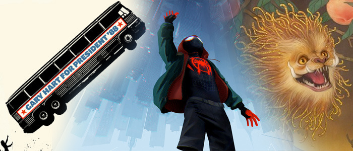
It's nice to get a superhero movie poster that isn't just a mess of Photoshop slapdash. And while the image above may not seem all that special at a quick glance, it's a perfect representation of the movie. It turns the Spider-Man formula upside down, it serves as a way of showing Miles Morales diving into a whole new world, but more importantly, it lays out the unique visual style of the movie.
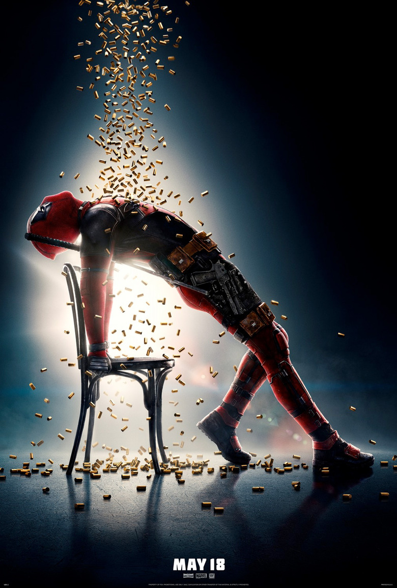
13. Deadpool 2
Considering the satirical and spoof-like nature of Deadpool, it would have made more sense to do some kind of poster that puts a fun spin on a popular sequel. But Deadpool is also subversive, so doing a Flashdance pose with bullets raining down instead of bullets works so much better. There's younger fans who might not get the reference, but the image is still funny on its own.
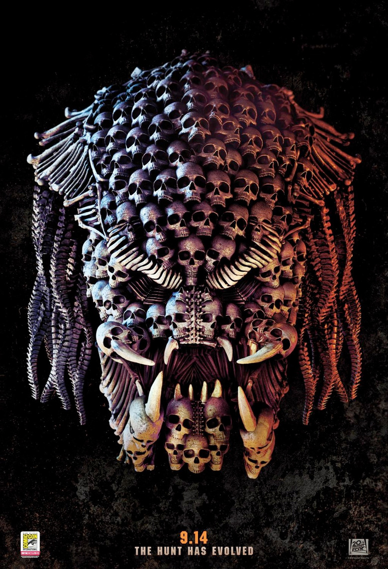
12. The Predator
I'm always a sucker for images composed of smaller objects, like in the style of a mosaic. In this case, it's a series of skulls, spines and teeth that form the face of the galaxy's most notorious game hunter. It's a shame they could sneak a couple xenomorph skulls in there for s***s and giggles, but we won't hold it against them.
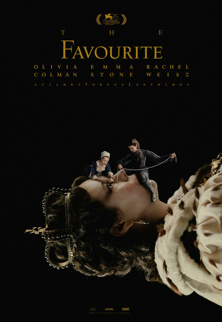
11. The Favourite
Having a little Emma Stone and Rachel Weisz sitting on the queen's face is not only surprisingly accurate based on the erotic nature of the relationship between the characters, but it's also a great way to illustrate how the two try to use Olivia Colman (as Queen Anne) as a puppet to better their own lives.
10. The First Purge
The sight of a red hat this style inspires fury among millions, and that's why using it to represent something as despicable as The Purge is perfect. Tying the corruption of the a**hole-in-chief to that of those behind the first Purge sends a clear message.
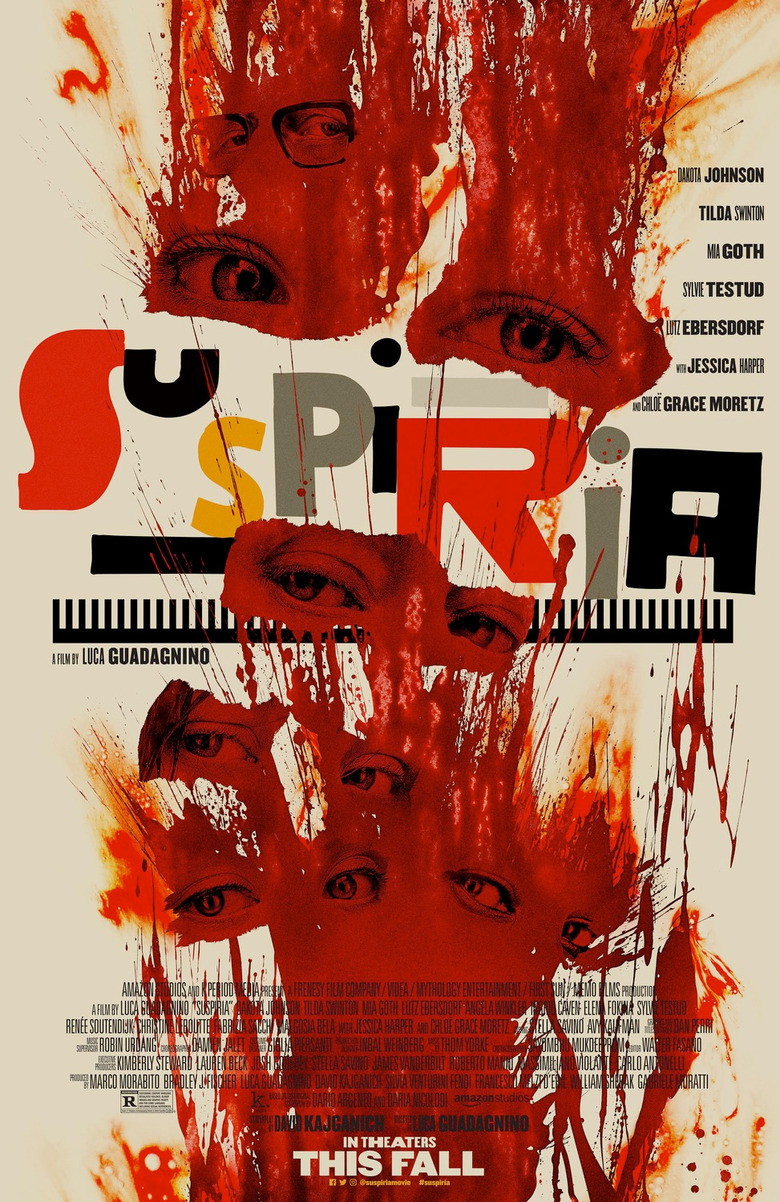
9. Suspiria
Much like the movie itself, this poster is an abstract piece of art. It's a shame it needs all the credits on there, because the peering eyes and the bright blood splatters are truly mesmerizing. The wild, ransom letter-like font of the title only make it that much more vivacious.
8. Incredibles 2
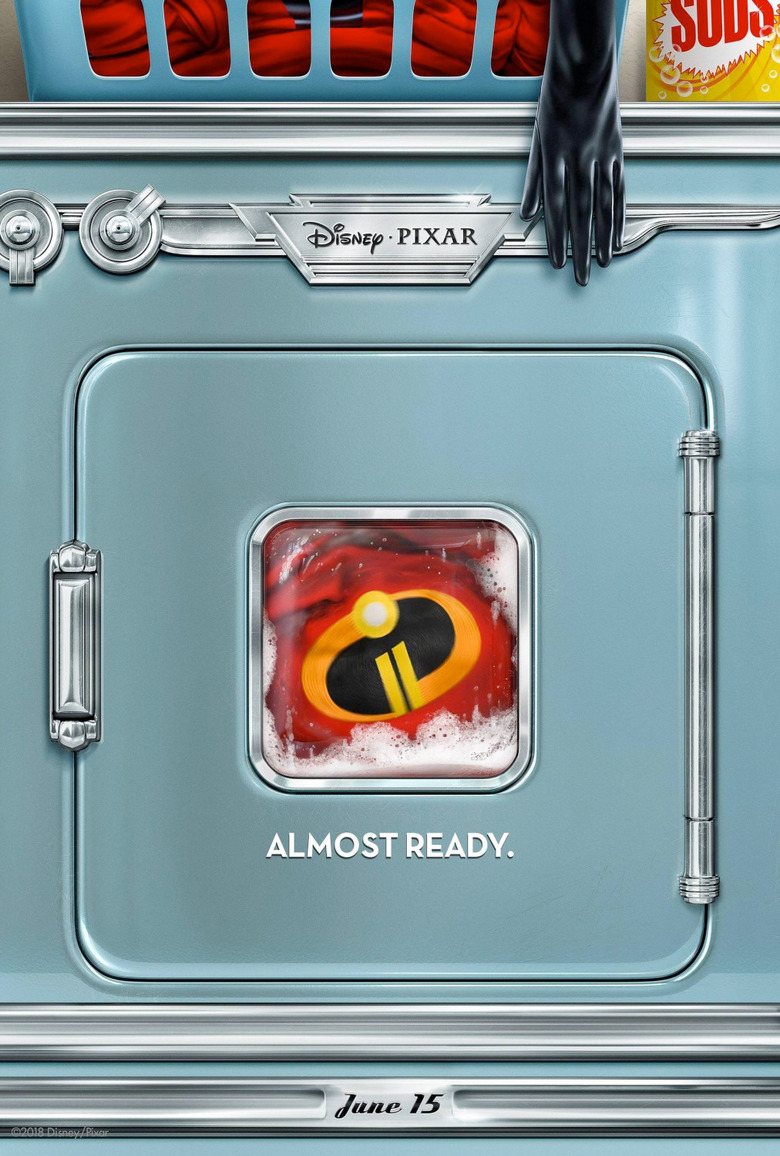
The art of the teaser poster is one that doesn't get enough credit, and this poster does so much with so little. Not only does it announce the impending return of the superhero family known as The Incredibles, but it does it in a way that lets people know that the family dynamic that made the first movie so great will still be there by having the super suits in the laundry.
7. Hereditary
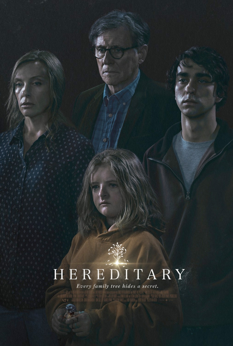
You'd be hard-pressed to find a creepier family photo than this. though each member of the family looks like they're posing for the annual Sears portrait, each looks troubled and disheveled, indicating that there's not much happy going on with this family, and for anyone who has already seen the movie, that's the understatement of the year.
6. Halloween
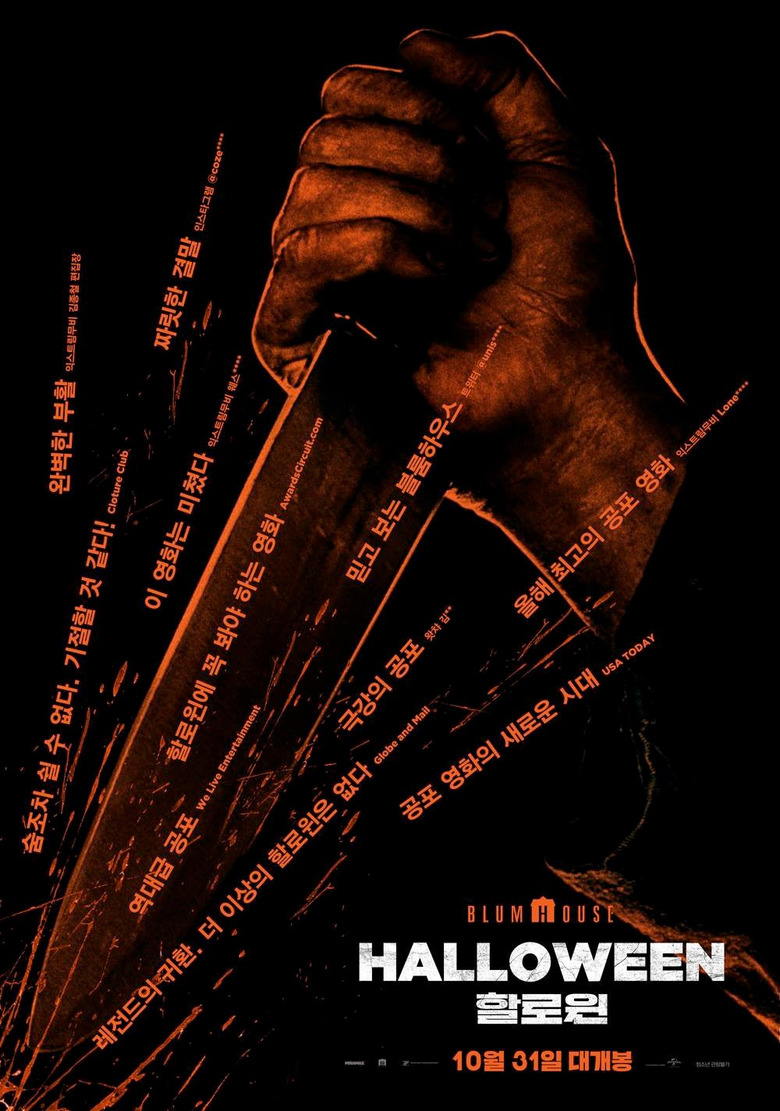
It's hard to make a good Halloween poster without relying on the imagery of Michael Myers, but this Korean poster for the sequel does an incredible job by using quotes praising the movie in a unique way. The lines of text with acclaim act as text blood splatters coming from Michael Myers stabbing one of his victims. It's dark but very slick.
5. BlacKkKlansman
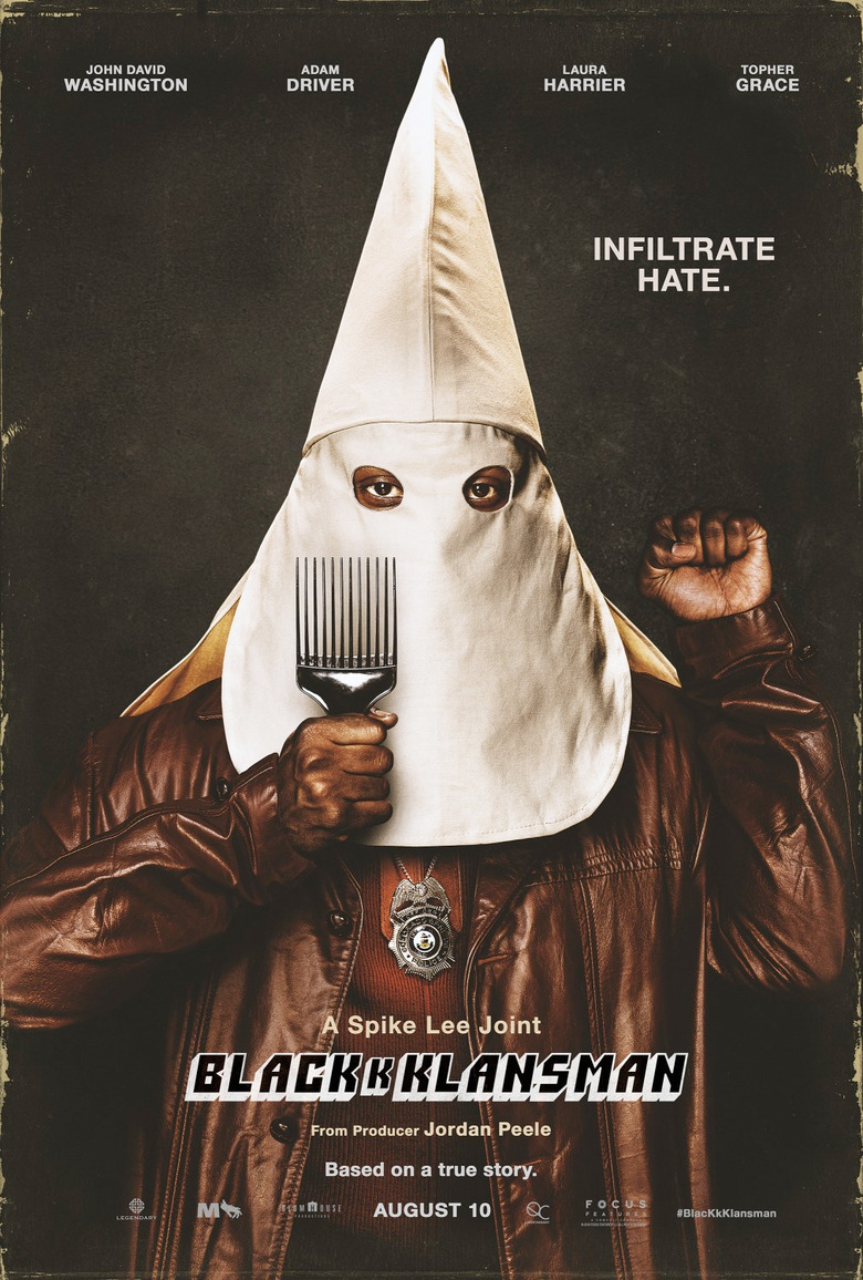
It should come as no surprise that the image of a black man wearing a Ku Klux Klan hood is going to get some attention. But it's the addition of the black power salute and the hair pick that makes it even better.
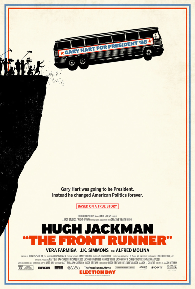
4. The Front Runner
This poster tells you everything you need to know about the movie. The presidential campaign of Gary Hary in 1988 went off a cliff when the press started digging into his personal life and uncovered an affair, the first gossip story of its kind in modern politics, and it would change the game forever. The poster tells us all of that. We don't even need to see the trailer. That's a great poster.
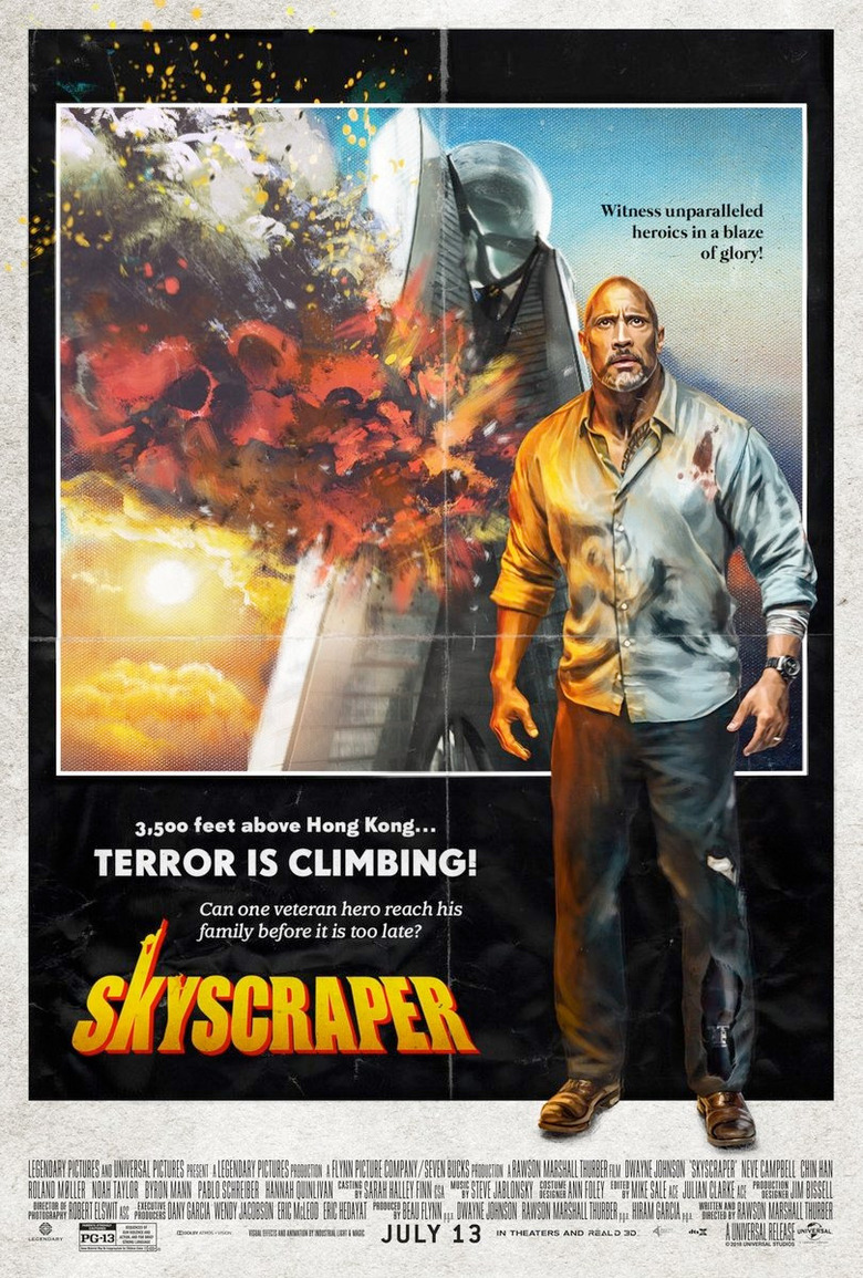
3. Skyscraper
Another thing I love is when movie posters pay tribute to posters of the past. In this case, Skyscraper is taking a cue from movies like The Towering Inferno, and it even has fake wrinkles and folds like it's been stored somewhere for years. Even the image of the fiery skyscraper itself has been given a legit illustration. That's just great.
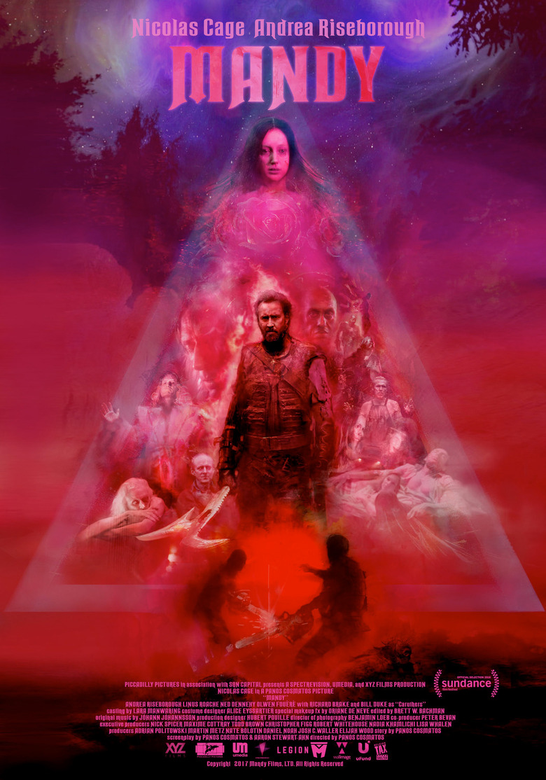
2. Mandy
It's not often you see a combination of red, pink, fuchsia and other similar colors on a movie poster unless it's for some kind of romantic comedy, but Mandy is nothing like that. Instead, these colors are all over the movie, more often than not in a menacing way, and this poster perfectly captures the wild nature of the movie, complete with a badass-looking Nicolas Cage right in the middle.
1. Fantastic Beasts: The Crimes of Grindelwald
Finally, this Chinese poster for Fantastic Beasts: The Crimes of Grindelwald, focuses more on the creatures than the movie does, and it's better than the film in every conceivable way. It's bright, colorful, and it contains some truly gorgeous artwork. It's a shame the movie couldn't be more like this single image. It might have actually been decent.
