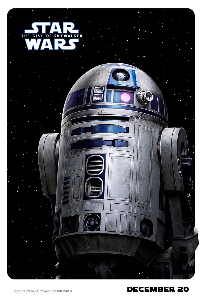
'Star Wars: The Rise Of Skywalker' Character Posters Might As Well Be Bubble Gum Trading Cards
The posters of the Star Wars franchise have been some of the best that studio marketing has to offer. Much of that has to do with the beautiful illustrations of Drew Struzan, and in recent years, fans have been missing his artistic touch. It's not that the posters for the new Star Wars trilogy have been terrible, but they feel like shiny Photoshop jobs as opposed to works of art. Unfortunately, a new batch of Star Wars: The Rise of Skywalker character posters are among the worst Star Wars posters we've seen.
Star Wars: The Rise of Skywalker Character Posters
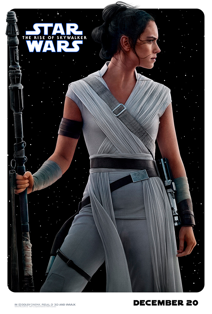
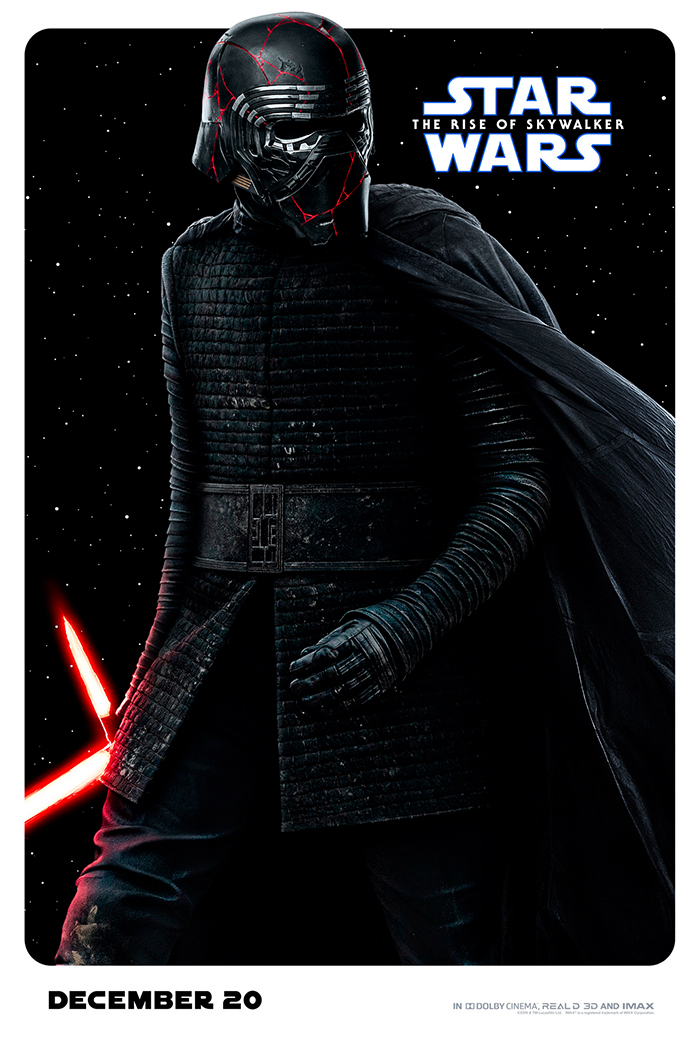
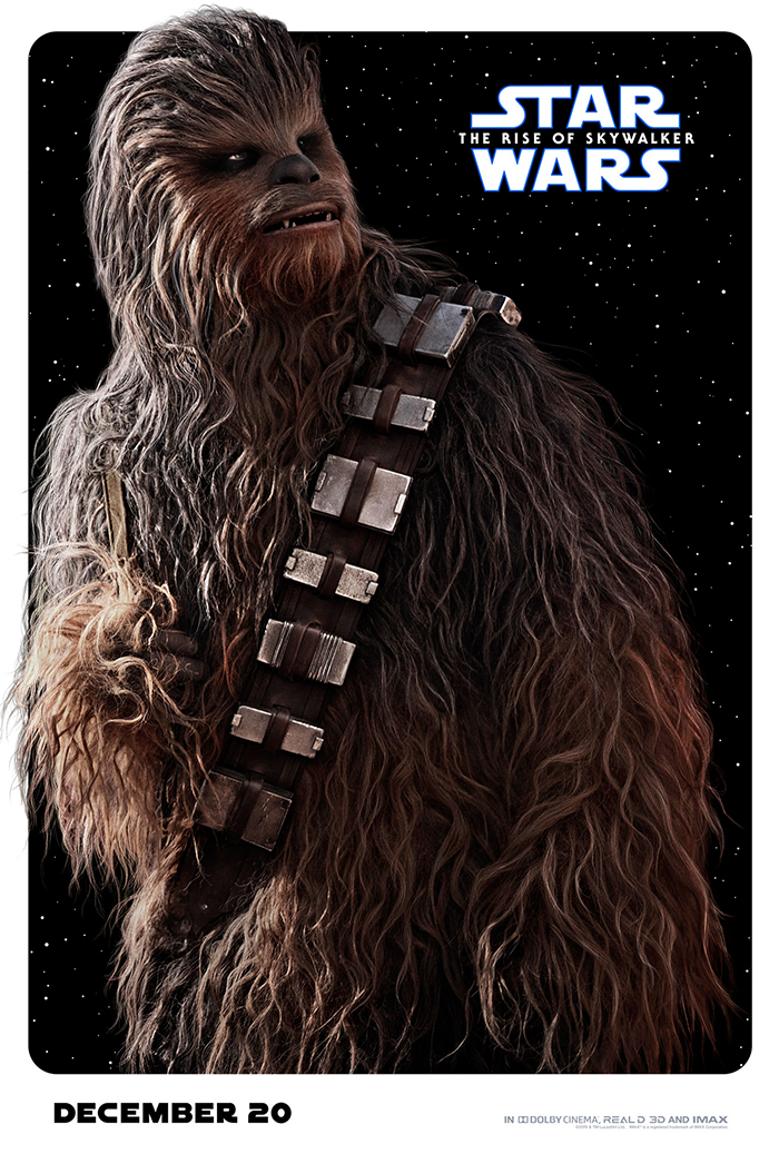
The posters for Rey and Kylo Ren show exactly what's wrong with these posters. Each of these characters look so glossy and touched up, they might as well be in a Sports Illustrated Swimsuit Edition magazine. The shine on Kylo Ren's helmet looks completely fake. And pretty much the entire roster of posters resemble the kind of promotional posters kids might see for sale at Walmart.
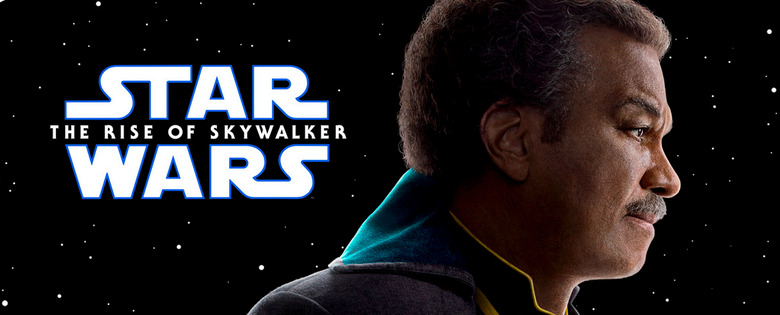
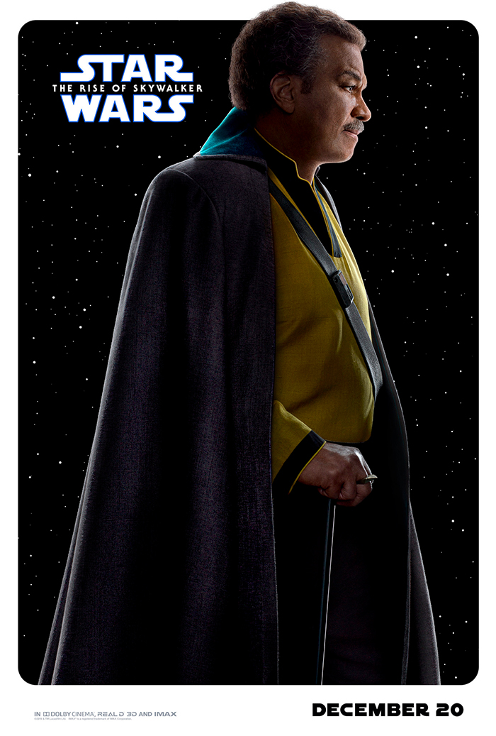
Lando Calrissian gets his own poster, but much like the Kylo Ren poster, his wardrobe doesn't allow for much color contrast. While the yellow of his shirt pops, the cape only adds to the darkness of space behind him. Couldn't they have done different backgrounds for each character poster? Even a generic planet background would have been better. But these are just lazy.
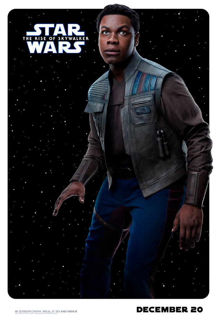
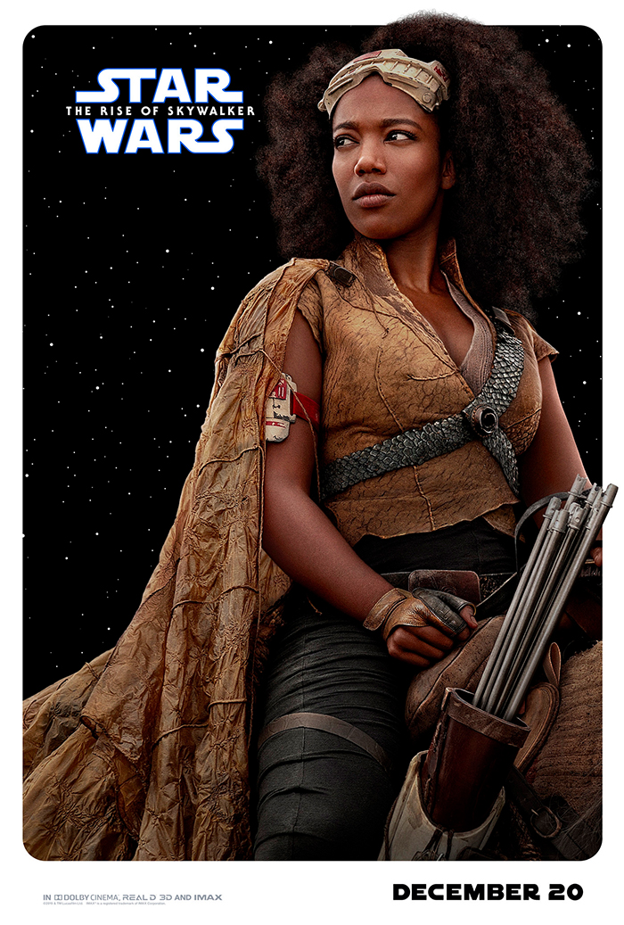
Here we have Finn and Jannah, who will be spending some time together in The Rise of Skywalker. Finn looks like he's posing for a Space Jam basketball card while that photo of Jannah appears to be a publicity still that was previously released and reworked into a character poster. Again, these are just completely uninspired.
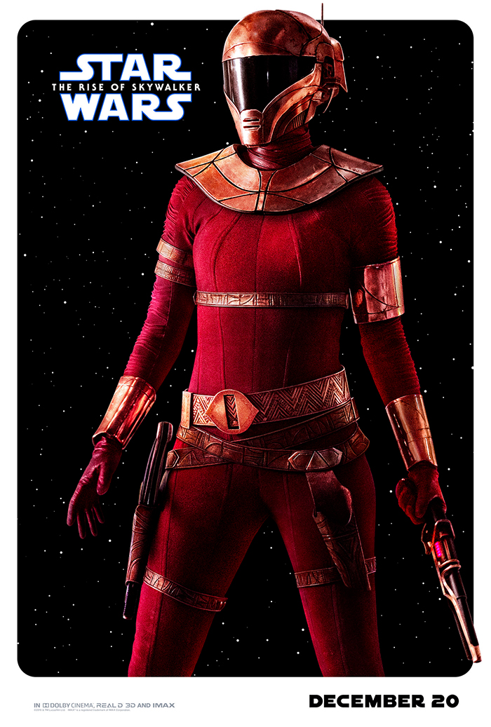
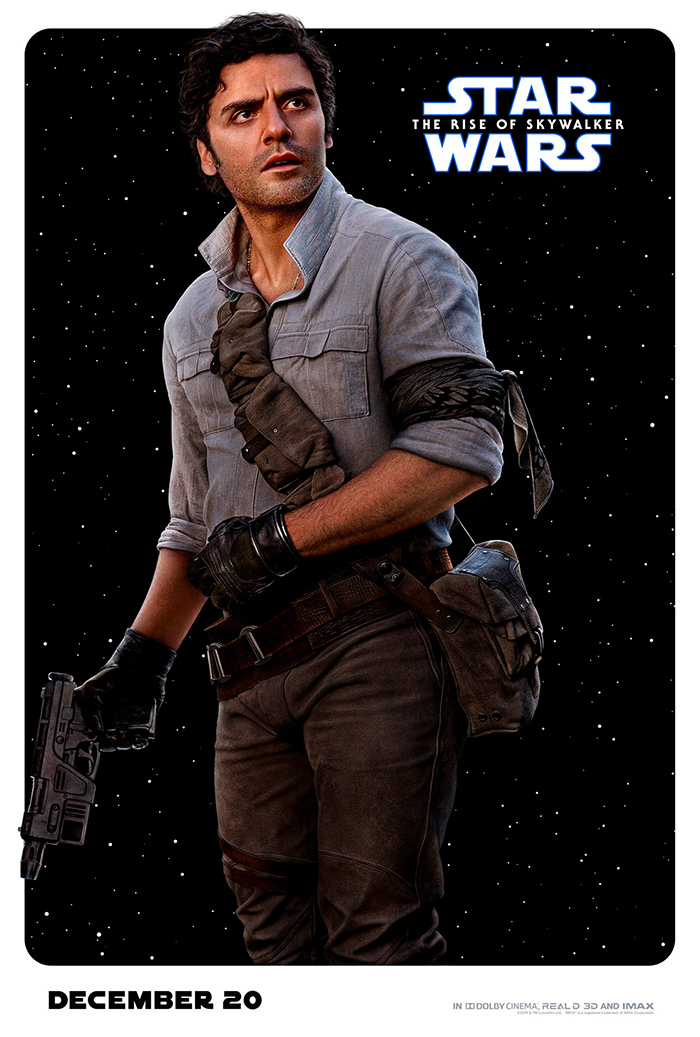
Poe Dameron and Zorri Bliss are both armed and ready for action. The only redeeming thing about this batch of posters is that we get a better look at the weapons that Zorri Bliss will be wielding in the movie. Otherwise, the Poe Dameron poster again shows why the black space background doesn't work, making the blaster in his hand look terrible.
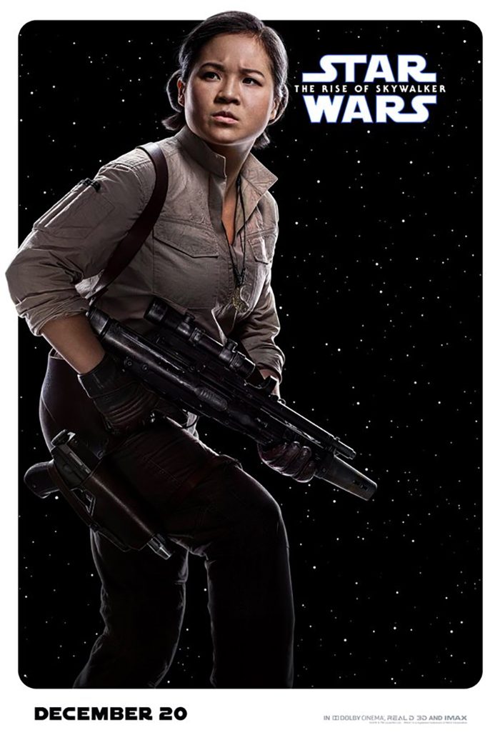
Oh hey, there's Rose! And she's looking pretty armed and dangerous in this poster. It's just a shame that again her wardrobe and weapons barely pop out of the space background.
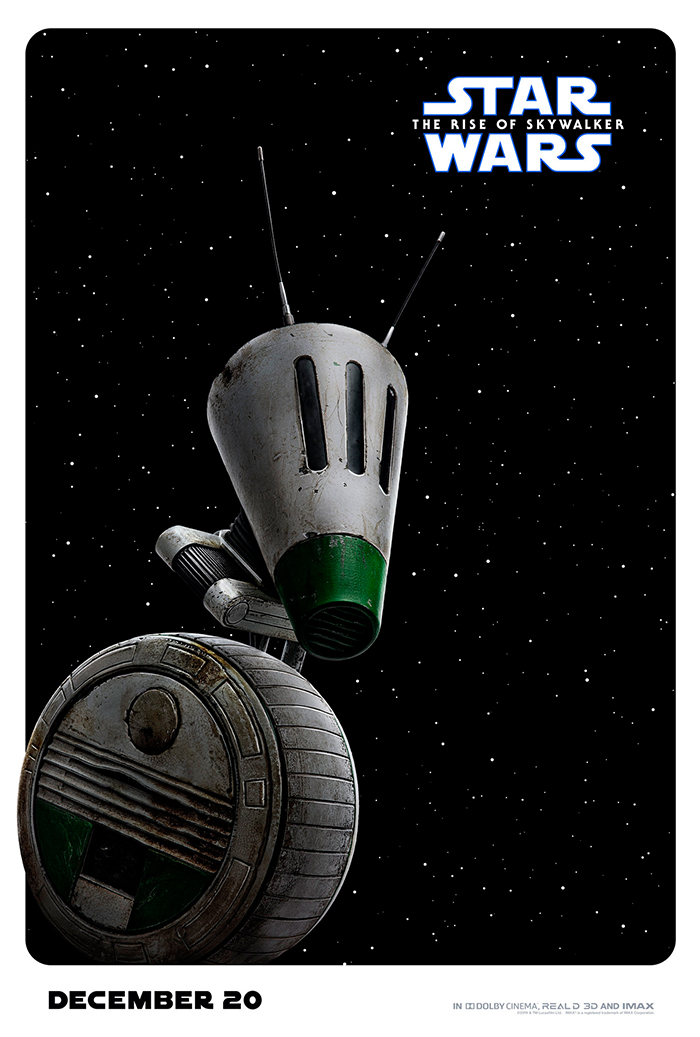
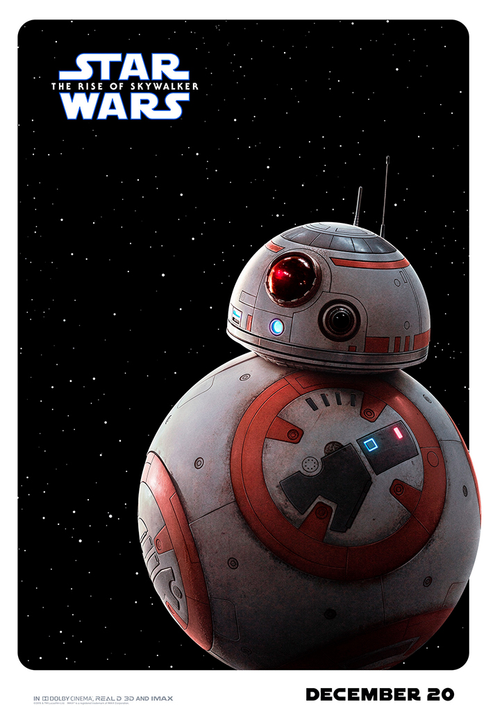
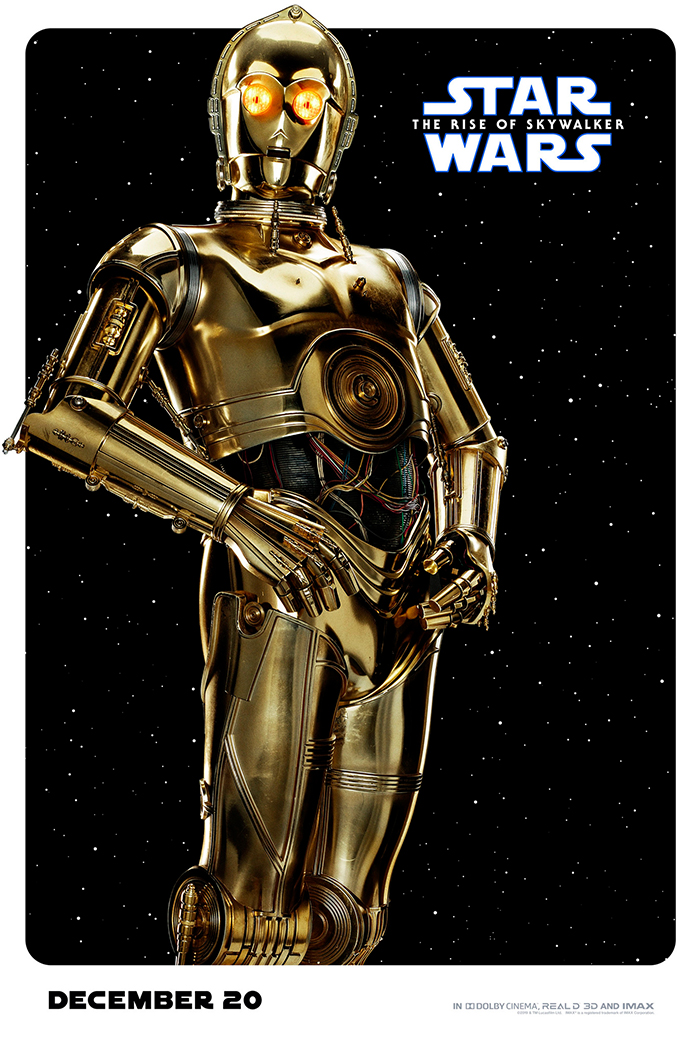
Finally, Disney really wanted to milk character posters for all they're worth, so they gave all four of the droids their own posters. They really couldn't team up BB-8 with D-O or C-3PO with R2-D2? That would have made much more sense and probably would have made for slightly better image composition.
Hopefully there will be better poster art arriving before Star Wars: The Rise of Skywalker opens on December 20, 2019.
