Finally, A Competent 'No Time To Die' Poster!
The posters for No Time to Die have not been very exciting. In fact, the posters for the entire Daniel Craig James Bond run have been rather lackluster. But hey, here's a new one that's not so bad! It's still nothing compared to those classic Bond posters, with their wonderful, stylish art design. But it's at least better than the one we got before this.
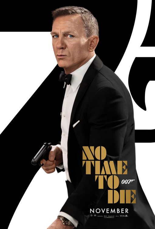
Before we get to the new poster, let's have a refresher on the No Time to Die poster that came out right before this.
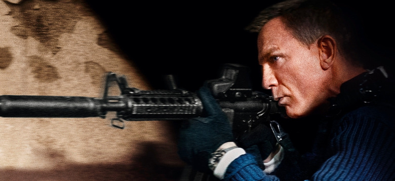
Yep, kind of bad! Craig's Bond looks confused, as if he's asking, "Are you sure this movie is really coming out in November?" And now, here's the new poster.
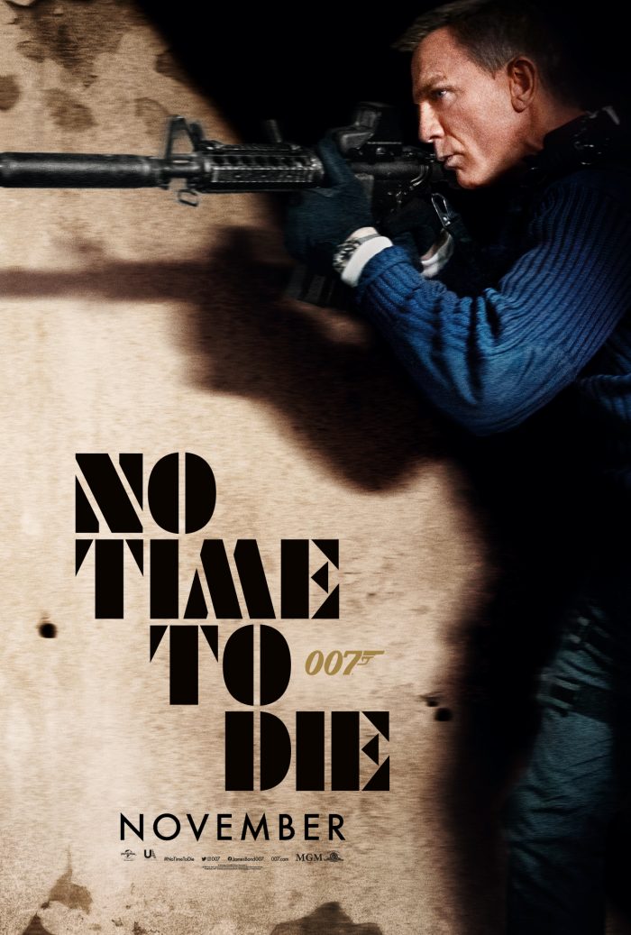
Much better! I kind of like how Bond is a bit blurry as if he's in motion. And I like the shadows. So this is definitely an improvement. But again, the Craig Bond posters have been kind of blah across the board. Here's Casino Royale.
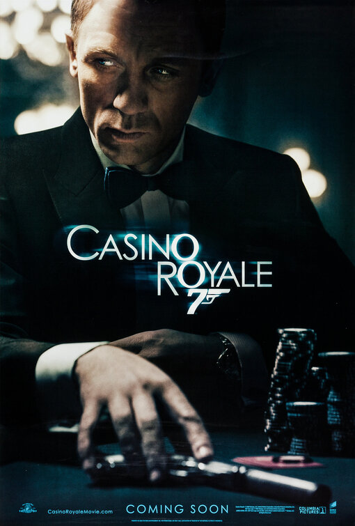
Okay, this is pretty good. It's moody, and I like the "Bond sliding a gun across a card table" idea. Not bad! And now it's all downhill from here.
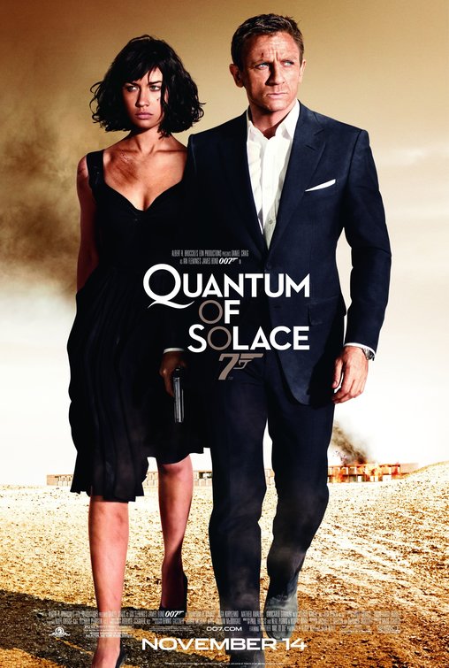
Ah, Bond is out for a stroll! Also there's a building on fire in the background, but he doesn't seem to notice.
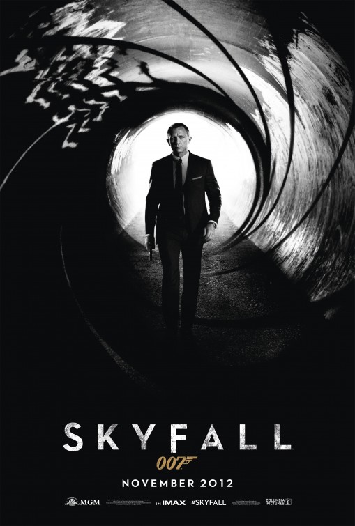
The Skyfall poster recreates the famous Bond gun barrel, but it's still rather drab. Why is it in black and white? Can we get some color up in here?
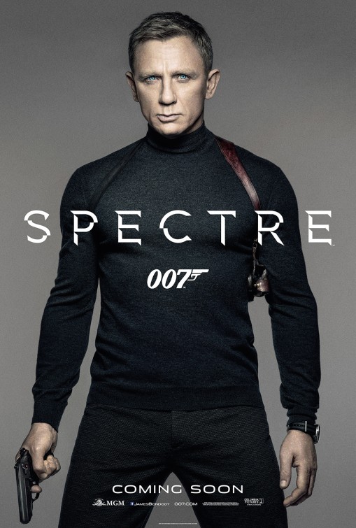
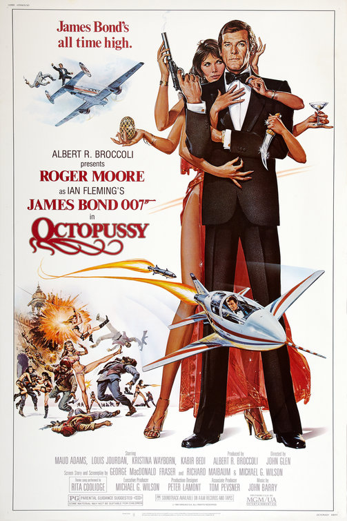
Sure, this is a nice turtleneck, but...come on. You could've done better, Spectre. Try harder. And now, for a reminder of what we could be getting with these posters.
Admit it. That's so much better than Bond just standing there in a sweater looking constipated.
Anyway, "In No Time To Die, Bond has left active service and is enjoying a tranquil life in Jamaica. His peace is short-lived when his old friend Felix Leiter from the CIA turns up asking for help. The mission to rescue a kidnapped scientist turns out to be far more treacherous than expected, leading Bond onto the trail of a mysterious villain armed with dangerous new technology."
No Time to Die opens November 20, unless it doesn't.
