The 20 Best Movie Posters Of 2017
We're close to the end of 2017, and as we rush to catch up on some of the awards season contenders in order to finalize our lists of the Top 10 Movies of 2017 (coming next week), it's time to take a look back at the year in cinema.
Before we ever see a trailer for a movie, we'll often see a teaser poster that tries to set the stage for what's to come on the big screen. A majority of official movie posters from studios are boring, familiar and don't do much to get people excited. But every year, there are at least a couple dozen movie posters that deserve recognition. So without further adieu, here are the 20 Best Movie Posters of 2017.
In order to be considered for the list, each poster had to be an officially sanctioned movie poster released in conjunction with a film released in 2017. There are also no Mondo prints, screen prints, or giclées, but you may find posters that were created as official IMAX or promotional posters for theatrical promotion. Foreign posters also qualified.
Keep in mind this is completely subjective and not meant to be definitive. If you disagree, feel free to respectfully say as much and chime in with your favorite posters in the comments. So without further adieu, let's get on with the countdown.
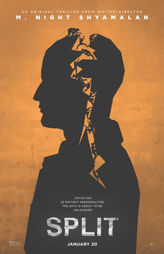
20. Split
The poster is simple in its execution, using a silhouette of James McAvoy's character Kevin as the focus and splitting it with a lightning-style crack through his head and into his body. The crack is filled with the various personalities residing inside of him. It's a simple design that brings to mind the work of Saul Bass.
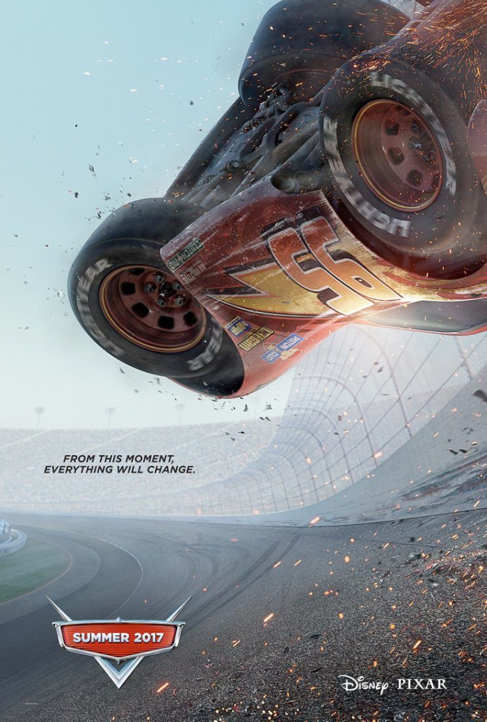
19. Cars 3
The Cars franchise gets lambasted by even the most loyal Pixar fans (ourselves included), but it's hard to deny the fact that this is a great teaser poster for the third installment of the series. Most of the time, sparks and embers appear on a movie poster for no discernible reason. In this case, they're coming from Lightning McQueen's body as he suffers a catastrophic wreck that nearly ends his career. For a family friendly movie, it's a shocking image to use to kick off the marketing, and that makes it a great teaser poster.
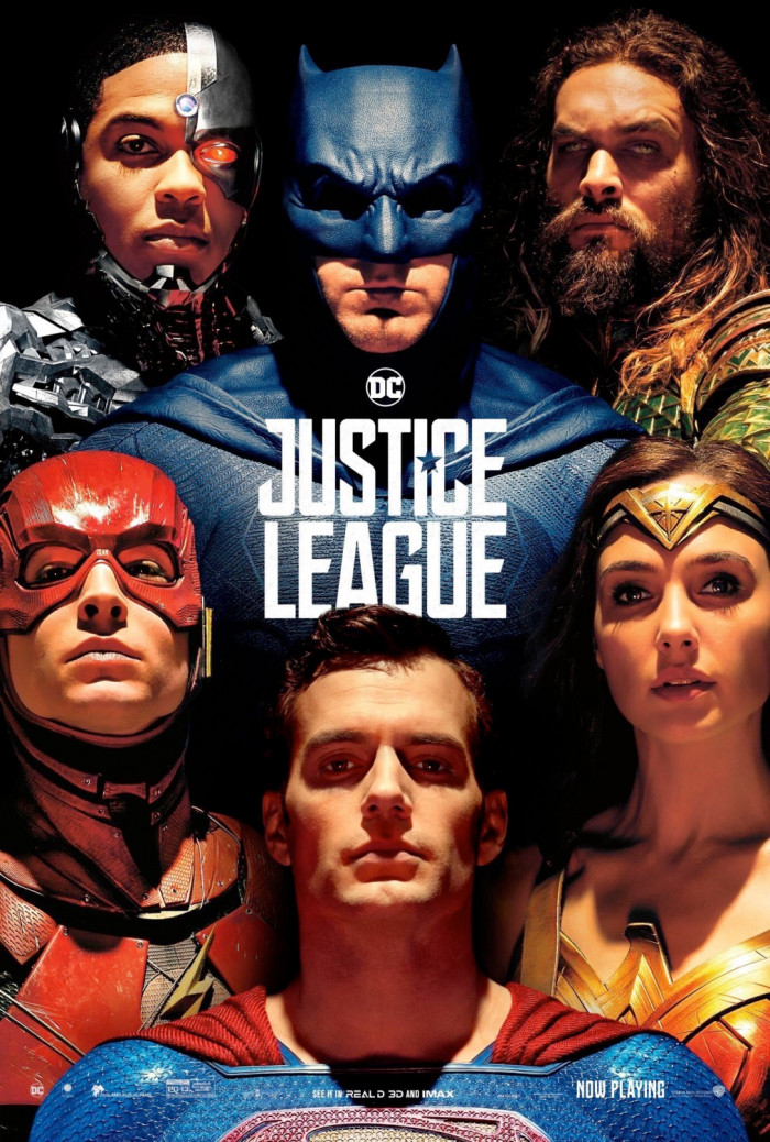
18. Justice League
Even though Justice League may not have been exactly what we were hoping to see as redemption for the DC Extended Universe, we can always look to this poster as a symbol of hope. To be clear, this version of the poster arrived after Justice League hit theaters, which is why Superman is included with the rest of the line-up. But even without Superman, this poster is gorgeous because it borrows the look of legendary comic artist Alex Ross' illustrations.
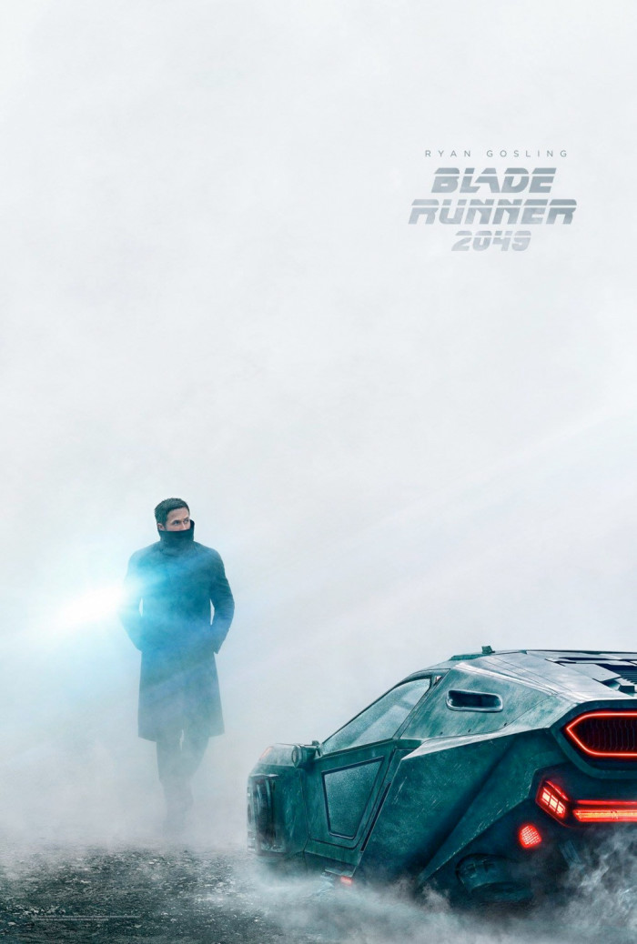
17. Blade Runner 2049
There were a lot of bad posters for Blade Runner 2049 using the clashing of blue and orange hues to draw attention to the movie (which obviously didn't work since it bombed at the box office). But this poster stands out from the crowd because of the stunning composition. The poster doesn't go for anything flashy, but fills nearly the entire poster with white, allowing Ryan Gosling and his vehicle to stand out while also fitting in with the aesthetic created by the original Blade Runner.
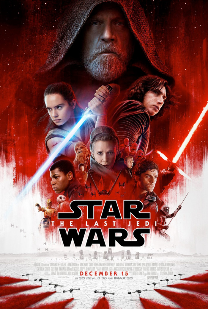
16. Star Wars: The Last Jedi
While this theatrical poster for Star Wars: The Last Jedi may not evoke the work of Drew Struzan, the spirit of his illustrations is still here. If anything, what I like about this poster is that it feels like a modernized take on Struzan's posters. The floating heads and bodies can be a lazy way to create a poster, but a poster like this fits in line with the Star Wars marketing style. But for me, what really makes it work is the rich red hues all over.
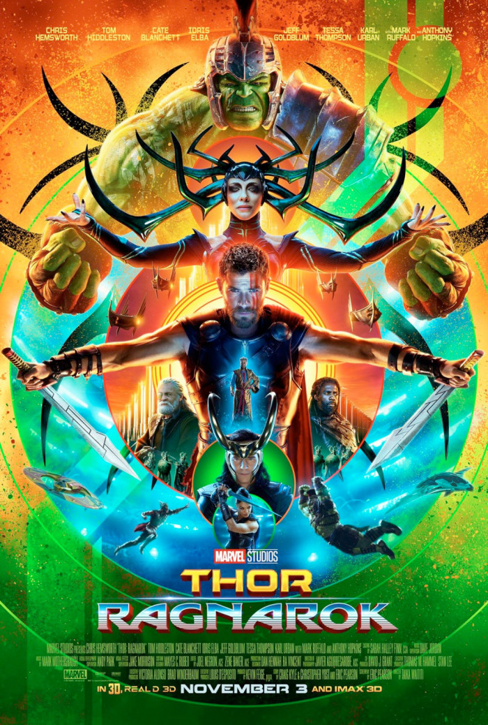
15. Thor: Ragnarok
Blockbusters can often get lazy with their poster marketing campaigns, especially when it comes to superhero movies. They slap together some Photoshopped images of the characters into a kind of collage with some pieces from key sets and a couple characters in action. But much like the movie, the poster for Thor: Ragnarok stood out from the crowd by not only bringing this vibrant color palette to the table, but also this symmetric, totem pole style composition that uses the traditionally sloppily Photoshopped elements in a way that's extremely pleasing to the eye.
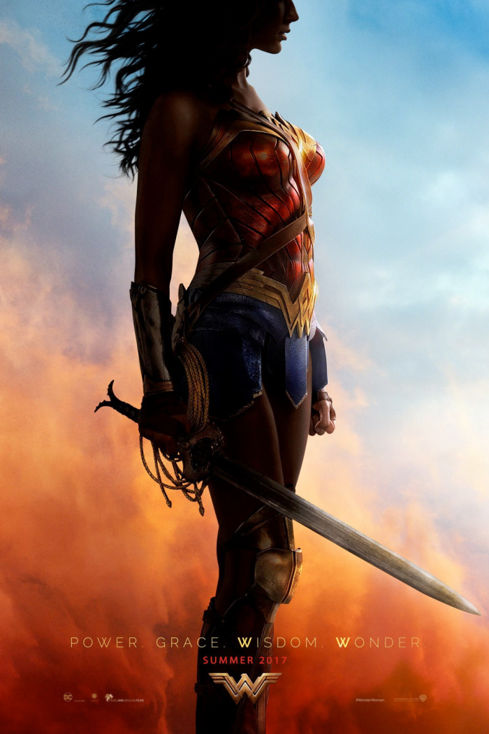
14. Wonder Woman
What more needs to be said about this richly colored Wonder Woman poster? This one stand out as my personal favorite of the overall bunch (all of which shared similar traits) simply because it doesn't completely show Gal Gadot's face. While the actress has a perfectly lovely face, I like the idea of a young girl being able to look at this poster and putting herself in the role of Wonder Woman.
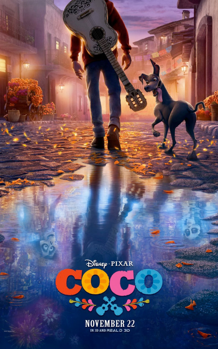
13. Coco
Pixar usually does a fantastic job marketing their movies all around, and the imagery created for Coco is no exception. On the top half, we see aspiring musician Miguel wandering through his little village, but in the reflection of the puddle on the ground on the bottom half, we get a glimpse of the Land of the Dead and Miguel's skeleton family who lives there. It's a vibrant, wonderful poster.
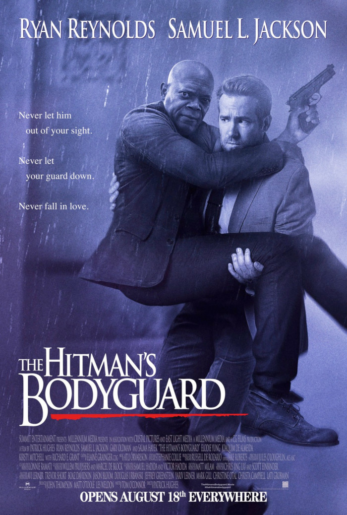
12. The Hitman's Bodyguard
There aren't enough posters for comedies that give off the vibe of the movie they're trying to sell. They're usually bland assemblies of heavily Photoshopped images of the stars in the movie, since that's apparently the best way to sell comedies in poster form. But in the case of The Hitman's Bodyguard, we get a hilarious, perfect parody of the poster for The Bodyguard.
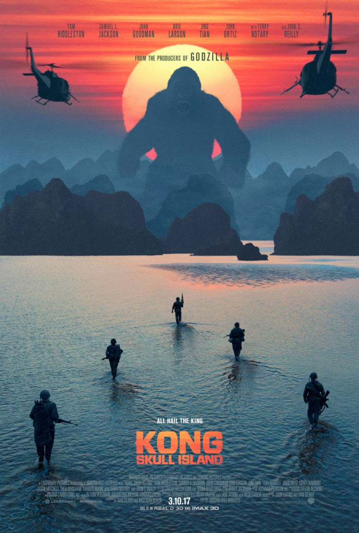
11. Kong: Skull Island
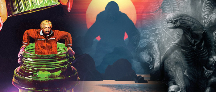
For a movie that brings to mind Apocalypse Now, the posters for this reboot of King Kong were certainly on brand. The sunset behind Kong not only shows us the ape's gigantic size, but it also brings to mind Vietnam war movies from decades ago. That's intentional, as those movies had a long of influence on Jordan Vogt-Roberts' action adventure.
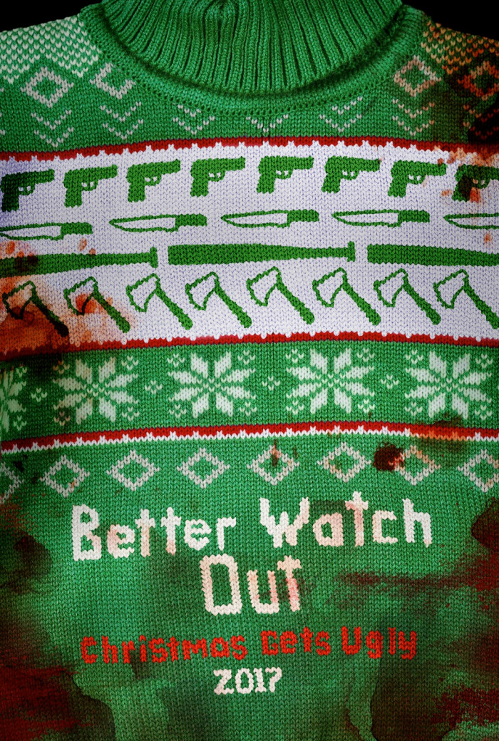
10. Better Watch Out
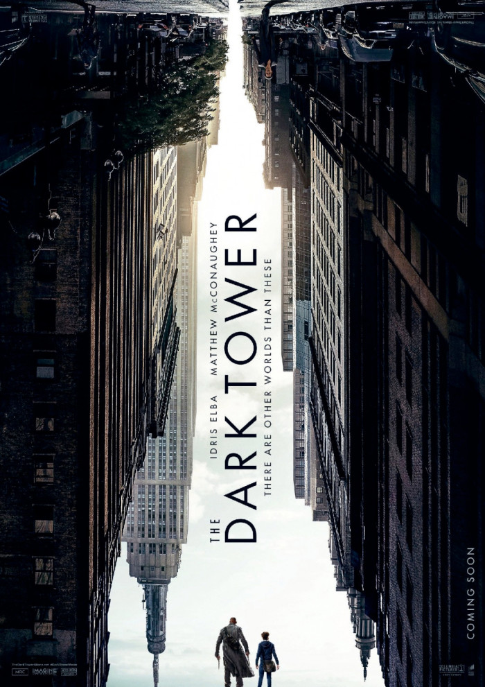
9. The Dark Tower
While we've seen designs like this before (the poster for Coco has a similar style), what's great about this particular approach is that the outline of the sky created by the edges of city skyscrapers create the outline of the Dark Tower itself. It's just a shame the movie wasn't anywhere near as good as this poster.
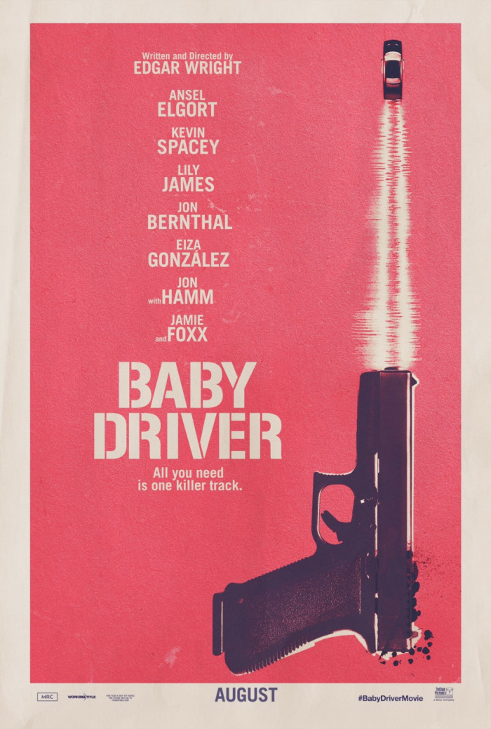
8. Baby Driver
Here's another case of how simple imagery is better. The car is being fired out of the gun, indicating speed and violence are in store for this movie. But the extra touch of using soundwaves as the bullet trail/tire tracks is what pushes it over the top to being a great poster. Combined with the tagline, "All you need is one killer track," and it's clear that the soundtrack of this movie is going to be just as integral to the movie as the action. A lot is said with very little.
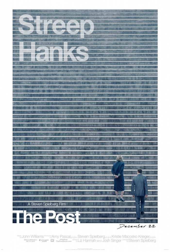
7. The Post
Much like comedies, selling dramas like The Post in poster form can be difficult and often rely on star power. In this case, the last names of Meryl Streep and Tom Hanks are certainly highlighted, but it's the repetitive image that draws your eye to the poster. We see Streep and Hanks on a long, wide staircase, indicating the climb they'll have to make in court to fight against the government. But I also like that the stairs look similar to the black lines drawn in confidential government documents to indicate something has been redacted, not unlike The Pentagon Papers at the center of this story.
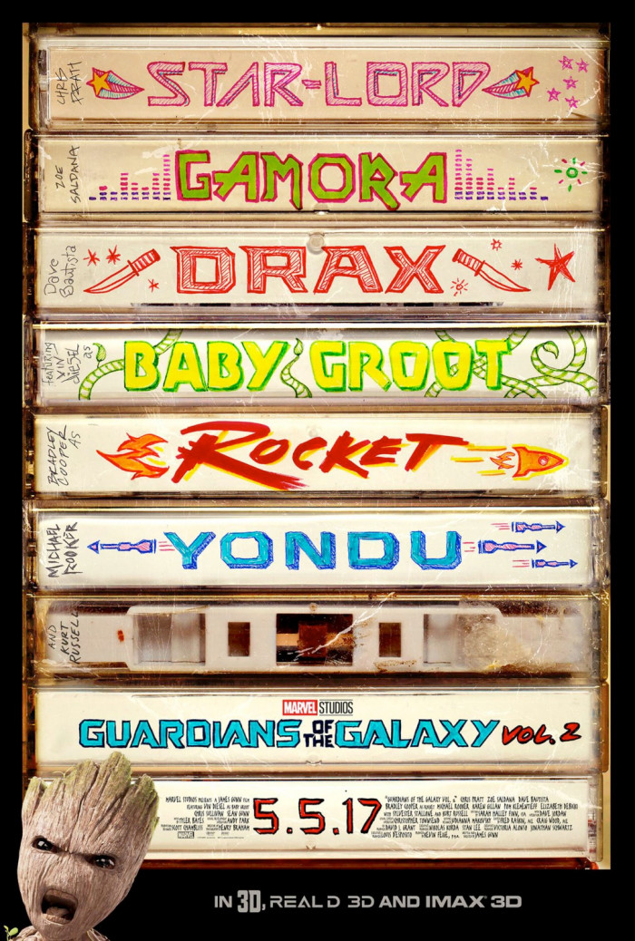
6. Guardians of the Galaxy Vol. 2
While I could do without the shoehorned image of Baby Groot in the lower left-hand corner, the rest of this poster is still good enough to make this one of the best posters of 2017. Each of the key heroes in the Marvel sequel get their own mix tape spine artwork that looks like it was drawn by hand in high school.
5. Good Time
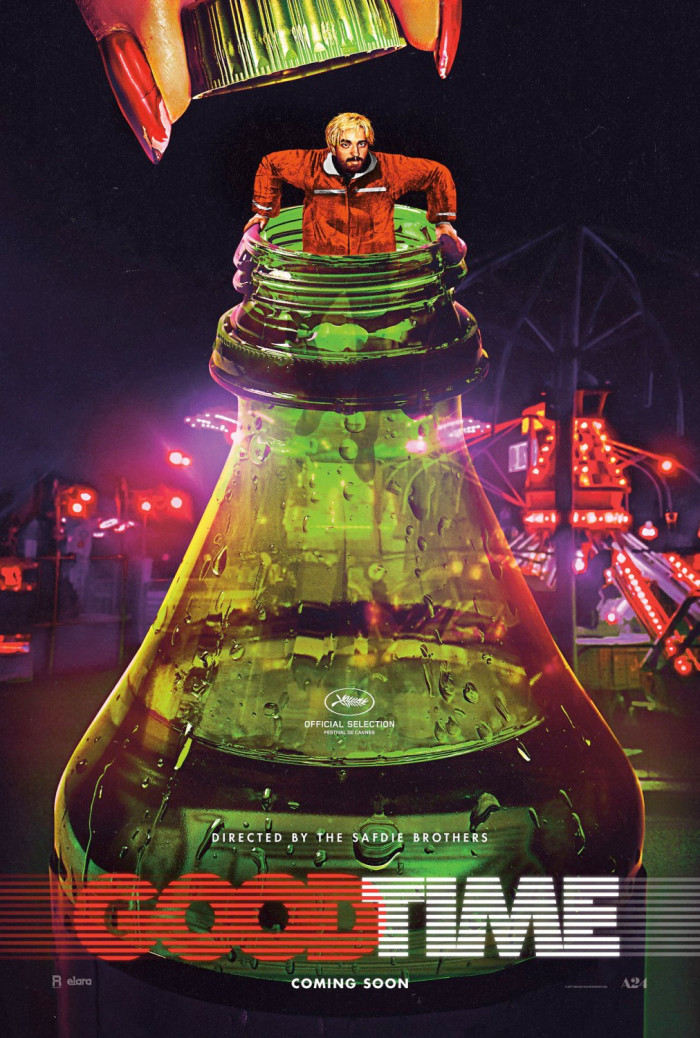
What I love about this poster, aside from the fact that it's illustrated, is that it feels straight out of the 1980s. It conveys the wild style of the film and the insane night ahead for this character without really telling us what the movie is about. That bottle is key, but in order to find out why, we'll have to watch the movie. The poster raises just enough questions (especially since it stars Robert Pattinson) to get audiences interested, and it's a fantastic image too.
4. Ingrid Goes West
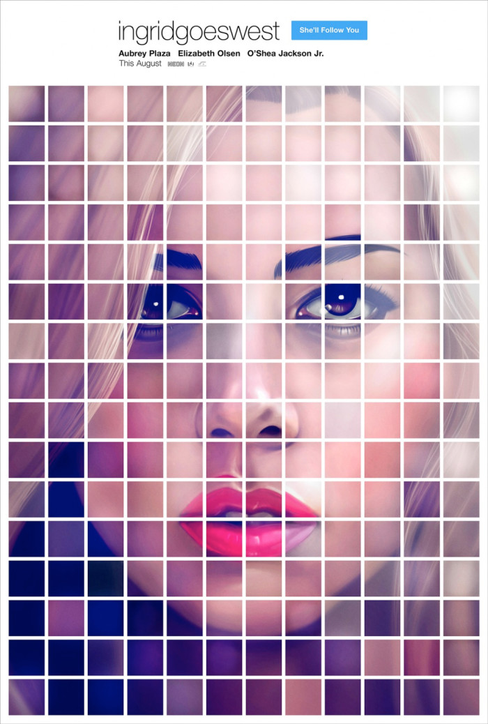
This poster could have easily been created in a more lazy fashion by just splitting a single image into a grid and making it appear like a collection of Instagram posters. But instead, it was made to look like a genuine mosaic by having the lines on the lips and eyebrows not quite match up. Putting the tagline on the "follow" button of this faux Instagram page is a nice little detail that makes this a perfect movie poster.
3. The Shape of Water
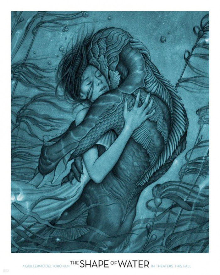
This poster is almost as gorgeous as Guillermo del Toro's movie itself. It almost looks like the cover of a novel rather than a movie poster. The way the seaweed flows like Sally Hawkins' hair and the union of her character with the fish man is simply stunning. We need more posters like this in movie theaters.
2. Mother!
The details in this illustration are magnificent, and there's even more to notice when you take a much closer look. Much of the imagery here won't make much sense until after you've seen the movie (and maybe not even then), but take notice of the face under the leaf on the far left, bottom side. Also look at the center of some of the flowers for a couple more interesting details. It's perplexing and beautiful all at once.
1. Alien: Covenant
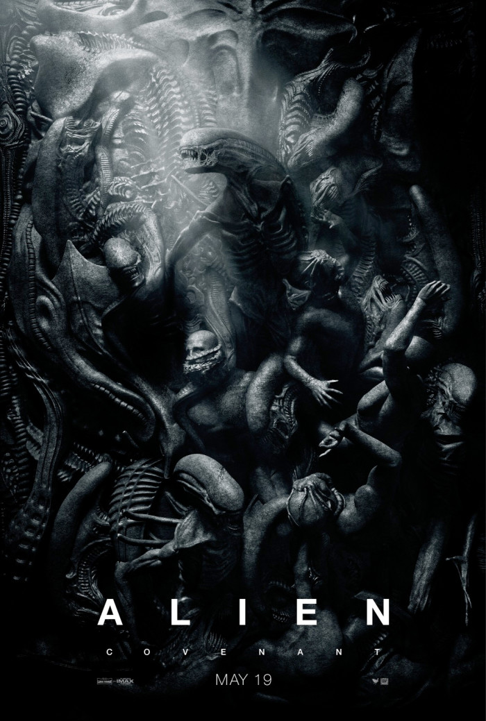
Inspired by the imagery of Inferno, the first section of Dante Alighieri's Divine Comedy, this poster for Alien: Covenant is twisted in its beauty, but also thoughtful in how the art that inspired it deals with the idea of Hell, Purgatory, and Paradise (or heaven). The poster is a recreation of The Gates of Hell by Auguste Rodin, and once you see the original art, you'll understand why this poster is so outstanding.
