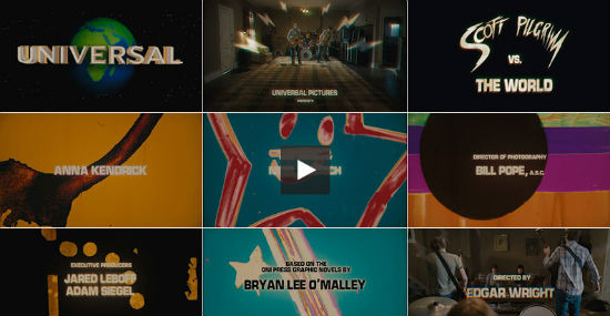
The Art Of The Title Sequence: 'Scott Pilgrim Vs. The World'
Much of my personal love for Scott Pilgrim vs. The World doesn't derive from where you'd think. People point to the funny dialogue, the great music or kick ass action while others might highlight the interesting story or some of the individual performances. That's all well and good. But when I pop in my Blu-ray, autographed by the whole cast, my personal love for the film comes from the the title sequence. The first 5 minutes or including everything from the 8-Bit Universal Logo through director Edgar Wright's credit.
The awesome site The Art of the Title Sequence spoke not only with Wright, but concept designer and head storyboard artist Oscar Wright as well as main title designer Richard Kenworthy in painstaking detail about the creation of the pulse-pounding credits sequence. We've got some highlights below.
The title sequence in Scott Pilgrim vs. The World sets you up for the epic of epic epicness promised by the poster. The blaring Sex Bob-Omb song by Beck, the awesome single shot as Young Neil's living room extends into infinity, the inside joke laden, color blast titles by Shynola, and of course the performances by both Sex Bob-Omb and Knives Chau all combine to get the audience so jazzed up before the movie even starts that, if you aren't hooked in by that, you aren't going to be hooked in at all.
We're got some highlights below but I can't urge you enough to click over to The Art of the Title Sequence and read these interviews in full and watch the videos provided. Fans of the movie will be overflowing with totally needless, but excellent, information.
One of the first cool tidbits is that, if it wasn't for Quentin Tarantino, Scott Pilgrim vs. The World might not of had a title sequence at all. Edgar Wright explains:
The film always opened with the studio credits and title of the movie always occurred over the long tracking shot in the living room with the band playing. That was one of the first scenes boarded and pre-vised. But originally all the credit cards were at the end over black. We originally ended on a completely different song too, "In The Long Run" by The Carrie Nations. We test screened it once in this version. But then a couple of people had a note about the movie, one of them being (name drop) Quentin Tarantino. He felt we needed a title sequence at the start to let people settle in and hint more about what we were about to see. We did a very rough mock up of this in the AVID with white on black titles along with waveform graphics. Even this temp sequence did the trick of giving the film more of a sense of occasion and a very distinct break between the prologue and the first scene moving the story forward. It also helped to have Beck's loudest soundtrack song blasting for two minutes straight. So we knew even with our mock up that the front titles made a big difference to the movie.
And here's how main title designer Richard Kenworthy of Shyola describes the process of getting the job and giving Edgar what he wanted.
It was a strange project in that Edgar had a pretty tight cut of the film in his hands already. Tarantino had seen a rough cut and suggested he needed a moment at the start that let the audience settle in. Edgar wanted to give the audience a little taster blast of the mayhem to come, but not spoil any surprises, so he specifically didn't want us to directly use Bryan's artwork. Initially we pitched what is best described as an 8-bit epileptic eye-fight. We cut together a mood film using a bunch of found pixellated clips of geometric patterns and manga FX, which was really over the top. Edgar liked the energy but didn't want to tint the film so blatantly with computer games from the outset. So we had a rethink. We had a very specific hole to fill – the band fired up their rehearsal, you got a main title, they rocked out, song ends and then you cut to Knives' reaction. We had a notion that this was how the song was playing in Knives' head. Listening to the song we hit on making a visual representation of their slightly amateurish, raw, garage-y sound. Something that had the feel of a live performance. A lively, colourful, in-you-face scratch film seemed a perfect fit. We did a test and it looked really promising.
I think that's enough of a tease. Pilgrim fans, again, head over to The Art of the Title Sequence for so much more information it's ridiculous. Other influences, animatic videos, it's insane.
