M. Night Shyamalan's Signs Almost Had A Very Different Alien Design
When movie fans think of M. Night Shyamalan's best-ever horror movie, the first to come to mind is likely "The Sixth Sense" ... and they'd be right. But for those looking for a slightly more outside-the-box entry, the director's 2002 alien invasion thriller "Signs" has set itself apart as a worthy conversation-starter and an exhilarating experience. I know, I know, folks found that water plot twist to be rather lacking and, as is usually the case with the idiosyncratic filmmaker's detractors, many simply couldn't get on board with the specific tone that lends itself towards stilted dialogue and generally earnest, irony-free themes. But for those able to get on Shyamalan's unique wavelength, the deeply spiritual and downright fun movie still has plenty to offer to the open-minded.
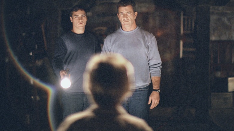
With the film recently celebrating its 20th anniversary, one such aspect has continued to stand the test of time: those antagonistic extraterrestrials responsible for some of the movie's most effective scares. For example, there's that moment early on when Mel Gibson's Graham Hess looks out the window and spies a ghostly silhouette staring back at him from a rooftop, and also that terrifying news footage giving us our first clear look at one of those aliens in the flesh.
But the process of conceptualizing and designing the villains of the story wasn't an easy one. In the earliest stages, the original plan for the aliens could've ended up with them looking much, much different than in the final product.
The evolution of the extraterrestrials
Though much of the film was filmed on-location, "Signs" boasts a pretty hefty amount of visual effects work as a result of the aliens at heart of the story. Though largely kept to the shadows or just slightly out of frame, even throughout the climactic final act, a mix of practical effects and VFX technology was used to bring them to life in as creepy, unsettling, and evocative a way as possible. The tech magazine known as "befores & afters" has always stood out as a reputable outlet for appreciating VFX work and their official Twitter account recently posted an insightful thread detailing many of the initial designs and the techniques used to film certain scenes in "Signs."
Wow, 'Signs' is 20 yrs old this week. Here's a quick VFX appreciation THREAD about the work of @ILMVFX. The making of doco features prodn VFX supe Eric Brevig, who mentions that original creature design had it more camouflaged in nature. pic.twitter.com/LIRupsalOa
— befores & afters magazine (@beforesmag) August 2, 2022
Among the many tidbits, one key reveal shows how the aliens could've felt much more reminiscent of the original "Predator" movie, with near-perfect camouflage allowing the creatures to melt more fully into their environment as opposed to the more imperfect, chameleon-like blending of patterns in the final cut. But the differences don't stop there, as the changes during production even apply to the actual movement of these monsters. As depicted in the film, their agility and otherworldly range of motion presents a formidable threat to our main characters, but at one point they could've felt much more familiar to the eye.
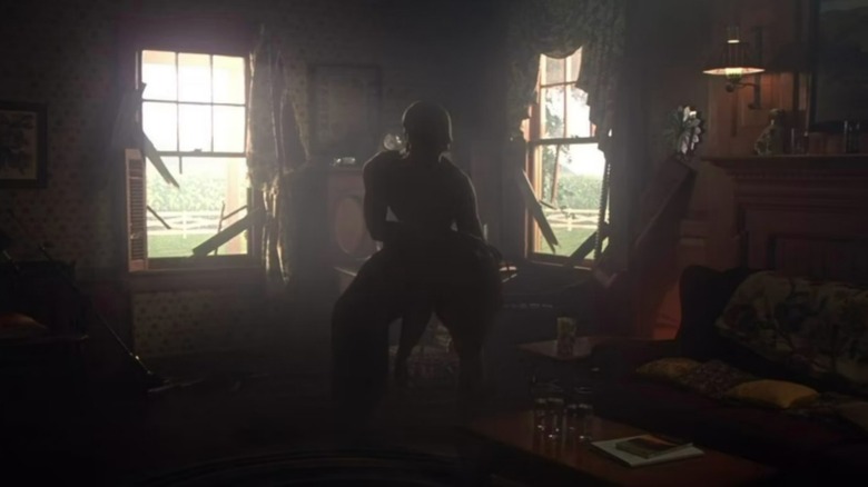
Also, the creature was initially imagined as something more feminine, and a female performer brought in as a reference for how the creature would behave. pic.twitter.com/bzbi1YBlSM
— befores & afters magazine (@beforesmag) August 2, 2022
As explained above, the creative team explored making the aliens more "feminine" and even brought in a trained performer (shades of Sonoya Mizuno in "Annihilation") to help develop their final look and feel. The rest of the thread contains even more fascinating details that just might have you looking at the film in a different, more appreciative way. 20 years later, I think it's about time we admitted that "Signs" is good, actually!

