Atlanta Cinematographer Stephen Murphy Takes Us Behind-The-Scenes Of Season 3 [Interview]
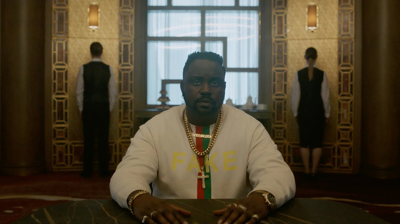
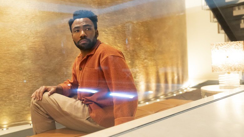
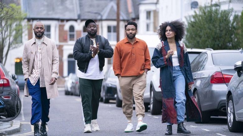
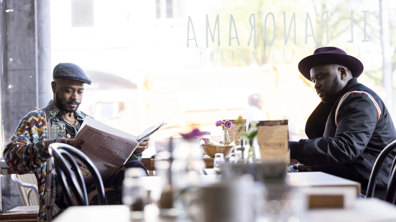
Stephen Murphy shot six of the 10 episodes in season 3 of "Atlanta." The cinematographer is behind "Cancer Attack," "New Jazz," "The Old Man and the Tree, "Sinterklaas Is Coming to Town," "White Fashion," and the recent season finale, "Tarrare." Murphy likened making the series to a tapestry, but that's the gist of season 3 overall. The cinematographer and everyone involved, including creator Donald Glover, were never repeating themselves.
Previously, Murphy worked on Amazon's "Hanna," "No One Gets Out Alive," and "Death and the Nightingales." Now, with "Atlanta," he's got a job on his resume that'll be hard to equal.
"It's almost become this mythical job in London with all of the crews who have referenced how good an experience it was," Murphy told /Film in an interview on "Atlanta" season 3, "and people keep comparing us to, 'Well, if my next job isn't as good as that job, I'm not doing it.' It was just a great experience."
Recently, /Film chatted with Murphy about his great experience on the latest season of "Atlanta," and what he thinks are the greatest skills a cinematographer can have.
'Spaces inform character a lot of the time.'
"New Jazz" is a very "Twilight Zone"-esque episode. Do you have a lot of questions thematically, or what's going on internally that are informing some of your choices?
I would say yes and no. The conversation about the visual style starts in a broader sense at the very beginning of prep, and then as some of the tactile things like the choice of locations start to become apparent as you're prepping, then you start whittling down those conversations into specifics about specific episodes, and you also start to get a sense of what the episode is.
Hiro [Murai] or Donald [Glover] might be choosing certain things, and they might be choosing them in an unconscious way almost, without consciously saying, "Oh, I need this room to be this," or "I need this space to be that." There's a little bit of that, but I think a lot of the time you find a space, and then that space informs your choice of what the next location's going to be in the sequence, and then that might inform the next location. It's a bit of a tapestry.
The episode begins to speak to you as to what it should be or what it should feel visually, as well as the broader conversations that you have, or have had in the abstract at the very beginning of prep. So it's a little bit of both. As all the other elements start to come together, you begin to have the spark of ideas, you know, "Oh, that space is really interesting, I hadn't seen the scene that way, but maybe now, that allows this to happen."
Say for "The Old Man and The Tree," which is mostly one location, what did you find that location was giving you?
In that particular case, when I turned up, I came onto the prep a little bit later, so Hiro and Jonathan [Paul Green], our [production] designer, had been searching for that location and had a very specific thing in mind, or rather they had a thing they didn't want it to be, and they had looked at a few houses and hadn't quite found what they wanted. When I joined, we continued on this very interesting scout for weeks and weeks, trying to find this elusive house that we couldn't find. We knew what we didn't want it to be, and we would go and look at these amazing houses all around London, and it just didn't feel right.
The guys had seen that house and discounted it for certain reasons, and we got so close to the beginning of production, we were a little desperate and they said, "Let's just go back and have another look. Stephen hasn't seen it, let's take him." And when I turned up at the location, I said, "Oh, this is great, this is perfect." And they were like, "Well, why is it perfect?" The house, if you can imagine it, if you look at the front door, it's a very, very wide house, it's this huge palatial house. I was looking at it a different way, and I said, "No, no, no. Forget the front door and pretend the front door is at one end of the house and it's no longer a long wide house, it's a really, really deep house that's quite narrow," and that's more in keeping with the style of the exterior that we had found in London, where you would have these terraced houses all in rows rather than one big wide house.
So when I made that suggestion, then suddenly Jonathan and Hiro completely saw the space in a different way, and then things started to click. Even though it's the same space, it was just a question of orienting ourselves to how the camera could see it rather than how you see it in a normal way when you look at a normal house.
Like you said, you all knew what you didn't want for that location, so what was it you did not want that episode to feel like?
Well, what we didn't want in that particular instance was the house to feel like a big house that you could find in Atlanta. There was always the sense across all of the European episodes that we wanted the guys to be in Europe to visit spaces and places that they couldn't see in Atlanta or couldn't visit in Atlanta.
There had been a previous episode in, I think, season 2, where some of the characters went to a big mansion and there was a big party, and those kinds of properties were available to us in London as well, but we didn't want to repeat that.
I mean, some of the biggest houses that we went to, they were horrendously decorated with absolutely no taste whatsoever, and that says something about the person. So the character needed to have a bit of a different kind of class, I'm not saying his taste is particularly good, but I didn't want to be overly gaudy or tacky or everything painted in gold and leopard print, which is what an awful lot of the big properties in London look when you go.
'Is it still Atlanta, even if they're not in Atlanta?'
How about the wide shots? Some of the show's best moments are just the characters hanging out. You really get to experience it in these wide shots, too, that lets you enjoy it.
Yeah, yeah. A lot of it is. I mean, my personal taste tends to gravitate more towards wide shots. I love seeing characters in spaces too, I think spaces inform character a lot of the time. From a lighting standpoint, I love seeing the room, I love seeing a large room and I love seeing a character placed within that environment, and what that says about them or what that says about how they're feeling.
Ironically, because of Covid, because we were still shooting in the U.K. and in Europe during the lockdown, we ended up getting quite unprecedented access to a lot of the spaces and locations that we wanted to shoot in, more so than a show our size would normally be able to afford. So we had this great opportunity to showcase the journey that all these guys were going to go on, particularly the "New Jazz" episode, which is a great journey, and the "Tarrare" episode, which is another great journey.
Anytime we got a chance to show the space or show the environment and the world, we took it, which also speaks to the idea of, they're not in Atlanta anymore. Is it still "Atlanta," even if they're not in Atlanta? I think you might take that as, yes it is, because they encounter an awful lot of the same sort of things that they do when they're there.
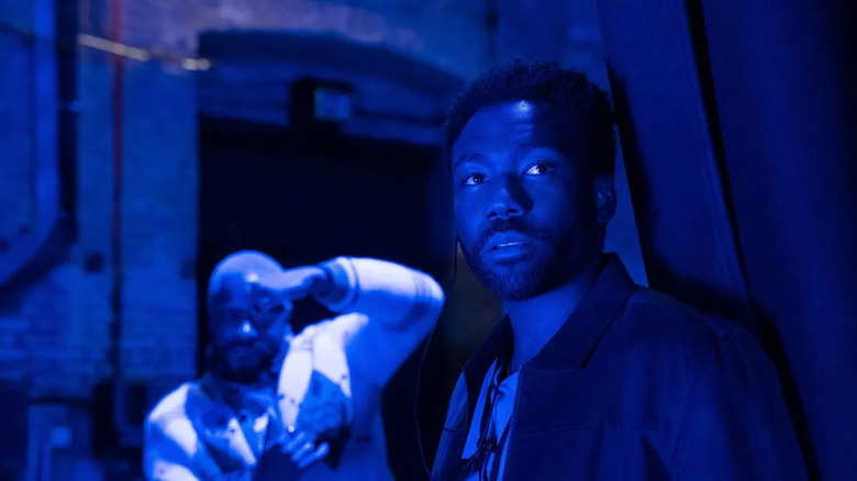
How was lighting the cancel club in "New Jazz"? Some cinematographers say red is such a tricky color.
Not so much, no. I've always used color and color contrasts and so I'm used to it. I think the trick with something very, very strong, particularly red, is that you need a little bit of a neutral color somewhere in the frame, like a white color, so that your eye continues to register what red is. If you just bathe everything in red, your eye begins to cancel it out, because your eye is so good at canceling colors out and trying to make things look normal. From a technical perspective, I just needed to make sure that the red wasn't the only color in that space. A little bit of red goes a long way.
So in that trip that they take up those winding stairs and then into the actual club itself, there's a lot of red in the wallpaper and the carpets and some of the lights. I didn't need to overcook it, I just needed to strip it back a little bit and present it in a simplified way, and that worked well. I knew that we'd be costuming the people in a particular way and they're in the graphic black and white suits, or the dog suit, which is also a black and white. I knew things would pop in terms of the costumes, from the backgrounds and stuff like that.
Like you said, the locations influence a lot of your work, but how about the performances? For example, Zazie Beetz in the finale, what about her performance inspired some of your choices?
A lot of that comes from the rehearsal process, so when the director's rehearsing the scene, I'll always stay in the room and sit in the corner and watch and listen. To me, listening is one of the biggest skills a cinematographer can have, because you're watching the conversation between the director and the cast, and between each other and the cast when the talking to each other, and you're trying to listen for the story beneath the story or listen to the subtext of the conversations, and that informs a huge amount of what I do or the decisions I make in terms of the lighting and the blocking.
With that scene in the finale [with Van by the water], it was such a powerful scene on the page, and I knew it was going to be a tricky one for the guys to pull off, and the best thing I could have done was give them space. I lit it in a really, really simple way that I knew wasn't going to cause any problems, was going to look good, was going to allow us to turn around our angles really quickly, so there was very little downtime between camera setups. And that momentum and that simplicity, it helps the guys keep their momentum and helps them stay in character and it brings about a better scene. So the best thing I could do in that circumstance was just try and keep things as simple and unobtrusive as possible, and try not to let the mechanics of the cinematography get in the way of the performance.
'Listening is one of the biggest skills a cinematographer can have.'
From a technical perspective, what were some moments in season 3 that are deceptively simple?
So if I said deceptively simple, but something I'm really, really proud of is, in "New Jazz," Brian's character, he gets chased. He's running away from the guy to have thrown the baby around, he steps into this dark room and closes the door. He turns around and he sees a sliver of light, he sees this white woman in light colored clothes in a pool of light, in a dark room. He slowly goes up and approaches her. At the end of that sequence, you're supposed to reveal that there's an audience in this black box.
That is something no one will ever think twice about, but I'm immensely proud of, because technically it's very, very difficult to take somebody whose skin is as dark as Brian's is, put them in a black box, and contrast them with somebody with super pale skin in a white costume, sitting in a white light, and have just enough information that you can read her features, and just enough information that you can read his features, and then not reveal the gag too soon.
Again, it's lit in a very simple way, but it is very technically difficult. I'm super proud of that, and I think Brian looks amazing. He's got the most amazingly reflective, beautiful skin, and I think it comes across incredibly well in that black box environment.
Like you said, the reveal doesn't come too soon. The pace of "Atlanta" often keeps you on your toes, especially how long shots can linger. What effect do you think the pace of the camerawork is creating?
It dictates a lot of the psychological impact of the scene on the viewer, and it's something that's quite well thought about by everybody, especially by Hiro on the set, and a lot of that comes from the fact that it's not the TV show that shoots conventional coverage. I don't think we ever did classical reverse shots for anything. Each scene is given its own 100% care and attention. It's never just a case of gathering footage to make decisions about later. There's a specific intention on the set in terms of how the scene should feel and how it should pace. We only ever shoot the shots that we want to see on screen, rather, the shots that we think we need to show.
That's part of why it's as unique as it is, because it's definitely the voice of one or two people augmented by all these experts that they've brought on board to work with them, and it's not watered down or interfered with later on. It has more of the mentality of an indie film or an '70s American cinema feature film because it manages to hold onto that singular voice all the way through its process, which is great.
At one point, Van quotes Darius that it's all a simulation. Something about that pace and style of the show made me wonder, is he right? Was that idea ever discussed?
It's not something that was mentioned to me specifically, so I couldn't comment on whether it's real or not, but I think Donald is so clever that even if he was going to go that direction, I don't think he would articulate that in a way that the rest of us might then act upon it and telegraph it. I think Donald and Hiro are very, very good at subtle stuff, throwaway story, throwaway humor, and I think if it was someone else and they thought that's where they were going to go with it, we'd all know about it, all the collaborators would know about it, and I think it would just become too obvious, even through no fault of our own. I think the guys are just smarter than that, they're really clever.
'You don't really want the camera to be doing anything to break that intimacy.'
Even though we get different perspectives and stories this season, are there any consistent rules about what the camera should and should not do in "Atlanta"?
No. The very first conversations that I had with Hiro were about the idea that each episode, with the camera, can be its own thing. There isn't a hard and fast rule about doing something or not doing something, not across the series. What we did do was for each episode, we might make up a rule or two and that we would loosely stick to.
If I was going to use an example, maybe the one consistent thing that we did across the show was both myself and Hiro really like a limited lens discipline where we ended up shooting, I would say 80, 90% of the six European episodes on just three lenses, that gives you a consistency across the show in terms of a point of view.
What it also means is we would traditionally start with a 27 mil. Most people for a wide-shot would be on 21 or maybe an 18 mil, but we would put the 27 mil on and instead of swinging the lens to go, "Okay, we can't quite see enough," we would move the camera, or we'd go, "Oh, maybe we're on the 27, but we're a little bit closer." It forces you to think about the camera's relationship with the cast and with the space a little bit more, rather than just changing lenses to see the corners of the room or see something you're not seeing. A lot of people don't take the time to do that, so again, it speaks to the specific visual intent that the guys have for the show.
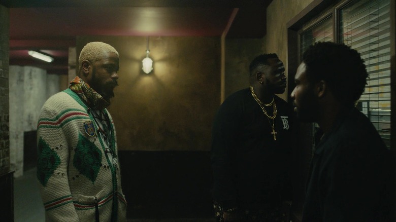
Each episode could have its own language. "Cancer Attack," we used an awful lot more steady cam because we needed to, and we had all the corridors to work with and we thought it'd be nice to have a bit of energy and have a bit of flow and connect scenes and stuff that.
"Old Man and The Tree" was a bit more studied and a bit more simplified in terms of what we did with the camera, we'd come up with different rules. I was suggesting trying to shoot a lot of it with the lens at a particular height, about five feet. If you're an old school street photographer and you're shooting medium format film, you're looking at your camera, it's hung around your neck, and you look down at the viewfinder at the top of the camera, so you end up taking a lot of your photographs at the same height, your chest height. And that's a neutral perspective, it's not too tall, it's not too short. We wanted a neutral perspective with zero tilt, where you're not really setting your camera at three and a half feet and tilting up to see an actor, you're trying to find a position where the camera is neutral and not having to operate to accommodate people. We took that approach with "Old Man and The Tree," which gives it quite a stately look.
"Cancer Attack" is very different, "Tarrare" is very different. "Tarrare" is this huge race across Paris, it's a journey. So the camera's moving and it's on tracking vehicles and then it breaks down when the Van breaks down and then at the very, very end when she's having her big confession, it's completely still because it doesn't need to do anything else.
So those were our rules, it wasn't necessarily that the camera had to do something, it was more, we might have a few ideas, which would be what I would call points of departure for a conversation about what the camera could or should do in a given suit.
'Cinematography can be sometimes incredibly complex, and it can be incredibly simple sometimes, but it shouldn't appear complex.'
In "Cancer Attack," when Alfred reveals he's creatively in a rut, how do you decide on which is the best lens to use for a more vulnerable moment like that one?
So that's us looking, again, with our three lens limited palette, we've got all the other lenses very close by, but we have found a really great consistent point of view by going, "Okay, well we like the 27, the 35 and the 40 mil." So we'd put on the lens you'd think it is, you'd line it up, you'd have a look. It's about that intimacy with the actor, the camera's intimacy, and does this feel good? Does this feel right? In that particular case, we knew we wanted to do a tiny, very slow pushing on that just to emphasize that emotional weight that he's feeling as he's listening to the lyrics of that song, which is stunning. It was absolutely beautiful to listen to.
It's about not about trying to do anything overly gymnastic with the camera, it's like, this moment is all about this performance, and it's about the listening, so how can we underscore that with the camera in a way that's not going to impede Brian's performance or isn't going to take the audience out of it? Because at that point, hopefully we've done our jobs correctly, you're glued to his eyes and you're just listening, you're really connected to him, so you don't really want the camera to be doing anything to break that intimacy.
Simplicity and listening seem to define cinematography for you.
Yeah, yeah, yeah. Cinematography can be sometimes incredibly complex, and it can be incredibly simple sometimes, but it shouldn't appear complex, maybe is the way I would put it. As an example, our very first shoot day on this show of the series was the sequence where the characters are all walking up the stairwell in that fake house at the beginning of "Old Man and The Tree," and we had trucks and trucks and trucks of equipment outside, and I lit that whole space with half a dozen regular domestic household light bulbs and one homemade light called a covered wagon, which is hidden off on the set. That's as simple as you can possibly get. Now I had all the lights I wanted, I could have used all of those, but they weren't the right tools for the job.
A week later, I had a 100,000 kilowatts of lights blasting through windows with cherry pickers and cranes and all sorts of stuff for a different location, which needed that. Both of the scenes looked very, very simple on screen, but one of them required a very complex technical solution, the other one required a very simple technical solution. But the end result is the same, it shouldn't distract from the audience. It should affect you in some way, but you shouldn't be aware of the paraphernalia.
It's not always possible, but ideally I try and keep as much of the paraphernalia outside of the set so the actors aren't as aware of it as well, so they have a little bit more freedom to be in the real space and other than the fact there's a movie camera in front of them, they're not having to step around lights and flags and stuff that. It's not always possible, but that's a goal to try and keep it as authentic for them as possible.
'We talked about lighting the space, not lighting the face.'
Was "Amélie" often discussed for the finale?
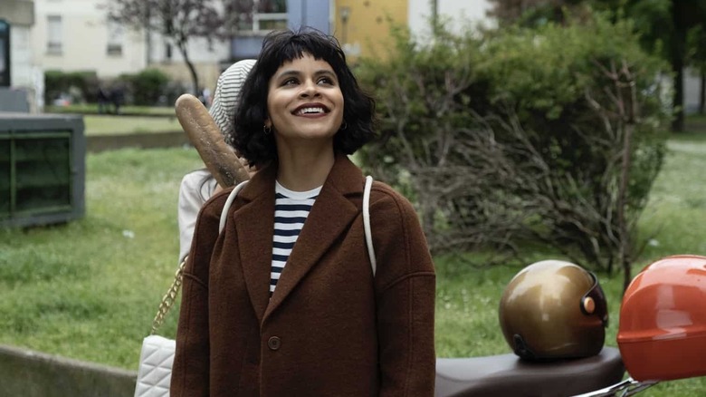
Yes, because it was definitely one of Donald's references when he talked about it. We also talked about the French New Wave a little bit too. Obviously, her hairstyle has definitely been influenced by "Amélie," it's definitely there. We weren't consciously trying to photographically replicate that, but what we were trying to get across was this sense of fun in the adventure and that kind of "Amélie" version of Paris, which is very romantic and it's almost a little fantasy in and of itself. So that was definitely in the back of our minds, but it wasn't ever a conscious, "Oh, we need to copy this," or "We need to get exactly that shot."
The one exception is the little sequence of the girls on the bikes that was done, literally going, "Do you remember that scene in 'Amélie' at the end, where she's on the bike?" And I was like, "Yeah." That's the extent of it. It's a nice little nod to it without us being overly literal.
Are there a lot of visual references used throughout the show or not too many?
My first conversations with Hiro were not with visual things in mind, they were broader conversations about the show and about what they were hoping to achieve in Europe. As he started breaking down the scripts and other locations started coming in and because things are getting refined along the way, then we'd start sharing images with each other.
Interestingly enough, Hiro was always very specific, he never wanted me to be literal with the images. It was more, this is a feeling. So when we were in Amsterdam, we talked about David Lynch movies. Isn't it "Lost Highway," the sequence where there's a scene in the coffee shop and it's in LA and it's super bright, and one of the guys is going like, "Oh, don't go at the back..."
Oh, "Mulholland Drive."
That's from "Mulholland Drive," wasn't it? Yeah. So it wasn't about being literal, it was about trying to get this quality across, it's really pretty and it's really bright, but there's something wrong and there's something a little dark or twisted going on. We would talk about things in the abstract that way, but never saying, "Oh, it has to be this," or "It has to be this."
The other thing we talked about which was really helpful was, Hiro and I are huge fans of Gordon Willis, the cinematographer who shot "The Godfather," and Harris Savides, another fantastic cinematographer who is no longer with us. We shared a lot of books and articles about how they worked, rather than literal images saying, do this or do this. We were having conversations about the idea of Harris Savides used to do this thing where we talked about lighting the space, not lighting the face. Light the room rather than the specific shot, and the actors inhabit that. If they happen to step into the light, great. If they've stepped into the corner that's full of shadows, that's real life, and that's okay too.
You know, and Gordon Willis has this fantastic eye for spaces, for architecture, and he has meticulous framing. And again, very simple framing, very, very reductive storytelling, just showing you the minimum of what you need, not over-embellishing with excess images that don't add to anything.
So we talked about them and we talked about how they worked and their ideologies and we bonded over that. And then, as I said, the location images would start coming in and we'd start sharing specific images and talking about ideas and feelings rather than them literally trying to replicate something.
"Atlanta" season 3 is now available to stream.
