Star Trek Opening Credits Ranked
Every "Star Trek" series has a different theme and open credits sequence, all influenced by those that have come before. The original series featured a voice-over from William Shatner as Captain Kirk, explaining the mission of the Enterprise before the stirring music crescendos and the ship zooms off into space. Kirk's monologue has become a part of pop culture, and each series has tried to find a way to both pay homage to the original and tell their own story. As such, there are a wide variety of opening sequences, each trying to capture the themes and visuals of their specific show in a matter of minutes. Some are successful, with memorable, hummable themes that invoke a sense of nostalgia. Others are simply forgettable, while there are others still that I wish I could forget. With 11 different "Star Trek" TV shows in existence, there's quite a range of quality in their title sequences, so I've put together a handy ranking of them all, from the great to the truly terrible.
11. Enterprise
Music: "Star Trek: Enterprise" automatically loses points for being the only "Star Trek" opening with lyrics in its title music. While the other series feature an assortment of orchestral arrangements, for some mind-boggling reason the folks behind "Enterprise" decided to base the theme on a Rod Stewart song. "Where My Heart Will Take Me" by Russell Watson was adapted from "Faith of the Heart" by Rod Stewart, and it is corny. And if the song's weird sentimentality sounds familiar, that's because Stewart also wrote a version of "Faith of the Heart" for the Robin Williams movie "Patch Adams," which was notoriously sappy itself.
Visuals: Unfortunately, the visuals are just as dated and sentimental as the song choice, showing the history of exploration on Earth before we took to the stars. The idea is kind of cool, but it ends up looking like a NASA recruitment video more than the opening of a "Star Trek" series.
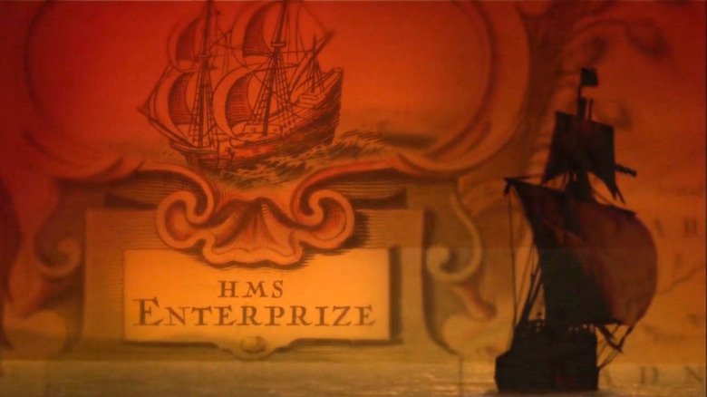
Trek Factor: While seeing the origins of exploration are neat, there's something about the misspelled "Enterprize" and the other various "old timey" elements that make the show feel weirdly dated, and not in an intentionally historical way. I imply cannot get over how hilariously late-'90s to early-'00s the intro feels, from the bizarre crossfades to the song that sounds a lot like the theme from "Firefly," which came out just a year after "Enterprise." Everything about it is trying to embody Americana, which feels oddly against the themes of intergalactic sharing of knowledge from the rest of "Star Trek." The whole thing feels corporate and sterile, and misses the point of "Star Trek" entirely.
10. Picard
Music: The instrumental theme by Jeff Russo is pretty excellent, though it doesn't have the same rousing spirit as many of its forebears. Then again, "Picard" focuses on a man in his twilight years, and isn't about exploring the cosmos or defending a pivotal gateway between universes. It's a little more contemplative, a little more somber, and the theme reflects that with its gentle string arrangements and hints of the theme from "Star Trek: The Next Generation."
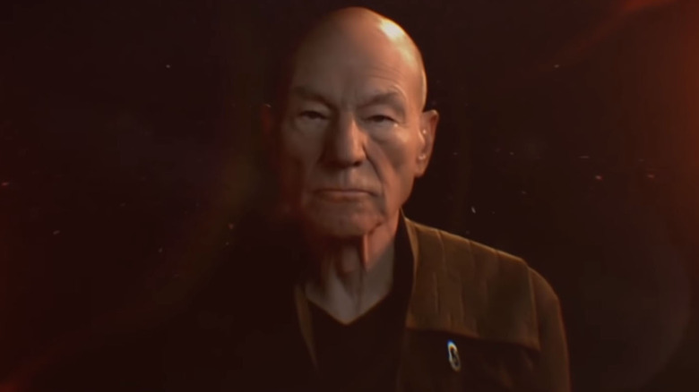
Visuals: "Picard" unfortunately falls into the recent trend of overlaying a bunch of images in a semi-psychedelic looking way to create a title sequence. The trend started with shows like "Hannibal" and "Nip/Tuck," though those had a unique conceit tied to their show, before eventually blowing up with the incredible title sequence on the first season of "True Detective." After that, everyone tried to mimic the style in their own way, and the opening titles to "Picard" feel more like an attempt at being relevant than staying true to "Trek."
Trek Factor: With no voiceover, a much more serene theme, and no footage of starships, planets, or really any of the things we have come to associate with "Star Trek," it's clear that "Picard" is just about Picard. That's fine and dandy, but it doesn't make for a good "Star Trek" opening.
9. Discovery
Music: "Star Trek: Discovery" features another theme by Russo, and it's significantly more "Trek" than the theme to "Picard." It's rousing and exciting with big orchestral swells — exactly the things that belong in a "Star Trek" theme. While it's not as instantly recognizable as some of the classic "Trek" themes, it still fits right in among them.
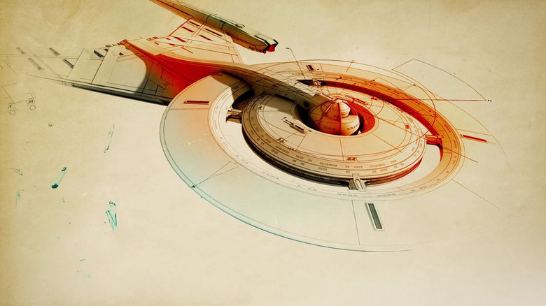
Visuals: "Discovery" has an interesting opening sequence, with blueprints and design schematics animated around the U.S.S. Discovery. It all looks very cool, but a "Star Trek" opening without stars just doesn't have the same feeling. The series was trying to set itself apart and become a bold new kind of "Trek," so the move away from the standard "ship flying through space" visuals is understandable.
Trek Factor: The title sequence to "Star Trek: Discovery" feels tangential to "Trek" without being directly a part of it. The visuals and music both hew closer to the sharp designs of the Kelvin timeline films, but at least it still feels "Trek"-adjacent.
8. Prodigy
Music: The opening sequence for "Star Trek: Prodigy" is scored by Michael Giacchino, who also composed the scores for the three Kelvin-timeline films starting with "Star Trek" in 2009. It's a rousing theme that sounds a little more "Star Wars" than "Star Trek," but since "Prodigy" is for kids, that whimsical, fantastical sound kind of fits. It's not the best "Star Trek" theme, but it's still pretty cool, and definitely feels age-appropriate.
Visuals: The visuals are where "Star Trek: Prodigy" really shines. The animation is gorgeous as the ship flies around the galaxy, zipping around planets and asteroid belts before more abstract but beautiful things start flying around the ship itself. The whole thing is designed to be awe-inspiring and get kids excited, and I can only imagine how thrilled I would have been watching these credits as a child. We even get a version of Captain Janeway (Kate Mulgrew), made from stardust. How cool is that?
Trek Factor: This opening has all of the basic requirements for a quality "Star Trek" opening: a ship flying through space, a good theme, and some fun little visual treats, but it's still very clearly intended for kids and it's a little more fantastical than your average "Trek" opening. It's perfect for introducing young viewers to "Star Trek," but doesn't have the same nostalgic oomph as some of the other openings.
7. The Animated Series
Music: Composers Ray Ellis and Norm Prescott took the theme from "Star Trek: The Original Series" and turned it into something more befitting an animated series. The theremin and orchestral arrangements are replaced by something significantly more poppy and upbeat, and when the titles actually show up and the big swell into the theme happens, it sounds more like "The Love Boat" than "Star Trek." It's a product of its time, though it's honestly incredibly charming.
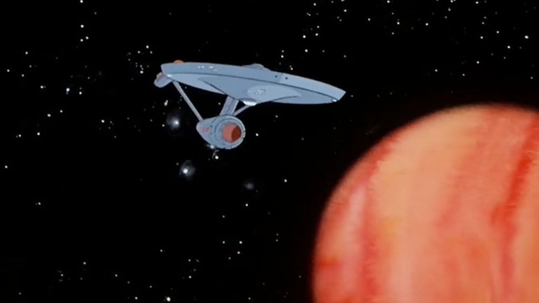
Visuals: There's a little animated Enterprise zooming around the galaxy, mimicking the credits from "The Original Series" in animated format. It's old, cel-shaded, hand-drawn animation, and by golly, it's fun.
Trek Factor: William Shatner reads the original series voice-over, the theme is based on the original theme to some degree, and the animation is a near carbon-copy of the original series credits. You really can't get much more "Trek" than this, but it's just too much a product of its era to inspire more than amusement. If you want to feel like you've been teleported back in time to the 1970s, just watch this intro.
6. Deep Space Nine
Music: The theme by Dennis McCarthy is great. It starts soft and builds into a big swell, as "Star Trek" themes are wont to do, but it stands just apart enough from the themes of the original series and "Next Generation" to clearly be its own thing. This is the first "Star Trek" opening without a voice-over, setting a precedent that would remain until "Star Trek: Strange New Worlds." Since "Deep Space Nine" was trying to take "Trek" in new directions, a different kind of opening makes a lot of sense.
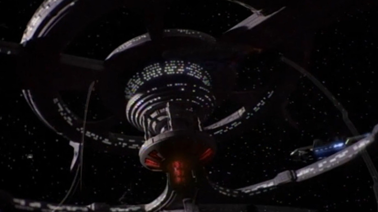
Visuals: We see the space station Deep Space Nine, located near both the planet Bajor and the wormhole that leads to the Gamma Quadrant. One of the coolest things about the "Deep Space Nine" opening credits is the way they change as the seasons progress, adding the docked Defiant and occasionally other docked ships, representing various plot points in the series.
Trek Factor: The lack of a voice-over (and Avery Brooks as Captain Sisko could have probably done a pretty cool one) and sheer length of this intro (it's nearly two minutes) unfortunately hold it back from being one of the best. "Star Trek: Deep Space Nine" may be my favorite "Trek" of them all, but its opening sequence just isn't quite as great as some of the rest.
5. Lower Decks
Music: The theme by Chris Westlake is pretty much perfect, mixing the sounds of many of the older series together to create something entirely new. From the opening chords, it's impossible to think of anything but "Star Trek." "Star Trek: Lower Decks" is a comedy show, but there's nothing comedic about the score. It just rules.
Visuals: "Lower Decks" uses the intro to show off the U.S.S. Cerritos, which doesn't get much screen time in the short episodes. We see it going on a bunch of missions and getting pelted by all kinds of space debris, which highlights the comedic aspect of the show. When we get a view looking down from above the ship, however, and we can read the ship's name and designation, it's fabulously nostalgic.
Trek Factor: Despite being a cartoon comedy series, the opening to "The Lower Decks" still feels like "Star Trek." It's both a throwback and something new, which is what all the best "Star Trek" tends to be.
4. The Original Series
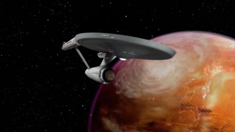
Music: The original theme by Alexander Courage is what started it all, inspiring the rest of the themes on this list in some way or another. (Except maybe "Enterprise," but that's on them.) The theme has the kind of a military march to it until Shatner finishes his voice-over and the title appears, then it softens and becomes a more melodic, joyful tune. The second half of the theme is exceptionally dated, but it evokes late 1960s television from the first note.
Visuals: Speaking of exceptionally dated, the images of the Enterprise flying around in outer space aren't exactly modern marvels of special effects. When you remember that they were creating these effects with models, careful camera placement, and matte paintings, they feel a little less silly and more impressive, but they just can't hold a candle to the CGI-created starships in today's "Trek."
Trek Factor: It's the original, there's no way to be any more "Trek."
3. Voyager
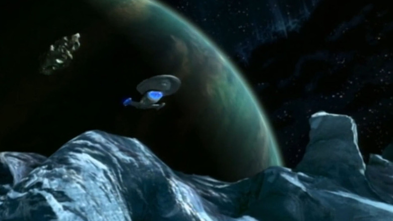
Music: Composer Jerry Goldsmith really knows how to write a great "Star Trek" theme. The theme for "Star Trek: Voyager" is one of the best, relishing in a big orchestral sound reminiscent of the themes from the original run of "Star Trek" films (probably because he helped with those, too). The theme to "Voyager" is spectacular, though not quite as catchy or memorable as the top two on the list.
Visuals: Yes, some of the CGI on the intro to "Voyager" looks a little dated, but it's not so outlandishly cartoonish that it detracts from the overall impression, which is that "Voyager" voyages. We see the ship zip around space, exploring planets, asteroid fields, and more, and it's really the first "Star Trek" opening that gave a real idea of the scope of Starfleet's exploration. We had seen the Enterprise zooming through space and around a few planets, and we had seen Deep Space Nine chilling next to Bajor, but this was the first time we got to see the full capabilities and range of a Federation starship in the opening credits.
Trek Factor: Pretty much the only thing holding "Voyager" back is the lack of a voice-over, because I need my captain to tell me the mission every episode, darn it!
2. Strange New Worlds
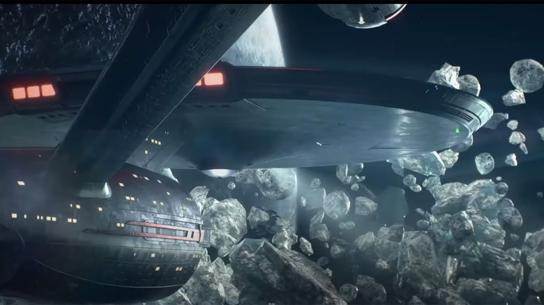
Music: Composer Jeff Russo got a lot of practice writing "Star Trek" themes with his work on "Discovery" and "Picard," and it seems like he finally found the perfect vessel for his ideas in "Star Trek: Strange New Worlds." The theme to the new series has everything you could ask for from a "Star Trek" theme: orchestral swells and booms, hints of the original series theme, and even a theremin to give the end of the theme an otherworldly sound.
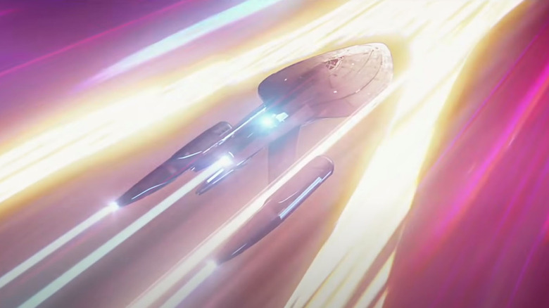
Visuals: The Enterprise gets to go on the kind of intro ride that Voyager did, exploring space and all of the various hazards it has to offer. The special effects are incredible, and the opening sequence is just gorgeous to watch.
Trek Factor: Starship bopping about the galaxy? Check. A smooth-voiced captain (Anson Mount as Christopher Pike) doing a voice-over monologue that starts with "Space... the final frontier"? Check. A theme that gets the blood pumping before delivering chills in its final moments? Check. "Star Trek: Strange New Worlds" is a throwback in many ways, but its opening proves that it's also updating and upgrading the old into something even more grand.
1. The Next Generation
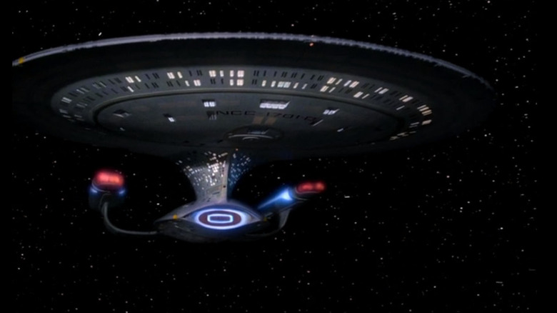
Music: The theme for "Star Trek: The Next Generation" is actually the theme from "Star Trek: The Motion Picture," composed by Jerry Goldsmith and based on the original score by Alexander Courage. When you ask the vast majority of "Star Trek" fans to think of a theme song, this is probably the one that's going to pop into their heads. It marries the original series, the movies, and "The Next Generation," making it the "Trek" theme for more than one generation.
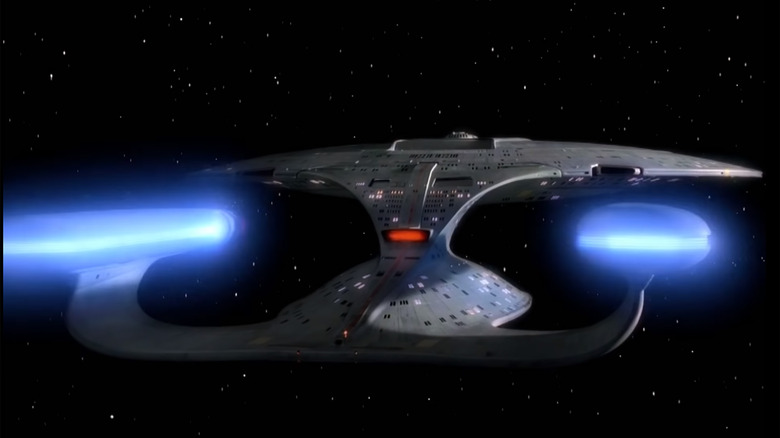
Visuals: I'm not going to lie: the visuals for "The Next Generation" are pretty lackluster. The Enterprise zips around the stars a bit, but we don't see anything else out there in space, and the zipping gets a little repetitive. Thankfully, this is also one of the shorter intros, so it's easy to just focus on the killer theme music and Patrick Stewart's phenomenal opening voice-over.
Trek Factor: If Stewart doing the whole "these are the voyages of the starship Enterprise" thing followed by Goldsmith's theme doesn't get your heart pumping and the hair on your arms standing on end, you might be a Borg. This is "Star Trek" at its most "Star Trek," which is why it's the best opening of all of the series.
