The Effects In The Night House Were Terrifyingly Real
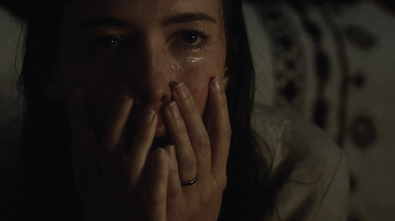
Three years after David Bruckner terrified Netflix viewers with "The Ritual," he returned to the world of horror features with the Rebecca Hall-starring supernatural horror thriller, "The Night House." Hall plays a woman named Beth, whose husband recently died by suicide. She spends her days wandering through the beautiful home on the lake he designed and built for her, but every night, she is plagued by ghastly nightmares, and finds herself overwhelmed with unexplainable visions of a presence in her home. Beth is convinced the nighttime hauntings will provide solutions, but the more she investigates the life of the husband she thought she knew, the more devastating truths she uncovers surrounding his death.
One of the best films of 2021, "The Night House" captivated horror audiences with a standout performance from Hall, its inventive approach to jump scares, and strikingly horrific visual imagery. With the film finally making its way to HBO Max, "Southbound" writer/director and "The Night House" special effects technician Patrick Horvath took to twitter to break down some of the masterful practical effects and in-camera techniques used to craft some of the best scares of the year. As the film industry continues prioritizing computer generated effects, it's always worth celebrating filmmakers who utilize practical artistry.
With THE NIGHT HOUSE on HBO Max I thought it’d be fun to go through some of the movie magic involved with designing the entity that shows up throughout. pic.twitter.com/0ZJM0bXyFA
— Patrick Horvath (@PatrickHorvath) April 11, 2022
Mannequins, forced perspective, and reflection tricks
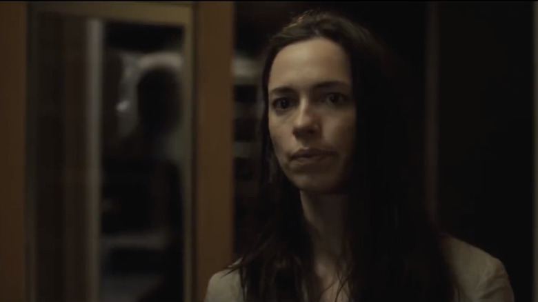
Horvath started his thread by revealing how they were able to insert the shadowy silhouettes appearing behind glass doors and windows. While some of the scares required specific set-ups, all of the practical scares shared a baseline of a mannequin as a human stand-in, shapes created with foam core and newsprint, and a camera set-up that would stream to Horvath's iPad to be used as a monitor. "All of this was trial and error to see what would even work within the scene," Horvath tweeted. "I knew from David Bruckner what the general shot and blocking would be, and the challenge was to figure out a forced-perspective negative space man that would form out of a confluence of edges."
Talking through it with David, we hit on the idea that it needed to be connected to the door that led downstairs, and that’s when we started thinking of frosted window treatments. pic.twitter.com/aaggfLsRSB
— Patrick Horvath (@PatrickHorvath) April 11, 2022
Horvath designed a window treatment and specifications for the kitchen/mail organizer for craftsmanship from Paratore Signs out of Syracuse, NY. These shapes and forced perspective were combined with the effects of frosted glass and reflections. By placing the silhouette on an opposing wall, they were able to mimic the appearance of a shadow behind glass that would immediately disappear upon Hall's closing of the door, as the image seen "behind" the door was merely negative space reflected. The result was a subtle jumpscare not of something appearing out of nowhere, but of having never been there at all.
Optical illusions set to scare
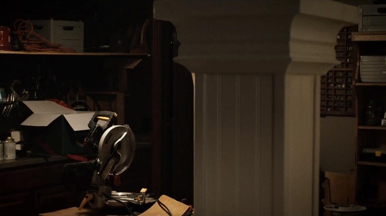
One of the more memorable scares features the appearance of a silhouette against the crown molding of a pillar in the home, only for the silhouette to turn and appear to look directly at Beth. While the "head turn" was made possible thanks to digital effects, the initial appearance of the silhouette was made practically. Once again playing with negative space and forced perspective, the owner of Paratore Signs came up with the idea of cutting an array of one inch thick high-density urethane boards of the profile image, and when glued together, sanded, and painted, it would resemble the custom molding Horvath had designed.
Painted, and in place w/ set dressing pic.twitter.com/7wzdA1HB3i
— Patrick Horvath (@PatrickHorvath) April 11, 2022
At the suggestion of David Bruckner, a shelf was added that ran the length of the back of the room, which helped dramatize the reveal of Negative Space Man (as he's been lovingly named) in the molding. As the camera moves across the room, it locks into place along with the forced perspective, bringing Negative Space Man to life. As the camera moves, the anticipation builds, as we the audience can start piecing together the puzzle of what we're about to see, and despite knowing what's coming, it's still scary as hell.
It's all about framing
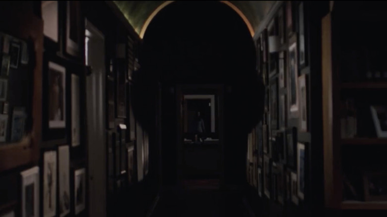
One of the biggest builds on the production had one of the easiest designs to execute — when Beth looks down a hallway to realize that Negative Space Man is right in front of her. Horvath designed a hallway with an arched ceiling to give the appearance of a head, and by playing with the forced perspective of artwork and picture frames down the hallway walls, the production team could successfully replicate the appearance of a person.
Last touch-ups involved a little paint for some door jambs and a bookshelf to complete the form of the entity. It was the biggest build of any of these, but the design was strangely one of the easiest. pic.twitter.com/UUhWgd4Wby
— Patrick Horvath (@PatrickHorvath) April 11, 2022
Allowing us as the audience to view the house through Beth's POV was a brilliant way to showcase the magic of filmmaking. Horvath, Bruckner, and team essentially took the building blocks of most visual magic tricks, and applied it to a supernatural horror film with spectacular results. "The Night House" is, as we declared, a metaphysical nightmare, and the ridiculously effective visuals were a major contributing factor to the horror's effectiveness. "The Night House" is already an inventive approach to the "hauntings as grief metaphor" wave of horror in recent years, but seeing the breakdown of care and artistry incorporated throughout is what will keep horror fans revisiting the film for years to come.


