Dune Production Designer Patrice Vermette Dreams Without Limitations [Interview]
Production designer Patrice Vermette and director Denis Villeneuve go way back. They've been working together for close to a decade now, starting with "Prisoners" and most recently reuniting for "Dune." Over the years they've brought a variety of worlds to life, including south of the border, Pennsylvania, and the interior of an alien spaceship in "Arrival." With the adaptation of Frank Herbert's epic sci-fi classic, the Academy Award-nominated production designer tackles multiple worlds.
The scale of "Dune" is on another level. For Vermette, there was hardly ever a limit of how big the sets could go. As the production designer told us, "Let's just dream." During a recent phone interview, Vermette explained to us how he helped realize Villeneuve's vision.
'It's a mix of so many influences.'
What about medieval times influenced you?
Well, the medieval aspect of it, aesthetically for me was more a relationship with Caladan and the castle on Caladan. In spirit, it was medieval influenced by Japanese architecture. And obviously, the works of Frank Herbert, the presence of medieval, it's all over the place, but for me architecturally was mostly sort of from Caladan.
What specifically from Japanese architecture?
It was like these old Japanese temples. It was the shapes of the openings. There's nothing in particular, but it's kind of a mix of a lot of things. Lots of influence mixed to create a something new. I would have a hard time to tell you specifically what influenced me. It's just a collection of images and put together in a mood board. And then, just like creating some sort of a recipe, it's a mix of so many influences.
What was on your mood board?
I tried to separate the worlds from the beginning. There was a lot of images, from World War II bunkers, and architecture. Aztec architecture, Brazilian brutalist architecture, and sculptures from the Eastern life. There were pictures of the war in Afghanistan. Quarries in China and quarries in Italy just for the scale, so there was a lot of stuff. Also, how light should play, so [we] put ourselves in a state, in a mood that would fit the aesthetics of the movie.
The scale is on another level. Was there any limitation? How big could you go?
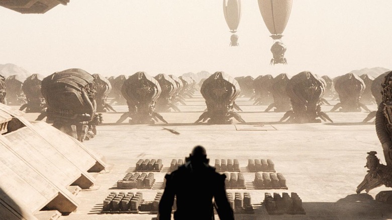
When we started dreaming the movie together, we went, let's just dream, let's not put any limitation. Let's go with what feels right. And obviously, when you read the book, it describes the residency as the biggest human made palace ever, like in the universe, in the known universe. So you're like, oh gee, that must be pretty darn big. So, it's great because it fits the arc of Paul's journey. So he goes into a world that is bigger than he ever imagined and you feel the weight on his shoulders. So physically, we just went, let's go for what feels right that helps support the story. And then let's figure out, how the hell are we going to do it?
The approach has always been that more is not better. For the actor and for Denis and for the crews, they are in the space as opposed to using green screen. So then we, obviously, we had the limitations on some of the sets, not all the sets, but some of the sets we had limitation for the space, because some of them also were just for budgetary reasons. So we had to come up with a couple of tricks, like moving the wall that would create another space. And another trick was to build everything that was higher than 24, and sometimes 30 feet, all out of fabric.
We would continue building the sets in fabric, like fabric on frame, paint them the same color as the average color of the sets. And we use that technique only for what was going on in the city. That technique would dictate where the light would be coming from, and the obstacles that the light would hit. So the sets would be lit, it would help light the set properly to represent what was on the concept part. It also would indicate to the VFX, the areas that needed to be collided with the right texture. Overall, it gave the right light environment, so the VFX part would be integrated better. So, the light is not contaminated by green. It all creates this world, that makes it more real.
I hope it makes sense what I just said. We wanted these worlds to feel old and to feel real. We cracked walls because that's what happens in construction. There are chipped corners, and they have moisture or moss on those walls, growing on those stone walls. Feel the ash. Like, it's old and then maybe it's time to move. So, create that atmosphere.
'Like an evil priest.'
In the Imperial lab, on the walls, there's Fremen language. What was written on the walls?
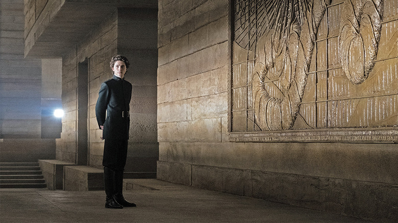
In the lab? Yes, absolutely. It was to make this planet a more livable place. It was before they discovered the spice, so I was imagining that the emperor would've probably hired local labor to help build those cells. Just like in Egypt, they would've written their story on the walls. There's the color of the sandstone, but it's also words written in Fremen language. With the writing on the wall, I had a bit of fun.
What are some other details on the set that, maybe an audience wouldn't notice at first glance, but help make the world more believable to you?
We spent a lot of time looking at the mural of the worm. The mural of the worm is part of multiple murals and those were made to tell the story of the spice exploitation through the eyes of the local culture and the worm. The first time we encounter a representation of the worm, it's through that mural. The worm is designed to look ominous and more like a deity, like a godlike creature with the sun coming from its mouth. And around it, you see that there's small, small characters just to show the scale of the worm. There's a harvester there in that mural, too. It's a bit like the writing on the wall for the laboratory. It's how the Fremen are trying to tell their story, to talk about their existence, in this colonial palace. Their voice is there.
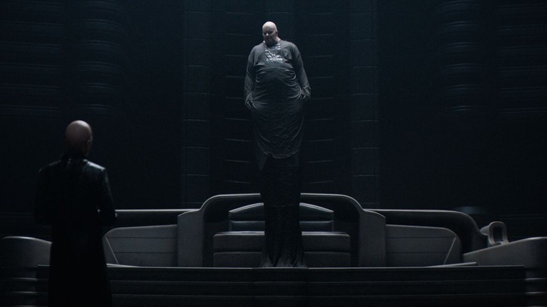
What was your intent with the Baron's environment?
Basically, it's like an evil priest. The height of the space that surrounds them needed to have a church-like aspect, but with the dark church, with these ribs mixed with the interior of a whale, like there's something mysterious. That's something that is, obviously, a bit creepy about that character.
"Dune" is now in theaters and on HBO Max.


