How Marvel Crafted The Tragedy Of Doctor Strange In The Latest Episode Of What If...? [Interview]
This week's episode of Marvel's "What If...?" animated series focuses on Doctor Strange (voiced by Benedict Cumberbatch). The episode in question finds Stephen Strange ending up in the same car accident from his big screen adventure. However, instead of seriously injuring him, the car accident kills Christine Palmer (Rachel McAdams). This sets Strange on the familiar path to finding enlightenment and healing in the mystical arts, including his eventual battle with Dormammu. But after saving the world, he can't help but be tempted to harness the power of the Time Stone inside the Eye of Agamotto to possibly bring Christine Palmer back from the dead.
Throughout the episode, Doctor Strange tries and fails to resurrect Christine Palmer again and again. No matter how hard he tries, he can't undo what is described by The Ancient One as an "absolute point" in time, an event that cannot be avoided, even by a powerful sorcerer using the Time Stone. That doesn't keep Strange from making a desperate attempt to wield enough power to stop this absolute point in time from coming to fruition. So he turns to absorbing the mystical energy of a plethora of fearsome creatures. The result is a menagerie of spectacular creature designs and twisted versions of Doctor Strange that deliver some of the best animation the series has seen yet.
Before the episode's official release, we spoke with Ryan Meinerding, the VP and Creative Director of Visual Development at Marvel Studios, to talk about the design work that went into the episode. From creating an evil version of Doctor Strange to the incorporation of many imaginative beasts, we chatted about how this stunning episode came to be and more.
Doctor Strange Turns to the Dark Side
Note: This interview has been edited for clarity.
I want to dig right into this episode of "What If...?" because it's full of such spectacular imagery. What exactly was your mandate for creating art for this episode? Just make as many fantastical creatures as you can for Doctor Strange to absorb and then just go from there?
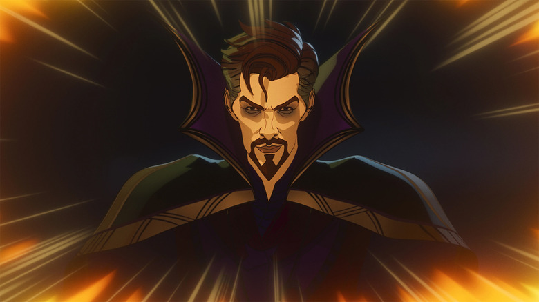
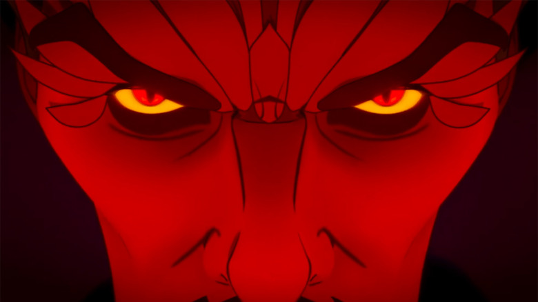
That's a good place to start. Essentially we have, obviously the MCU Doctor Strange to start from, the sort of look and costume. I think Bryan was looking for how to do the evil version of that. How do we get him to a place that actually feels like he's really gone down a road that he shouldn't have, and he went down a road that's very different than where we've seen him in the MCU up until this point?
The different creatures sprung out of the storyboard artist imagination and [director] Bryan [Andrews'] imagination, and [head writer A.C. Bradley's] imagination. We were just doing our best to keep up with all the creativity that was being thrown at us and say, "How can we not only do interesting visuals for creatures that he could be absorbing, but how can it become interesting once he's absorbed it and you see that creature represented in him for a second?" And then also using all those design elements to turn him into something at the end of the episode when he can't really control them.
How many different creatures did you create art for in this episode?
It's a very good question. I don't actually know. It feels like it must've been about 20.
Were there any that didn't make the cut that were maybe a little bit too wild or that you just couldn't include for whatever reason?
No, people were pretty judicious about moving forward with what the proof concepts were, but I think the only exploration I can really remember — we did a lot of exploration of what the different Doctor Stranges would look like once those creatures [were inside him] and when he started to turn evil and he gets the cloak. It looks more evil and his face starts turning a little bit more gaunt and pointy. We did a lot of exploration for his costume. We did within each creature. There would be a significant amount of design work done to figure out what each creature was. But I don't think we did more exploration outside of those concepts.
Do these creatures come from the pages of Marvel Comics or were they pulled from general fantasy mythology and whatnot?
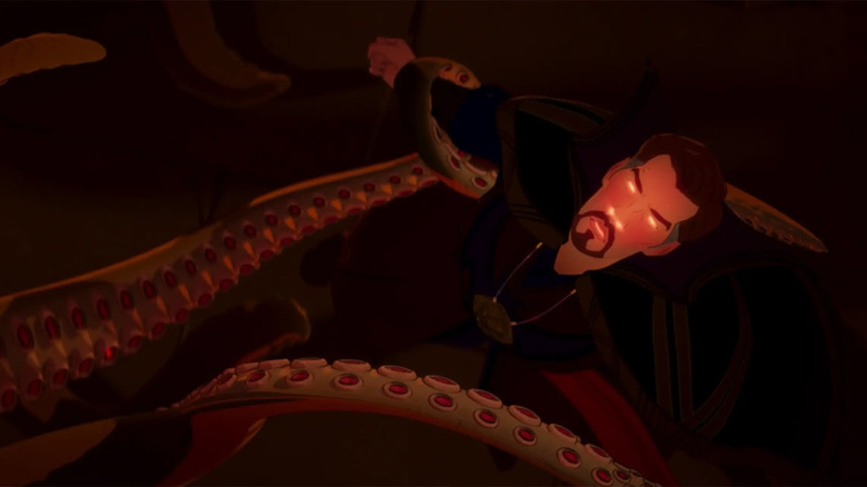
As far as I know, they don't come from the comics. It feels like they were more engineered towards the idea of, if this character needed to be incorporated into an evil Doctor Strange, would it look cool? How do we get antlers, how do we get tentacles... stuff like that.
This is the second time we've seen that giant tentacle creature in this series. Is that supposed to be Shuma-Gorath or is that just a nondescript creature with giant tentacles?
As far as I know, it's not Shuma-Gorath, but I'm not entirely sure what their plans were. I think Bryan's sensibilities have — he loves Cthulhu stuff, so the notion of doing more tentacles in an episode, I think it was just the more tentacles, the better. So I would look at it from that point of view. I don't think any of those creatures were really directly or pulling from any or any character in comics.
When it comes to the art you created for this episode, which was your favorite to design?
There are a lot of variations Doctor Strange. It doesn't seem like there's that many if you watch the episode. But he's beaten up. He's got a tux, he's not got a tux. He's got his, more or less, MCU costume, he's got the new costume, he's got the evil version. We got like 10 or 15 versions of him absorbing a creature. So in terms of the characters in the episode, he really is almost every character in the episode in some way, with all the variations we had to do. And the notion of getting him right, I think was the most fun, figuring out a stylization for his face and his overall look with the costume.
We had worked very early to find the style and I had done probably six or seven drawings up front, which included Peggy [Carter] and Steve [Rogers] and HYDRA Stomper, and what else? Zombie Cap was one of them. The notion of Doctor Strange was one of those very early ones that I got to take a stab at. It was a lot of fun to really do a Doctor Strange that looked like a J.C. Leyendecker drawing. Using J.C. Leyendecker as a stylistic reference to truly hit that really illustrative style was a lot of fun.
The Marvel Movie Grind
Is there any difference, as far as your work process, when it comes to creating concept art for the Marvel movies when compared to an animated series like this, where the style is so specific and it's not necessarily meant to be as realistic?
There's a lot of difference in how it's accomplished, meaning just what tools I'm using. For the live-action stuff, I'm doing some 3D, I'm doing a lot of painting and Photoshop, I'm making things look as real as possible. With this show, it was actually more about drawing. It's about figuring out the right line work and figuring out the right simple shading. If you only have a light side and a shadow side, and there's no in between, you can't do soft things. The tools are just a little bit different from an artist point of view, but I'm still going for exactly the same things, right? I'm trying to do the things that are going to work with the story, that really communicate the style of the show and make the characters feel like icons, trying to find those things that are going to make people love the characters as much as they love them in the live-action stuff.
Is it difficult trying to find a balance when you're drawing the characters, and they're supposed to resemble the live-action versions of the characters, but then they also have this illustrative style to them? How do you determine when it's just stylized enough, but still recognizable as the actor?
Doing these characters has been a lot of fun, mainly because we're taking the characters from the MCU and then running them through that Leyendecker filter. So what comes out the other side is usually slightly more simplified, slightly idealized in a Leyendecker way, but it was actually one of the most fun parts of the show, to try and find those looks for the characters that would be evocative of the character that people love from the show. But they're really set within the "What If...?" style for the episode.
So it's the idea of having the MCU version be a really strong, firm place to start from, and then having that really strong "What If...?" simple concept of "What if Doctor Strange lost his heart instead of his hands, so he became evil?" The idea of figuring out the look for evil Doctor Strange based on having the MCU as a starting point was pretty straightforward and fun, frankly. Because when you say it like that, I hope this sounds simple, we didn't ever do any evil looks for Doctor Strange when we were working on the films, so the notion of being able to go there in this one just felt like it was actually a pretty straightforward process.
Speaking of the movies, is there a piece concept art you've created that you were very proud of but it didn't make it into the movies?
I'm very fortunate in the stuff that I've really been passionate about has ended up being in the films more often than not. The one thing that I really wanted was to design Hulkbuster. whatever I did on "Age of Ultron" just didn't seem to resonate with people, so a very talented artist named Josh Nizzi designed the Hulkbusters that have been in the films so far. I've done a lot of Iron Man suits, the idea of doing the big bulky one was a lot of fun, but it's also one of the reasons why I think it was fun to work on HYDRA Stomper, right? The notion of doing the Steve Rogers equivalent of an Iron Man suit in the '40s, it looks like it's military, it's still got the star for Steve, but it hopefully feels enough like Howard [Stark] did it, even though it kind of looks like something that Tony would have done as well. I think those big mech suits that are larger than life are always going to be something that's fun, and Hulkbuster was the one that got away.
The latest episode of Marvel's "What If...?" is streaming on Disney+ right now. You can read our previous interviews with the executive producer of the series right here, and another interview with the series director and head writer over here.


