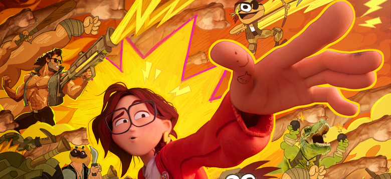
'The Mitchells Vs The Machines' Animation Featurette Highlights The Film's Groundbreaking Style
The Mitchells vs The Machines is now streaming on Netflix, and it's fantastic. We're talking "best of the year" material here, folks, so if you haven't watched it yet, I encourage you to do so immediately. Not only is the film funny, sweet, and almost overwhelmingly clever, it also boasts a unique, often groundbreaking animation style that really makes it stand out against other animated films. Phil Lord and Christopher Miller produced the movie, and like their previous Spider-Man: Into the Spider-Verse, The Mitchells vs The Machines blends all kinds of different animation styles, from 3D computer animation to 2D hand-drawn art. And a new featurette delves into the film's unconventional style. Watch it below.
The Mitchells vs The Machines Animation Featurette
Pixar has become the gold standard for so much modern animation, and you certainly won't hear me deride them – I think Pixar does great work. But I also feel like so much of it is starting to blend together and look the same. So when something like Spider-Man: Into the Spider-Verse, and now The Mitchells vs The Machines, comes along, it's exciting. These are movies that prove how flexible animation can be; why adhere to one rigid style when you can have a whole slew of them?
The film follows a family on a road trip that goes very wrong when a robot uprising throws the world into chaos. While the family unit as a whole all take center stage, the majority of the film is seen through the eyes of teenager and filmmaker Katie Mitchell. Mitchells vs The Machines uses Katie's mindset, her filmmaking, and her penchant for memes to blend several different styles that somehow all work perfectly together.
"One of the amazing things about animation is that its only limit is the scope of the filmmaker's imagination," says Christopher Miller in press materials for the film:
"It feels like only now do we have the technological tools to make it so that truly any visual style or language conceivable can be represented on screen, and we're just at the beginning of a golden age of creativity. It's kind of like when the Impressionists rejected hyper-realistic rules of art and suddenly an explosion of stylistic expression emerged, like Pointillism, Fauvism, Cubism, Surrealism, etc. Animation can be the purest window into the mind of the filmmaker. Plus, in animation it's a lot easier to get away with really dumb physical jokes."
Lord adds: "We're medium agnostic really. Sometimes animation gives you the best chance to make a particular story something special."
The press materials also underline that the film "is set in two distinct settings: the Mitchells' world which has a very specific visual feel and shape vocabulary, and the austere tech universe, which is full of sharp angles." Toby Wilson, the movie's art director, says:
"There is familiarity and warmth in the Mitchells' world, and the shapes are organic — lumpy, squishy and wobbly. We lean in on the imperfections, and that hand-crafted look is a lot of work, as we try to mimic the hand-crafted 2D look to give the film warmth. The tech world is the exact opposite. This is a world designed by A.I., so we looked at a lot of photographic references. When the machines invade, they dominate the human world, and their color palette takes over, as well."
Wilson also adds: "We also worked on the lighting of the characters so that it doesn't look like it was done by computers. It looks like someone painted that light around the body. We are imitating 2D cel animation. It's either 100 percent lit or 25 percent lit, there's not a lot of in-between, in order to make it look and feel like classic animation."
"While Spider-Verse was inspired by comic books, Mitchells is more illustrative," says visual effects supervisor Michael Lasker:
"It combines traditional mediums, where you can feel the hand of the artist married with the 3D aspects of the animation. It looks handmade and painterly. It's a completely new style. Once we knew the look we wanted to accomplish, we analyzed paintings created by the visual development team that illustrated what they were after stylistically in order to figure out the best way to bring them to life. This led us to write new tools in our pipeline designed to replicate each component of the art. Since the visual style evolves over the course of the story, starting in the human world and ending in the world of robots and technology, our new toolset had to be flexible. Our new look is more free-flowing than we had for our previous movies."
