How Pixar's 'Luca' Took Inspiration From Studio Ghibli And Aardman To Create A "Handcrafted Feel" [Interview]
Luca is probably the closest Pixar will get to making a Studio Ghibli film. That's probably not a huge swing to make — the creatives at Pixar have long been fans of the works of Hayao Miyazaki and the anime studio that he co-founded, frequently citing films like Kiki's Delivery Service and Spirited Away as influences for their own award-winning films. But there's a certain feeling with Ghibli films that is hard to express. A nostalgia, a serenity of spirit, a bittersweet simplicity that has been consistent with most of the films from the renowned Japanese animation studio. And Luca gets pretty close to achieving that (at least in the 30 minutes of footage that this reporter watched for an early press presentation dedicated to the Pixar film).
And that was intentional, according to Luca animation supervisor Mike Venturini. The director of Luca, Enrico Casarosa, grew up watching some of the earliest TV works of Miyazaki and his frequent collaborator Isao Takahata, like Future Boy Conan and 3000 Leagues in Search of Mother, and that love for all things Miyazaki bled into Luca.
"That really comes from Enrico's love for those films and how it's influenced him as a filmmaker," Venturini told /Film in an interview over Zoom. "We use the word lyrical to describe his storytelling. It's very rhythmic and get can get quiet at times."
Which was why Venturini and the animators turned to the works of Miyazaki as inspiration for Luca — as well as the films of Aardman Animation and Laika, which specialize in stop-motion.
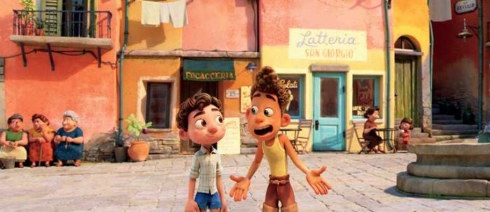
"We watched all of that stuff for that kind of handcrafted feel of it," Venturini said, which led to Luca looking unlike any other recent Pixar film — simpler, expressive, more like 2D animation. That may sound like a step backwards for a studio that specializes in making increasingly photorealistic 3D animation, but it makes for an utterly fresh Pixar movie, Venturini said.
"[Luca] just ended up being a wonderful collage of all these influences," he said. "Which is why when you watch this film, you're like, 'It's different than what a Pixar film does, but I can't put my finger on where else I've seen this. It feels comfortable and familiar but I can't say I've seen exactly this.'"
Read our full interview with Venturini on the melting pot of influences on Luca below.
 During the presentation, you said that your team was greatly inspired by 2D animation. Can you speak specifically about which aspects of 2D or which films inspired Luca?
Well, we went outside of 2D as well, we looked at the stop motion. We looked at some of the Aardman stuff we looked at the studio that made My Life as a Zucchini, a European stop-motion film. We watched all of that stuff for that kind of handcrafted feel of it. Aardman, we looked at for mouth shapes and how simple some of their dialogue is. We didn't want to be too complex in our dialogue, because we wanted it to be more graphic. But mostly we were looking at anything from the [Hayao] Miyazaki library starting with his very first series he did, Future Boy Conan, which was, you know, a television show that Enrico [Casarosa] grew up with, that really imprinted on him. And so we watched episodes of that. What we started to notice was, certainly in anime in general and in Miyazaki's work, it's very expressive in a different kind of way. And one of the ways was, that they do these really big eyes and mouth-shapes and it's like an expression of the character's emotion or energy. It's not meant to be realistic in any way.
And it's through the full body too.
Yeah, yeah! And then they'll get really small, and delicate, and quiet. So we wanted that range in our characters and we knew that because we wanted these kids to be playful and seeing and doing things for the first time, we really wanted to feel that emotion and just be super expressive. So from a design aesthetic, those were some of the things that we pulled. The other thing was that in Miyazaki's films, it's very efficient. They only animate "complex" when they need to for the story, they don't do it if it's not important to the story. They'll find really wonderfully drawn poses and spend a lot of time in the pose. We noticed lots of scenes of characters just sitting there and it's just the wind in their hair, and very little animation, almost none in some situations. And we wanted to try that. We always, at Pixar, we try to make things feel organic, and there's a lot of movement and realism in it. We wanted to try to pull that out, because we felt like in the Miyazaki library there's a lot of mood that you get from that, and we wanted to kind of try some of that. So those were some of the inspirations that we pulled from.
There's a word for that sort of space between actions in Miyazaki films, ["Ma," a Japanese word roughly translating to "emptiness" or "negative space"] of letting the characters just sit, and not having to fill the screen with so much space and energy and movement. Which I think is a very big rarity in a lot of modern Western animated films, so that's really exciting that you're bringing that to Luca.
Now that really comes from Enrico's love for those films and how it's influenced him as a filmmaker. We use the word lyrical to describe his storytelling. It's very rhythmic and get can get quiet at times. What we found, actually, in early screenings is that maybe we were doing that too much and it kind of slowed the energy down, so we had to be very selective. So you'll see moments in the film where they're just sitting under the stars looking up at the sky, it's just quiet, it's a little bit quieter of a moment. Or when Luca first transforms and he's on the beach and he's just looking around, seeing the breeze, and the grass, and the trees, there's some really quiet moments. But we had to be selective, because for the Pixar films, we do want to maintain a certain level of energy, and certainly with the kids and the playfulness, we wanted to keep that keep that.
So I'm glad you mentioned Aardman movies because during the presentation, I remember thinking specifically that the mouth movements like the sculpting of the mouth looks so Aardman. I just wanted to ask about how that was different in terms of how you usually animate Pixar characters and making that more like 3D in the way that feels stop-motion.
Yeah, so there's a couple of details and I didn't want to get too into the weeds in my presentation but since you asked, some of the things we were looking at — in 2D, they animate often every other frame, so it's not as full in detail. So the choices have to be a little bit more graphic because you're trying to describe more information with fewer frames. Our films are on ones. And so what we tend to do with dialogue is use every single frame, and we pride ourselves if you can kind of mouth read without the sound of the character, it's very realistic in that sense. On this film, we did not want that, so we wanted to animate our dialogue as if we were animating every other frame.
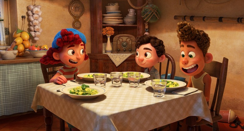
So we watched 2D, we watched Aardman, we looked for how they did that. In Aardman [films], shapes are very simple, often using the same shape for multiple frames, so we thought, let's try to use the same shape for multiple frames but figure out how to do that on ones. The other thing that they do that's fun, that's just graphic and descriptive, is they're very liberal with when a character has a tongue, when they have teeth. In Aardman's stuff, the teeth just pop in and pop out, if it's like a big smile to a "ooh," the teeth disappear, so we did that too. Usually in our films, the teeth are solid in the head and you see them whenever the mouths open, but here we develop controls to [make] the teeth [invisible], to get the little new shapes that have nothing in there. We developed ways to move the tongue around to get it to feel more like a drawing, so a lot of detail there.
 Tell me more about the multi-limb effect — how did you come around to using such an old 2D technique? Any other 2D techniques or out-of-the-box techniques?
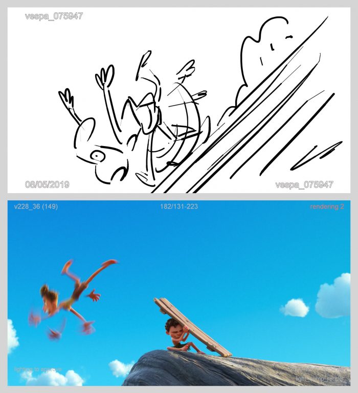
Multi-limb was probably the most aggressive because it required the new technology of the transformation rig, to be able to do it. The reason that we really wanted to do it on this film goes all the way back to Future Boy Conan, one of Enrico's favorite television shows, and they did a lot in that, and so he just always thought it'd be fun and add some zaniness to the physicality. So we you know we were going attempt it, and then when we realized that, that new technology could help us do it, then we really leaned into it.
Other things that we've done, I'm going say it's mostly in the face, in that doing custom sculpts to hit mouth shapes. So we would look a lot at the storyboard drawings and see what the artists were drawing. Usually, we would reinterpret that into something with a little more anatomy, but on this film we just said, "Let's go for it and try it." So they do a lot of silly mouth shapes like the "ooh" shape, or big mouth shapes when they're eating pasta and stuff like that that require the articulation team to jump in and do handcrafted sculpting.
So it sounds to me like there's just a confluence of traditional 2D, new 2D, Western and Eastern animation techniques going on in this movie, which is something that I actually didn't really anticipate going into Luca. Did you go into this project with these different stylizations in mind, or did it arise organically?
Yeah, we kind of just discovered it as we went along. We knew that Enrico wanted something unique, he wanted to create a new, unique look to the film. And in the very beginning, it was as wide open as "I'd love to find a style of animation that fits that design sense" that he was creating in the world, that was more painterly and colorful. We did not know what that meant.
So we just started — we actually put a playlist together of a bunch of inspirational clips from all different kinds of animation from very, very, very simple cutout animation, stop motion, all of these things. And then we sat with Enrico and we watched it, we said "What things in here excite you, and what appeals to you?" And then once we narrowed that playlist down, the animators started doing analysis on how could we try something like this in our film? What would we have to change about the way we build the characters? And then we would try things and bring it back to him and he would go, "more" or "less," and we sort of calibrated.
And then we started getting excited about some of the ideas we were coming up with, and it just ended up being a wonderful collage of all these influences. Also influenced by what we love at Pixar, which is why when you watch this film, you're like, "It's different than what a Pixar film does, but I can't put my finger on where else I've seen this. It feels comfortable and familiar but I can't say I've seen exactly this."
***
Luca will be available to stream on Disney+ starting June 18, 2021.
