Beautiful Unused 'Force Awakens' Concept Art Shows Us A Different Version Of The Movie
We may receive a commission on purchases made from links.
Industrial Light and Magic (ILM) has released 45 pieces of Star Wars: The Force Awakens concept art images, some of which show a very different movie than ended up on the screen. Hit the jump and let's take a look at some of the unused concepts. I'll try to add some background information as well.
Some of these Star Wars: The Force Awakens concept art images appeared in The Art of Force Awakens book, which is a must-buy if you don't own it already, but a lot of the images that have been newly posted have not appeared previously. Let's dive in and take a look.
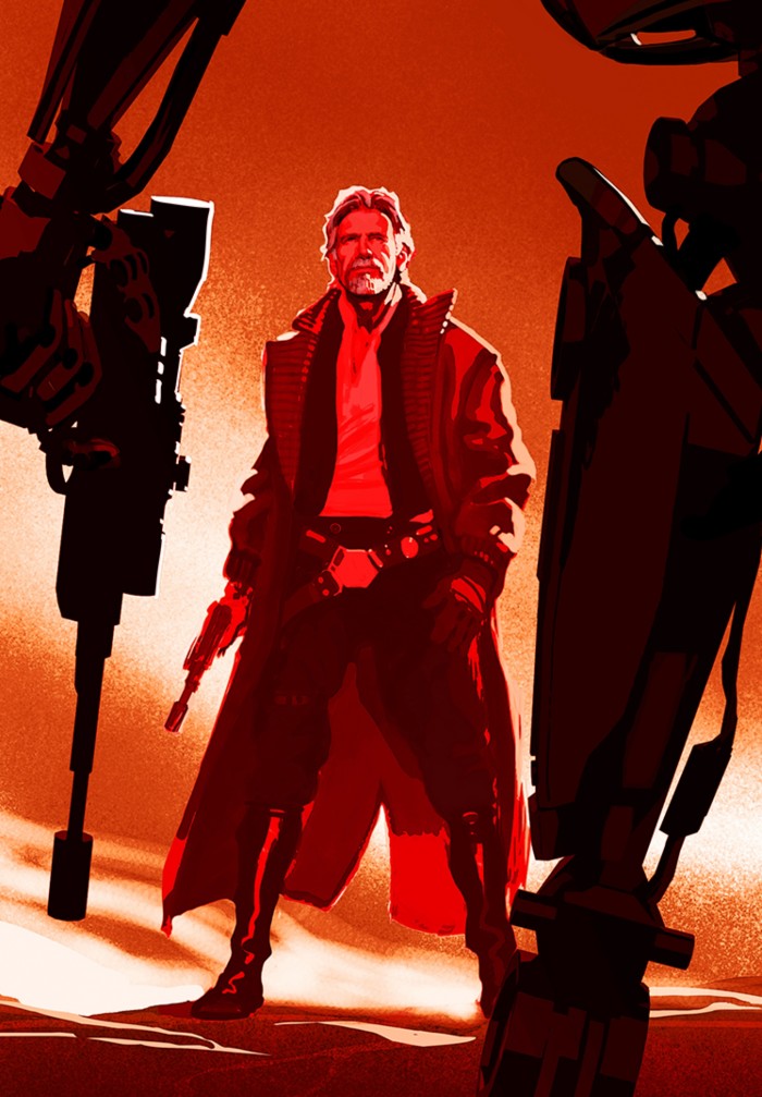
I love this alternate image of Han Solo's costume, which is inspired by True Grit. I actually wish they had gone with something like this, as his outfit in the final film is too similar to the original trilogy (so much so that Leia even comments on his new vest looking like his old one).
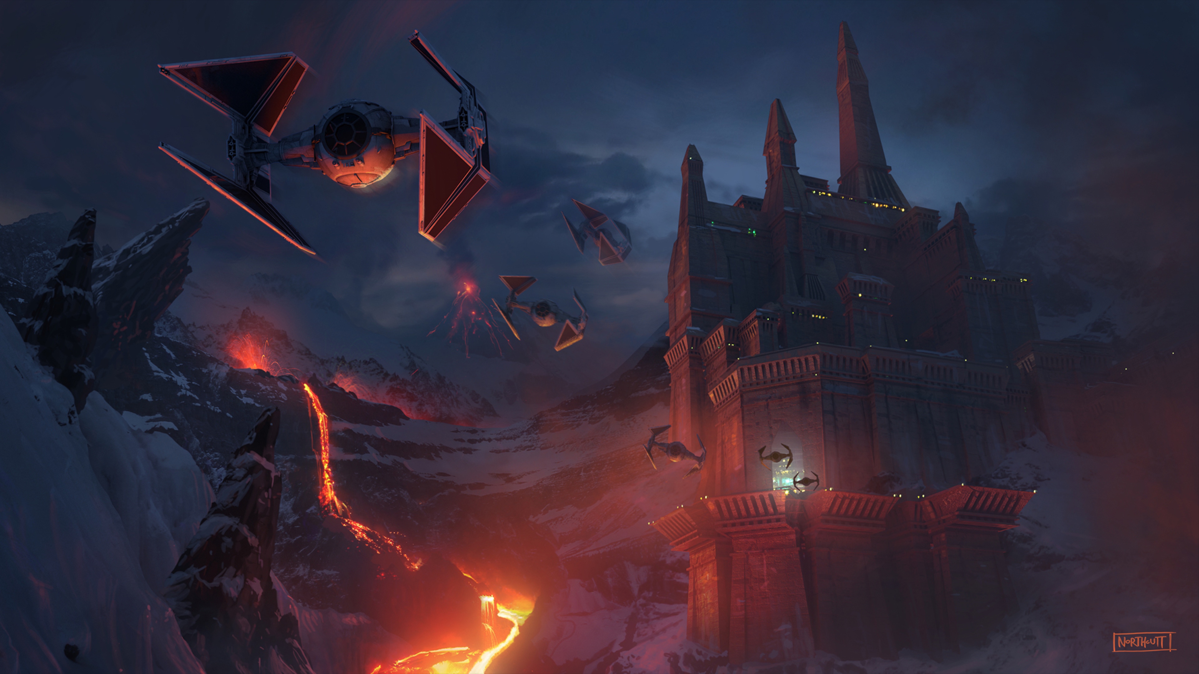
Early in the development of the movie, the villain operated out of a castle, inspired by old unused concept art for Darth Vader's castle.
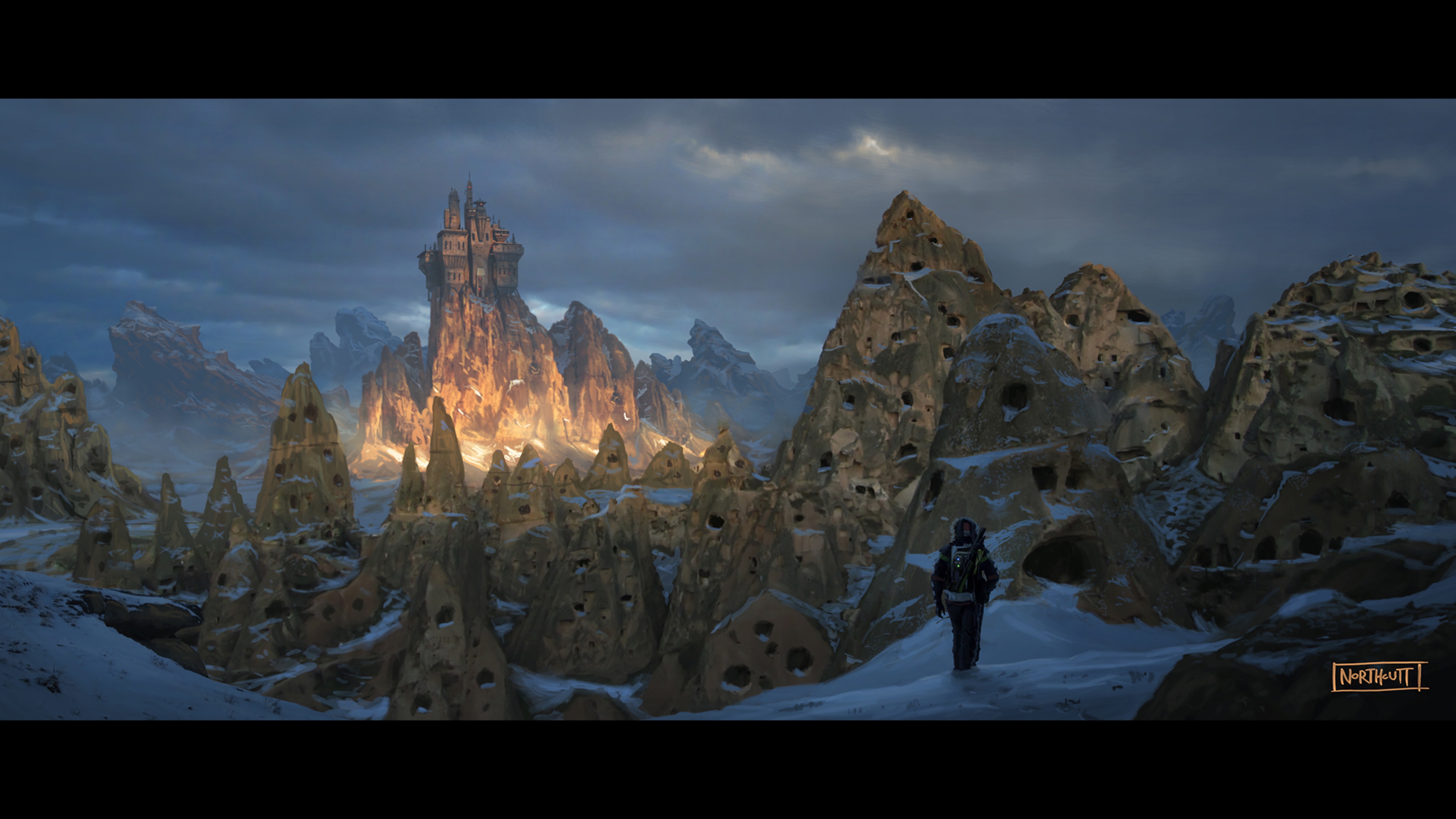
Here is a design of Rey's home planet, before it was decided that it would be a desert planet. I love the colder look to this design, but I understand why they wanted to begin this story in a planet that looked and felt familiar, rather than alien, to this franchise.
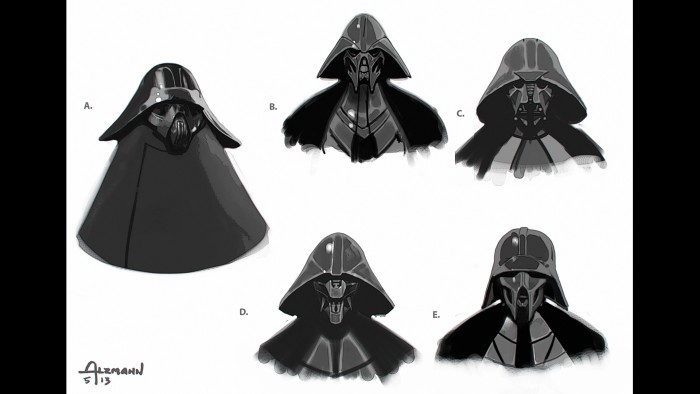
When they were going through designs for the bad guy that would become Kylo Ren, they played with the idea that Darth Vader's look might be the outfit that could be different for other Siths. It's an interesting idea but I'm glad it was abandoned very early on.
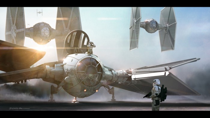
This piece of concept art shows how the new TIE fighters could have landed. It's a very cool concept but this is not canon, as we see landed TIE fighters in the background of Hux's speech on Starkiller Base and they don't appear to have this design.
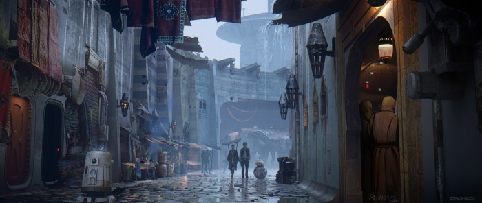
So many fans have commented on how Force Awakens beautifully employs some of Ralph McQuarrie's unused designs in the film. This city design above is interesting because it's not only signed by the ILM artist who created it but also features McQuarrie's signature, even though he has been long gone from this world.
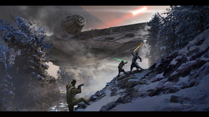
Here is a very different looking lightsaber battle between Kylo Ren and... is that Rey(?) on a snow planet. The guy to the left appears to be an early version of Finn, when he was still designed as a white, almost Anakin-looking Jedi.
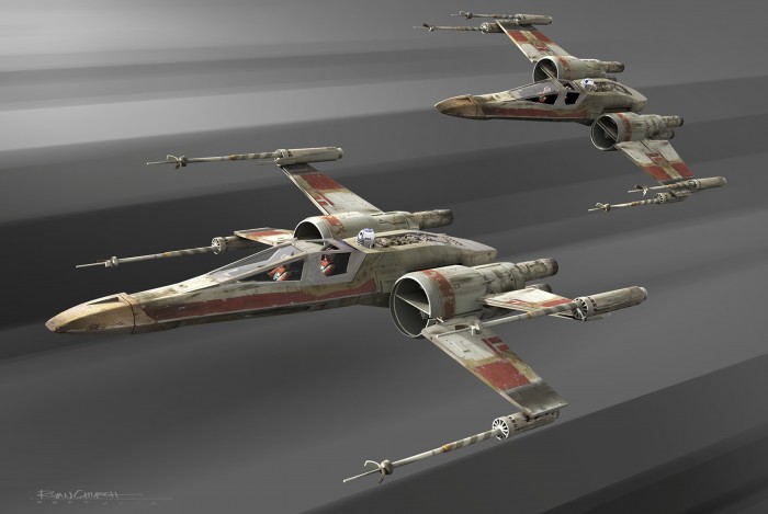
Here is a design for an X-Wing fighter that would have added a second pilot to the mix. They instead decided to add a second pilot to the first order TIE fighter instead.
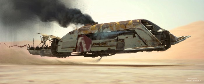
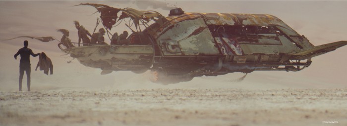
Here is a look at a space pirate ship. In earlier versions of development, the space pirates were a bigger part of the story. I think in the final film they have evolved into the gangs who board Han's freighter. Late in development they used some of the space pirate designs in a scene that would have shown Finn hitching a ride to the Nima Outpost on Jakku. I think the scene still appears in the novelization. This is art of what that would have looked like.
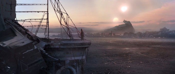
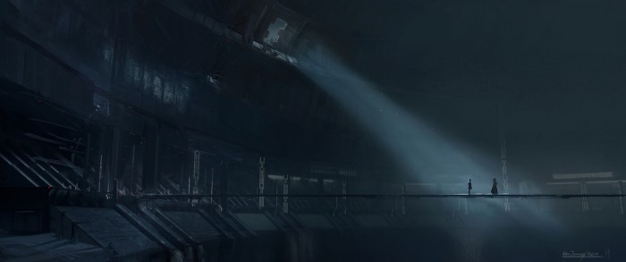
This is the only piece of concept art that I'm including in this post that shows a scene as it appeared in the movie. I'm including this piece because it may be my favorite piece of Force Awakens concept art created for the film. If I could buy a version of this piece blown up to an oversized wall print, I would.
Please check out the rest of the Star Wars: The Force Awakens concept art posted on ILM's portfolio page.

