The 20 Best Movie Posters Of 2015
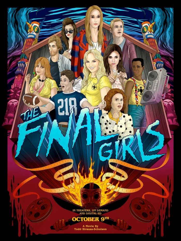
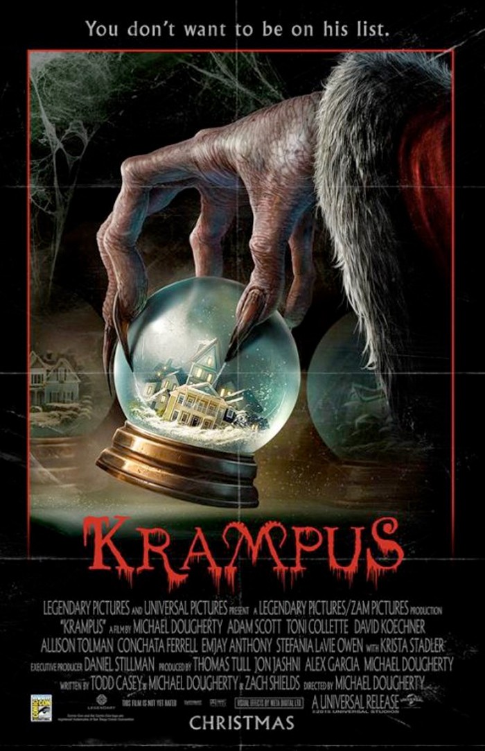
A large majority of movie posters are forgettable. Most simply use Photoshop to slap some characters together, combine them with some action setpieces, slap on a title and credits, and print them to be displayed at the movie theater. But every now and then some movie posters actually catch our attention, and some of them are actually worthy of being called art. And we'd like to call attention to some of our favorite movie posters of the year by counting down the 20 Best Movie Posters of 2015. Check them out below!
Now before we get to the actual posters, I'd like to explain that every poster you'll see below is an official movie poster. You won't see any Mondo prints or other screen prints or giclées that may have been created in tribute to movies that were released in 2015. Foreign posters were considered, but none that caught my eye made the cut. Keep in mind that this is very subjective and not meant to be definitive, so if you think some other posters are worth mentioning, post them in the comments! And now, let's get on with the countdown.
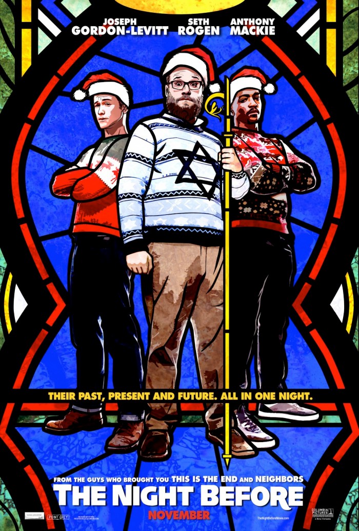
20. The Night Before
Posters for holiday comedies are usually garbage. They pretty much always feature the cast making goofy expressions, hinting at how awkward and uncomfortable a family Christmas is going to be. And while this poster does feature the cast of The Night Before just standing there, including Seth Rogen with a goofy expression on his face, the stained glass aesthetic makes it stand out. The images are almost undoubtedly traced, but I think it's a good poster.
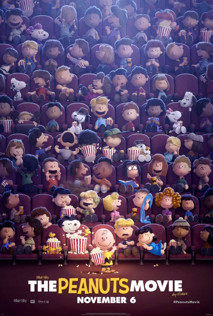
There's so much going on in this poster! That's what I love about it. Seeing so many kids in the style of Charles Schulz's Peanuts comic in the movie theater is a very cool image. Plus, it's far more interesting than just featuring Charlie Brown by himself with the primary players. It makes the world of Peanuts feel big. Also, the concessions cups that look like Charlie Brown's shirt are a nice touch.
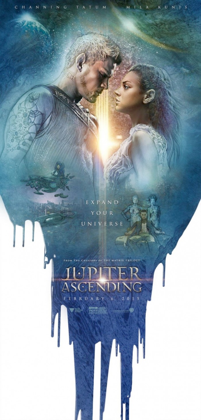
18. Jupiter Ascending
This may have been a pretty awful movie (though our own Angie Han had it as an Honorable Mention in her top 10 list), but there were a batch of artistic posters that were released to promote the film that actually made it look cool. This one was my favorite because it almost feels like a Drew Struzan poster concept.
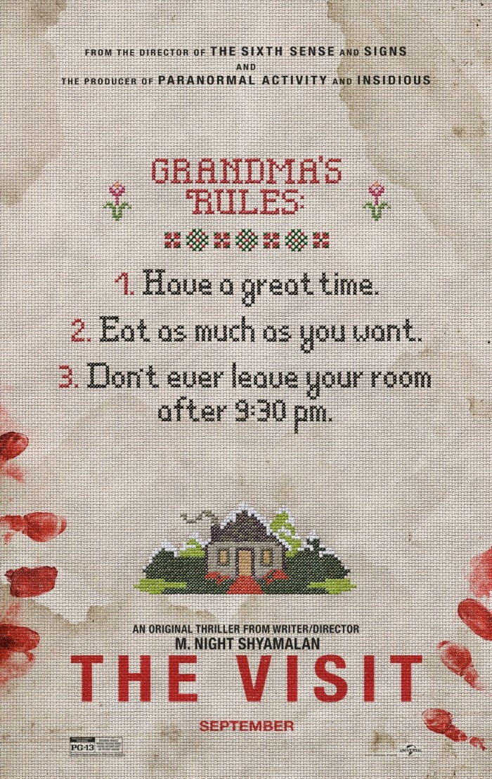
17. The Visit
Simple teaser posters often turn out to be some of the best of the year, and the first poster for The Visit was no exception. Grandmothers love cross-stitching, so having the poster for a visit to the grandparents' house turned terrifying is a nice touch. The bloody fingerprints and the stains all around add the right amount of creepiness to the poster.
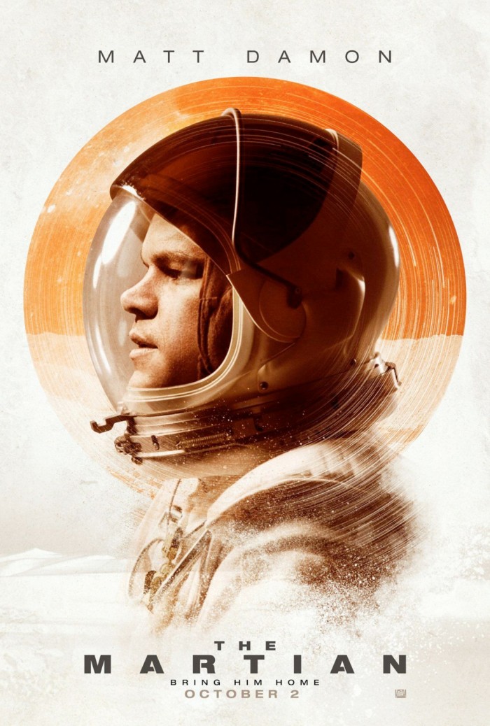
16. The Martian
The first teaser poster for The Martian was pretty uninspired, calling back to the teaser poster for The Social Network and dozens of other posters just like it. But this one just looks cool. It's almost like there's a vinyl record of Mars around Matt Damon's head, which seems appropriate when you consider how important the soundtrack of The Martian is to some of the comedy that unfolds.
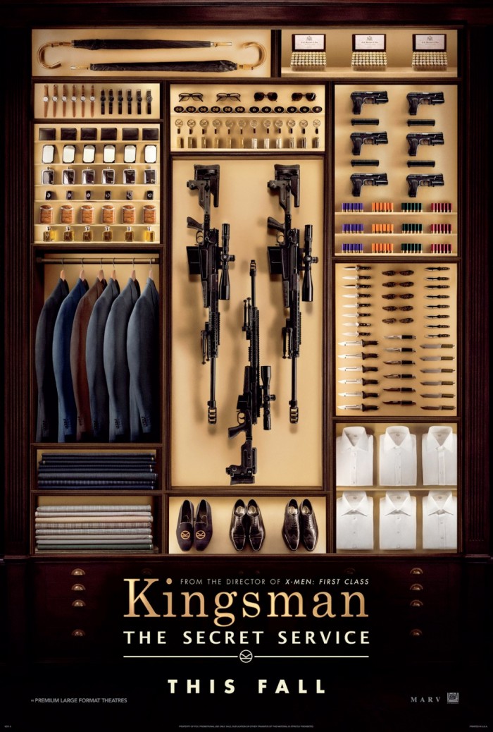
15. Kingsman: The Secret Service
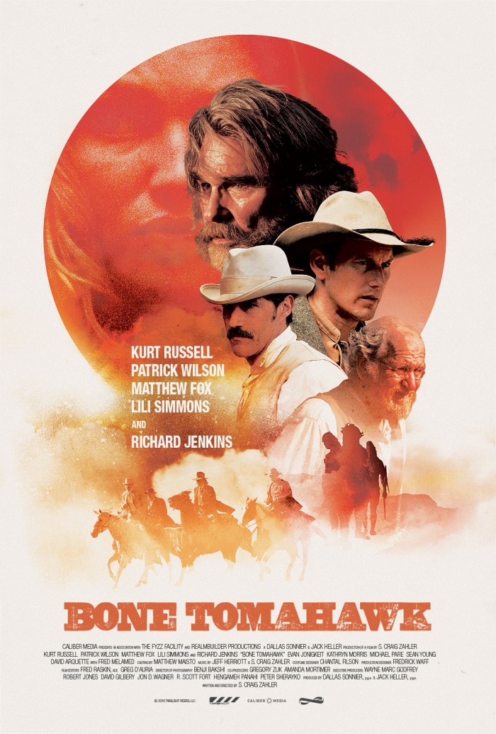
14. Bone Tomahawk
It's always nice when a poster goes retro and gets it right. This poster for Bone Tomahawk throws back to the days of old westerns and could easily be the cover of some kind of novel from the '70s. I could complain that I wish it looked a little more illustrated, but the composition is done very well, and it's a hell of a lot better than most floating head poster designs.
13. Hitman: Agent 47
12. No Escape
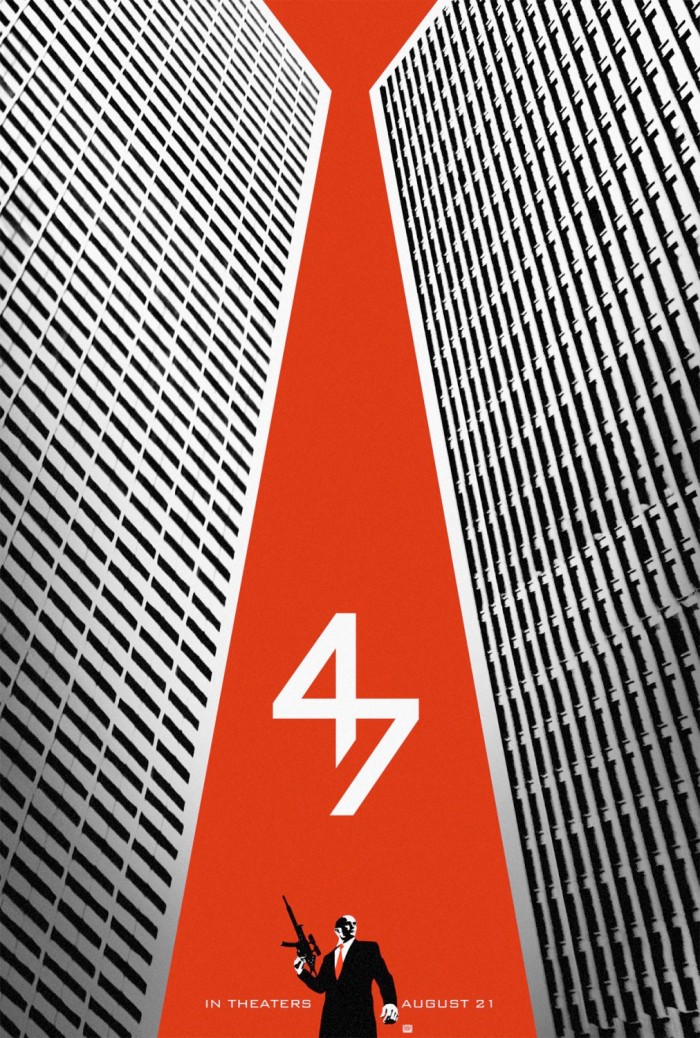
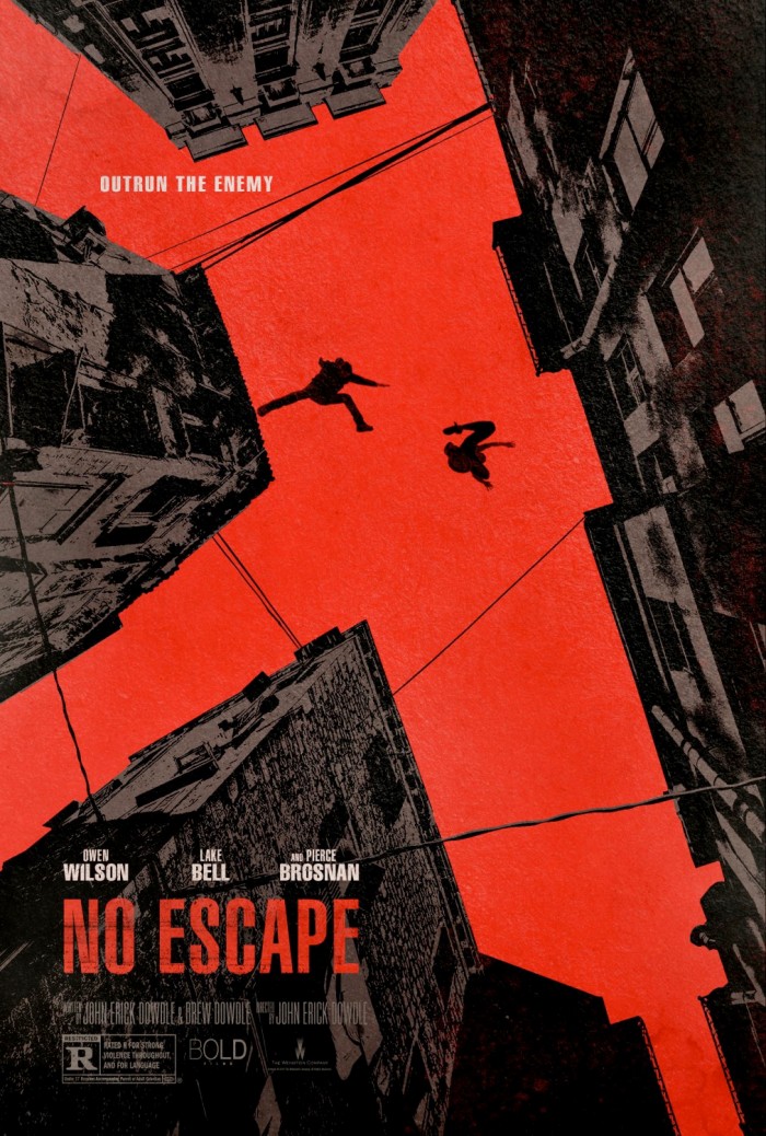
Not unlike the Hitman: Agent 47 poster above, I like the use of buildings to create the shape of a bright red gun. This movie came and went so quickly that you may not even have noticed its marketing campaign. That's a shame, because this is a very cool poster that relies more on cool imagery than just the faces of the film's stars.
11. Macbeth
10. The End of the Tour
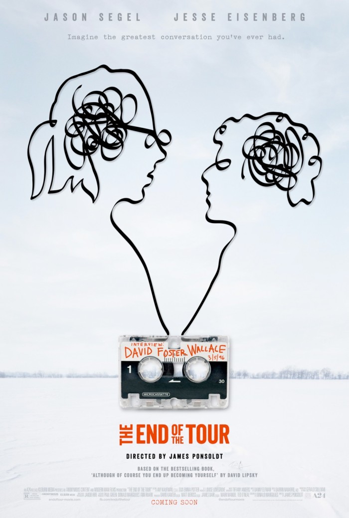
Jesse Eisenberg and Jason Segel look great in the form of unwound tape. This is a simple teaser that, again, doesn't need the actual faces of the stars to sell the movie. I especially like that the tape and faces created by it aren't just placed over plain white background, opting for the snowy Midwest of David Foster Wallace's home that we see in the movie.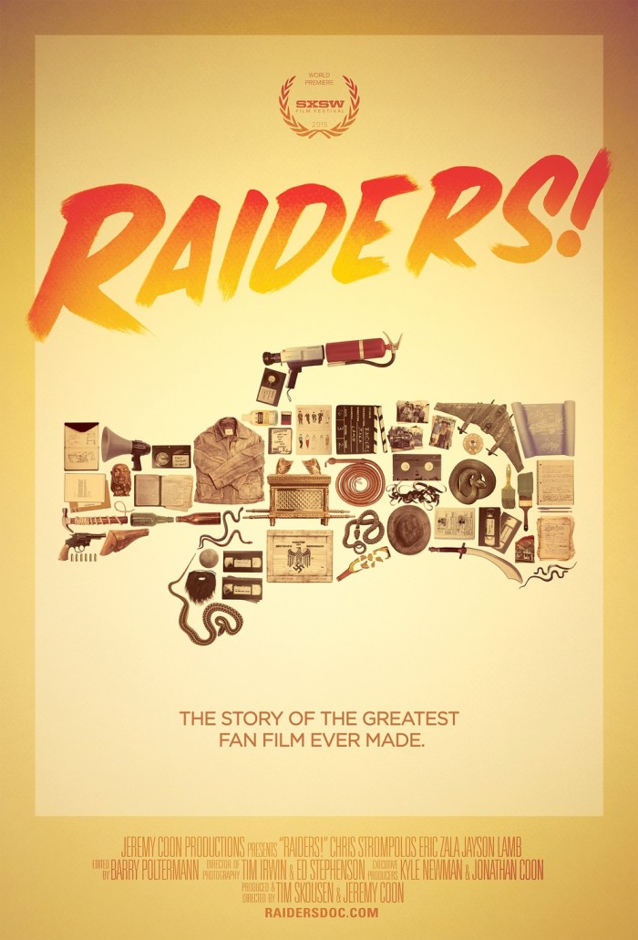
9. Raiders!: The Story of the Greatest Fan Film Ever Made
What can I say, I'm a sucker for posters that use objects to make up the shape of another object. In this case, it's a cool combination of props from Raiders of the Lost Ark and various elements used by the kids who made a homemade, shot-for-shot re-creation of Steven Spielberg's classic action adventure, which is finally getting a release in theaters this year thanks to Alamo Drafthouse.
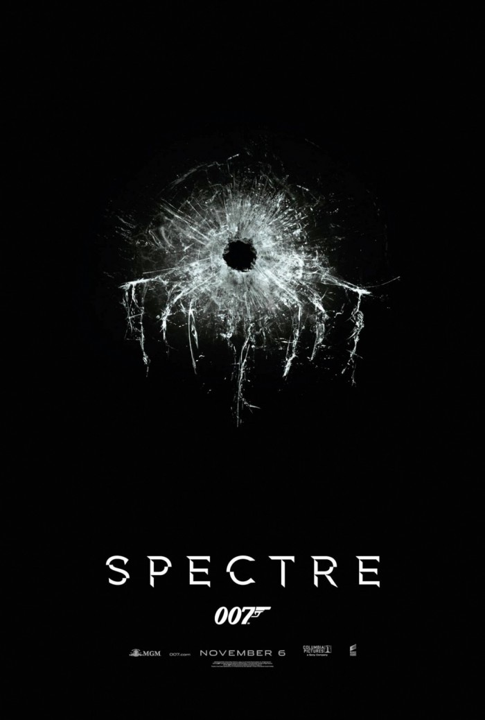
8. Spectre
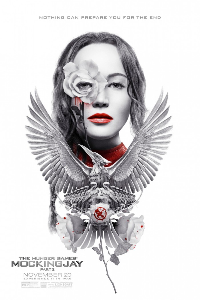
7. The Hunger Games: Mockingjay - Part 2
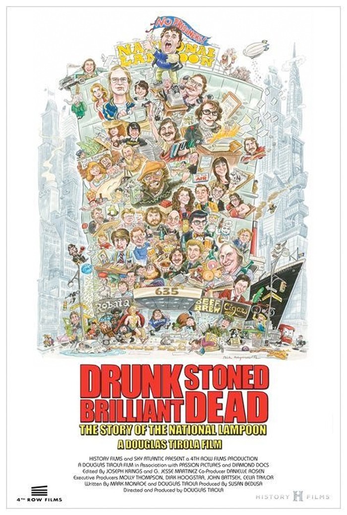
6. Drunk Stoned Brilliant Dead: The Story of National Lampoon
Taking a cue from the poster for National Lampoon's Animal House, the poster for this documentary about the now-defunct comedy institution illustrates all the important people that brought us laughs over the years, whether it was in National Lampoon Magazine or movies like Vacation. It's a very busy but very well-done poster.
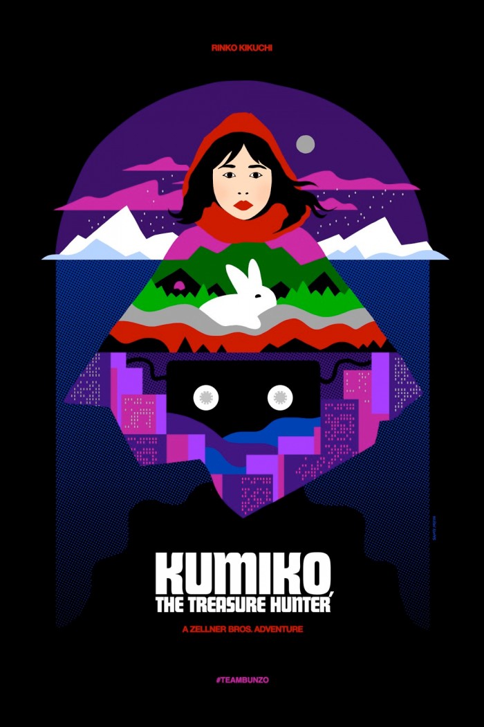
5. Kumiko, the Treasure Hunter
Looking like pop art meeting stained glass, the poster for this Sundance selected indie is vibrant and just plain cool. Rinko Kikuchi, a rabbit, a city and a video tape all form a mountain, not just as a sight of the landscape from Fargo, which is the driving force of the movie, but also as a symbol of the main character's uphill journey to find what's she's been searching for.
4. The Final Girls
3. Krampus
2. Ant-Man
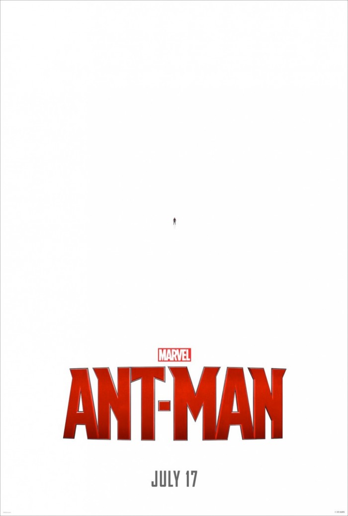
It's a bold move for Marvel Studios to promote one of their more obscure superheroes without any big names on the poster, and without any flashy imagery. Instead, they use the size of the hero to their advantage to create something that is clever and catches the eye. The later posters for Ant-Man may have fit the cliche mold of bad Photoshop and whatnot, but this one was a top notch teaser poster.
1. It Follows
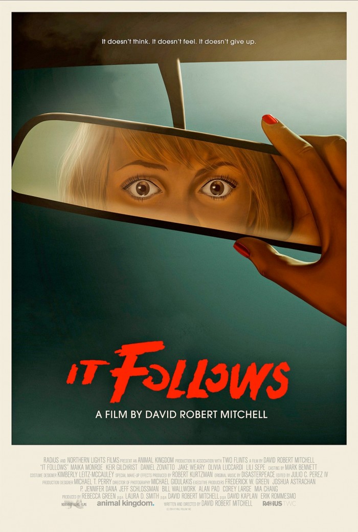
This is a great poster. Not only does it have a retro feel to it, jibing perfectly with the style of the movie and its incredible soundtrack, but it also feels like the cover to a cheesy young adult horror novel. The movie is anything but hokey, and it's certainly unnerving. And this poster uses the unknown to create suspense and hint at horror instead of just throwing it out there. It's not easy to tease a movie like It Follows in a poster, but this one does it perfectly.
***
So those are my picks for the 20 Best Movie Posters of 2015. What do you think of them? Are there any of your favorites that I didn't include? How mad are you that I didn't include the Star Wars: The Force Awakens poster?
