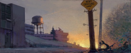
What Pixar's 'Newt' Would've Looked Like
I wasn't too broken up about what happened to Newt, Pixar's now defunct tale about two newts who can't stand each other and then (presumably) fall in love. The premise just sounded too bluntly familiar, and not up to caliber we've come to expect from the studio that brought us Wall-E and Up. When they canceled the project, I took that as confirmation that my initial response was more than me just being overly cynical.
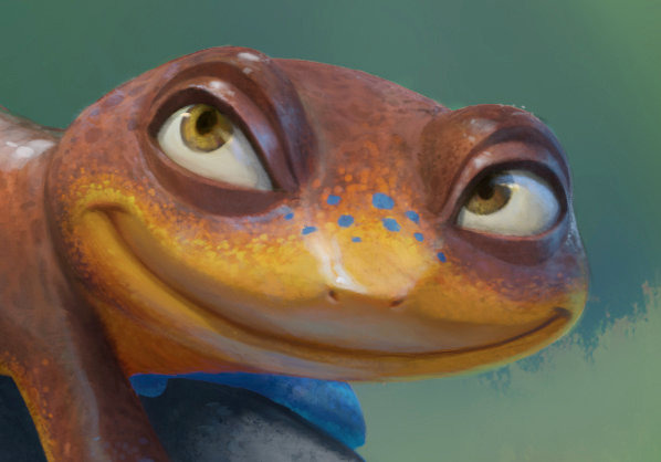
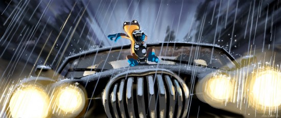
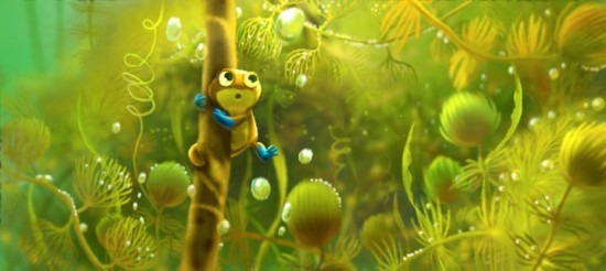
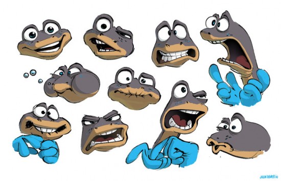
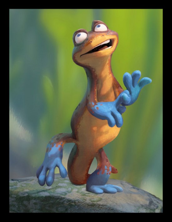
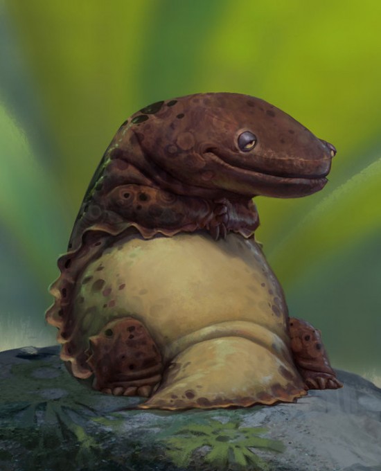
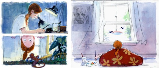
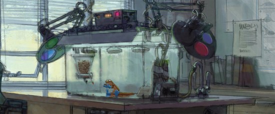
Now that I've seen the concept art for the film though, I take it all back. I don't care how unoriginal the story is, I want to see this movie.
The art was released on Disney/Pixar's Facebook page, which noted that even though the project was no longer in development, "that doesn't mean we can't share some of the Pixar artists' amazing artwork with our Facebook fans".
If nothing else, Newt had the potential to be Pixar's most visually stunning outing yet, with the newts' semi-aquatic lifestyle providing ample opportunities for gorgeous scenic views and settings like we've never seen before—at least not through the lens of Pixar, anyway.
The film was set to be the feature debut of Academy Award winning sound designer Gary Rydstrom (whose Pixar debut was the short Lifted). Here's the plot synopsis that was released a couple of years back:
What happens when the last remaining male and female blue-footed newts on the planet are forced together by science to save the species, and they can't stand each other? Newt and Brooke embark on a perilous, unpredictable adventure and discover that finding a mate never goes as planned, even when you only have one choice. Love, it turns out, is not a science.
I've included the highlights below (click the pics to see them full-sized), but there are plenty more character mock-ups and beautiful scenic paintings in the full gallery, so be sure to check those out too.
Thanks to /Film reader Justin Jump for the tip.
