Harry Potter Fans All Have The Same Complaint About The Trailer For The HBO TV Series
No, you're not imagining things: Today's films and TV shows really do look different, and not in a good way. As noted in the viral hit YouTube video essay "Why Movies Just Don't Feel 'Real' Anymore," this can be attributed to a number of factors. For example, a lot of the terrible CGI you've undoubtedly noticed lately stems from overworked visual effects artists being forced to meet unrealistic deadlines. Perhaps more than anything, though, modern big-budget projects tend to avoid dramatic color grading in favor of flatter and murkier visuals. It can be a creative choice, but this is too often done for reasons that are far less defendable.
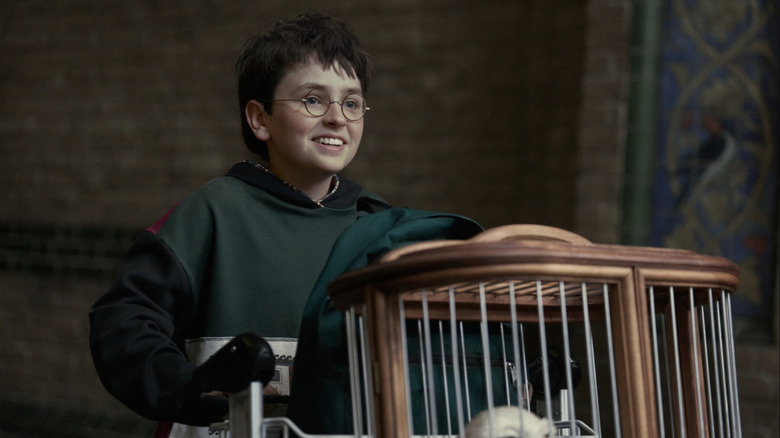
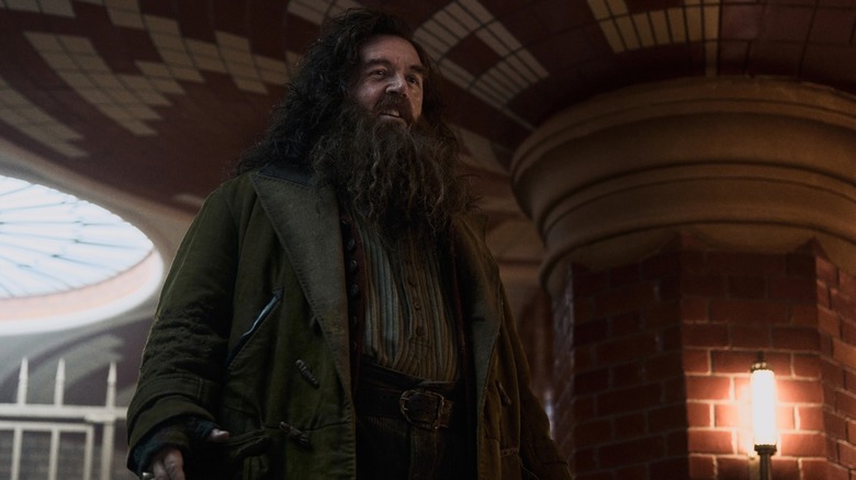
Enter HBO's "Harry Potter and the Philosopher's Stone," as it's officially titled. The first trailer for the "Harry Potter" reboot TV series has arrived, and fans have been quick to point out that the imagery contained therein is noticeably lacking when it comes to the whimsical colors and sharp lighting of director Chris Columbus' 2001 film of the same name (whose title was localized stateside as "Harry Potter and the Sorcerer's Stone"). "A Fresh Breath of TV" podcast host Ayana Monique nicely summed that sentiment up by using a gif of Ken Leung's Eric Tao on "Industry" (another HBO show, fittingly) gesturing "no" while commenting on "the color grading of the 'Harry Potter' reboot" on Twitter/X. The YouTube video creator "EndymionTV" similarly questioned this on the social media platform, writing, "Why is the new 'Harry Potter' so dark? Where's the whimsical color?"
They're far from the only ones who feel that way. As Twitter/X user "abby" put it:
"[T]he world of '[H]arry [P]otter' is so magical and whimsical, and you can't even give it any color ... ? [S]omeone please explain what [H]ollywood's issue is with color grading please??"
Wizarding World enthusiasts aren't exactly loving the Harry Potter TV reboot's darker visuals
Not to keep piling on, but the "Harry Potter" TV show trailer more or less confirmed our biggest fears about the series ... and by that we mean it mostly looks like an uncanny retread of the "Harry Potter" movie adaptations that came out before it. Then there's the fact that Wizarding World creator and "Harry Potter" TV show executive producer Joanne "J.K." Rowling has a well-documented history of denigrating the transgender community, on top of using the wealth she's amassed from this franchise to directly fund anti-trans organizations. Add it up, and it's no wonder this project is as deeply controversial as it is.
And yet, in spite of all that, it seems everyone finally agrees on something: This sucker looks way too dang dark (literally). Even Pop Culture Crisis host Brett Dasovic, who appears a bit more upbeat on the "Harry Potter" reboot series than others, has admitted there's something to this critique. Indeed, in a post on Twitter/X, Dasovic described the color grading at "the castle" (i.e. the world famous Hogwarts School of Witchcraft and Wizardry) as feeling like "classic 'Harry Potter,'" but acknowledged that the "washed out blue of the color grading everywhere else feels depressingly modern."
Compare that to Twitter/X user "Samantha Josephine Stockings," who argued the "current trend in lighting and colour grading" embraced by the "Harry Potter" TV show "should be considered a crime against humanity." If nothing else, this darker and grittier visual style lends credence to the idea that this series is targeting millennials more than Gen Z or Alpha (aka the next generation of cinephiles), and that feels like a questionable decision at best.
HBO's "Harry Potter" series will premiere around Christmas 2026.