Star Trek's Starfleet Insignia And Its Variations Explained
The Starfleet insignia seen on the chests of every officer in the service is typically nicknamed the Starfleet delta by fans, given its resemblance to the Greek letter. The symbol more closely resembles the letters lambda or alpha, of course, but if I were to legitimately complain that a Starfleet insignia looks more like one Greek letter than another, it might be the nerdiest complaint in the history of fandom. So, dear readers, this is the last we shall ever hear of it.
On the original "Star Trek" series, the delta logo was only seen on the uniforms of those serving on board the U.S.S. Enterprise. Other ships seemingly had different insignias, but that was a detail never canonically addressed in dialogue. Indeed, it seemed to be a production error; a recently uncovered 1967 memo from production designer Robert Justman to costumer William Ware Theiss (the original designer of all Trek's Starfleet uniforms) pointed out that both Justman and show creator Gene Roddenberry wanted the delta to appear on all the Starfleet uniforms, regardless of ship. Any different logos previously seen on "Star Trek" (like the various "knots" and "flowers" on various itinerant guest stars) were meant to indicate different branches of the future military, like merchant marines. Theiss was asked to make costume adjustments accordingly "under penalty of death." That was clearly a joke.
Thanks to this memo, however, all Starfleet officers, no matter their ship, would proudly wear a Starfleet delta on their right lapel. The chest-worn insignia has been a consistent detail throughout the "Star Trek" franchise, even as the insignias gradually changed look and function over the decades. On the original series, they were merely insignias. In later shows, they became functional communicators. Later still, they even became portable hologram-projecting work stations.
What does the symbol actually mean? Let's delve, fellow Trekkies.
The meaning of the Starfleet delta
The "arrowhead" shape of the Starfleet logo was likely inspired by a similar shape seen on the real-world NASA logo, initially put into used in 1959 by President Eisenhower. The original logo featured a miniature space-scape, with a distant star, a nearby planet, and a small, comet-like moon circling the planet. There was also a large, floppy, arrow-like shape draped over the nearby planet, likely meant to invoke speedy travel through the stars. That floppy arrow shape was carried over into future iterations of the NASA logo, and is still in use to this day.
William Ware Theiss likely internalized the arrow shape's association with space travel and made a subtler, simpler version of it for "Star Trek." There has been no in-canon dialogue explaining why the Starfleet logo looks the way it does. The original Starfleet deltas were patches sewn onto the uniforms.
The original "Star Trek" series, recall, featured color-coded uniforms that indicated the department in which they worked. The gold uniforms indicated command, the red uniforms indicated engineering and security, and the blue uniforms indicated science and medical. If one looks closely at the respective insignias, however, one will see that they, too, had symbols to indicate their department. Command uniforms boasted five-pointed star shapes to indicate command, while engineering and security had a spiral-like "gear" shape. Sciences had a rudimentary globe in their deltas, while medical had old-fashioned Red Cross crosses. In the picture above, Scotty (James Doohan) is actually wearing the wrong symbol. It should be the engineering symbol.
In "Star Trek: The Motion Picture," the logos would incorporate a circle behind the delta shape, and an officer's department would also be indicated by a badge's color. There were six colors for uniforms and patches in that movie, but most Trekkies haven't bothered to memorize them.
For most of the "Star Trek" movies, the individual departmental symbols were all replaced by the command five-pointed star shape, and the patches were replaced with large, elaborate, bronze brooches.
The deltas became communicators in 'Star Trek: The Next Generation'
When "Star Trek: The Next Generation" debuted in 1987, the departmental symbols were abandoned entirely, and the bronze brooches were replaced by more discreet metal badges. The Starfleet delta was a solid silver, and it stood in front of a gold-colored ellipse. The ellipse is, one might theorize, meant to emulate the elliptical path of a planet's orbit. You can see one on the chest of Captain Picard above. Also, new for the series: the delta logos also served as communicators, with officers tapping them before sending a message to another officer. The hand-held, flip-open communicators of the original "Star Trek" were now a thing of the past.
It's also established throughout "Next Generation" that the comm badges are location trackers. The computers on the U.S.S. Enterprise can locate people on board based on where their comm badges are, and transporter chiefs use the badges as a means to lock onto people for beaming. One might immediately note that location-tracking comm badges aren't good for security, as anyone up to illegal shenanigans could simply remove their badges and leave them behind. Badges adhered to uniforms via an unexplained, futuristic mechanism.
For acting ensign Wesley Crusher (Wil Wheaton), the badge was entirely silver.
For the "Next Generation"-inspired movies and on "Star Trek: Deep Space Nine," the comm badges changed again. The golden ellipse behind the Starfleet delta was replaced with a gentle rectangular shape, inscribed with a small, empty rectangular "bar." There is no canonical explanation for the change. It seems, though, that the "Star Trek" showrunners merely wanted a new delta symbol to indicate a new era.
The rectangle communicators persisted from 1994 all the way through the end of "Star Trek: Voyager" in 2001.
The 'Discovery' deltas had fun bonus features
The 2001 series "Star Trek: Enterprise" was set a century before the events of the original "Star Trek," so that show featured no deltas; it was before the symbol was invented. The 2009 "Star Trek" film, a reboot of the original series, saw Kirk (Chris Pine) and co. all wearing metal silver badges sans ellipse or rectangle, and with the original series' departmental symbols restored. They were not communicators, however, and looked like fun pins for Trekkies to buy. Of course, you can.
Since 2017, a new wave of "Star Trek" shows was unleashed on the public thanks to the inception of Paramount+ (originally called CBS All Access). Each one of the new streaming-era "Star Trek" shows took place at a different point in "Star Trek" history, and a new slew of comm badge designs was thrown into the mix. "Star Trek: Discovery," set just a decade before the original "Star Trek," featured gold metal badges with departmental symbols intact, and sported a vertical "offset" line down the delta's right side.
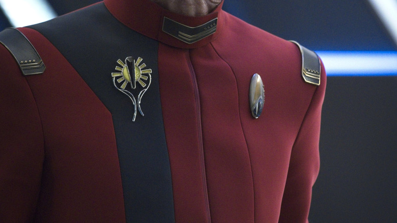
That series, thanks to a time portal, would eventually jump forward to the 32nd century when Starfleet comm badges had evolved. The new super-futuristic Starfleet delta was now smoothed out and elongated, and circumscribed by a long silver oval. The new comm badges also featured rank pips. A badge that displays the wearer's rank hearkens back to several episodes of "Next Generation" where characters visited parallel timelines where officers had their ranks indicated on their chests.
Additionally, the "Discovery" badges were more sophisticated pieces of machinery. Not only could the 32nd-century badges project holographic workstations in front of the wearer, but they also served as personal transporters, allowing users to zip around a starship on a whim.
Each 'Star Trek' show has a different delta now
"Star Trek: Picard" was set several decades after the end of "Star Trek: Voyager," and Starfleet deltas were different once again. One can only assume the makers of the new "Star Trek" shows wanted each show to have a different style of comm badges, as to offer Trekkies a quick visual shorthand as to what series they were watching. "Picard" sported badges with a hollow Starfleet delta, with two trapezoidal shapes extending downward. They looked pointy, and I trust no officers every hurt their fingers using them. The trapezoids were also derived from older "Trek" episodes that visited alternate timelines, although the alternates had slightly larger trapezoid shapes.
"Picard" also featured some parallel universe badges, and one can see an "evil" Starfleet logo on the chest of Admiral Picard (Patrick Stewart) in this article's header image.
"Star Trek: Lower Decks" takes place shortly after the events of "Star Trek: Voyager," and the animated series simplified the delta by making it a flat, silver shape with no accents or symbols. "Star Trek: Prodigy," also animated, featured a more traditional golden badge, but with a larger, stylized version of the old-fashioned "command" five-point star inscribed on it. "Star Trek: Strange New Worlds," set only about five years before the original "Star Trek," made metal badges that looked very much like the old-school patches seen on Kirk's uniforms back in the 1960s, complete with the old-fashioned departmental symbols intact.
The idea of the Starfleet logo being a sew-on or iron-on patch seems to be a moribund concept. Plus, it's fun for fans to buy licensed versions of the badges they like the best and pin them to their shirts or costume uniforms. Some companies have even made wearable badges with Bluetooth features, allowing people to use them as telephones. We're at the doorstep of having "Star Trek" comm badges for real.


