Deadpool & Wolverine's Unused Wesley Snipes Blade Designs Are Better Than What We Got
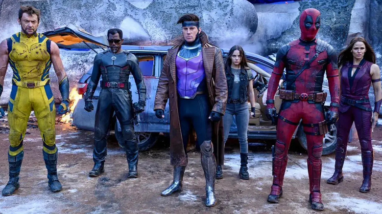
The "Blade" franchise is feeling a little cursed these days. The reboot set to star Mahershala Ali keeps gaining and losing directors and feels like it might never actually see the light of day. Meanwhile, it seems like the original Blade, Wesley Snipes, has been relegated to the world of cameos. It's great to see him on "What We Do in the Shadows," of course, hamming it up a bit on the vampire council with some other amazing vampire actors. The response to Snipes' appearance in "Deadpool & Wolverine," though, has been a bit more mixed.
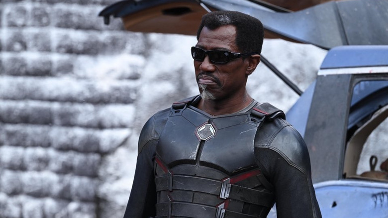
Some fans were thrilled to see Snipes as Blade again in any form, even if it was some void-based multiverse weirdness. Others felt that it was just another part of a film that was pandering and leaned too hard on meta-references. Regardless of whether you loved seeing the OG Blade back onscreen or felt it was an irritating bit of fanservice, one thing is for certain: that armor is boring. It looks like almost every other basic piece of armor in the Marvel Cinematic Universe, with a molded chest plate and a buckle or two. And after seeing concept artist Wesley Burt's amazing original designs that weren't used, we just have to wonder: is Blade actually cursed?
Burt's original Blade designs were much better
Burt took to Instagram to share the designs, which will be apparently be included in an upcoming art book, and they're pretty freaking fantastic. There's something for everyone, with looks ranging from goth master ninja to a design based on his classic comics look, complete with a biker jacket and leather pants:
The post also mentions that there were other concepts by other artists as well, which means there are probably even more excellent designs out there that feel less reminiscent of everything else in the MCU. These concepts have a lot of character and feel more like Blade, whereas the outfit in the movie feels more like Blade got his outfit from Bucky Barnes at a yard sale and painted it black. I'm sure that artist had other great designs, too, but this one ain't it. It took some convincing to get Snipes back on the Marvel bus and in Blade's boots, so the least they could have done was give him some great looking boots to step into.
Blade deserves better
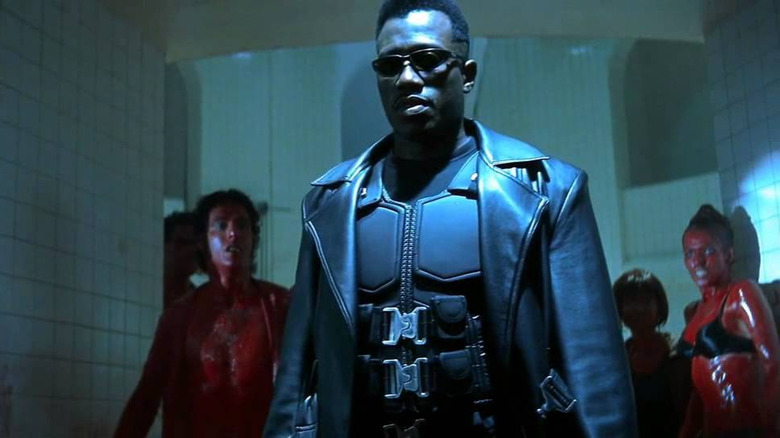
When you look at Blade's armor in the original 1998 movie, it looks kind of ridiculous (and cool) in a very late '90s way, but it also looks pretty darn functional. There are lots of separate pieces that allow Blade to move freely, plus if a piece gets damaged or he needs to access another layer it's a snap to get things off. There's also a sweet duster/trench coat, which feels baked into the Blade cinematic look at this point.
I love all of the "Blade" movies (yes, even the much-maligned "Blade: Trinity"), and one thing they all share is that Blade looks seriously cool. He's a bonafide badass, the only man who can put fear (and lots of stakes) into the hearts of vampires. "Blade" made a huge impact on cinema, and it's really a bummer that we didn't get to see Snipes in a design that hewed more closely to the original film or gave him a really cool, updated new look. It seems like Snipes might be open to playing the Daywalker again, though, so maybe we'll get another chance to see him really slay.


