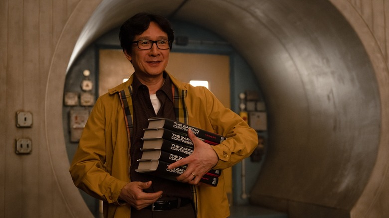
Loki Season 2 Cinematographer On How To Make Each Decade Look Unique And Embracing Mistakes [Exclusive Interview]
Public opinion towards Marvel isn't exactly at its highest point these days. Stories of overworked VFX teams, pushed release dates, a complicated casting problem, and a seemingly endless onslaught of post-"Endgame" projects have led to a growing public ambivalence towards the expansive franchise. As fans and detractors continue to discuss the evolving function of the MCU, a subset of moviegoers and TV fans have taken to calling the latest Marvel projects "slop," bemoaning a perceived lack of visual flair in particular. While plenty of the above critiques are valid, it seems clear that these people have not been watching "Loki."
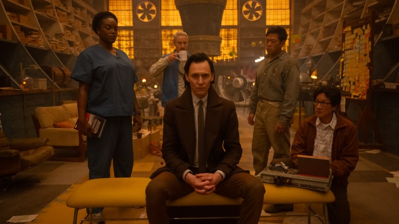
The second season of the Tom Hiddleston-led Disney+ series is one of the most visually interesting projects to come from the Marvel Cinematic Universe in years. While your mileage may vary when it comes to the show's trippy time-bending plot and other elements, it shouldn't be controversial to say that as both a Marvel project and a TV series, "Loki" looks damn good. Elegant, eerie, and just the right amount of nostalgic, the new season's varied visual style is both formally inventive and decidedly easy on the eyes.
/Film spoke with cinematographer Isaac Bauman ahead of the season finale to get to the bottom of what makes the second chapter of "Loki" so striking. The answer, it seems, involves careful coordination with VFX supervisor Chris Townsend, acclaimed horror directors Justin Benson and Aaron Moorhead's commitment to a perfectly imperfect handheld style, and period-accurate camera lenses and techniques that cultivate a distinctive mood for each decade. Oh, and tungsten. Lots and lots of tungsten.
Note: This interview has been lightly edited for clarity and brevity.
'Do whatever you guys want'
I know people talk about how some superhero shows have a sort of nondescript house style going on, but I definitely think this season of "Loki" is one of the most unique-looking things that Marvel has done. Were you given any sort of visual parameters to work within since it is a shared cinematic universe?
No, you know, not at all! The only thing we were ever told was, "Do whatever you guys want." Obviously anything we wanted to do, we would then have to get approval for. But there were no guidelines that were given to us at the outset. It was, "Show us what you got and we'll give it the thumbs up or thumbs down," and everything got the thumbs up.
That's awesome. I know you used handheld wide lenses in some scenes. How did you decide which scenes got which lenses?
What we said was that the handheld wide lens thing would be the default. So it was just assumed that essentially every single scene would be that way. And then as we went through the process of shot-listing the scenes, we would sometimes encounter scenes that were like, a couple shots into the scene, myself or one of the directors would say, "This scene does call for a different approach." Even though we intended the handheld to be the default, when the material spoke to us and it suggested otherwise, we chose to listen.
Gotcha. So did you have a certain visual language set up for different time periods?
Yes, we did. We used the different time periods as an opportunity to switch things up. We figured we would end up spending so much time in the default handheld mode that any opportunity that presented itself to do something else, we might as well take. Those different time periods were a very clear opportunity to switch up the visual styles a little bit and just experiment. We shot for such a long time. We shot for 18 weeks.
Wow.
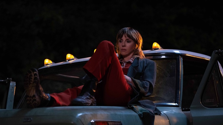
You're always looking for reasons to do things a different way. So, especially episode 5 ... nearly the entire episode takes place in a sequence of different time periods. We visit the '60s and the '90s, present day Earth, as well as the TVA, the 2000s. So we tried generally to emulate what we perceived to be the "house style" of that era of filmmaking in Hollywood. We did a sequence — you've already seen some of the 1980s where Sylvie is at. So for example, with that, there was no handheld at all, and we used longer lenses — not too long, but they weren't really into those super wide lenses back then — and we put the camera on the dolly, which we almost never did. The camera, even if it wasn't handheld, it often is just on a zoom lens or the crane. It's never ever doing dolly moves ever, except in these different time periods.
'We just made sure to never compromise those giant, enormous shots'
That's so cool. Were there any pop culture reference points you kept going back to, or touchstones when you were talking about the "house style" of those decades?
That's a good question. We didn't usually point to specific films in the period. It was more just our collective memory of what we thought they had looked like, rather than really grounding it in concrete, "Okay, this movie did this, this movie did that." With the exception, ironically, of the 2000s. There's a sequence where we're in the 2000s with a character and they work in a hospital and we wanted it to feel like an episode of "House."
Oh, I love that.
We were like, "How would they have shot it if this was like a 2000s medical drama?"
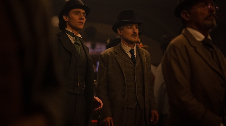
People will instantly know what it is! I also wanted to mention that World's Fair setting in episode 3. I thought it was really spectacular, and it's also just a historical setting that I feel like people have wanted to see on screen for a long time.
Yes!
How did the more ambitious shots in that episode come together? I know there was one that was pretty involved, but there were a few that really struck me.
There was a ton of VFX in that sequence and very intricate, detailed VFX, so there was a tremendous amount of planning involved in every single shot because of VFX costs, essentially. You're in a fluid take and the camera points at something it's not supposed to see, and all of a sudden you either can't use it or you're spending a ton more money on it. So the VFX supervisors were always very careful to work with us on that one, from planning the shots through shooting the shots and telling us what to avoid and all those sort of things.
But we all wanted to give the World's Fair an appropriate amount of scope, you know? It's like, "This is meant to feel big," and we kind of worked back from there. "How can we make this feel as big and grandiose as possible? The way that the World's Fair would've appeared to people who attended it at the time." It's like that wonder, the sense of developing technology in the future and excitement, we wanted the audience to feel that way. So we were very fortunate to work with Industrial Light and Magic as our vendor on that one, and they're just the absolute best. So we knew we were in good hands, and we picked a couple just planting-the-flag keystone moments that we knew we wanted to have no restrictions. We just wanted to have an epic massive VFX shot, like that initial reveal of the Ferris wheel, or a shot of the White City and the entire World's Fair as if we're on an aerial, a drone or something over the carriage that they're in on the Ferris wheel.
Planning these big VFX shots is very much a process of, "Okay, well then if we do this, then we can't do this or this or this." And then when you're in situations where you want to do something, they're like, "Well, we can do that, but if we do that, then we can't have that big one. You can get these three little ones, then the big one goes away." So we just made sure to never compromise those giant, enormous shots that would sell the scope and the majesty of it, no matter how tempted we were in smaller shots to want to have a little bit of blue screen in the background behind someone or whatever. It was all about focus and protecting what mattered.
'I wanted the lighting to feel like the production design feels'
That makes sense. A lot of prioritizing, it sounds like. You also made some particular lighting and color choices for the time periods. Can you talk me through the season's lighting design? I'm especially curious if the VFX impacts the lighting design as well. I guess I've never thought about that before.
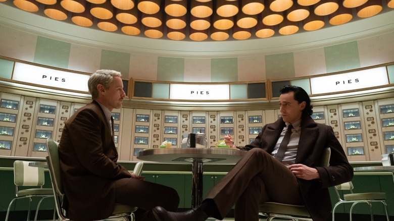
It's interesting. The idea was, I wanted the lighting to feel like the production design feels. It felt like there was an opportunity to unify the aesthetics of the lighting and the production design even more than they had been before. And we looked at films like "2001: A Space Odyssey" or even some "Godzilla" films, and I looked at "Live and Let Die," the first Roger Moore Bond film, really trying to give it that late '60s, early '70s feel with the lighting. Of course, the lighting was harder then, in general, and that look, even though it's fun, you wouldn't want to do it for an entire production. So it was more about taking the spirit of that lighting than the direct aesthetic approach they were using back then.
That meant a couple of things. It meant switching the lighting of the show to tungsten, where previously all the sets and the TVA had been lit with LEDs. We reconstructed the sets in London. The first season was [shot] in Atlanta, so everything was rebuilt from the ground up anyhow, but we put tungsten everywhere, which, tungsten is the type of lighting they used back in the day, until very recently. It's actually a filament that gets hot, and that's where the light comes from. Because the source of the light is similar to the sun itself — glowing chemicals, basically, there's nothing electronic about it, it's a chemical reaction that's happening — it creates a broader spectrum of light. You can actually measure it. You take a light meter or a color meter, and you can measure how many colors are in it that compose the whiteness, because white light is actually the sum of every color of light happening all at once simultaneously.
So when you use tungsten light, you get a very broad, full spectrum that even though it's hard to put your finger on it, and it doesn't always show up in side-by-side tests, the net effect overall is just undeniable. It looks fuller and richer, and the colors that it touches look richer and more saturated and vibrant, and everything just feels more organic and tactile. So that, I think, really clicked with the production design, which hearkens back to that, again, late '60s, early '70s kind of a thing. There's Soviet stuff and there's brutalist stuff, and then there's more whimsical mid-century modern stuff all kind of blended together. So the approach was that, it was, "Let's switch to tungsten."
It was also, "We have to light the spaces, not shots." I wanted to move entirely away from having any lights on the set. So we worked very closely, [production designer Kasra Farahani] and I, to make sure that each set had enough light sources built into it that I felt it would key the characters appropriately. A lot of times that is just some big soft overhead source, an example being in the chrono monitor wing: The whole ceiling is a light, basically. When your entire ceiling is a light, hopefully you don't need to put any lights on the floor. So not every set is quite so simple, and not every set you can just make the ceiling a light. That would get monotonous anyhow. But we worked together to make sure that we felt that there would be enough light and the right type of light on each set. [It's] primarily overhead lighting. You'll notice almost every set is lit from overhead.
The challenge that creates, and the reason why in that circumstance, why most productions still end up putting lights on the floor, is because of eyelight. Because when the light's coming from up there, a lot of times those characters get those dark eyes. That was the major challenge, but we solved it with a battery-powered handheld eyelight that was operated by a "spark," as they refer to them in England, who followed the characters and the camera everywhere, just holding this little LED ball of light. We had to cheat. We had to use LED, because it had to be on a battery in a backpack. Also, I'm there in the tent adjusting the level of it. It gets further away or closer, so you're kind of wirelessly always massaging the level of this little eyelight and just maintaining that ping in the actor's eyes. It was clear really quickly: As long as we had that little ping in there, we could get away with murder in terms of how much from above the light was coming from.
'They specifically wanted it to feel like war photography'
To me, it feels fitting for this to be a Marvel show where we're a bit more aware of the cameras because the show's kind of about exposing the way the world works, right? Did you plan for any corresponding themes like that, or was it just kind of a happy coincidence?
Well, first of all, I wanted to touch on the question you asked previously, because I didn't address the VFX on lighting.
Oh, of course. Yeah.
I kind of had come into this not having shot something with this extensive a use of blue screen and green screen. I had some experience, but not this much. In early conversations with our VFX supervisor, Chris Townsend, he was very clear that what he, on behalf of the VFX department, wanted were strong lighting choices. You see these movies sometimes with really wishy-washy kind of flat lighting, and I'd always assume that was because the VFX team didn't know what they wanted to do, and they just kind of wanted the most generic lighting possible so that the maximum number of different potential lighting scenarios and the VFX would all kind of fudge together and work with the lighting on the subjects.
Totally.
Chris, to his credit, said, "No, just light it exactly how you want to light it. Light it strong. Light it decisively, and that lets us know how to do the lighting in the VFX. You do what you want and we'll take our cues from you." So he kind of gave us the freedom to just make very strong lighting choices in VFX, in blue screen, entirely blue screen sequences, which was really cool, I thought. And I'm deeply grateful for that.
Yeah. If you're going to have an intro to a bunch of VFX, that's a good way to do it.
Yeah. Now the camera, yes. We talked early on about — Justin Benson and Aaron Moorhead, the directors, who were the ones who really spearheaded this implementation of the handheld style, they specifically wanted it to feel like war photography. Like they're a documentary journalistic filmmaker, camera operator, on the battlefield in World War II. You know, "Roll!" You've got to run to cover with the soldiers. So it's funny, our camera operators want the camera operation to feel invisible. We had an incredibly talented A camera operator, Andrew Fletcher, who did the whole season and is just a major part of what made it so special. But it's funny, Andrew, like all camera operators — like myself — kind of had to get used to the idea that we are not trying to disguise the fact that there's a human operating the camera.
We're trying to embrace and even amp up how human the operating of the camera feels, and that means mistakes. We want what are considered to be mistakes. We want to put those intentionally in the show. We want to see the operator accidentally clip a doorway with his shoulder on the way through. We want the camera to bounce a little bit too much when he has to run. We want the camera to fall to the side a little bit and then suddenly get straightened out on accident. We want those things and we want that to be part of the style of the show. We want it and we want a lot of them. So the idea is that, instead of distracting from the experience, it makes it feel more real and makes it feel like you're in that moment. You didn't decide to do another take because you couldn't because there was only one take because it's really happening. Right? Like a documentary.
"Loki" season 2 is now streaming on Disney+.
