The Real-Life Military Tech That Inspired Star Trek: Enterprise's Ship Design
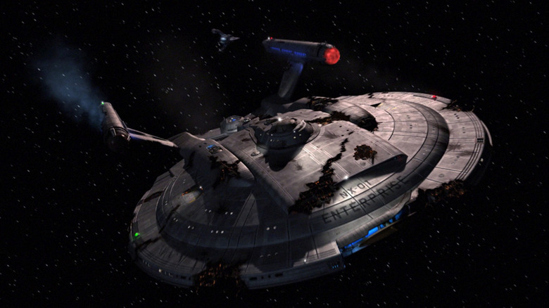
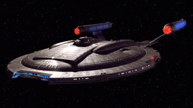
Because it was set a century before the events of "Star Trek," the 2001 series "Star Trek: Enterprise" had to undergo a massive design overhaul. The title ship couldn't look as slick or as roomy or as functional as the U.S.S. Enterprise did in 1966, so the designers backscaled everything 100 years. They eventually found a perfect sweet spot resting somewhere between modern-day NASA and James T. Kirk.
The cushiness of Federation starships has only increased over time. In the 24th century of "Star Trek: The Next Generation," the U.S.S. Enterprise-D was carpeted, calming, and contained a lounge, an arboretum, and a sonic shower in every crew quarter. The bridge even had a control panel mounted on a swooping wooden appliance. In contrast, back in Kirk's 23rd century, the U.S.S. Enterprise was square, more severe, and more functional. There were lounges but they were cramped, and the quarters hardly looked comfortable. Reaching back to the 22nd century of "Enterprise," the ship now had grating for floors, tiny sleeping areas, and a lot of metallic interiors. More than ever before, a Starfleet vessel looked like a submarine.
This was an intentional choice. In the excellent oral history book "The Fifty-Year Mission: The Next 25 Years: From The Next Generation to J. J. Abrams," edited by Mark A. Altman and Edward Gross, "Enterprise" creators Brannon Braga and Rick Berman wanted to give their show a definite mechanical/military vibe, and even looked into the way modern undersea vessels were designed as inspiration.
The Enterprise vs. the Lusitania
The NX-01 as it appeared on "Enterprise" was a much smaller ship than the ships seen in later Trek shows. It only had a saucer section — the tubular drive section was seemingly not yet invented — and only housed 83 people. The Enterprise-D, by contrast, held over 1,000. It was also a lot less technologically advanced. They used grappling hooks instead of tractor beams, and transporters were not safe for human usage. Food had to be prepared in a galley. Braga recalled that a lot of these "basic" Trek technologies were designed to resemble a submarine that he visited in person. He said:
"In developing 'Enterprise,' we kept in mind a tour of a nuclear submarine we had done. We really took our cues from that. This ship is somewhere between a nuclear sub and a starship. We don't have shields. We have something called hull plating. Photon torpedoes don't exist. There's some sort of torpedo that is very much like a high-tech missile. And the list goes on. Some parts of the Enterprise look like the space shuttle, some parts look like Kirk's ship, and some parts look like nothing you've seen."
Sadly, Braga didn't say the name of the submarine he visited. He did say, however, that the NX-01 was meant to look decidedly uncomfortable. Braga continued:
"[I]t's definitely more rudimentary and more cramped, and I think much cooler than any of the ships we'd designed so far. It's not Picard's bridge, which looked like the waiting lounge at an airport. It definitely had a more realistic look to it, yet it was no less cool."
However one feels about "Enterprise," one must admit that it was the most notably realistic of the "Star Trek" shows, at least in its technology designs.
The San Diego naval base
Co-creator Rick Berman also recalled going to a naval base in San Diego, California to visit a real submarine to find design ideas. More than anything, the new Enterprise had to be the opposite of cozy. Luxury was a no-no. As Berman said:
"Brannon [Braga] and I had the idea to give it more of a look of a submarine; something that was all business. We and Herman Zimmerman went down to the naval base in San Diego and managed to get on a couple of submarines, to just get the feel of what it is to be confined in a relatively small space. We wanted it to be the antithesis of the luxury of the other starships. And the design that Herman came up with does have a lot of a submarine look."
Berman recalls that Paramount wanted "Enterprise" to look sleeker and sexier. It was, after all, a sci-fi show about a high-tech, near-utopian future. Surely it would be all smooth surfaces and gleaming lights. Berman and Braga had seemingly had enough of illuminated panels and holodecks. They wanted a show full of dark greys, metallic surfaces, and black work boots. Berman said:
"I know the network tried on a number of occasions to get us to spruce it up a little, but we didn't think that was really appropriate. They constantly wanted more color."
A fun piece of trivia: according to story editor Marie Jacquemetton, portions of the "Enterprise" sets — not the ship, sadly — were repurposed from the production of the short-lived "Baywatch" spinoff "Baywatch: Hawaii." Some of the space-age bases were actually a lifeguard station.


