Spider-Man: Across The Spider-Verse Production Designer On New Tech & Not Tricking Audiences [Exclusive Interview]
The first "Spider-Verse" film was a miracle. It not only set a standard for movies about the multiverse, but also broke new ground and proved that American animated movies didn't have to compromise in their visuals, but could actually look as good as their concept art. It also set impossibly high standards for the sequel, and yet somehow "Spider-Man: Across the Spider-Verse" not only met those expectations, but surpassed them with one of the best and biggest movies of the year.
"Across the Spider-Verse" doubled down on everything that made the first one great and added to it. It delivers a movie that actually explores the ramifications of a multiverse, handles dozens of characters and makes them all compelling and fleshed out, interrogates ideas about Spider-Man and canon in nuanced ways that build on what came before, and still delivers an earnest and heartfelt story about Miles Morales coming into his own.
Of course, the film also just looks fantastic — like, breaking your brain fantastic. From the animation, to the VFX, to the design of the different worlds we explore, this is one of the best-looking movies of the year, regardless of medium. Ahead of the VOD release of "Across the Spider-Verse," we spoke with production designer Patrick O'Keefe about mixing different visual styles (including live-action), pulling obscure references in designing the look of the film, bringing comic book artists to the crew, and much more.
Note: This interview has been lightly edited for clarity and brevity.
'We never really make a choice based on our limitations'
Much of this film required inventing new tools. How did that impact the design of the film? Did you take into consideration the available technology before going to work, or did you figure out the practicality after?
I'm fortunate enough to have, in my opinion, the greatest studio in the world with Sony Pictures Imageworks and just the brilliant minds there that can basically, what we've learned over the first film we made together, "Into the Spider-Verse," it seemed like they could build absolutely anything we needed. And then on the second one, they proved it. They can build absolutely anything.
I never want to limit our creativity ever, and so we're always making decisions based completely on, what does the story need stylistically? What do we want it to look like? What will serve the story purposes? The geniuses at SPI will then build new technology to do all that. And we have these artists that that's all they're doing, is they'll be looking at artwork we're creating and then it's not even specifically for a shot or a part of the film yet, and they're like, "Oh, you guys want to be able to do watercolor. We're going to make a new watercolor program." And they'll start developing this program for them to use.
Now what does happen is they'll show us some stuff and they're like, "Hey, so we were making the watercolor thing and while we did that, we ended up making a chalk pastel thing by accident and it looks incredible." And we're like, "Oh, damn, that does look incredible. Okay, that's good to know. We have that tool and let's see if the story dictates an area that would necessitate using that." We never really make a choice based on our limitations, but that doesn't mean we won't use the available technology to our advantage. But if some crazy cool new technology does get made, we're going to look for a place to use it as long as it fits the story. It's always about telling the best story we can visually ... story's always driving style, style is driving technology, but there's this feedback loop where then awesome new technology exists and it opens our minds to new ideas of style and that can inform us creating even more new technology to support that.
'We knew Gwen's story was going to be a much bigger part in this film'
Given the expansion of the worlds and the story, what was the element or design that was most crucial to figure out first?
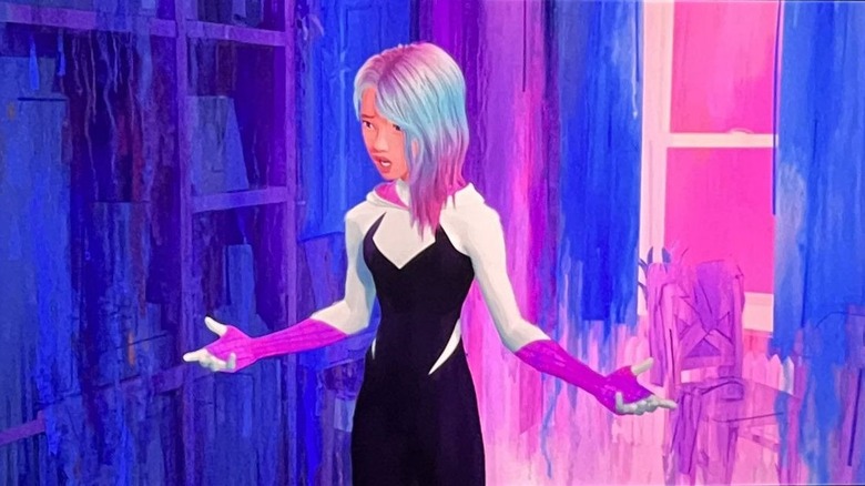
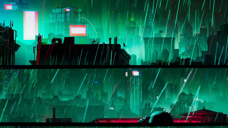
On the first film, "Into the Spider-Verse," we got an opportunity to go into Gwen's world. We sort of dipped our toe into Gwen's world, and the stylistic choices we made then were the same ones we would eventually made. Her world is this mood ring that is driven completely by her own emotionality and pays homage to those gorgeous Jason Latour [and] Robbi Rodriguez covers, and we wanted to hit that. But in the first film, we're only there for a moment. We're just dipping our toe in. Now, we're diving in headfirst and we're going to swim in the pool for a while. So we knew Gwen's story was going to be a much bigger part in this film, and getting to know Gwen emotionally to her core and her world and all the drama that she's entrenched in.
So we knew that needed to get pushed and it couldn't just be these static images. That's where we needed to understand the fluidity of her emotionality, and that would be represented in this wet into wet watercolor medium, which we wanted to feel alive. She is a living person with emotions that are sort of roiling over and blending from one to the next as a dramatic teenager does. So we created this style that then created the technology that would allow us to actually paint 3D watercolor paintings in her world that are transitioning as if you're layering a new wash of color.
She gets angry, and all of a sudden this red wash starts to bleed into the rest of the environment. As her and her dad are having these standoffs, the world is sort of falling apart behind her. We wanted the painting to go extra wet into wet and have it all drip down. That was one right away that we knew we had a stylistic approach, but we needed to go way further if it were going to support the heavy lifting that the story — that's the very dramatic moments in the story in Gwen's world. So developing, pushing the style further right away, that was one of our first big tasks there.
'It's important that style never overtakes the film and distracts from the story'
This film doesn't just experiment with even more animation styles, but also incorporates live-action at times. How was it to blend those together, from a design standpoint?
One thing we're always looking for in this film is, as [Spider-]Punk would say, he doesn't believe in consistency. So a big thing from any style to style was actually how to separate them and make sure they feel inconsistent from Gwen's world, to Punk's world, to Pavitr's world. When it came to the live-action, originally we sort of just dropped the stuff in and we're like, "Well, it's live-action, it should just look normal and real." It was so jarring and pushed everything so far apart that what we needed to do was come up with some ... "filter" is the wrong word for it, but a stylization on top of the live-action so it felt cohesive with the world and didn't feel jarring.
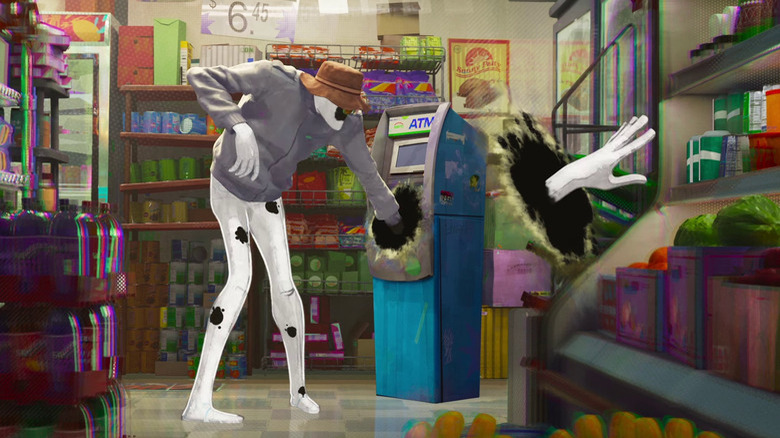
It's important that style never overtakes the film and distracts from the story. So when we tried dropping in the Prowler, or the other Spider-Men into the scene, we had to actually start messing with them a little bit and bringing some stylization in to give them a cohesive look so they didn't pull you out of the film. A good example is when Spot goes into the bodega. We actually needed to increase Spot's volumetrics a little bit, because if he looked too flat, it broke the reality.
In the first film, we learned this lesson that a spider is uniquely wholly of their own universe, but then when they travel somewhere else, they can take on some of those properties or else it sort of breaks the image plane, and again pulls you out of the story. So when Spider-Man Noir came into Miles' world, he actually got some values of gray. The lighting in the world is based on Miles' world, but he's sort of wearing his clothes. He's bringing his environment with him. So the Spot brings all his existing design and philosophies, but the world of Venom is a much — it's real world. It has volumetric lighting and all that. So we would apply those lighting characteristics to the design and render characteristics of the origin of the character.
What was the most obscure reference pulled when working on designing the film?
Oh boy. The most obscure reference, because there's some wild ones out there. One that came very late in the game, which is not necessarily a comic book reference, was the opening. Gwen on the drums. We really wanted it to feel like an experimental animation piece that represented sound. We're going to be representing emotion in Gwen's world visually, and now we wanted to represent the emotionality of the drumming. Drumming is very much a part of who Gwen is. And I believe it was [art director] Dean Gordon and Phil Lord came upon these experimental animations by Oskar Fischinger, and it's real kind of almost art school style animations where you're seeing the movement of sound on screen. And that really set the stage for the film and how we were going to display everything, whether it's emotion, whether it's sound. This is a comic book, right? So when you're sitting there reading a comic book, there is no sound. How do you represent these things? So diving into this sort of experimental, almost rudimentary art school, Oskar Fischinger style of animation really sort of launched the film. And it was very interesting finding that so late. But then of course, the audience experiences it as the first part of the film. Often that happens: Near the end, you find the microcosm that encapsulates the philosophy of the whole film.
'If you know what to look for, it's painfully obvious right there'
The last act with Earth-42 is a great piece of misdirection. What were the keys for designing that Earth and the differences and similarities with Miles' world?
Earth-42 is like, that's my baby. That was the one from day one that they're like, "We're going to go to this world." [Directors] Joaquim [Dos Santos], Kemp [Powers], and Justin [K. Thompson] described to me what was in their head and I was just like, "Oh, I've got this," because I'm a big — everybody who knows, I walk around the studio with a big fat black marker and that's how I do all my sketches are just these aggressive, sketchy things and it's always very dramatic. It's always high contrast. So Earth-42 was a baby for me. I can get all into the references there, but one thing Phil and Chris were very, very cautious of is we didn't want to trick the audience.
They always said, "We can hide the ball a little bit, but it should be there." And Joaquim Dos Santos, big "Back to the Future" fan, we would talk a lot about in "Back to the Future," too — if you know what to look for, it's painfully obvious right there. Twin Pines has become Lone Pine. There's the bars on the windows. So we wanted to make it obvious and not trick the audience.
Now of course, you've got the music and you've got the energy and the emotionality. You're all caught up in it. You're eating your popcorn, you're marveling at the visuals, and so you go with the story. We realized we don't really need to hide anything. We can put it there. Now, as Miles is sort of waking up to the idea that he is in a different world, we would then just turn those things up to their appropriate volume. So the hatching and Ben-Day dots that are so common, they're sort of the building blocks and the structure and the DNA of his world, in this world, have been replaced with spray paint and aggressive ink hatching, and smudging with your fingers. My fingers are literally in the movie as I smudged ink, and all those things start to dial up as Miles is awakening to the fact he is in the wrong dimension. Because now he is seeing the fact that he's not there and he's seeing all the clues that have been available to the audience. So again, not wanting to trick the audience, leaving it there, the evidence is there, but just like all of us, the whole film we try to experience through the characters, so from Miles' point of view, we're all sort of awakening to 42 at the same time.
'This is a world ruled by the Sinister Six'
Can you talk about some of those details in Earth-42 that sort of clue us in about this being a different world and a different Miles?
In Earth-42, one of the first things you'll notice for the keen observer is this is a world ruled by the Sinister Six. And they've sort of done a corporate takeover of the world in a lot of ways. There's no superhero — I think the analogy of a superhero is that there's this underlying good in a society. I think in our real world, we have superheroes all over the place. They don't wear capes. I mean, neither does Spider-Man, some of them, but they're out there fighting for good. In the world of Earth-42, that sensibility is gone. And so the villains have made their way into the corporate world and have taken over.
So while Miles is swinging through the city, you'll notice the Sinister Six own all the major companies and all the branding is Sinister Six. Viacom is Vulturecom, Con Edison is owned by Electro. These utilities at the heart of society have all been corrupted by these Sinister Six and other villains. So the signage throughout is all villain branded.
Then in terms of the render style, we start to see that transition. We're removing things like the Ben-Day dots, we're removing things like the hatching, even the graphic reductive style that we use to represent Miles' world is all being replaced with this grittier, more aggressive, more "the artist's hand," as we like to call it, approach to creating art.
So where Ben-Day dots had been replaced with spray paint, light and shadow has really been replaced by inking. There's a heavy black inking in Earth-42 that's very Sean Gordon Murphy or Chris Samnee or John Paul Leone. Leaning on those artists and their work, incorporating them to give it all sort of this rougher style as we have entered into a world from Miles' perspective that is sort of a rougher, grittier execution of his own.
'It's important for us to make this feel authentic and include those comic book creators' voices while doing it'
Several comic book artists, including some directly involved in creating some of the characters in the film, worked on it, like Rick Leonardi. Why was this important? What contributions did they have on the film?
So these movies are about our connection to and our love for comic books and the proud history that comic books have as this beautiful art form. And as such, while making them, it's important for us to pay homage to the comics we grew up with and our relationship to them. That's always our North star. Phil [Lord] would always say, "When in doubt, lean into the comics" — stylistically, story, all that. On the first film, we got to bring in a few comic artists, but with the second film we were a little more known, and it was a great opportunity for us, as comic book fans, to now be able to ring up some of our favorite comic book artists and beg, "Hey, would you like to come help out?" And they were so grateful and gracious to be there.
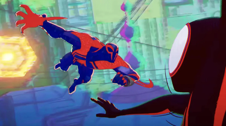
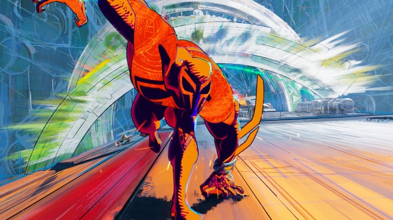
It's important for us to make this feel authentic and include those comic book creators' voices while doing it. A lot of awesome stories and characters were developed by these comic book artists. Now they appear on all these screens, and yet they don't often feel like the original comic book. So when it comes to story, we're working with guys like Dan Slott. He's involved and checking out the film, and he's a big friend of the film and helps guide us through the Spider-Verse that is larger even than the movies. On this film, we got a great opportunity to work with, you said Rick Leonardi. He created Spider-Man 2099. Nicest dude in the world. We brought him in to talk about the sensibilities and his approach to doing artwork for 2099 and learned a lot just about, how does his pen move across the illustration board? Representing that artist's hand is very important to us. So we got him to scan in some old drawings for us, do some mark making, he's got this wicked shorthand on how he shades. He kind of outlines his shapes and then gives it this really toothy wide gauge scribble and we would call it Miguel's teeth. That became intrinsic to his style.
Another great example was Brian Stelfreeze. We've got this awesome character, Spider-Woman, voiced by Issa Rae, and we really wanted her to feel like this luxe, powerful, strong, confident, beautiful Black woman. And so we leaned into the work. We were looking at a lot of artwork, and we found Brian's work, who we're all big fans of. He did a lot of work on "Black Panther," I'm sure you know his work. He's got this really rich watercolor ink wash style, and it builds these dense, beautiful skin tones that are just gorgeous, that just feel opulent. They feel strong, they feel proud, and as a Black man, he understands intrinsically how best to render the skin color. Because representation is very important to us as well. So we got with Brian, and again, he did some paintings for us, but he was also gracious enough, just like Rick, to walk us through his process and philosophies.
It was interesting because these guys have done it for years, but I don't think ever had to sit and break down their process for a film. So Brian would often be like, "Oh, I never thought about it, but this is actually how I do it." And that was really, really fun. So he brought this awesome ink washing style that was great and was perfect for Jessica Drew in the film, because it gave her this sort of high art elevation in the world because he's such an incredible artist. So going to the source, going to the comic book, and then beyond the comic book into the comic book artist's brain has been so valuable for us as filmmakers, but also it's kind of just a joy to get to hang out with some of your favorite art heroes and talk shop.
'What would your aunt bring to your barbecue? What's that thing that just has to be there?'
One scene I loved was the barbecue party for Jefferson, which really shows Miles' multicultural background. What went into designing that scene?
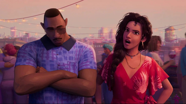
Yeah, the barbecue was a great one because we have a very diverse crew. So we lean on our crew much like comic books — we lean on our crew for the diversity. We don't want to suppose or make assumptions. So we would speak to people on the crew, whether you're a texture artist, or the head of writing, or the head of the company, or a [visual development] artist, whomever. Going and speaking with these artists, these filmmakers, that are of those cultures, that are of those communities, and asking them, "Quintessentially, what would it be at the barbecue that you would have?" What I love about the barbecue is it's a mixing of cultures and communities, and that's really what Brooklyn is, and what major cities really are.
So we have the standard sort of American barbecue. The African American favorites. I spent some time in Brooklyn going to bodegas, going to barbecues, and just hanging out with street photographers there and seeing what's in their world. But then we lean into a lot of our Puerto Rican, Latino filmmakers as to, "What would your aunt bring to your barbecue? What's that thing that just has to be there?" And Miguel Jiron, our head of story, and Octavio [E. Rodriguez] and our story artists brought a lot of that culture in.
I'm a little Canadian, Irish, French Canadian, and so there's a bit of a blind spot for me there, and they're like, "Oh no, you have to have — the pupusa has got to be there. It wouldn't be a party without the pupusas. And the flan." We had a big conversation about flan. And I don't know anything about flan. I did a painting of flan and they were like, "No, no, no. The sauce has got to be just like this and the right specularity on the sauce." And I love that, because when it comes to things like that I'm an expert, like the graffiti, I'm going to be like, "No, no, no. Okay, the drip drips like this."
We have such an accepting crew of filmmakers that it's like, "Oh, the drip's wrong? Let me get the drip right. Oh, the flan sauce or glaze is wrong? Please, I would love to know how it looks right." One of my favorite paintings, I did a tiny little painting, was the beef patty in the bodega because I grew up in Toronto near a Jamaican neighborhood, and would eat beef patties to and from art school pretty much every day. I lived on them. So when I saw a beef patty needed to be done, I was like, "Oh, that's me." And I spent more time than anyone should making sure the beef patty looked just right, and the microwave was just dirty enough that it looked like my Jamaican bodega that I would go to growing up.
'How do we make this piece of paper threatening?'
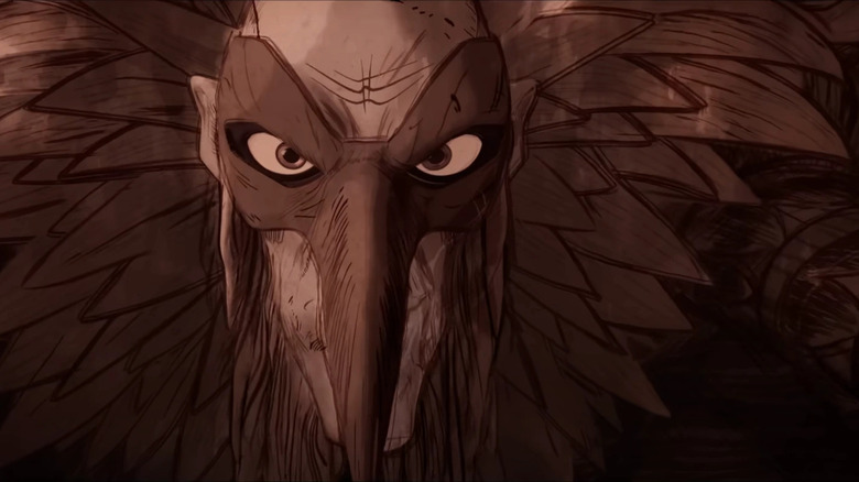
What went into the design for Vulture and the paper-like texture of the character?
Yeah, the Da Vinci Renaissance-era Vulture was quite a challenge, because we were trying to make this extremely formidable, scary character. This is somebody who's going to be a handful for not just Gwen, but Jessica Drew and Miguel. But the concept was sort of running opposite of that. It's a piece of paper. So how do we make this piece of paper threatening? We knew we wanted it to feel like it's from another dimension. So going back to the original comic books, on parchment, and done with ink and quill, and making it feel like of that era, we had artists make their own ink. One thing I noticed looking at the Da Vinci stuff is the ink actually changes color quite a bit. I was reading some awful — well, it was not that awful. I was reading a Michael Crichton book where they travel back in time and they had to make their own ink. And the ink was inconsistent because all the different oxides just sort of separate over time. So getting the artists to use the actual tools and materials.
We also got an artist named Mauro Belfiore, he's from Italy. He helped do a lot of the designs and do the Italian backwards handwriting, just like Da Vinci, to really give it that authentic feeling. But now we need this character to feel threatening and scary. So one thing that really helped is we would change the color of the paper at times. So he would get darker due to inconsistencies in the paper, in the aggressiveness of the line work to make it feel sharp, and slice you open. Death by a thousand paper cuts, I guess. Leaning into the materials and instead of shying away and saying, "Oh, this thing needs to feel strong so it needs to be made of strong materials," and leaning into the shape languages of, again, this sort of death by a thousand paper cuts, these little paper blades, gave us the opportunity to make a scary character that still felt authentic to its story purpose of being this Da Vinci-style character.
"Spider-Man: Across the Spider-Verse" arrives on digital on August 8, 2023, and hits 4K UHD, Blu-ray, and DVD on September 5, 2023.
