Across The Spider-Verse's Nueva York Took Cues From One Of Sci-Fi's Most Respected Artists
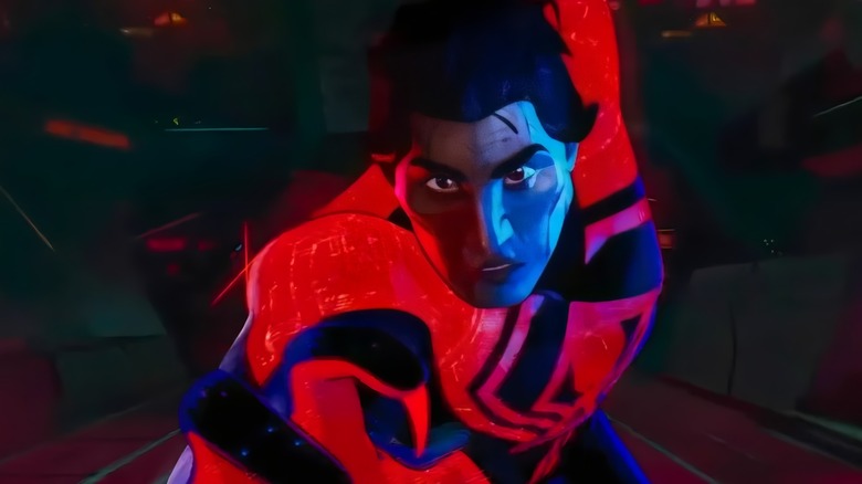
"Spider-Man: Across The Spider-Verse" has earned rave reviews and well-deserved praise for its absolutely mind-blowing animation. The Sony sequel manages to top the original Spider-Verse film's art design by featuring not just one or two animation styles, but a half-dozen or more. While I'm perhaps most partial to the punk collage aesthetic of Hobie Brown (Daniel Kaluuya) and the drippy watercolor of Gwen Stacy (Hailee Steinfeld), one of the film's most striking aesthetics appears in the homeworld of Miguel O'Hara (Oscar Isaac), aka Spider-Man 2099.
The brand new art book "Spider-Man: Across the Spider-Verse: The Art of the Movie" by Ramin Zahed explores the making of Miguel's world, a tech-heavy dystopia that is officially called Earth-928. As co-director Joaquim Dos Santos explained in the book, if Miguel's world looks especially familiar, there's a reason why.
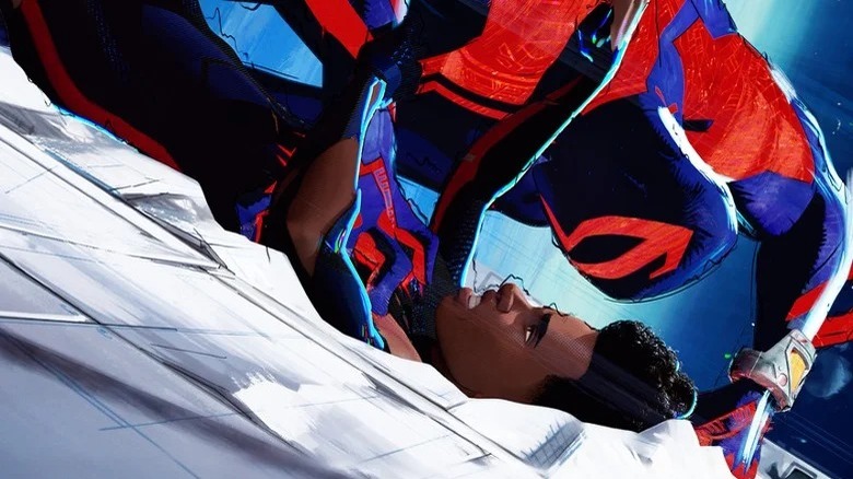
"This futuristic version of New York is hugely inspired by the works of visionaries like Syd Mead and Ron Cobb," Dos Santos said. You may not know Mead and Cobb's names, but you certainly know their work — both were concept artists who created some of the most formative visions of the future ever put to screen.
The world was inspired in large part by the work of Syd Mead
Ron Cobb, who passed away in 2020, contributed concept art to movies like "Star Wars," "Alien," "Total Recall," and "Back to the Future," while Syd Mead, who died in 2019, created the art behind "Blade Runner," "Star Trek: The Motion Picture," "Aliens," and "Tron." If you were watching movies in the '70s and '80s and had a clear idea in your head about what the future might look like — shiny, clean, and dangerous — you have Cobb and Mead to thank.
"Spider-verse" animation head Alan Hawkins described exactly how Mead's work in particular led to the creation of the slick and colorful yet unwelcoming world of Earth-928. "I love the world of Miguel O'Hara, and how it was hugely influenced by Syd Mead's concept art," he explained. "The world above the ground is very idealized, with great blues and clean lines. Then, the underground sections are inspired by darker visions of the future, like in 'Blade Runner.'"
It's easy to see how Mead's works inspired the movie. A series of images he made for U.S. Steel in the '60s, when he was cutting his teeth designing brochures for companies, is available on the artist's official website, and features a world that's all sharp reflective surfaces and gorgeous near-neon lighting. Miguel's world looks similar, and that's not an accident, as animators apparently used a special digital art tool designed to mimic the style of classic futuristic concept art. "We built an entirely new line tool that allowed us to draw layered lines on environments that mimicked the concept art," visual effects supervisor Mike Laker shared in the new book, noting that "these lines had the ability to overshoot geometric forms for the cleaner architectural aesthetic of the world."
An impressive roster of classic inspirations
According to filmmakers, it wasn't just one artist who inspired the "Blade Runner"-esque world. Production designer Patrick O'Keefe also cites three different famous Johns — "Star Wars" poster designer John Berkey, Industrial Light & Magic visual effects art director John Bell, and Isaac Asimov novel cover painter John Harris — as inspiration for the look of Miguel's world. He says it was "thrilling" to pull from the movie careers of legendary sci-fi concept artists, but that the animation team was also informed by the lesser-known earlier stages of some of the artists' careers.
"We also looked at many of the works that came before," he said, "early in those artists' careers when they were selling cars and kind of envisioning an aspirational world of tomorrow." Mead's pre-Hollywood work is particularly visionary, as another of his U.S. Steel images actually inspired the design of one of the most memorable machines in "Star Wars," the mammoth AT-ATs.
Right about now, Spider-Man purists might be worrying that the team behind "Spider-Man: Across The Spider-Verse" forgot to include any nods to comic book art styles in Earth-928, but there's no cause for concern. In the latest issue of Animation Magazine, co-director Justin K. Thompson notes that the innovative animation tools used to craft Miguel's world were also modeled after the work of the comic book artist who first brought the character to life in 1992, Rick Leonardi. "We worked closely with those artists to develop tools that could translate the way they did their linework and their textures so that it could be applied to the 3D look of the characters," he told the outlet.
The thin line between utopia and dystopia
If all of that's not enough, Justin K. Thompson name-drops yet another comic series in Zahed's new book: "Space: 1999," futuristic comics from the 1970s that continued the saga of a short-lived British sci-fi TV show. He says that the clean, brutalist design is meant to evoke the comics along with — you guessed it — Syd Mead's works, which he said created visions of "manicured, aspirational futurism."
By now, many of us associate the cold, sleek shininess of works like this, not with utopic futures, but dystopic ones, like those of "A.I. Artificial Intelligence" or "Blade Runner 2049" (the last film Mead completed before his death). This deceptively orderly and beautifully ominous type of design is especially fitting for a guy like Miguel, who's all sharp teeth and even sharper scowls. "Nueva York has a cold, hard exterior with a lot of problems underneath it, reflecting exactly how Miguel is portrayed in the movie," Thompson said.
We'll almost certainly get to see even more of Nueva York when the next installment in the franchise, "Spider-Man: Beyond the Spider-Verse," debuts in theaters on March 29, 2024. In the meantime, you can check out "Spider-Man: Across the Spider-Verse: The Art of the Movie," which is now available in bookstores.


