Star Trek: Picard Took A Historical Approach To Updating The Next Generation's Tech
One of the big challenges with prequels or sequels that come years after the original entries — whether that's the "Star Wars" prequels, "Avatar: The Way of Water," or now "Indiana Jones and the Dial of Destiny" — is whether to try and match the look of the original or take advantage of new technology. When George Lucas made "The Phantom Menace," he finally got the chance to make the movie of his dreams with all the crazy visuals and worlds he wanted because the technology had finally caught up. For audiences, however, it meant that the prequels looked like an entirely different type of movie set in an entirely different universe with shiny new technology compared to the grounded and practical look of the originals, despite the original trilogy taking place only 19 years after the prequels.
There's no right answer to how to approach this problem. If you try to make the new title look exactly like the original, it may look out of time and outdated, but if you go too far in the other direction, it may be disorienting for audiences. One show that found the right balance when it came to its look and technology is "Star Trek: Picard." This show is a treat for "Star Trek: The Next Generation" fans, with our review calling it "the best NextGen movie that we never got." The show takes place two decades after the events of the last movie in the NextGen era, and there was a lot of world-building to fill in, which Patrick Stewart was happy to do himself.
Because of that 20-year gap, the world of "Star Trek: Picard" is not the same as that of "The Next Generation," and a lot of thought went into updating the technology of the show.
Consider the elevator
Speaking to IndieWire, production designer David Blass talked about looking at the real world for inspiration in how technology advances through time. As a conceptual exercise, the design team looked at elevators and how their look changed over the past 20 years. Sure, phones, TVs, computers and the like have changed tremendously since the '90s, but how much have elevators really changed? "How much change really goes on in our architecture during that span of time?" said Blass.
"One of the things I said to my team was, 'Star Trek is not a fantasy show,'" he explained. "It's not a sci-fi show. It's a historical drama that takes place in space. But it's got 60 years of history that we have to be true to."
To make sure the updated technology would still fit with the visual style established in the original "The Next Generation," Blass and showrunner Terry Matalas brought back craftspeople who worked on that show and other "Star Trek" projects from the '90s to ensure continuity. This meant reaching out to Dan Curry, who designed the original Klingon weapon bat'leth, in order to give Worf a new weapon on "Star Trek: Picard."
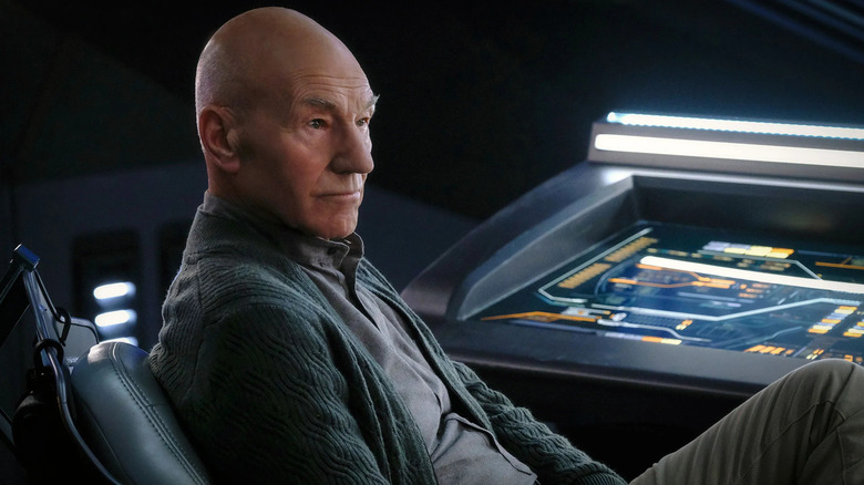
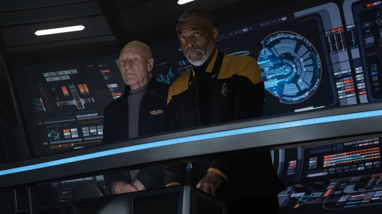
LCARS computer interfaces in "Picard" have actual animations on high-definition monitors, whereas before they were printed illustrations on light-up displays. But because of changes in filming techniques, the team at "Picard" pulled some tricks to update the visuals. Take the same LCARS illustrations, which in the '90s appeared with a green hue on TV despite originally being blue. In "Picard," computer and video playback specialist Todd A. Marks managed to add a bit of green to the playback version of the LCARS animation to capture that old school look.
But just because you can make it look shinier or more polished doesn't necessarily mean you should. Likewise, when recreating the Enterprise-D bridge set for the penultimate episode of season 3, the team used the same tools and even the same type of wood to recreate the set as faithfully as possible. "The painters got exactly the right number of grains in the wood," Blass said. Make it so, indeed.

