The Enterprise-D Makes It Bright And Clear: Modern Star Trek Bridges Are Too Darn Dark
This post contains spoilers for the ninth episode of "Star Trek: Picard," season 3.
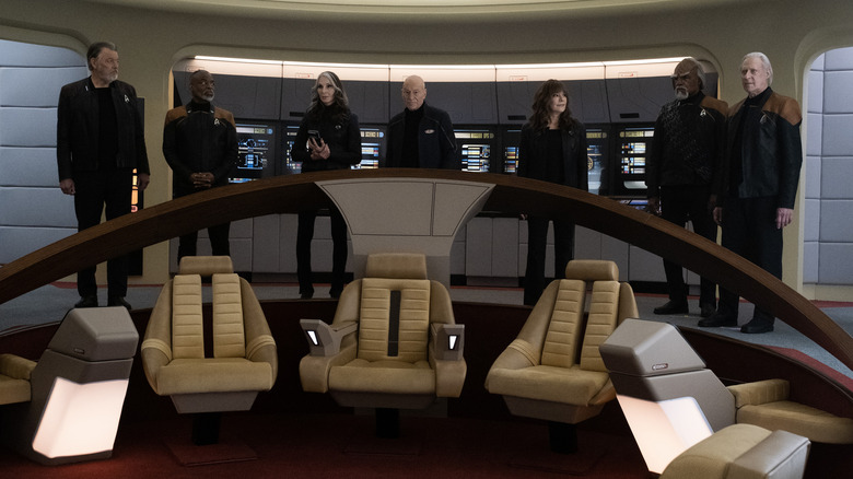
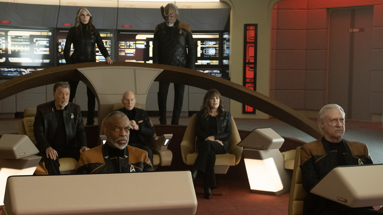
In the ninth episode of the third season of "Star Trek: Picard," called "Võx," hundreds of Starfleet vessels have been overtaken by a malevolent Borg consciousness, led by the powerful psychic mind of Jack Crusher (Ed Speleers), the son of Jean-Luc Picard (Patrick Stewart). In order to save the day, the over-65 ensemble of "Star Trek: The Next Generation" stars have to make use of an old-fashioned ship that's not tied into the modern Starfleet wi-fi. Luckily for them, Geordi La Forge (LeVar Burton) has been secretly reconstructing the decades-old Enterprise-D — the ship from "Star Trek: The Next Generation" — in secret in his garage. The episode ends with the cast striding out onto a bridge that hasn't been seen since "Star Trek: Generations" in 1994.
This moment may have evoked many wistful waves of nostalgia in the viewer. The characters certainly seem to be a little verklempt to be back in their old workplace where they all first met. Is it a brazen attempt to manipulate the viewer's emotions through the shock of recognition? Perhaps. Does it work? As of this writing, social media is certainly joyously abuzz with the ship's reappearance.
But even the bitter souls who were unmoved by the resurrection of the Enterprise-D still breathed a great sigh of relief. As Picard and company took to the bridge, everything was visible. Even in a wide angle, the rear bridge stations were visible, the helm was visible, the placard on the wall was visible. It was all visible because, for the first time in the show's run, there was finally some decent f***ing lighting.
After skulking in the shadows of the Las Vegas dive bar that was U.S.S. Titan, it felt good to have our pupils finally constrict.
Nice, even TV lighting
Many Trekkies have long criticized the Enterprise-D for its resemblance to a luxury hotel. Its grey-beige-lavender decor might be the color scheme found in a 1987 frozen yogurt shop or Gap outlet store. It was rounded and soft-edged. The Enterprise-D boasts the only bridge in "Star Trek" that has wooden accents. By comparison, the U.S.S. Titan had steel floor plating, a lot of metallic and plasticine textures, and hard, pointed angles. The same could be said of the U.S.S. Stargazer in season 2 of "Picard," or the La Sirena from season 1. In all cases, the lighting has remained notoriously low, making starship bridges look like strip joints. With illuminated touch-panel controls in aggressively dark rooms, one might assume that all bridge officers would be in sick bay often, complaining about eye strain.
Why are the bridges of starships so f***ing dark? Is it meant to communicate intimacy? Is it so the bridge officers can "disappear" at their own stations, unbothered by the work of others? Or have human eyeballs evolved to be more comfortable in the night? Do surfaces get dirty easily, and the darkness is the only way to hide the stains? It's also possible, though, that neo-Trek audiences only ever saw starships during their darkened "night shift" hours. Maybe, because the new "Star Trek" shows are being made in the era of illuminated smartphones and laptops — "Next Generation" predates these innovations — the new designers wanted the starships to look more like a modern desk jockey's workspace.
The history of TV lighting
Regardless, the sight of the Enterprise-D was a massive relief for the eyes. Too much of modern "Trek" has adopted a dank, orgy club aesthetic, and the sight of an older starship didn't make us nostalgic for 1990s "Trek," necessarily, so much as for a time when photographers thought to blast everything with light and ensure that viewers could see anything.
Did the bridge of the Enterprise-D look like a hotel lobby? Yes. Was it good for viewers? Also yes. Would it be a more comfortable place to work? Also, also yes.
Bright, even TV lighting, of course, wasn't always the norm. Going back to the 1950s, when "I Love Lucy" was on the air, star cinematographer Karl Freund was hired to design lighting for the relatively new medium. Freund was the photographer on such films as "Metropolis" and "Dracula," and directed "The Mummy" for Universal. For "I Love Lucy," Freund pioneered flat, even sitcom lighting, wherein light fills every corner of the set. This type of lighting is used on sitcoms to this day. On a sitcom, there are no shadows and no dark textures. With the aesthetic established in TV history, even "Star Trek" eventually followed suit, and the bridge of the Enterprise-D was well-lit and visible.
As a Trekkie — that is, as someone who is obsessed with starship details and the functionality of Starfleet vessels — I can speak for all of us when I say that we'd like to see everything happening on the bridge. Trekkies want to see what buttons are being pressed and how engineering stations are shaped. We want to feel like we can operate the ships ourselves.
Hiding your bridge in the shadows makes everything visually unappealing and indistinct. Blast some Freund light in there, please.


