Scream VI Cinematographer Brett Jutkiewicz Slices Into The Slasher's Killer Set Pieces [Exclusive Interview]
This article contains spoilers for "Scream VI."
City settings can give a bustling yet cold energy to a horror film. Sure, there are millions of people around, but how much can you rely on the kindness of strangers? Unlike previous entries in the meta-slasher film series, "Scream VI" explores this question through dark New York City alleyways and cramped subway cars. In a setting filled with such a mass of bodies, Ghostface has the advantage of hiding in plain sight — a fact that the film relishes around each shady corner. When the trio of killers strikes in the final act showdown, Radio Silence showcases their flair for knowing how to frame, set up, and linger on each kill sequence. Eye-gouging, thrown television sets, and glass shard stabbings make this entry the most blood-soaked romp yet in the franchise.
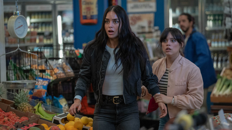
Directed by Radio Silence's Tyler Gillett and Matt Bettinelli-Olpin, "Scream VI" follows Sam (Melissa Barrera), Tara (Jenna Ortega), Mindy (Jasmin Savoy Brown), and Chad (Mason Gooding) six months after the event of 2022's "Scream." Tara wants a "normal" college life filled with bad decisions and keg stands, but Sam's overprotectiveness — and questionable bloodlust — pushes a wedge between them. Internet culture has turned Sam into commenters' favorite pin-cushion for barbed insults, as they believe she orchestrated the latest murders to hit Woodsboro. Once Ghostface strikes in the Big Apple, Gale Weathers (Courteney Cox) can't help but lend her expertise — aided by the long-awaited return of Kirby Reed (Hayden Panettiere) from "Scream 4."
This week, I had the chance to delve into what makes 2023's "Scream VI" a unique cut above the rest during an interview with cinematographer Brett Jutkiewicz ("Stranger Things," "Ready Or Not"). We explored how the film crew cultivated such a claustrophobic atmosphere, the challenges behind the film's killer set pieces, and more.
Note: This interview has been lightly edited for clarity and brevity.
'The killer could really be anyone, anywhere, at any time'
My first question is around how you and the directors capture the tension in this film. In previous "Scream" films, it's a bit more centering around isolation, right? No one can see you or hear you or you're further away from other people — like Casey's chase sequence, where there's that distance of not being able to reach her parents but being so close, which makes it terrifying. But this one is more about claustrophobia, the idea that everyone's around you, so really anyone can be the killer. I want to dig into how you approached that and how maybe that played into your choice to use spherical lenses for a grittier look and to be operating more in low lighting. How did that approach factor into those choices?
One of the first things that stood out to me reading the script was this change of location for the franchise. This is a very new different environment that the story was taking place: It's New York City! A "Scream" movie has never been set in a city like that. So that stuck out to me immediately reading the script and started to get me thinking about how we can embrace this new location for the franchise and create something that is tense and exciting and a little bit different than what has come before. Talking to the directors, we certainly talked about how to create an environment that feels threatening, that feels like danger can be lurking in every shadow, around every corner. At the same time, you're in a place where there's so many people around, which is very different.
There isn't that sense of you're isolated in a suburban home and the threat is outside and trying to get in. It's more like the killer could really be anyone, anywhere, at any time. So one of the things that I suggested to the directors early on is looking at a lens change from the previous film. All of the previous films had been shot on anamorphic lenses, and I suggested for this film we look at testing spherical lenses. Really, the difference for me is the spherical lenses just have a little bit less artifice than the anamorphic lenses.
'What the spherical lenses do is that it's slightly more like how the eye sees'
People love anamorphic lenses because of that quality that it has, that filmic quality that feels...
Softer?
Yeah, it's a bit softer ... it just has another layer of texture between the audience and the movie. What the spherical lenses do is that it's slightly more like how the eye sees, slightly more true to reality. I thought it would be an interesting way to embrace this new location and have a slightly grittier feel to it, strip away a little bit of that artifice and really put the audience in the perspective of the characters and in the environment. That was a change that we had made and was a big thing that we talked about early on.
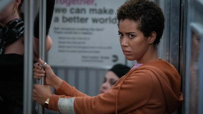
We did some testing and narrowed it down to this great set of Cooke [Optics] spherical primes. Beyond that, in the lighting, trying to create mood and contrast, but also give it a heightened naturalism, so things feel natural. They fit in the world, but there is this heightened element to them. The subway scene, for instance, with the flickering lights: I live in New York, I'm from New York, and they don't flicker like that anymore, certainly. But it's all about creating a heightened experience for the audience. So looking at what's happening in the scene and the emotional content of what's going on with the characters and trying to elevate that a little bit and create a visceral experience for the audience.
About that subway scene: I read that you rigged hundreds of lights to flash, to give the sensation of movement as the subway car is moving, which is fantastic. It feels that way — I live in Boston and I felt like I was on the metro. I would love to hear about testing how to play with that lighting to go on and off because it's such a great way to build tension, but I imagine it's something that you have to play with a bit to get the pacing right.
Yeah, the subway sequence was probably the sequence we talked about most in prep. Huge logistical challenges. Obviously, we were shooting in Montreal and not New York, so there's a lot of discussion about how we were going to achieve this very complex sequence with not only a moving train, but a train that pulls in and out of multiple stations throughout the sequence. So what we landed on was, Michele Laliberte, our production designer, and her team actually built a subway car entirely from scratch. [They] built a platform about as long as the train car. Our special effects team was able to pull it in and out of the platform to have it move out of the shot when the characters get separated, and which is amazing and they did a great job.
'We surrounded both sides of the car, about 70 feet of lighting on either side'
Whoa!
The special effects also rigged it to shake as it was moving, which was really helpful because we were shooting all of that handheld. You really feel it when it comes to a stop or when it's moving. All the people in the subway sway back and forth and it really gives you a sense of motion. Then from the lighting side, we talked a lot about different options for this and eventually landed on doing these chase lights. So essentially we surrounded both sides of the car, about 70 feet of lighting on either side, with multiple rows of light that my gaffer, Eames Gagnon, he, along with our programmer, created these chase sequences of these lights, so that they would move at different speeds and move in different patterns. It had to feel natural and not repetitive.
So we had one sequence of lights going at one speed and another going in another. So it created a little bit of randomness and chaos in the lights and the lights going by. There was a lot of testing that was involved in that. We had a very thin black netting fabric between the window and the lights, which just blurred the lights on camera just a little bit. You can't notice it, but definitely when you're seeing the light actually on camera, it softens the look of it. So it's less apparent that it's just a row of lights and it feels more like a train's moving, passing these lights going by.
Then the flicker effect was something we knew we wanted to do. I think it's even scripted in certain areas. We were able to set it up in a way that I was able to be on a walkie-talkie with the board operator. I could just flicker on command and flicker to fully off and come back on, or just a quick flicker. So it was great to be able to watch the performances and both the directors and I would be calling out when the lights should flicker. So it really gave us so much control. There was some discussion early on like, "Oh, can we actually do this on a real subway car?" I'm so glad that we wound up doing it the way that we did just for that control and to be able to build that tension with the flickering lights on the fly like that.
'Luckily, we got that in one take'
Yeah, it's excellent. Also, there are so many good chase scenes in this film. The one I'm the most curious to hear more about is Gale's chase scene. It's very hard to shoot a chase scene around walls, because there's cement in the way! You have to think of how you're going to peer in and out of that and not lose pacing. I think it's one of the standout moments of the film.
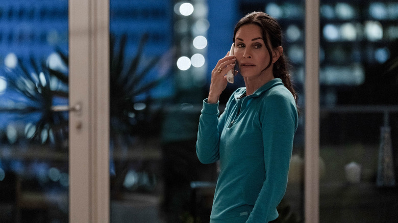
Oh, cool. Yeah, the Gale chase scene was interesting. We found that location fairly early on in our location scouting and fell in love with it. We loved the city view and the opportunity to go outside onto the balcony for a part of the chase, which was great. It really started just looking at the location first. A lot of the sequence was in the script, but before you know where it takes place, it's really impossible to visualize it and work it out. So it was a coordination between myself and Tyler and Matt as well as our stunt team. The stunt team did a little bit of work in there early on to pre-visualize some of the ideas they had for the chase and then the directors and I took that.
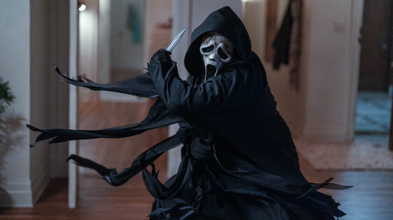
What we wound up doing was creating an overhead diagram of the space and plotting out exactly where the Gale and Ghostface would move in the space and how the choreography would progress through the space. That was important for us, that it really felt like it was progressing throughout and getting more intense and more scary as it goes. There's a little bit of cat and mouse, but then there's a little bit of straight fight choreography as well. The bookcase that Ghostface throws Gale's boyfriend through was built by the art department and put into the space. So that was added, which was amazing and was able to break away like that. Luckily, we got that in one take, so we didn't have to rebuild the bookcase after.
The big support columns in the space, when we first looked at it, we were like, "Oh, we're going to have to deal with these big ugly columns." But we wound up using them to our advantage and creating some choreography around them. But it was a challenge, since it's a practical location, we had to shoot at night for the most part. There were some parts where we were able to start a little earlier during the day and just black out the windows for things where we weren't really seeing out the windows. But they were long nights ... we were there for three days. On the last day, we shot all night and we were still shooting as the sun was coming up. We had to pull down the blacks outside the windows at six in the morning when the sun was coming up. But I'm really happy with how it came out. I think it's quite tense and scary.
'Once we found the theater location, it really gave us more ideas'
Were there any kills that either didn't make the cut or on paper there was a plan for how it would happen, but then once you got on set and looked at how the shoot is going, it just pivoted into a different direction?
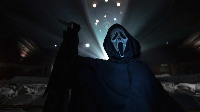
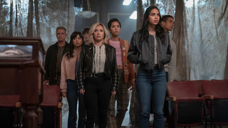
Yeah, I think one example of that is the movie theater shrine. It was always in the script as this shrine to Ghostface with all of the props and the elements in it. But once we found the theater location, it really gave us more ideas. And the idea of the projection came out of the discussion of the location because we found this great theater and then the directors and the writers started thinking about different ways to use it that maybe weren't originally in the script. They came up with this great idea of including this projected material. So that became such a big part of the look of that sequence at the end of the film. It's hard to imagine that actually wasn't really originally in the script for the ending of the film.
That's an example of something that evolved. What's great about Tyler and Matt and is that they have such a close relationship with Jamie [Vanderbilt] and Guy [Busick], the writers. So they can adjust and create things as we're prepping and just come up with these fantastic ideas. It's never like we have to square peg into exactly what's on the page. They're very collaborative and can just look at what we have in front of us in terms of location and create something that's even better, maybe, than it was originally.
'We needed a construction crane to lift the camera crane onto the roof'
I love Anika's (Devyn Nekoda) ladder scene, so I would love to know a detail about shooting that viewers wouldn't expect that went into building that moment.
Yeah, I think that sequence is interesting because it's a combination of a practical location and a stage build. So basically, when we're outside and we're seeing all the wide shots of the space, the shot from overhead looking down, that's all on the real location. We found the exterior real location first, and the art department built the top two floors actually on stage, the exterior of that. So we're constantly cutting back and forth between the actual location and then what we built on the stage. So the challenge there was just making sure everything matched and it felt seamless. You couldn't tell the difference between when we were on stage and when we were on the actual location. At some point in prep there was some talk of, "Well, for the overhead shots, can we do that on stage with just green screen below?" Credit goes to Matt and Tyler pushing to do that stuff on the practical location because I don't think you can ever really get that look with visual effects. It was logistically challenging.
We had to bring a crane up onto the roof. We needed a construction crane to lift the camera crane onto the roof, so it was a challenge. David Dinel, my key grip, and his team did a fantastic job bringing that all together. So we could just tell them where we wanted the camera and they made it happen. I think that sequence, it's such an important sequence in the film. It really sets up just how brutal Ghostface is. So we, as with the whole film, really wanted to make it feel grounded in reality.
I talked a lot about trying to avoid "impossible angles" where it would be impossible to get those angles on the real location as just a guideline of how we were shooting it on the stage. We broke that a little bit here and there — just because we needed some of these intense close-ups. But that was the starting point. If we were shooting this all on a real location, where could the camera actually be? I think going into it with that mindset helped give us some grounding, just an anchor to how we wanted to approach how that scene looked.
"Scream VI" is now playing in theaters.
