14 Animated Movies That Innovate With Style And Technology
Animation is a medium of movement. Shapes, lines, light, and colors come to life. Filmmakers constantly find new ways to move those elements on-screen in the hopes they will move you. The technology has evolved exponentially since "Humorous Phases of Faces," the first publicly known animation, debuted in 1906. Innovations have transformed how animators draw, paint, photograph, render, and edit their films. New generations have transformed how animators utilize the medium to express themselves.
Animation is the freest form of expression in cinema. Live-action filmmakers are limited by their technology, while animators can draw anything that comes to mind. That freedom allows filmmakers to explore difficult subjects while keeping them approachable and accessible to children and adults. They can be about the nearing of death, fear of loneliness, overcoming depression, violent revolution, and the creation of Earth. We put together a list of 14 movies that used innovative styles and technology to push animation and film in new directions.
Spirited Away (Drawn to life)
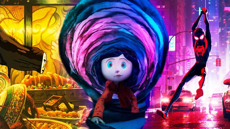
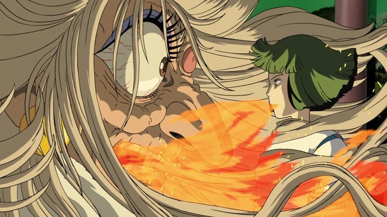
Hayao Miyazaki's pen is a portal to fantastic, living worlds where your face feels the sun, you smell the flowers, and you crave the sashimi. His hand-drawn approach to filmmaking makes Studio Ghibli's movies iconic. "Spirited Away" is his most celebrated, winning an Academy Award and scoring 97% on Rotten Tomatoes. Roger Ebert called it one of the finest films in animation history, praising how the movie fills every frame with "generosity and love." During an interview with Ebert, Miyazaki said, "Everything starts with the human hand drawing." Miyazaki preaches pen and paper but recognizes the benefits of computers. In one scene, he adds that the hand-drawn flowers are computer animated to "give them depth." Miyazaki believes digitizing his hand-drawn cells can enrich their visualization.
Another tool that Miyazaki wields like a master is pace, inserting emptiness, or "ma," that allows you to absorb the animation. "If you just have non-stop action with no breathing space at all, it's just busyness," Miyazaki says, "If you take a moment, then the tension building in the film can grow into a wider dimension." His work on "Spirited Away" differs from his other films. Instead of feeling the sun, you feel the dirt caked on Chihiro. You smell the stench around a polluted river spirit. You're disgusted by the gluttonous mounds of sashimi. Miyazaki's pen is a portal, but the worlds he draws feel grounded in our reality and evoke reactions that most filmmakers cannot.
The Triplets of Belleville (Sketchpad rhythm)
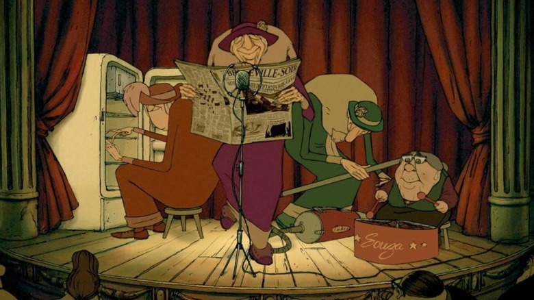
"The Triplets of Belleville" feels like you're flipping through the pages of a sketchpad. It ignores and even rebels against modern animation standards. Director Sylvain Chomet told Animation World News, "Animation is like a manifesto. You have a style, a technique, but it is an art and you express yourself through that art." "Triplets" has no dialogue and a flimsy narrative but you're pushed forward by an inertia generated through the fusion of music and handcrafted art. The opening scene even features a formula honoring Einstein's theory of relativity, which suggests time and space are distorted by motion. "Triplets" is in constant motion with dance, musicianship, cycling, wagging tails, and drooping body parts.
Chomet told Computer Graphics World that he meticulously penned every storyboard to show the animators where the characters need to be in frame. His crew followed his game plan — and his rebellious spirit. Composer Benoît Charest recorded music using appliances that characters use in the film. Animators brought in a dancer named Sandy Silver to time out complicated hand-clapping routines and other choreography. Production designer Evjeni Tomov drew all 800 backgrounds and checked every frame for blocking to make sure the animation matched the music. Chomet told BBC he did rely on computer graphics for "the boring stuff," which gave animators more time for "enjoyable elements" like character acting. Chomet's orchestration of dedication keeps the film swaying and snapping despite a reliance on animation techniques that mostly faded long ago.
The Mitchells vs the Machines (Welcome to Katie Vision)
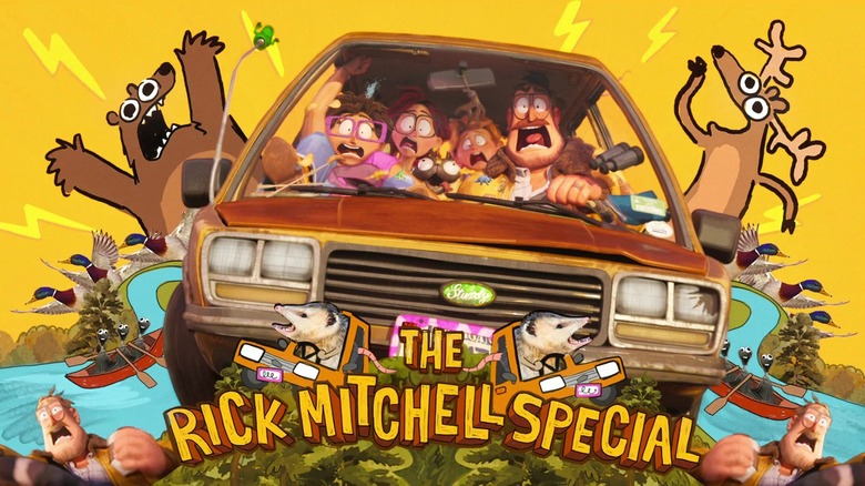
We adults see our lives as wonderful paintings, both tragic and beautiful. When kids come along, they spray paint and slap stickers on our perfect visions. It's not until we adults realize the kids' additions improve our art that we become happy parents. "The Mitchells vs the Machines" captures parental growth like no other film. Hundreds of artists spent years creating its 3,000 shots. Visual effects supervisor Mike Lasker told Computer Graphics World the team had to develop new techniques to create Mitchell's hand-painted world and a robot world that felt A.I.-designed. The team did a brilliant job; the art is wonderful, tragic, and beautiful. It's also not what makes the movie stand out.
Katie Vision gives "The Mitchells vs the Machines" an art style that bursts with character on-screen (and coffee table). Character designer Lindsey Olivares toyed with the idea that while the audience is watching the movie, Katie is editing and adding effects. The idea earned her a new role: production designer. "There's a young energy and freedom," Olivares says, "that comes from taking a very high-quality final frame and drawing directly over it like a teenager." Lasker says her idea "gave the film a home movie feel" and "helped connect the audience to Katie as an artist." In an industry where A.I. could start to muscle out humanity, it's wonderful to see filmmakers whose innovations show that you cannot emulate the artistic ingenuity of humans.
Yellow Submarine (Interdimensional acid trip)
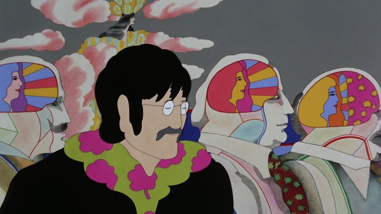
Experimental. Psychedelic. Iconic. "Yellow Submarine" is a pure dose of Beatlesdom that modulated the collective consciousness of the animation community. It encapsulates the mood and tone of the 1968 Beatles, yet the Beatles had little to do with it as they were overseas during production. Heinz Edelman designed the fabulous four to look like they were ripped from the Sgt. Pepper's Lonely Hearts Club Band album cover. Director George Dunning and his animation crew made them dance. They devised innovative techniques to make cutouts look three-dimensional and fit in with the rest of the film. The documentary "The Beatles Mod Odyssey” smartly points out that the animation ranges from "storybook simplicity to pop art and psychedelic shimmer."
Edelman was inspired by the Beatles' "modern innocence" when he devised the film's iconic art style. He told TheBeatles.com their music uses "collage elements from other modern styles and more classic elements into what is essentially pop music." The inspiration isn't lost on former Pixar director John Lasseter, who says the film "embraced the exploratory spirit of the '60s in its use of experimental animation techniques, like the mixed media ... the film's technical innovation, however, always rested on fundamental principles of great design." The crew looked to Picasso's use of space and line when they animated movement. "Satire has become a part of our daily diet," Dunning said. As you can imagine, when the Beatles returned from overseas they found a psychedelic masterpiece that they loved, loved, loved.
Snow White and the Seven Dwarfs (A planar shift)
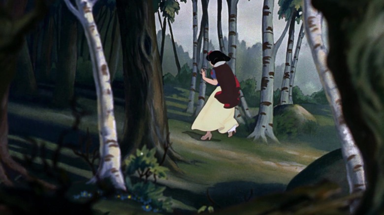
Don't go in the woods is a trope that Disney loves to employ almost as much as killing off parents. When watching "Snow White and the Seven Dwarfs," you see why the studio fell in love with forest settings. The forest offers a visual dimension not seen in animation up to this point. The trees come to life; they draw your eye forward and back, and you feel that Snow White is lost and could be in danger. The authors of "Snow White and the Seven Dwarfs: New Perspectives on Production, Reception, Legacy" say the woods serve the narrative by adding drama: "The forest that pervades Snow White and envelops its characters is anything but an inanimate backdrop."
Disney pulls off this cinematic feat using a multiplane camera. It allows animators to stack elements of a single image on different planes. In his book "Animation: Genre and Authorship," Paul Wells talks about how the crew used it. He says, "Each pane would effectively be a different 'plane' of action, and could move from side to side, and back and forth to facilitate the maximum degree of authentic movement through space." In 1937, the technique brought moviegoers into the world, into the forest, into the castle, and into the dwarves' cabin in a way that hadn't been achieved before. Multiplane cameras launched Disney into an unprecedented five-year Golden Age of film that also included "Pinocchio," "Fantasia," "Dumbo," and "Bambi."
Spider-Man: Into the Spider-Verse (Into the multi-style)
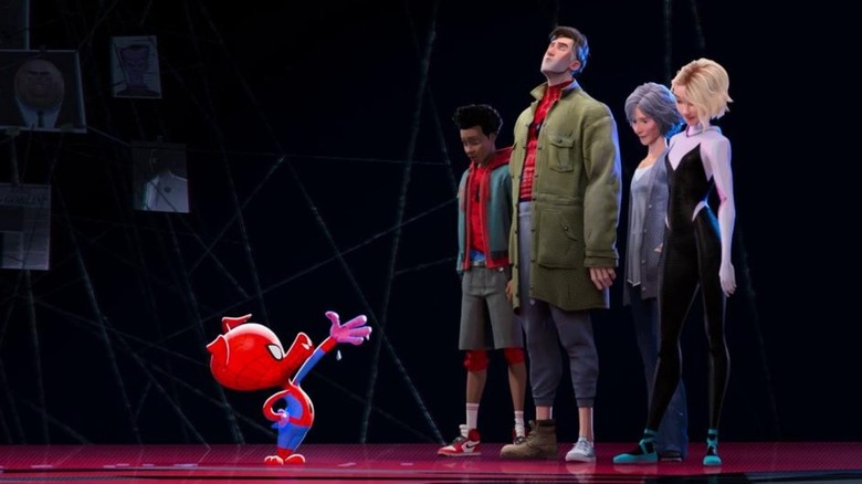
"Spider-Man: Into the Spider-Verse" feels like a coherent collage of comic book cutouts. Elements of anime, noir, satire, impressionistic painting, modern graffiti, and CG realism are side-by-side. The result isn't just coherent, it's amazing — NO! — sensational — NO! — spectacular — NO! — it's all of those Spidey-tastic adjectives packed into one movie. Director Peter Ramsey assembled the ultimate team of artists and animators, telling The Verge they thought back to old "silk-screening and printing-press ideas" used in publishing to form a graphic novel style from CG.
Artists painted the city to serve as a grounded backdrop. Character designers created each "Spider-Man" as they would exist in their own world. They're then cut and pasted into Miles Morales' timeline. CG supervisor Mike Lasker told Filmmaker U that advanced lighting techniques made it work. "They all need to exist together," Lasker said, "reflect off of the floor, get hit by lights, all the directionality has to line up — otherwise they look completely separate from each other." To get the graphical style they wanted, the crew took common CG tools like ray tracing, "broke" them, and learned to use them in new ways. The approach allowed each animator to inject their own personal flair into the film's 3,000 astonishing scenes. Our friendly neighborhood animators are back at it with a sequel on the way. Producer Chris Lord says the sequel "Across the Spider-Verse" is something you've "never experienced before." Is anyone else's spine tingling in anticipation?
Fantastic Planet (Surreal realism)
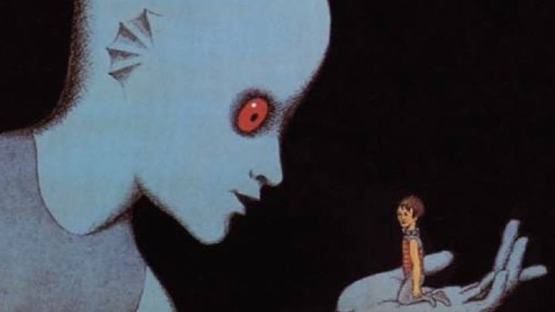
"Fantastic Planet" director René Laloux describes the film's surreal drawings as "Rabelaisian" in a Criterion Collection interview — and the obscure reference is a spot-on description. The film is an allegory about humans being pushed to the bottom of the food chain and shows the impact on humans with frank brutality. In a separate Criterion Collection interview, artist Roland Topor says about the film's beings, "The way I use them pulls them from reality and sets them in a world where nothing is fatal ... it's a gratuitous game without consequences." Topor came up with the character designs and prepped the drawings before they were finalized in Prague. The designs fit the Rabelaisian description; they're bawdy and unique, but the initial design is not what makes the animation pop on-screen.
When Laloux met with his Czech animators, they showed him close-ups of the character drawings in stop-motion. He called the animation effect magical and decided that's how he would make the film. The designs stand out because of the contrast between the paper's colors and the black lines. Laloux says the effect of contour and shadow "gives it a life that a line printed on celluloid and filled in with solid colors on gouache could never achieve." Laloux won the Special Award at Cannes in 1973 for "Fantastic Planet," and was also nominated for the Palme d'Or award.
The Rescuers Down Under (CAPS to the rescue)
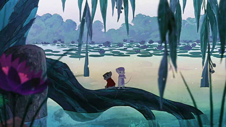
"Who's going to want to see a sequel to 'Rescuers?'" animator Mike Gabriel told Collider when reflecting back on the 1990 film. In the '80s, Gabriel didn't realize "The Rescuers Down Under" would change animation history and prop up Disney for the next half-century. The sequel to "The Rescuers" made just $27 million but the animation is beautiful. Roger Ebert praised Disney animators as "back in top form." The studio accomplished this by developing an innovative computer animation production system called CAPS. It allowed animators to utilize multi-layered shots like live-action movies.
You've seen CAPS at work powering the ballroom scene in "Beauty and the Beast" and the stampede in "The Lion King." "Rescuers Down Under" is basically a CAPS beta test that caused an incredible amount of stress. According to Collider, associate producer Kathleen Gavin says the CAPS implementation ran into "constant" setbacks that led to at least one cry. Yet, Gavin and her crew's work paid off. System developer Randy Cartwright called the implementation of CAPS one of the highlights of his career because of its impact on later films: "The look of those pictures, having the richness and the colored lines and the tones and the shade and the shadows and all the different moving elements could never have been done that way without the system." CAPS opened up a whole new world for Disney animators to make films like "Aladdin" and "Mulan" — which are at their best in CAPS-animated form.
Your Name (Blurred lines)
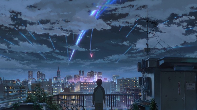
Director Makoto Shinkai embraces tradition but doesn't let it hold him back from utilizing new animation technology. His 2016 film "Your Name" is stunning; there's no surprise it's the third highest-grossing anime film of all time. The wide shots of Tokyo look like they're taken by a small army of HD camera drones. The countryside is buzzing with life. It can be hard to determine what's created by computers and what's hand-drawn, which is on purpose. Shinkai uses a blend of 2D and 3D art sources, because, as he told MovieMaker, the most experienced artists still utilize pen and paper today. He would like to see more art drawn with pen and tablet to streamline the process.
Streamlining his art would help. "Your Name" bombards you with quickly edited images of people, places, transportation, food, and art. In the Blu-ray commentary, Shinkai says the background, characters, and 3D effects are all hand-drawn first. Other elements, such as birds and vehicles, are drawn using Pencil+. Shinkai's animation crew then blends the art to make it appear to be from the same source. The attention paid to every detail on every frame is how "Your Name" can choreograph celestial events, dining montages, social media posts, and traditional dancing without missing a beat. It is a stunning film that I did not get to see on the big screen. I won't make the same mistake with Shinkai's next film "Suzume."
Coraline (Many faces of Coraline)
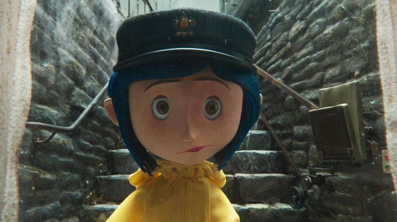
Coraline's freckles. You can connect those little dots to a new approach of stop-motion animation for the film "Coraline" and its studio Laika. The studio's director of rapid prototypes Brian McLean says he negotiated the number of freckles that could be hand-painted on Coraline's face. However, once they got their hands on a Stratasys J750, it changed everything. "We had the ability to suddenly do things that had never been conceived in stop-motion before," McLean said. Do things they did, many times over. Animators had access to 6,300 replacement pieces for Coraline's face; the number of freckles didn't matter anymore.
"Coraline" became the first feature-length movie to use a 3D printer for replacement faces. Laika facial animation designer Martin Meunier told The Hollywood Reporter they wanted to "keep that authentic, handmade look — not make it look too 'computery.' That was a big deal." It seems to have worked. "Coraline" author Neil Gaiman said about the movie, "I think the thing that impresses me most, because it's the thing I hadn't realized, everything you see on the screen, somebody's made." About 450 somebodies, to be exact. Their hard work micromanaging each frame in "Coraline" and four other stop-motion classics helped make Laika an animation icon.
Toy Story (To CG and beyond)
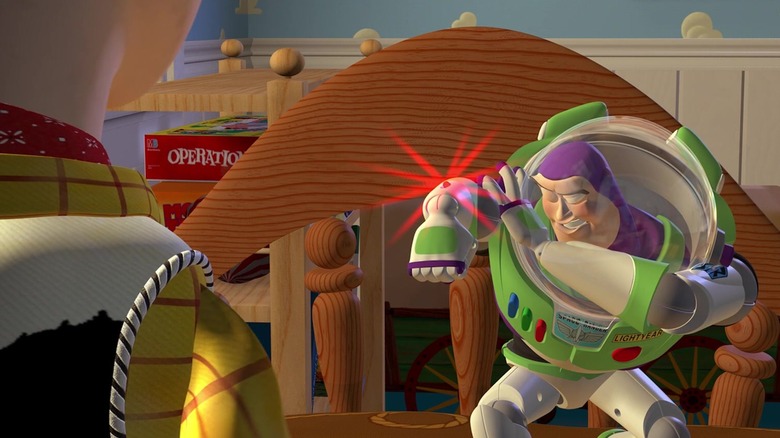
When you're staring into the infinite void of space, you're reminded of your limitations. The Pixar team behind "Toy Story" saw the infinite possibilities of computer graphics when considering its animation style, but decided to pull back a little. "Everyone was trying to create computer animation tools to make something that looked absolutely real," director John Lasseter told an Academy Award panel in 2015. "Now, I'm going to step back from reality [to] produce something that the audience ... knows 'this doesn't exist.' And then make it as real as possible."
The Pixar team used standard movie lighting and camera techniques, but allowed the main characters to remain cartoonish, or toy-like. They wanted "Toy Story" to exist in the space between hand-drawn and live-action. Art director Ralph Eggleston added that "the lighting and textures" made sure the film is "somewhere in the middle." One tool that helped fill that space is Motion Blur, which blurred the background to simulate real photography. Pixar RenderMan developer Edwin Catmull says unblurred backgrounds are distracting. "You don't see it consciously," he says, "but subconsciously you know something's wrong. We had to solve the problem to make it so the computer graphics could be used in filmmaking but in doing so, we also enabled the special effects revolution." More than two dozen fantastic films later, you can see the imprint Pixar has left on the entire industry.
Puss in Boots: The Last Wish (Hand-painted fairytale)
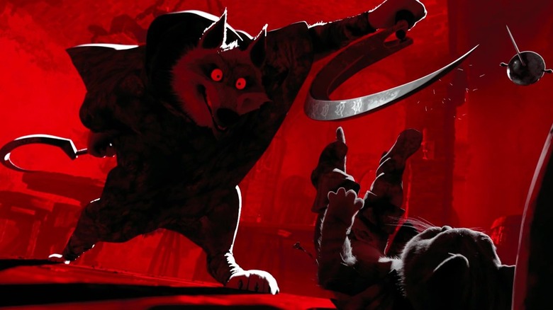
Animation changed drastically since the last time Puss strapped on his boots. When director Joel Crawford signed up for "Puss in Boots: The Last Wish," he saw a window of opportunity and snuck through with the first paintbrush ever to touch the "Shrek" universe. He told Variety, "You can see the brushstrokes and it looks as if you're in a moving painting." He believes the use of some hand-painted techniques wrestled back control from computers to establish more dramatic pacing. At the INBTWN Animation Fest, Crawford said, "In moments that are fantastical ... using the stepped animation ... it feels more exciting than life, so you can push things. Then in grounded moments, where Puss is feeling fear ... it's very real."
In the movie, Puss is down to his last of nine lives with a dangerous predator on his tail. Production designer Nate Wragg helped Crawford determine when to use CG and when to transition to the simplified painterly feel. Wragg told Animation World Network that removing detail can make the animation look cheap, which is why he took measures to maintain sophistication. "We made sure that the paint strokes and textures and paint splatters," Ragg said, "still had a high level of detail and fidelity in those applications, even if they were more artistic." Painterly effects also expanded the color palette for more vibrant adventures and visually striking scary moments. The animation approach paid off with an Oscar nomination.
Belladonna of Sadness (Bewitching watercolors)
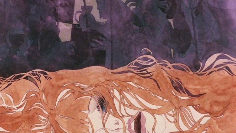
Vive la révolution! "Belladonna of Sadness" is a revolution that will not be televised — not with its extreme adult content. Kuni Fukai's hand-drawn art is enchanting and repulsive for a reason. "Belladonna" is loosely based on Jules Michelet's book "La Sorcière: The Witch of the Middle Ages." It's about a woman subjected to constant violence until she has an awakening, makes a pact with the devil, and inspires rebellion. The story is told by mostly slow-panned and zoomed camera shots of watercolor paintings. Often, the soft pastel watercolors are vividly assaulted by darks and reds.
It's a violent journey, expressed through art nouveau painting styles similar to Gustav Klimt and pop art popularized by "The Yellow Submarine." The art viscerally symbolizes the trauma faced by the women's liberation movement that was gaining momentum in Japan at the time. Expert colorist Caitlin Díaz, who helped restore the original prints, says the hand-drawn artwork is "not only aesthetically pleasing, but also layered with themes of power, gender politics, and history." Because of the restoration, a new generation of cinephiles are able to see the film. Elijah Wood is among them. He told EW, "It's so unique, to blend traditional animation with these sort of tableaux paintings that the camera's passing over. It's really just unparalleled. I've never seen anything like it." Those are strong words coming from a guy who co-founded cult production company SpectreVision
Fantasia (The rite of animation)
In 1940, The New York Times called "Fantasia" the "most original and provocative film in some time." It may have been too much for audiences of the era who weren't ready to be "deliciously inspired" and taken on "imaginative excursions" as the Times writes. In the psychedelic '60s, though, the movie caught on with a new generation. The film experiment was no longer considered a misstep and would change the history of motion pictures as The New York Times and Walt Disney predicted. The film goes far beyond beloved dancing hippos and Mickey Mouse sporting a wizard robe.
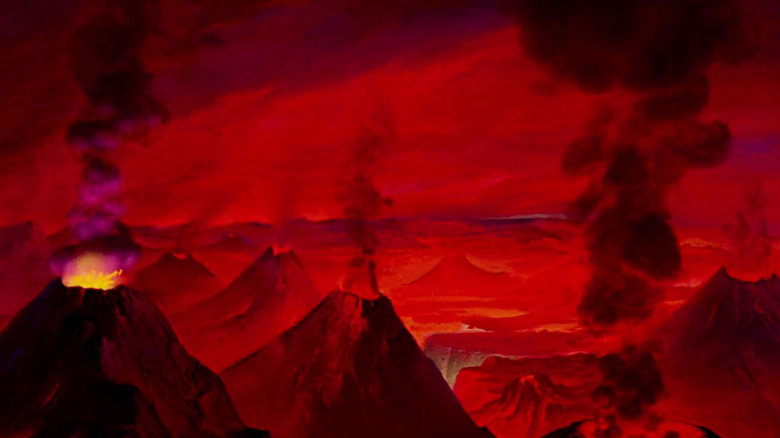
"Fantasia" relied on the same multiplane camera techniques used in "Snow White and the Seven Dwarfs," but advanced them to introduce a film experience that was unparalleled. In the documentary "The Fantasia Legacy: The Concert Feature," animators and historians point to innovations like filming high-contrast black and white stock of burning oil rags for smoke effects, turning cameras upside down to film paint being poured into water to mimic gasses, and pumping air into vats of mud to simulate lava. Film theory professor Colin Williamson says it's remarkable that Disney developed innovative animation techniques that could emulate the "spontaneity and contingency of movements and transformations taken directly from the natural world." Or, as Barnum Brown (the paleontologist who discovered the Tyrannosaurus) reportedly said, "Mickey Mouse had to be created so we could see the creation of the world."
