Pink Floyd — The Wall Is A Metaphorical Masterpiece Of The Abstract Animated Medium
(Welcome to Animation Celebration, a recurring feature where we explore the limitless possibilities of animation as a medium. In this edition: "Pink Floyd — The Wall.")
The first time I watched "Pink Floyd — The Wall" was also the first time I experimented with hallucinogenic drugs. A '90s kid to the core, I had heard countless stories from my parents and their friends about how life-changing it was to experience the film for the first time and I wanted a little taste of that. The joke's on me though, because I have aphantasia (meaning, when I close my eyes, I cannot visualize or "see" with my mind's eye), and hallucinogens are one of the only ways folks like me can actually visualize with my eyes closed. Needless to say, I totally freaked out and had to lie down for what felt like approximately three days. Regardless, 10/10 would do again in a heartbeat.
"Pink Floyd — The Wall" is a dramatization of the legendary British rock band's eponymous concept album. Directed by Alan Parker ("Midnight Express," "Angel Heart," "Fame") the psychological musical drama incorporates animated elements throughout a live-action story. The screenplay was written by Pink Floyd vocalist and bassist Roger Waters, with Bob Geldof of The Boomtown Rats fame playing a rockstar named "Pink," who is driven mad following the death of his father and constructs a physical and emotional wall to keep himself safe. The animated segments were directed by renowned cartoonist, Gerald Scarfe, who would later go on to serve as the production designer on Disney's "Hercules."
While animation only comprises 11 minutes of the runtime, it is so phenomenally incorporated that the scenes are typically cited as the most memorable moments of the entire film.
The perfect medium for prog rock
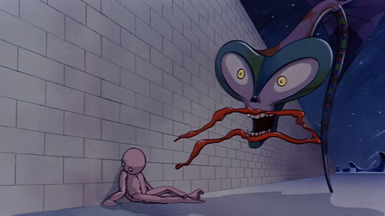
Gerald Scarfe's awe-inspiring animated segments in "Pink Floyd — The Wall" serve as the perfect argument for why animation is a medium and not a genre. The film is a dramatization of songs from the same concept album, but depending on how the song is presented, the impact is completely different. Once "The Wall" dives headfirst into animation, the self-loathing, pity, and emotional turmoil are presented in a manner of equal parts nightmarish agony and fantastical beauty.
Pink Floyd is considered by many to be the greatest progressive rock band of all time, and a big draw to the genre's style is in the poetic lyrics and experimental soundscapes that highlight the artistic process of music-making rather than what could be replicated on stage. It's commonly explained as music for listening instead of music for dancing. Part of the enjoyment of listening to prog rock, or concept albums in general, is listening to the lyrics and creating an image in your mind of the words. Because Scarfe's visuals are often abstract, it's a medium that lends itself to the imaginative environment of listening to prog rock. The visuals are not a literal interpretation of the lyrics, and instead evoke sensations rather than talking directly to the audience.
The beauty of prog rock is that it allows the listener to project their own interpretation of the material, which is a lot harder to do with the live-action segments that are a bit more traditional in their adaptation. The abstraction of the animated segments is still visually weird enough for the audience to develop their own opinion on what it all means, and there are plenty of online forums dedicated to analyzing and interpreting what Pink Floyd and Scarfe were trying to say with these moments.
If you don't eat your meat you can't have any pudding
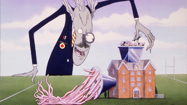
The animation in "Pink Floyd — The Wall" is executed using traditional hand-drawn techniques but presented in a variety of different styles. The one unifying factor, however, is the usage of manipulated characteristics. Faces are presented as more exaggerated or simplified depending on the character, and non-human objects or plants are often given personified traits to help blur the lines between fantasy and reality. The disproportionate visuals are often used to enhance or distort some of the elements of the live-action segments, like the return of the teacher and students as first seen during "Another Brick in the Wall." The grotesque visuals of children being literally thrown into a meat grinder are more visceral and graphic once shown in animation — as the teacher's twisted face distorts into something more spine-chilling than what the live-action version portrayed.
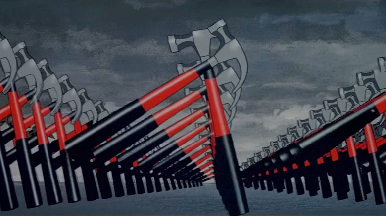
The animated segments are utilized predominantly to show Pink's psychological deterioration and capture his warped sense of reality in a way that just couldn't be executed as effectively in live-action. The film overall is a sadly still relevant exploration of themes of fascism, corruption, and abuses of power, but it's also a painfully honest look at a person's descent into madness. No disrespect to Roger Waters' script or Bob Geldof's shockingly good performance, but "Pink Floyd — The Wall" likely wouldn't have the continued legacy without the addition of the animated segments. Marching hammers, mutated sex flowers, the infamous trial sequence, and splattered skulls all serve as the delicious, memorable pudding of an extremely meaty film.


