The Mitchells Vs The Machines Pushed The Limits Of The Tech From Spider-Man: Into The Spider-Verse
In the beginning, there was "Toy Story." Pixar's first feature film set the standard for CG animated movies in 1995, and each successive film built upon that framework, whether made by Pixar, DreamWorks, or any number of their competitors. The tools and pipelines used to make these movies became holy writs, and breaking from them was unthinkable. Yet there were those who challenged the status quo. 2008's "Kung Fu Panda" featured an introductory sequence in 2D, directed by Jennifer Yuh Nelson. The staff of 2015's "The Peanuts Movie" worked hard to translate the charms of the original comic strip into beautifully textured CG. But "Spider-Man: Into the Spider-Verse" was more than just a challenger. Its release in 2018 was the animation equivalent of Martin Luther hammering his 95 Theses onto Pixar's door. There was no going back.
"The Mitchells vs the Machines" was tasked with following up on the most important animated film in recent memory. "Spider-Verse" had won the Oscar for Best Animated Feature, setting an extremely high bar for Sony Pictures Animation to try and repeat. The film was also released directly to Netflix, instead of in theaters, which made it harder for the film to find its audience with a smaller marketing campaign. Its groundbreaking style, though, marks it as a worthy successor to "Spider-Verse." It may have even been more challenging to make.
Leap of faith
The creators of "Spider-Verse" wanted to change the way that animated films were made. This was very difficult, as nothing similar had ever been achieved in CG animation. The team at Sony Pictures Imageworks had to build many of their tools and pipelines from scratch, but they had an advantage, which is that they knew exactly what they wanted to make: a living, breathing comic. Every choice they made and every person they hired was in service of this goal. Per Ramin Zahed's book "Spider-Man: Into the Spider-Verse – The Art of the Movie," the team used frame modulation to change the tempo of each character and scene. They built the world out of Ben-Day dots. Dark lighting is used to create atmosphere, bucking the trend of other brightly-lit animated films.
"The Mitchells vs. the Machines" had no such model to draw upon. The story was original, and there was no book or movie to take inspiration from. Many of the staff had never made a feature film before, either. Mike Rianda was the creative director on the first season of "Gravity Falls" and taught a class on Story at CalArts, but "The Mitchells vs The Machines" was his first full-length animated movie as a director. According to Variety, he recruited a "crew from the television world" together with recent university graduates to bring "The Mitchells vs. the Machines" to life. With the help of in-house staff like "Spider-Verse" VFX supervisor Mike Lasker, they hoped to once again reimagine what CG animation could look like.
A celebration of humanity
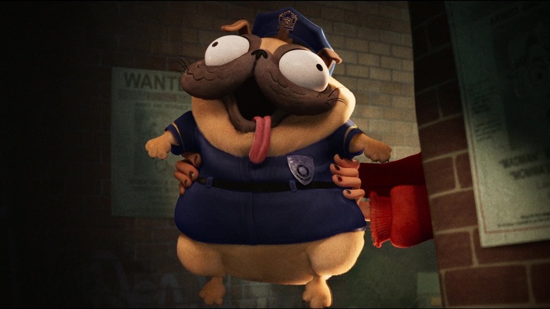
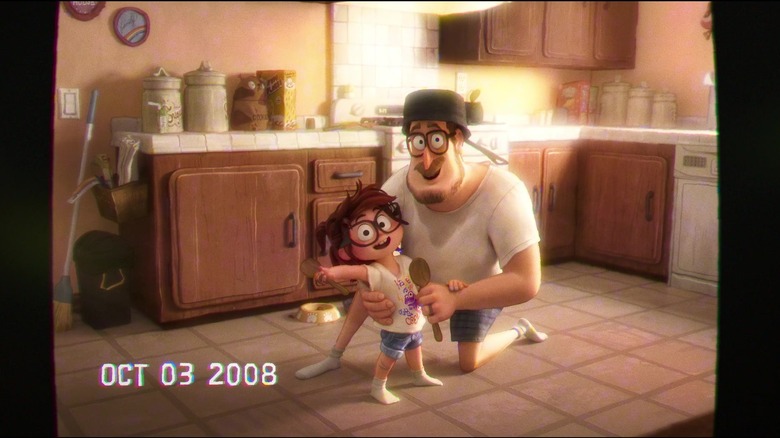
The theme that Mike Rianda's team settled on was a "celebration of humanity," per an AV Club interview. The humans of "The Mitchells vs the Machines" were rendered as living, imperfect illustrations. "You can see the paintbrush strokes and you can see the wobbly lines," said Rianda. By contrast, the world of the machines was built to be sleek and symmetrical. The great challenge of "The Mitchells vs the Machines" was to prove that a family like Katie Mitchell's could be beautiful in its own right. That handcrafted art, even made on a computer, could measure up against perfect technological replication. Says Rianda in IndieWire, "we wanted every sort of character to look like it was drawn by a person."
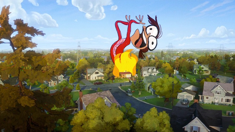
Of course, accomplishing this was easier said than done. Rianda and company had to find a way to integrate the 2D cartoons they loved with the framework of CG to make the film they wanted. As Mike Lasker says in an interview with SIGGRAPH, "creating the handmade world of the Mitchells versus the computer-made ... world" was a big challenge. "How do we have these two looks in the same movie and have our characters exist in both?" Designs, textures, and lighting all had to be just right in every scene so that the audience wouldn't be pulled out of the movie. This meant "adjusting the dials" constantly depending on the character and the location. Rianda's team had to consider every detail and its effect on screen. According to an official YouTube featurette, they "combined digital backgrounds and hand-painted elements" to build the world of the film. Trees and grass were stylized to ensure continuity with the character designs, and programs were built to replicate those elements as needed.
A world of brushstrokes
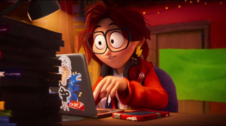
It was also essential that the characters themselves were just right. Supervising animator Tim Rudder says in an interview with Animation Mentor that squaring the "subtle and nuanced acting" Mike Rianda wanted with "distinctly cartoony designs" was difficult. Ensuring the googly eyes of the Mitchells family was endearing rather than terrifying required extensive testing and a steady hand. Any false step would destroy the reality that the animators fought so hard to create, transforming their movie from a "celebration of humanity" to an uncanny valley disaster.
The staff of "Spider-Man: Into the Spider-Verse" had already thought long and hard about the challenges posed by "The Mitchells vs. the Machines." In "Spider-Verse – The Art of the Movie," visual effects supervisor Danny Dimian is quoted as saying that "what's interesting about art is all the imperfections that go hand in hand with a human creating things." Sony had already gone part of the way towards realizing "The Mitchells vs. the Machines," but additional tools were needed. Over the course of production, Sony pioneered a new outlining tool as well as a new shader tool. These tools were used to mimic "the texture and variation of watercolor," according to the YouTube featurette.
By building the titular "Spider-Verse" out of Ben-Day dots, the animators replicated the method by which classic comics like "Spider-Man" were colored. Similarly, the world of "The Mitchells vs. the Machines" was composed of thousands of watercolor brushstrokes. In the SIGGRAPH interview, Mike Lasker discusses how if a character like Rick Mitchell happened to be "far from the camera, we might use bigger brushstrokes rather than little ones for clarity." This allowed the team to preserve the hand-painted effect, while simultaneously using technology to make the process of animation a little easier.
It should be like Katie did it
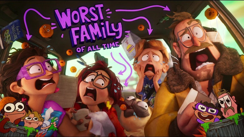
The great innovation of "The Mitchells vs. the Machines" is Katie Vision, the constant 2D doodles appearing on the screen of the film. These doodles were pioneered by Lindsey Olivares, the film's character designer and a talented animator in her own right. As Mike Rianda said to Deadline, "one weekend without telling anyone, she just stole some animation and drew on the screen ..." Katie Vision perfectly expressed the themes of the final film. It is a significant technical achievement in integrating 2D and 3D CG animation. It's also purposefully amateurish. "Conceptually and philosophically," said Olivares, "it should be like Katie did it." Katie Vision captures the same hopes and fears that Katie channels into her own art. It's an ever-changing visual joke, a means of expressing character, and a magic trick all at the same time. Olivares' invention is a true "celebration of humanity" in all its fallibility.
One year later, Pixar would release "Turning Red," the best of the studio's recent run of personal stories. The film is less visually ambitious than "Spider-Verse" or "Mitchells," despite its efforts to integrate 2D effects into its 3D world, but its incorporation of anime aesthetics and the emphasis on a tween's notebook scribblings as a gateway to the soul is right in line with how "Mitchells" treats Katie's art. The artists that made "Turning Red" refer to this process as "designing from her point of view." The pursuit of subjective reality, rather than objective reality, is the new frontier of 3D CG animation. Olivares got there first with Katie Vision, and all it took was a leap of faith from the bridge "Spider-Verse" built.
