See 'The Wire' HD Remaster Compared To Original Presentation
We started to get bent out of shape earlier this week when HBO announced that the aspect ratio of The Wire HD remasters would be set at 16:9 rather than the original 4:3 broadcast ratio. Series creator David Simon quickly weighed in to provide a great deal of information on the remaster process, and we learned that in most cases these remasters would be using more information from the original camera negative, rather than cropping information from the top and/or bottom of the original presentation.
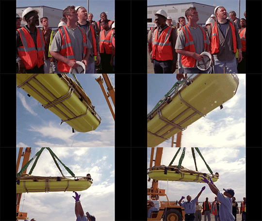
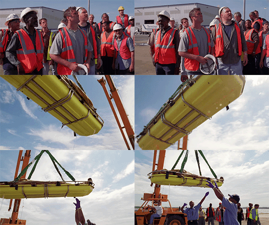
The gif above shows the basic result of this process, thanks to a couple example videos Simon has provided on his own site. Below, we've got a couple more examples, and some larger images you can check out to see the differences between the show's original presentation and the new HD remasters.
That gif above is a really rough image, but it shows you the basic differences between the original presentation, and the new remasters. Those images come from videos provided by David Simon. (via The Playlist.) Here's some more detail.
Look at this bit from one scene in season 2. The gif on the left represents the original broadcast presentation, while the one on the right is the HD remaster. (Larger gifs are here and here.)


David Simon explains the changes below.
(Note that his explanation and the end of the clip below is a season 2 spoiler, so be careful if you're concerned about that sort of thing.)
First, there were many scenes in which the shot composition is not impaired by the transfer to 16:9, and there are a notable number of scenes that acquire real benefit from playing wide. An example of a scene that benefits would be this one, from the final episode of season two, when an apostolic semicircle of longshoremen forms around the body of Frank Sobotka. Fine as far as it goes, but the dockworkers are all that much more vulnerable, and that much more isolated by the death of their leader when we have the ability to go wider in that rare crane shot.
Here are the two videos of that shot above, each one running much longer than the gif form.
That example represents one time where Simon thinks the 16:9 framing works particularly well for the scene. He talked about another one, from the very first episode of the show, where the new framing didn't automatically work as well. We ran this quote the other day, but here we'll do the same thing he's done on his own site, using the new video clips to show the differences he's talking about.
But there are other scenes, composed for 4:3, that lose some of their purpose and power, to be sure. An early example that caught my eye is a scene from the pilot episode, carefully composed by Bob, in which Wee Bey delivers to D'Angelo a homily on established Barksdale crew tactics. "Don't talk in the car," D'Angelo reluctantly offers to Wee Bey, who stands below a neon sign that declares, "burgers" while D'Angelo, less certain in his standing and performance within the gang, stands beneath a neon label of "chicken."
That shot composition was purposed, and clever, and it works better in the 4:3 version than when the screen is suddenly widened to pick up additional neon to the left of Bey.
Here's a first draft of the remastered scene:
In such a case, the new aspect ratio's ability to acquire more of the world actually detracts from the intention of the scene and the composition of the shot. For that reason, we elected in the new version to go tighter on the key two-shot of Bey and D'Angelo in order to maintain some of the previous composition, albeit while coming closer to our backlit characters than the scene requires.
And here's the second draft, incorporating the corrections he talks about just above:
There will be many more examples of this sort of thing, we're sure, as Simon indicates other similar issues came up during the transfer process.
But this is a good indicator that, while the HD version of The Wire will certainly be different, it might not be bad, and in some cases could actually offer viewers something new.
Edit: I've seen people talking about the fact that Seasons 3-5 of the show were shot on Super 35, with suppositions that there would be a change in the way the real estate of the actual negative was used as a result. But when Season 5 was about to debut, cinematographer David Insley said,
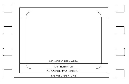
These later episodes of the show are shot Super 35, 3-perf, and that saves a lot of money because that means we're shooting about three quarters of the film we used to. But we're only using the 4 x 3 part, so we're losing the edges of the 16x 9, but it's less than we were using when it was 4-perf, so (the image is) somewhere between a Super 16 image and a standard 35 (mm) image.
In other words, the basic ratio of used to unused negative frame real estate wasn't quite the same as in the first two seasons. So there might not be as much space on the side of the original 4:3 frame to pull from, but there should be enough to widen the image to 16:9 with minimal cropping, and potentially without cropping at all, especially thanks to the ability to paint out unwanted crew and gear that might intrude on the very edge of the frame.
