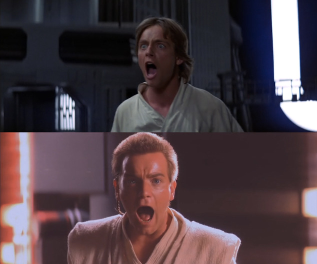
VOTD: 'Star Wars Poetry' Highlights The Visual Symmetry Of The Sci-Fi Saga
In the months leading up to Star Wars: The Force Awakens, there's been some renewed bashing of the prequels, mostly because they feel so far removed from the original trilogy. From the visual effects to the storytelling, there's just something about the prequels that feels off.
However, by using clips from the original trilogy and the prequels compared to each other and played simultaneously, a new video called Star Wars Poetry shows how the prequels share more similarities with the original trilogy than you might think. Specifically, between the two trilogies, visual symmetry becomes apparent and even impressive.
Here's Star Wars Poetry from Pablo Fernandez (via The Playlist):
Honestly, this actually makes me respect the prequels just a little bit more. They're still inherently flawed and suffer from George Lucas having free reign to do whatever he wanted with little to no supervision, but it's clear that he still had at least some vision when it came to making the prequels.
In fact, it's the visual of the prequels that are probably the trilogy's greatest strength. Sure there are far too many digital effects used that make everything look a little too shiny and new (this has been explained away by the fact that it's far in the past before parts of the galaxy have aged and fallen into disarray), but there's still some solid work done when it comes to image composition.
And when piecing together some of the story beats that we've heard about in Star Wars: The Force Awakens, it's clear that there's going to be a lot of similarities between the first in this new trilogy and A New Hope. Whether that's done as much visually as illustrated between the prequels and the original trilogy remains to be seen, but we'll find out in a little over three months.
