Orange And Blue Shades Dominate In Movie Trailers, Too
By now, you're probably well aware of the trend toward blue and orange shades in movie posters — especially since, once you catch on, it's hard to un-see it. But have you ever noticed that those two colors dominate in movie trailers as well?
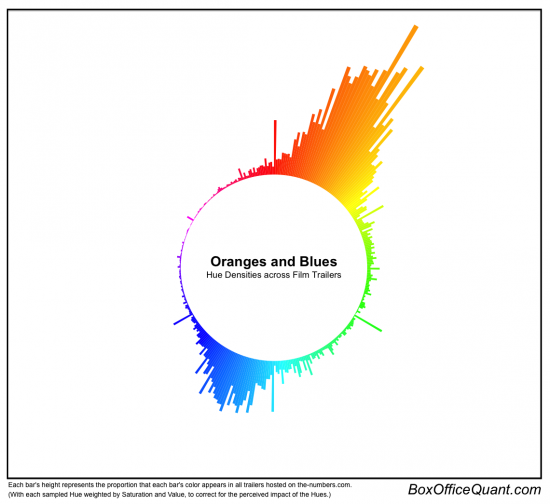
That's the finding of one analysis by Stanford University masters student Edmund Helmer, who compiled data from 312 different trailers for hue (color), value (distance from black), and saturation (intensity). Check out a nifty visualization and read more about Helmer's results after the jump.
Some people have commented and researched how often those colors appear in movies and movie posters, and so I wanted to take it to the next step and look at the colors used in film trailers. Although I'd like to eventually apply this to films themselves, I used trailers because 1) They're our first window into what a movie will look like, and 2) they're easy to get (legally). So I've downloaded all the trailers available on the-numbers.com, 312 in total – not a complete set, but the selection looks random enough – and I've sampled across all the frames of these trailers to extract their Hue, Saturation, and Value. If you're new to those terms, the chart below should make it clear enough: Hue is the color, Value is the distance from black, (and saturation, not shown, is the color intensity).
And here's a visual representation of the data he came away with:
Pretty! And very heavy on the orange. For a closer look, head over to Helmer's original blog post, where he has an interactive chart showing the average hues and values of each of the trailers he analyzed. It turns out Green Lantern is blue, Red is green, and that seen in these terms, Due Date and Tree of Life are practically the same movie. Who knew?

