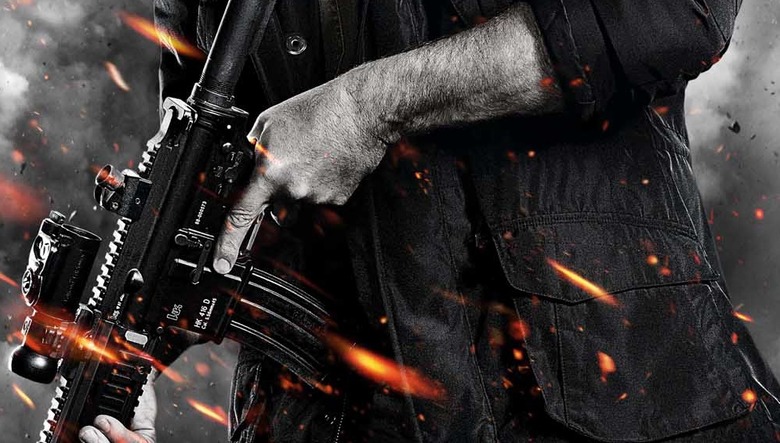
Movie Poster Design Trend: Hero Stands, Weapon In Hand, Before aCloudy Background, With Flying Debris, And Sparks
A few years ago, Justin Leduc created a web comic we published that opened the world's eyes to Hollywood's excessive use of orange and blue contrast on theatrical one-sheets. It's something that, once noticed, you can't unsee. We've since looked at other poster design trends: one-sheets overcrowded with characters; Disney's magical worlds; and a focus on third-person heroes.
Justin has returned again to show us another overused design concept that Hollywood is now obsessed with: a hero standing, weapon in hand, before a cloudy background, with flying debris, and sparks. It is a more obvious design tactic that you've surely noticed, but you probably didn't realize how overused it has become in the last few years. Hit the jump to see some of the many posters that have employed this design trend.

