MondoCon 2016: A Conversation With Artist Todd Slater And A Look At His Newest Posters
If you're a movie fan on the internet, you're probably familiar with Mondo, the Austin-based purveyors of posters, clothing, and toys that have a habit of selling out in the blink of an eye. And this weekend brings us MondoCon 2016, the annual convention that puts dozens of the company's regular artists in the same space for a pop culture celebration that is breathtaking and wallet-draining. Like last year, I'll be in attendance to bring you all of the necessary news and share looks at the beautiful art that will be on display.
In advance of this year's con, I was offered the chance to speak with artist Todd Slater, who will be in attendance this year and will have a few new posters, including a unique take on the Don Bluth animated classic, The Secret of NIMH, for sale at his booth.
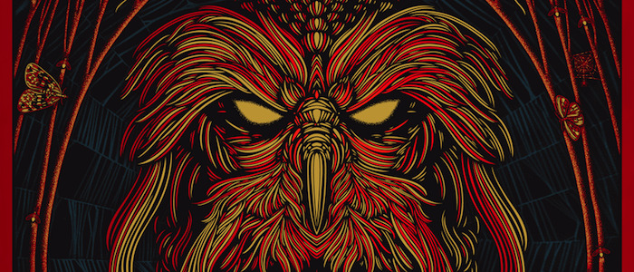
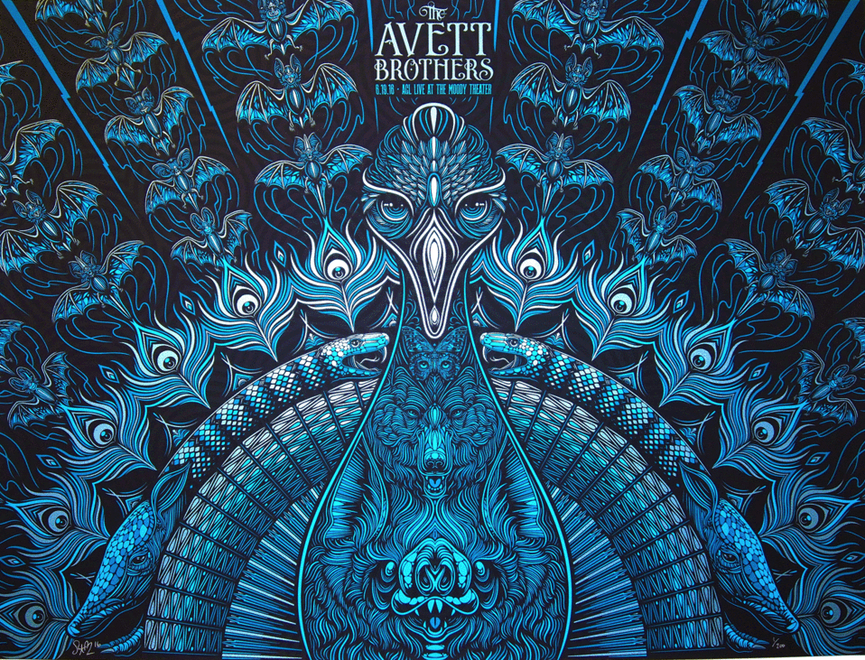
Although he primarily works in the music poster scene, Slater has been working with Mondo since the company's early days and has done his fair share of movie posters. Two of his new posters (which you can view in the gallery below) are band-related: a copperplate foil stamped art print of a poster he created for an Avett Brothers concert and a modified gig poster he initially created for Widespread Panic. However, it's the Secret of NIMH poster that should draw a movie fan's eye, as it offers a unique reinterpretation of the Great Owl from Bluth's beloved movie.
My complete conversation with Slater, which touches on his past and present work with Mondo, begins after the gallery.
You have a very specific and recognizable style. Did you have any initial inspirations when you were getting started? Where did you come from?
I was living in east Texas. I went to school out there at Stephen F. Austin. I went to art school. I worked at a t-shirt shop after school. Basically, I started making gig posters in 2004. If you look at my work from 2004 to 2011, it's a myriad of different styles, of me trying a bunch of different things. I think a lot of that stuff sort of got lost in the shuffle now. Somewhere in there, around 2007 or 2008, you can see the beginning of what I do now and it slowly evolved into me liking to do what I do now and doing that for a lot more of my prints. I think I'm influenced by '70s psychedelia. I think it just came organically from working all day every day and just making pictures.
And you do a lot of music posters, right?
Most of what I'm known for are gig posters, stuff for bands. That's how I got my start. I was connected to Mondo because [Mondo's] Rob Jones is my really good friend. I was there at the beginning, at the very start of Mondo, when they were doing Rolling Roadshow stuff. But music stuff is what I was known for first.
As someone who is a big movie poster fan but doesn't know much about the music poster scene, how do those two audiences compare?
They are totally different. They are really different, actually. The thing they have in common is that they're screen printed. With a gig poster, with that subject matter, you're totally free to explore whatever you want and usually the fans of the band are pretty accepting of whatever you do because there isn't a visual already associated with a lot of the bands. The subject matter is just so wide-ranging on a gig poster. On a movie poster... I think that when Mondo first started, they looked way more like gig posters. Artists were taking more liberties with the subject matter. Now, I think they've really refined that and a lot of the movie posters stay true to the subject matter but it's executed in an exceptionally beautiful way and with the highest amount of craftsmanship. I think Mondo posters are...the level of craft is really, really high. The level of craftsmanship on a movie poster is much higher than the baseline for a gig poster. I think you see weirder stuff in gig posters, but the technical ability and the craftsmanship in a movie poster. It just depends on what you're interested in.
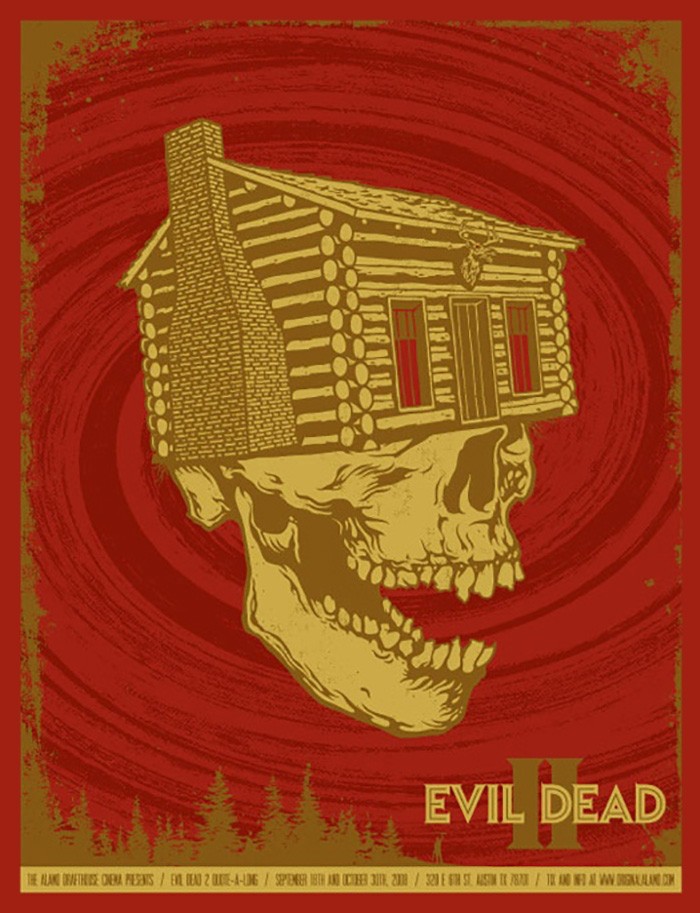 It's interesting that you talk about early Mondo feeling like gig posters, because your poster for Evil Dead 2 feels like it could be representing a band.
That was pretty early. 2006 or 2007. When that came out, people did have problems with it. I think that my approach was a gig poster. Likenesses weren't even an issue then. It wasn't even discussed, putting Bruce Campbell in the print. I just did whatever I wanted to do. That was under a different Mondo regime. Tim Doyle was heading up Mondo then. That was one of the ones where I learned that if you're going to do a really beloved film, in most cases, you're going to want to stay true to the subject matter. There are exceptions, but for the most part, you're going to want to put Bruce Campbell in an Evil Dead 2 poster.
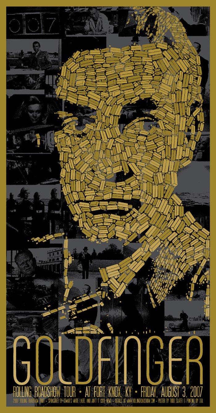 One poster I've seen on a few walls around Austin is your Goldfinger poster. Where'd the inspiration for that one come from?
That one was pretty crazy. That was around 2007 and was part of Mondo's Rolling Roadshow. They showed the movie at Fort Knox and they had a print made for every date of the Rolling Roadshow. I talked to Rob about it and it was an idea I had within the first minute of him offering me the job. I said I wanted to do a mosaic of Sean Connery made out of gold bricks and Rob said "If you can pull that off, it would be pretty cool." So I did it and it wasn't really a big deal when it first came out and then somewhere along the line it got into a Sotheby's auction and it sold for a bunch there and the demand went way up. People seem to look at it differently after it was at that auction. I still get pretty steady emails about that one. That one really took on a life of its own after that.
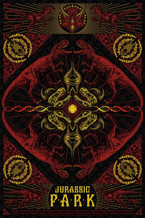 I want to talk about your Jurassic Park poster. That movie has so much easy iconography but your poster doesn't lean on any of that. How did you make the choice to go in the opposite direction?
I think I made the choice because it was for a Jurassic Park show and I knew the likenesses and the T-Rex ripping the car would be represented in the show. If I went for an oddball take on Jurassic Park, it would be more accepted because the other ideas would be fulfilled. The idea of DNA and replication, that became a vehicle to put a lot of different dinosaurs in the print. When I was offered the job, it was a chance to draw a lot of different dinosaurs and that on its own was really fun to do.
Let's dive into three of the new posters you're bringing to MondoCon. How about we start with that Avett Brothers poster? How do you figure out a visual representation for a musical act? Do you listen to the band non-stop?
It's really changed. I used to always listen to the music and try to make these insider references to lyrics. I realized after talking with bands and with management is that what bands really want is art that stands alone, independent of a lyric or what they're doing. It should just match the mood or the tone of their music. A lot of the time, it's just a gut reaction on what I feel about the band. And the Avett Brothers have been working for a long time, so I know their music well and don't have to listen to it while I work.
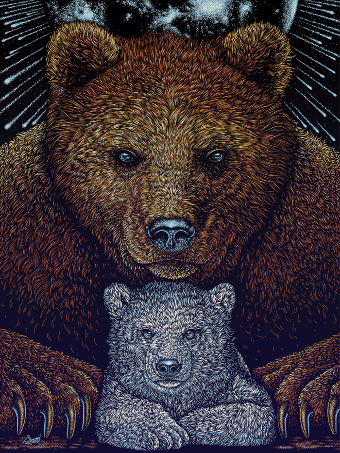 My favorite of the three posters you sent over is the bears. What's the story here? Did you just want to draw bears or is there something else going on?
It was a gig poster first. After they come out as gig posters, I sometimes add to them, rework them, take the band's name off and make an art print independent of that. I thought the juxtaposition of a brown bear and a baby polar bear...I just liked the idea of pairing those two things together. I didn't want to touch on any specific environment issues. Thematically, it's just broader. Visually, I just like the idea of putting a brown bear and a polar bear together. It was just appealing in that sense. It was a gig poster for Widespread Panic first.
The third one has me at a disadvantage. I don't think I recognize the character here...
It's the Don Bluth movie, The Secret of NIMH.
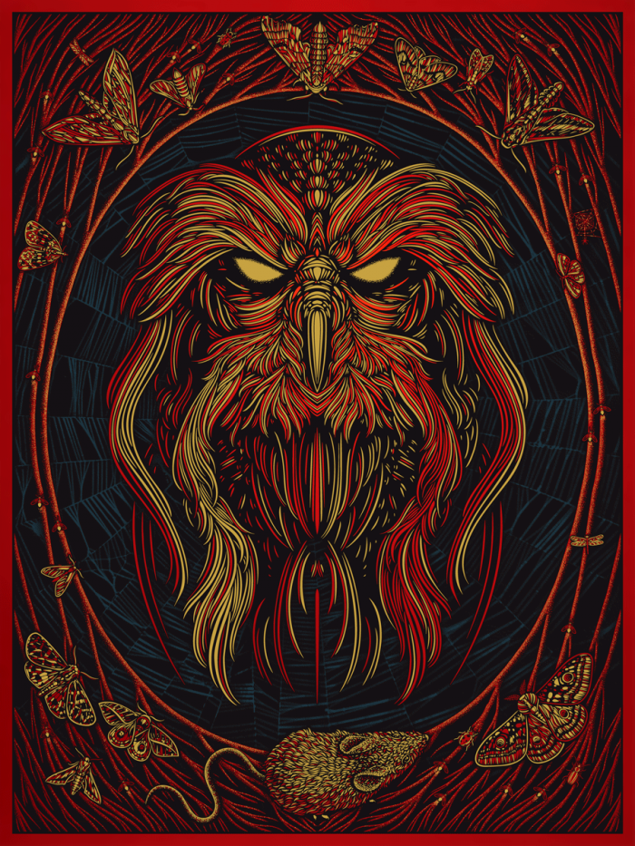 Ah! I haven't seen that in a long time!
Yeah, it looks like the Great Owl from The Secret of NIMH. It references that, but it doesn't stay true to the exact proportions of the animated cells. It's sort of a nod to that. The mice in the movie are cartoon, Disney-looking mice and this is a more realistic portrayal. That was a movie I saw as a kid and I liked the gravity of the Great Owl a lot. I like owls a lot. It's a subject matter that occurs quite a bit in my work. I think that the owl in that movie just had a presence and a gravity that I just liked. It was a gut feeling that this was a picture I wanted to make.
...
MondoCon runs October 22 through October 23. You can find additional information at the official site.
