MondoCon 2016 In Review: Beautiful Art, An Interview With Mondo's Justin Brookhart, And The 5 Best Posters From The Con
One of the first things you notice at MondoCon is that there are people who take this collectible movie poster thing far more seriously than you do.
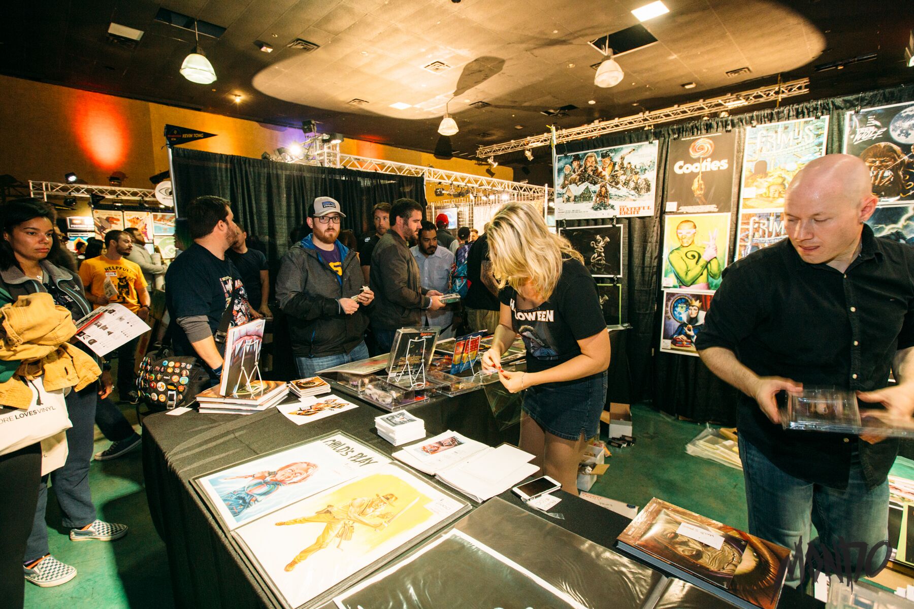
I'm there because the subject matter at hand appeals to my interests. I like pop culture art. After all, my walls are already lined with posters produced by the Austin-based Mondo and their ever-growing stable of artists. But at the end of the weekend, it's still a lark, albeit a lark that sees me spending far too much money on art that will have to live in the closet until I'm able to conjure more wall space out of thin air. For me, the amateur collector, MondoCon is a fun way to spend two days. For others, the attendees carrying war-torn and heavy-duty poster tubes that look they were designed to survive a small explosion, it's a religion. The best thing I can say about MondoCon 2016 is that both crowds seemed to be having a good time.
I've been in Austin, Texas long enough to remember when Mondo was just a t-shirt and collectible shop located in the corner of a movie theater lobby. But like a frog sitting in boiling water, it took me far longer than it should have for me to realize that this homegrown tribute to movie art had bubbled over into a genuine phenomenon and one of the leaders in the rise of pop culture art and other related collectibles. In addition to posters and t-shirts, they now produce vinyl soundtracks and toys and pins and even pint glasses. If it can reflect a movie or TV show or character you love, Mondo is making it.
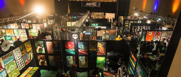
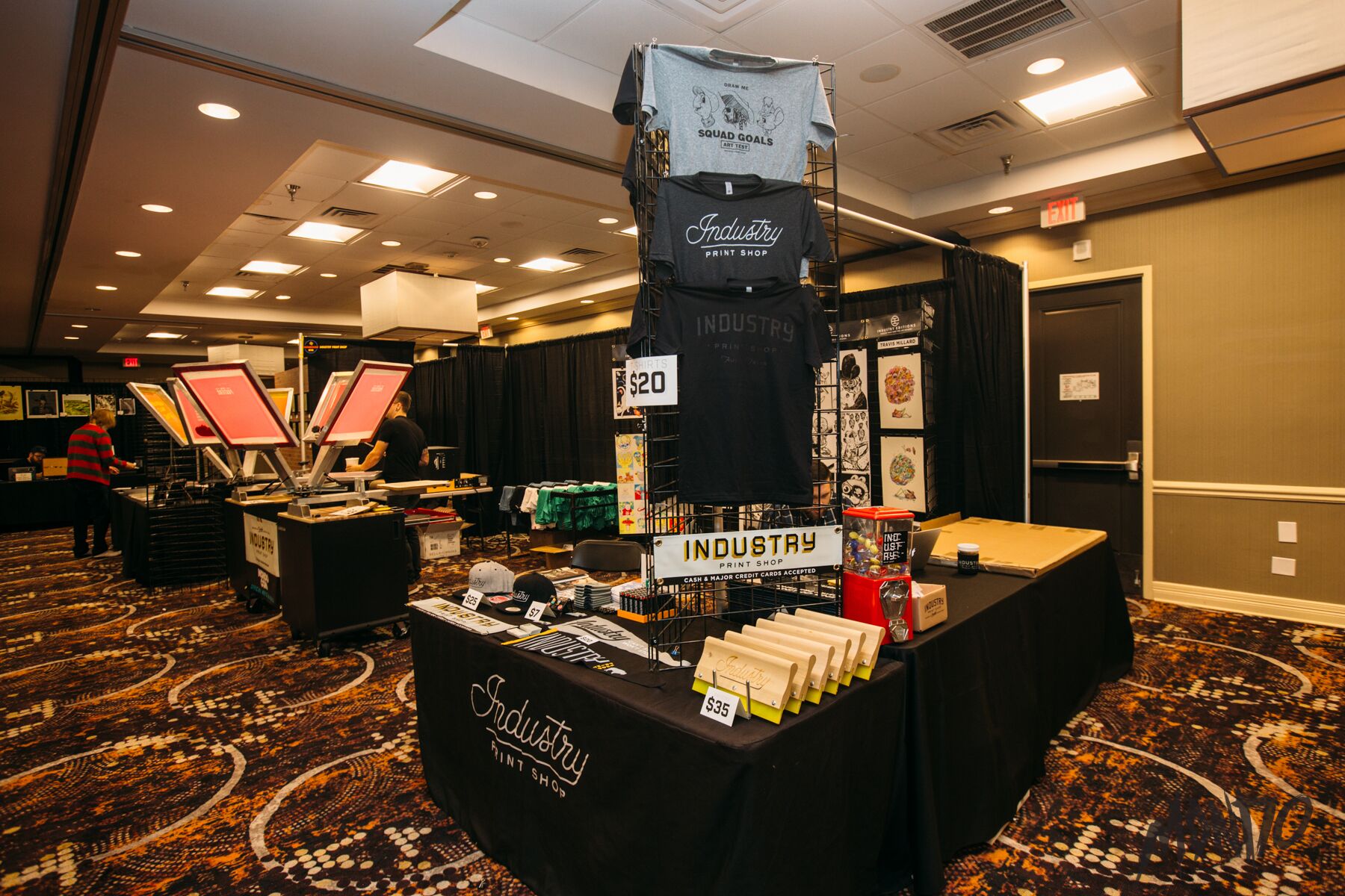
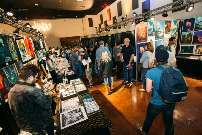
Now, Mondo is big enough to host its own convention, taking over the Austin Film Society (also known as Marchesa Theater) and the neighboring Holiday Inn for one weekend each year. This is the third MondoCon and this set-up is already starting to feel stretched a little thin. A few different logistical choices could probably help ease the crowding issues for another year or two, but if the con continues, Mondo may need to seek out a larger space.
But hey, too many people wanting to attend a convention is probably a good problem to have, right?
Still, the first hour of the first day of MondoCon is something of an assault. Some folks literally wait in line all night and they're rabid. There's one booth they must visit, one limited edition poster the have to get, one artist they're seeking out because they're wishing and hoping that they still have a copy of something that otherwise sold out years ago. The initial rush, the opening of the doors, should feel familiar to anyone who has attended any other convention in the past.
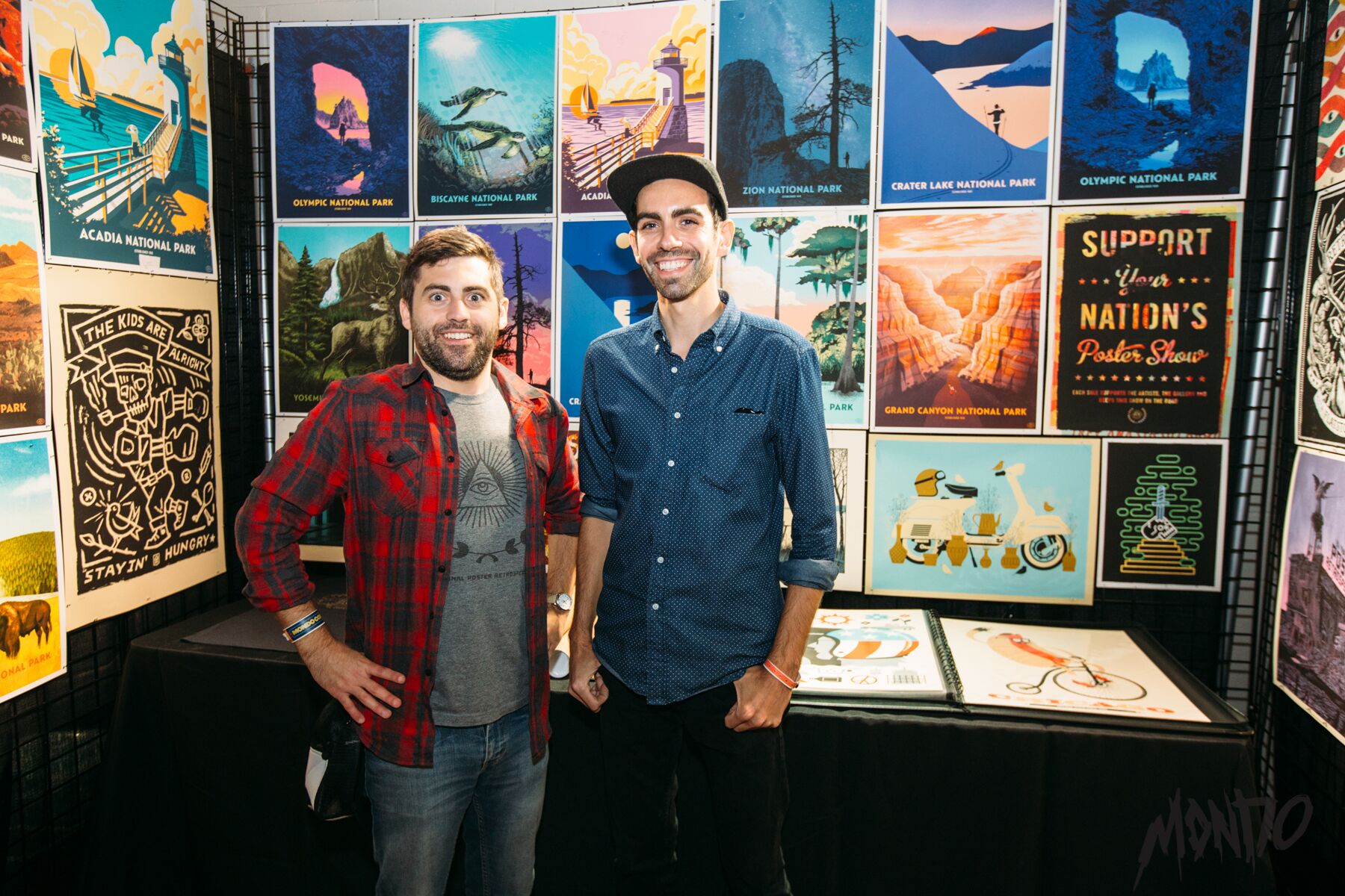
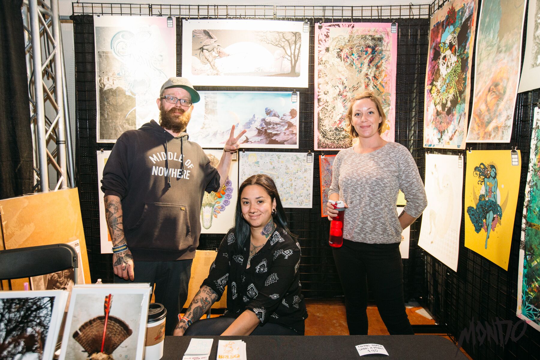
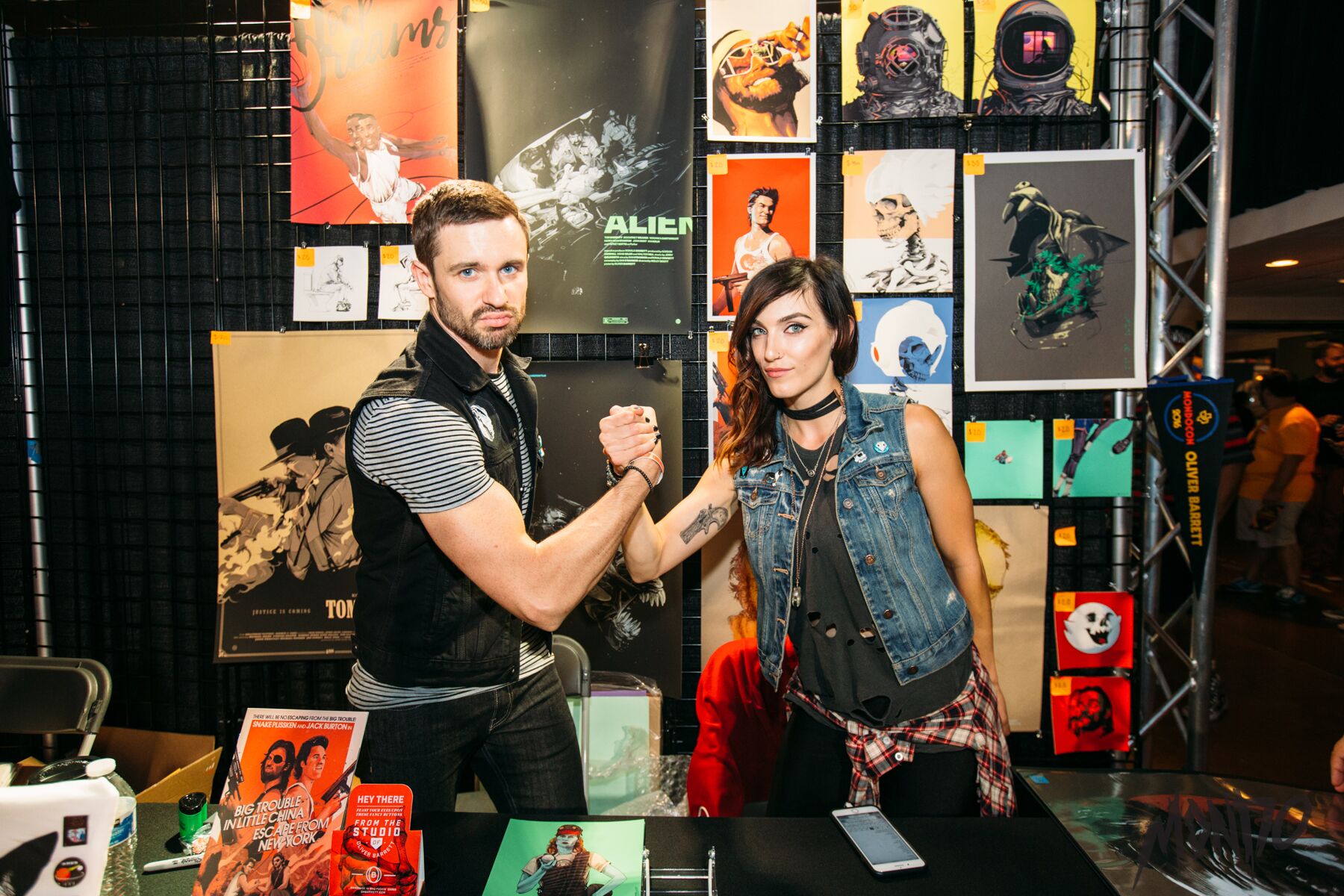
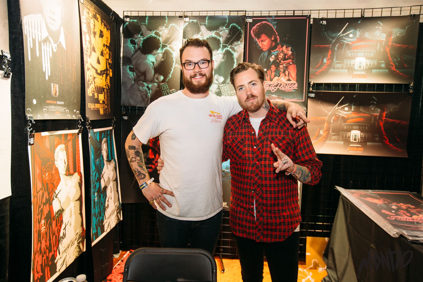
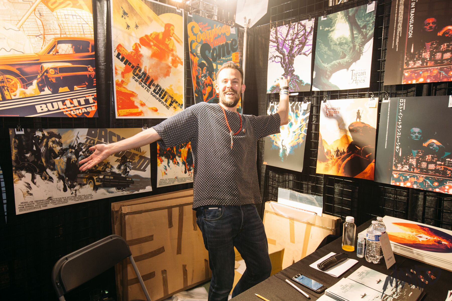
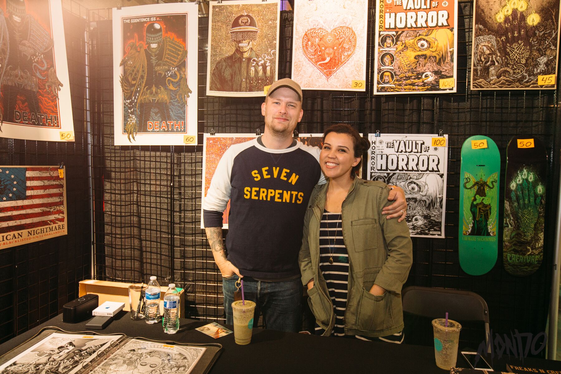
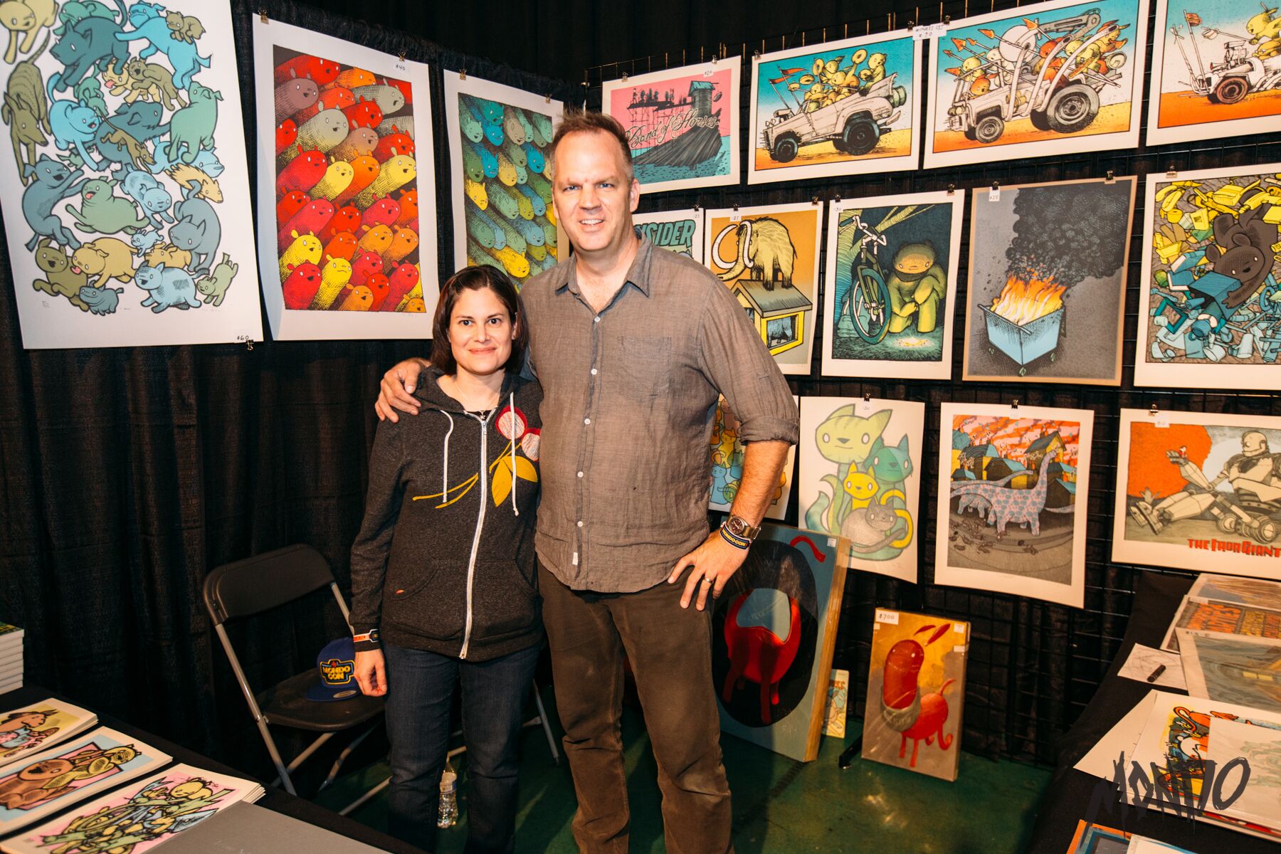
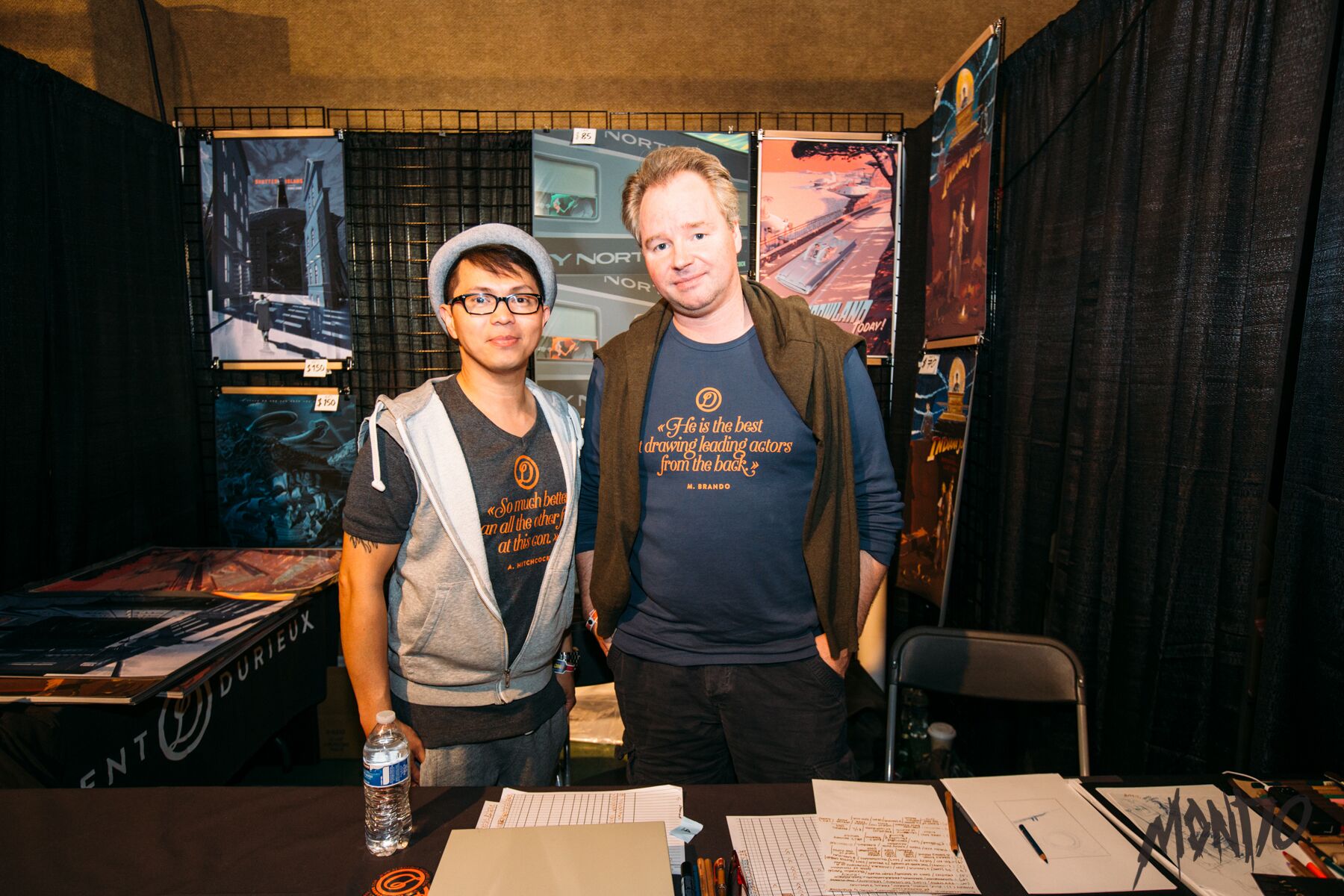
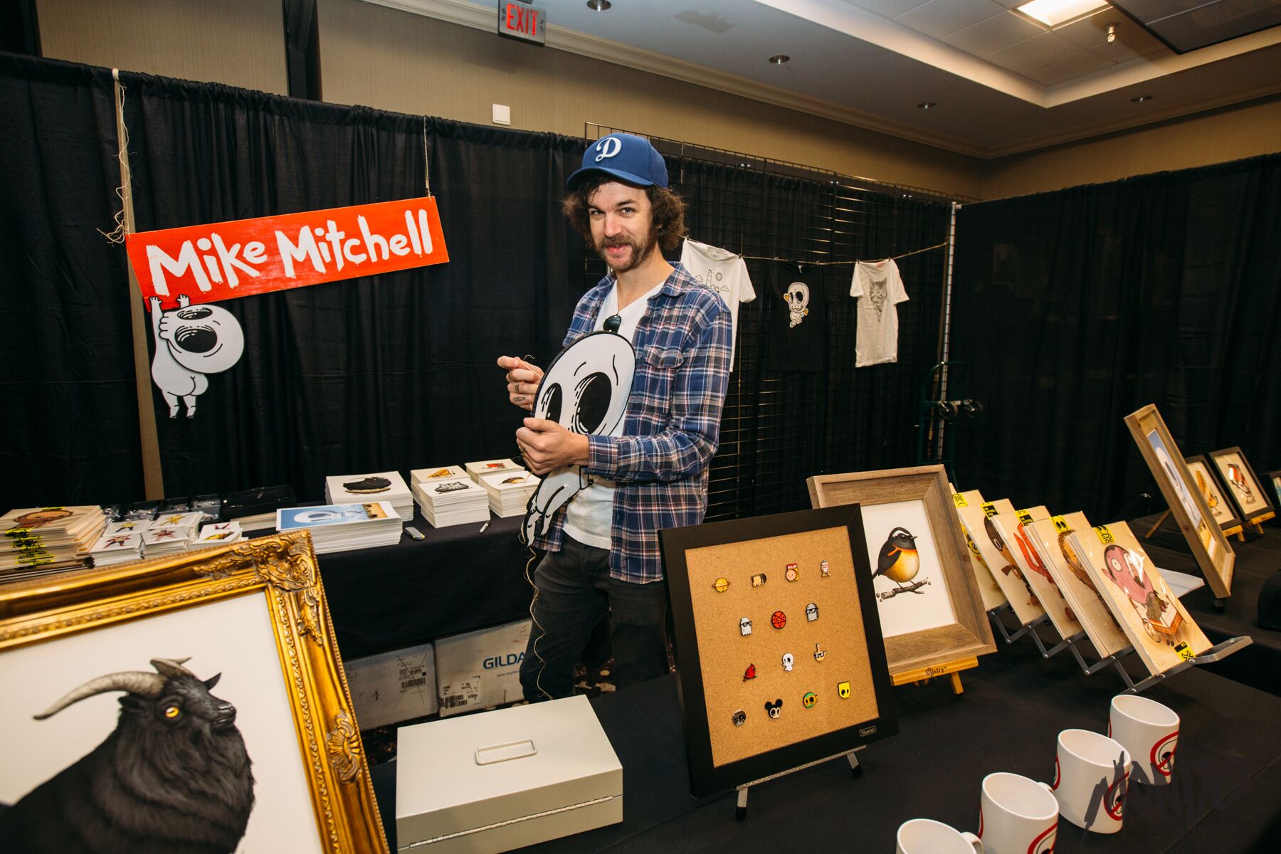
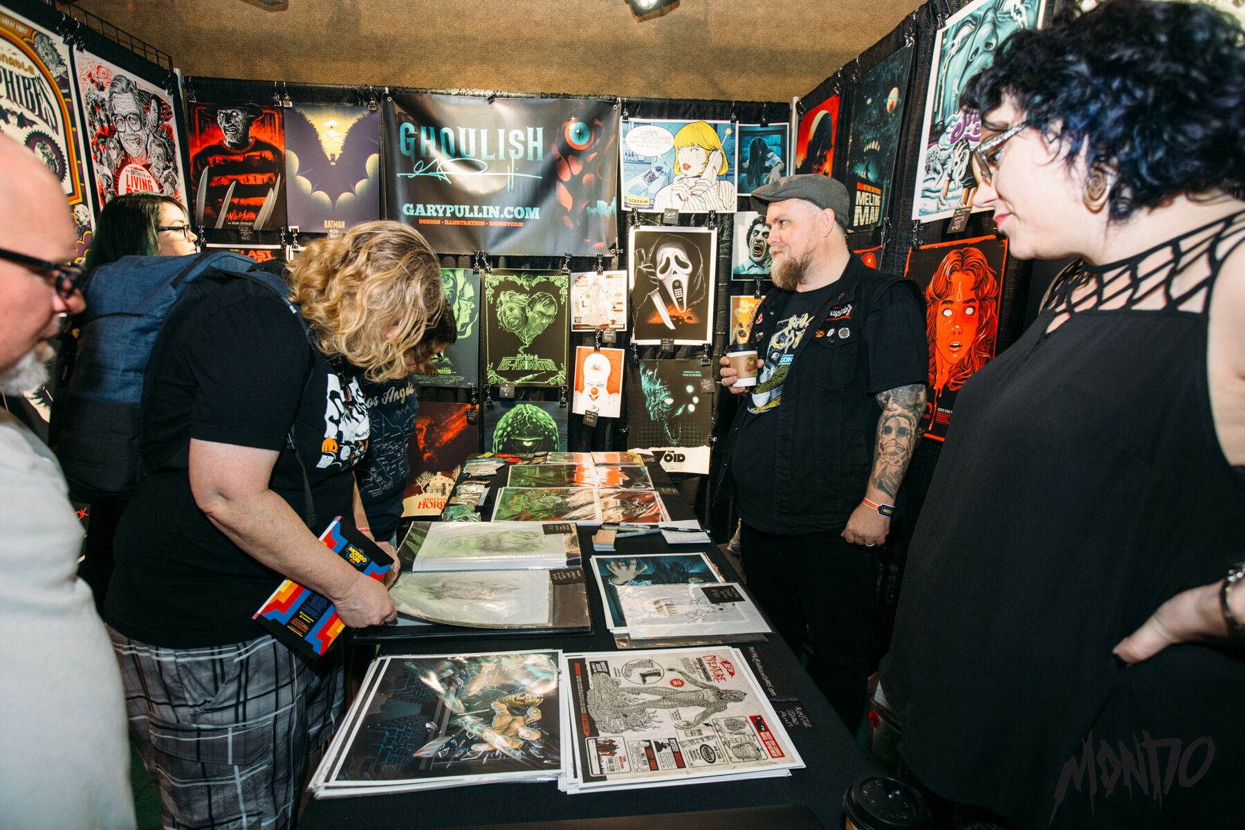
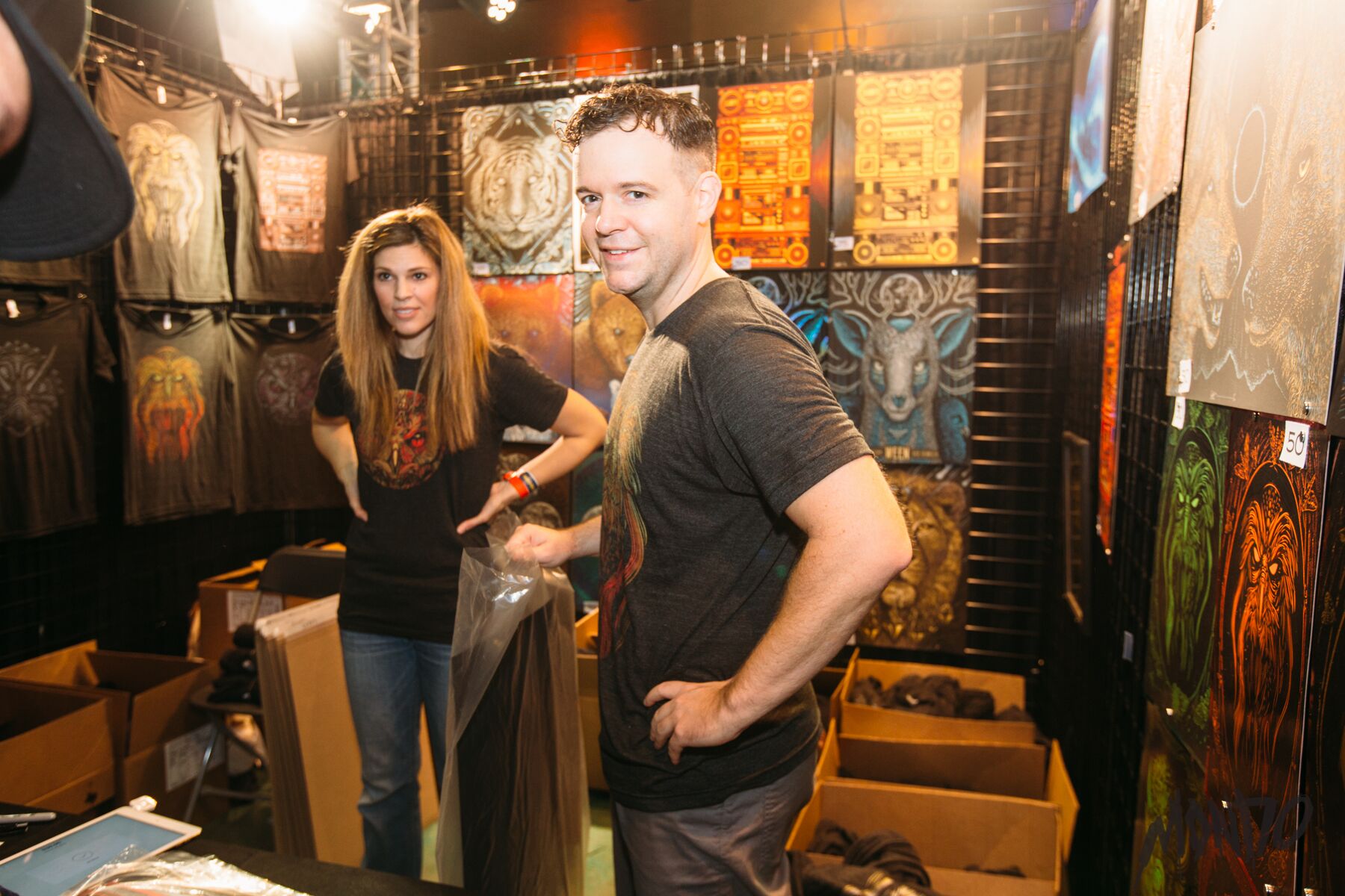
After those first few hours or so, MondoCon starts to find its groove. Attendees stop hunting and start looking. Artists, no longer staring down the barrel of a long line with a credit card reader that only wants to work 50% of the time, are able to relax and engage their customers in conversation as their transactions are processed. This is MondoCon starts to feel worth the trouble. It's one thing to buy the latest and greatest from an artist you admire, but it's another thing altogether to have a moment with them.
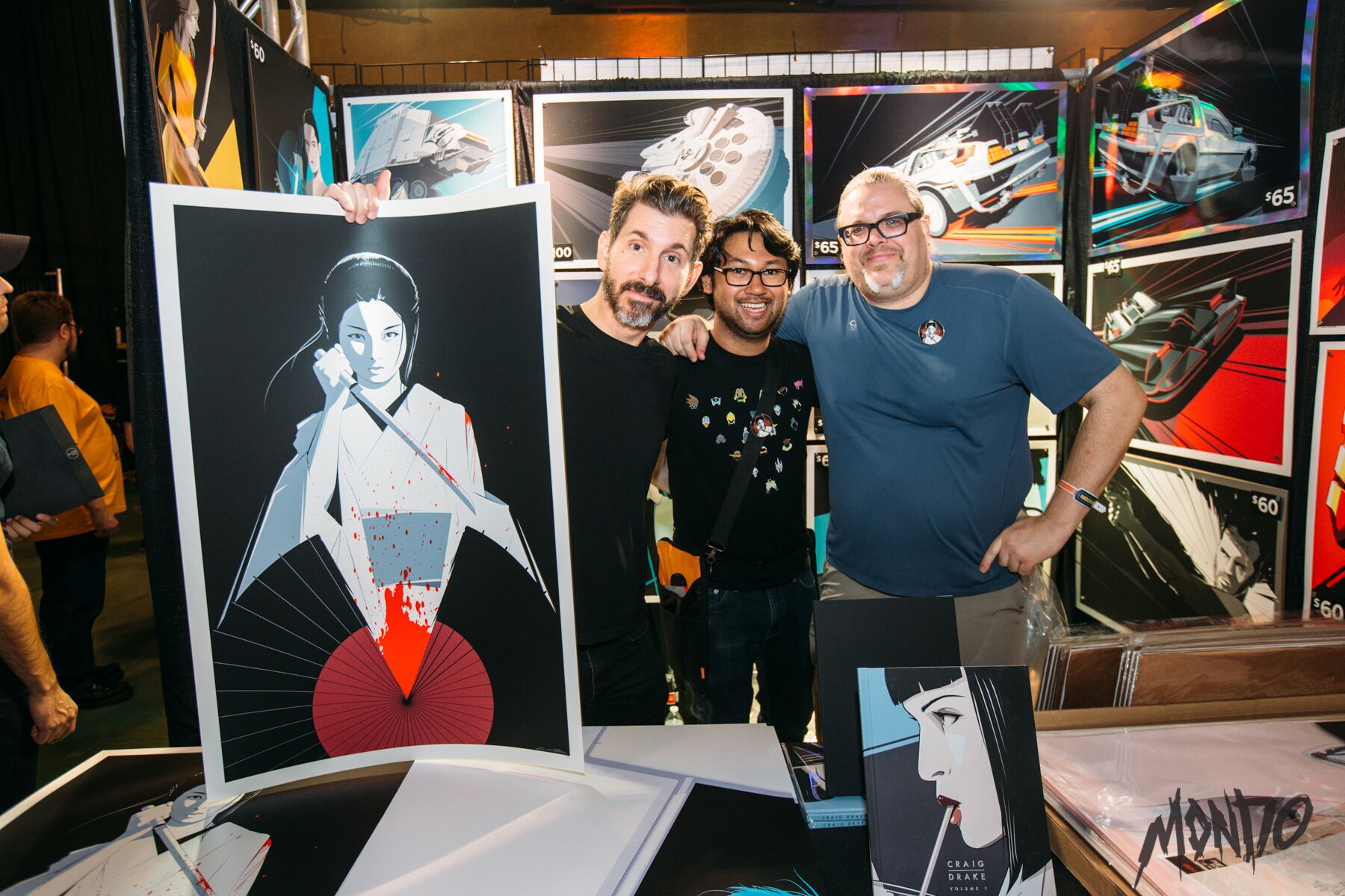
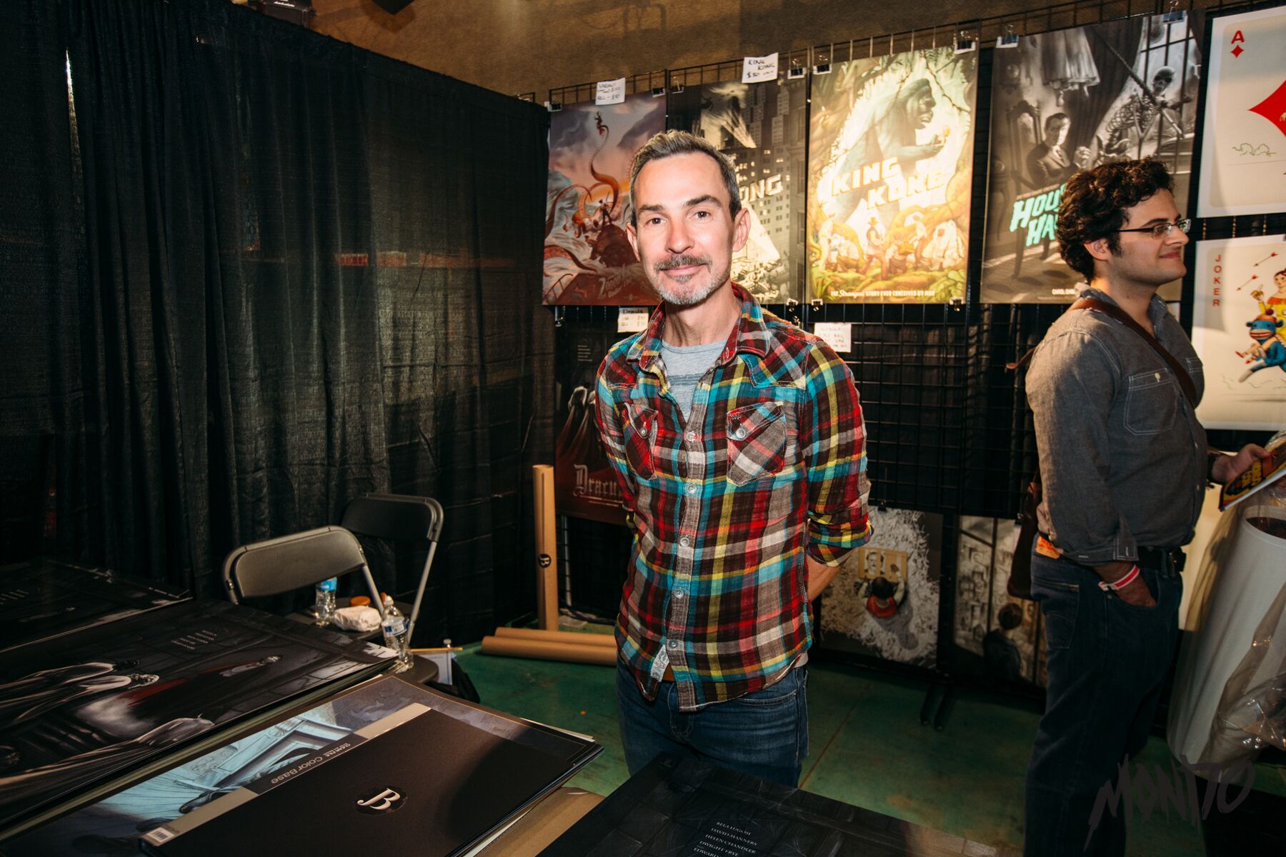
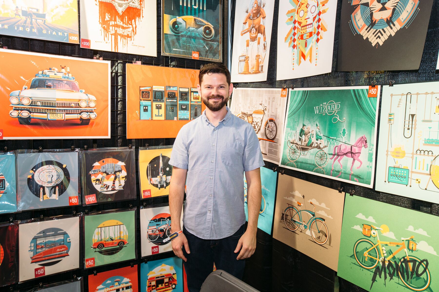
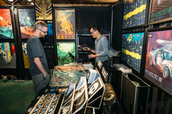
MondoCon is in an interesting place right now: just big enough to attract incredible artists like Jason Edmiston, Laurent Durieux, Olly Moss, Daniel Danger, Ken Taylor, Beck Cloonan, Scott C., Matt Taylor, Kevin Tong, Craig Drake, Jonathan Burton and many, many others, but also just small enough that you can have a personal interaction with them. It's a delicate balance, a sweet spot that I hope future cons can maintain. MondoCon will never be as big as something like San Diego Comic-Con, but it's easy to imagine it growing large enough to become more cumbersome and less fun to navigate. But right now? It's nearly perfect, especially on day two, when everyone has settled into a more relaxed groove and the lines start to thin out.
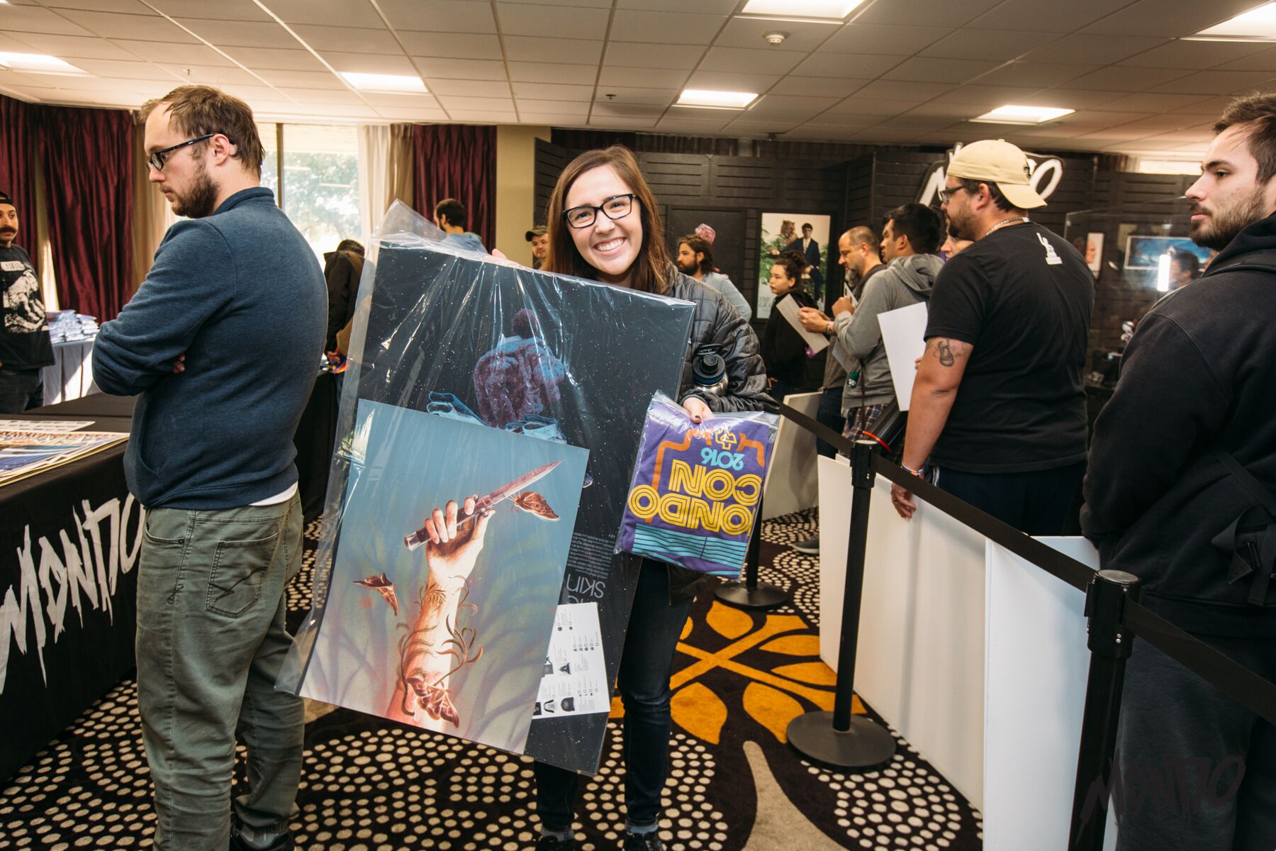
There are some frustrations inherent to MondoCon that are simply inherent to the pop culture convention scene in general. Crowding can be a serious issue, especially in areas where a few major draws have been placed a little too close to one another. And while the crowds grow thinner and less intense as the weekend goes on, some lines are simply unbearable. The Mondo Store, for example, commanded waits of three hours or more on day one. I stepped in the line later in the day and still waited for upwards of 120 minutes. Then again, the same line on day two was non-existent. Then again, several posters were completely sold out on day two and if I had waited, I wouldn't have been able to snag certain prints. MondoCon is a delicate balance of weighing time and money against how much you really want a particular poster or piece of art.
It's easy to imagine someone showing up to MondoCon and wandering the halls and checking out art and just having a good time and calling it a day. But the $90 admission fee (which covers both days) feels like a warning: be prepared to spend money should you walk through the doors and if you're not prepared to drop that just to get in, this may not be the con for you. I lost count of the number of times I gritted my teeth and thought "I'm Supporting Artists And That Is An Important Thing To Do In The Year 2016" as I handed over my credit card. I spent a... certain amount of money and called it a weekend. Meanwhile, I watched as the more enthusiastic collectors, those with the bomb-proof poster tubes, literally drop thousands of dollars in single transactions. Like I said, there are some people who take this stuff far more seriously than I do.
It should be noted that I don't regret a single penny spent. At the end of the day, it's hard to deny what a pleasure it is to spend two days browsing art and handing over your cash to people whose work you genuinely admire.
And this is also the point where I feel like I should mention the elephant in the con, the conversation that I heard from a few too many attendees. Nothing deflates your mood quite like overhearing people strategize about their plan to buy everything for the sole purpose of flipping it at a higher cost. While there's nothing Mondo can do to stop this and what attendees do with their money and time is their business, there's something dispiriting about attending a genuine celebration of pop culture art and occasionally rubbing shoulders with people who are there for profit instead of genuine excitement.
Still, when the dust clears and the weekend ends and my checking account begins weeping tears of blood, MondoCon remains an event worth attending and a fine place to blow a lot of money on a company and on artists who continuously do fine, high-quality work. Despite the crowding and the lines, the volunteers are friendly and fast on their feet. The artist line-up is top-notch. The screenings of A Clockwork Orange, Enter the Dragon, and The Fountain, special events whose tickets costs included a poster or vinyl album unique to the screening, reflect programmers with a knack for knowing exactly what their audience wants (or in the case of a screening of The Witch, need).
The most positive thing I can say about MondoCon is that I fully intend to be back next year. My wallet is already shuddering.
 Late on the second day, after I had written most of that first page, I sat down with Justin Brookhart, Mondo's vice president of operations, to discuss the logistics of running a convention like MondoCon. I'm in bold and he is not.Is attendance higher or lower than last year?
It's more. About two hundred more attendees on Saturday and our Sunday attendance was way up. We had way more attendees on Sunday. I imagine that's because we offered a discounted two-day ticket in the past, which we haven't in the past. It's just been the same price. We also offered an early bird discounted ticket, which I think helped get more people out. A lot of people did new releases on Sunday and I think that helped, too.
Assuming you knew you'd have bigger crowds this year compared to last year, how did you approach to organizing the con to handle crowding and lines?
We have a general idea based on fire codes and things like that, what our hard-cap for each venue is, things like that. What we can't ever estimate is what people will choose to make their priority in line. Are they going to go line up at the Holiday Inn convention center first or are they going to the Mondo booth or the AFS cinema? Which booth are they going in? Which hall are they going in? There's a lot of contingency plans and options we talked through on how to make adjustments real quick, like if a particular artist has a long line all of a sudden or if this guy does a release at noon. A lot of logistics planning goes into it. Luckily, we've been at this venue, the AFS cinema, for a few years now, so we definitely know how it works. So we generally have a good idea of the general flow of traffic and things like that. It makes it a little easier each year.
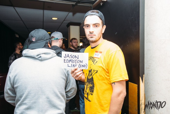 The thing that has been in common each year I've been here is that the moment you enter his hall in the first minute of the first day, you see a line at Jason Edmiston's booth. He's been everyone's first stop every time I've been here! I imagine you can plan around knowing stuff like that.
[Laughs] Absolutely. Always. Jason had that spot in that hall the very first year, the first corner spot whenever you walk in on the right-hand side. It was a random placement in first year, but after that year, he came up to me and said "Please put me here every single year that you guys have this convention" I agreed right there on the spot. He's there every year so his line kind of snakes out. He brings a ton of stuff each year and always make sure he brings a ton of new exclusive stuff. It draws a crowd for sure.
And then when Jason Edmiston's line died down, the layout of the hall just sent everyone straight to Kevin Tong's line. As a spectator, it felt like his line is the one that you guys kept on battling all day. Everyone was constantly working to keep it organized and out of the way. Did the volunteers undergo training to react on the fly to reorganize lines? They seemed to be on top of things.
That's basically it. We have volunteer leads in every single hall and they have the authority to make decisions and decide if they need to add more extensions to this hall or do I need more volunteers to help queue people up single file or more people holding beginning of line and end of line signs. We prepare like that. But there's also the x-factor of the artists running their own booths. We can't really control how quickly they check people out, how much they want to stop and engage with the fans and talk with them, which is something we want to encourage. But the more they're talking with each individual fan, the longer it's going to take to check people out and the longer it's going to be based on speed. Those are the factors we can't always plan for. We don't want to dictate too much for how the artists handle their own booth. We want to set them up for success and let them go. We just try to be really fluid with our decision-making on that sort of stuff.
 MondoCon isn't nearly as big as something like San Diego Comic-Con, but I feel like all conventions share the same issues.
100%.
Lines, crowds...
Lines, people, limited space. What I found to be true, no matter what convention you're going to, people don't mind waiting in line if they know they're in the right line and the line is moving at a steady pace, even if it's not fast and they feel like the line's being treated fairly. No cutting in line, no one's getting special treatment or anything. If you abide by those rules, I feel like people are relatively patient. But I've gone to events... I went to a concert recently and they had no line management whatsoever. I was standing in line for 45 minutes before I could get anyone to confirm that I was in the correct line. That's crazy to me. You need people telling you "Yep, you're in the right spot. Don't worry. Just wait." You have to value your time at a thing like this. There are a lot of limited products being sold at this convention. You have to make decisions. It's a tough thing for some of our fans where they come in here and if they don't get something at this booth and if they don't get over to the next booth in the other hall, it could sell out. It's stressful for them, so we try to eliminate that stress as much as possible. Just by over-communicating information, really. That's a thing we say often. Over-communicate, over-communicate, over-communicate. We try to do that. I feel like it's worked out this year. A few hiccups, but nothing too crazy.
Attending MondoCon is easy for me. I live twenty minutes away. So I'm curious about the make-up of the crowd. How many people are traveling from around the country and the world to attend?
I'd say about 80% travel here for the convention. We have a large fan base here in Austin, our core fans we've grown with over the years, but we have a wide international base. We're seeing more and more of those people every year. People from all over the U.S., international people. It's a pretty good mix. We can see it when we partner up with the neighboring hotels and they can tell us how many rooms they're booking. It's a pretty high number. The international guys are really impressive to me. We have this one fan who has come over here every year from Japan. It's the only convention he goes to. It just blows me away that this small thing we just made up a couple years ago that is really just all of our favorite people and companies coming together for one weekend, that he's found such a connection to that and wants to travel and take time out of his schedule and spend a lot of money to come here and just experience it for the weekend. That blows me away. We want to show those guys a good time and show them the full experience. We want to make sure everyone is leaving with a positive note.
The Five Best Posters of MondoCon 2016
In picking my favorite posters from MondoCon 2016, I tried to be very strict about only selecting prints that made their debut at the con. Any old favorites on sale, no matter how rare or spectacular, were instantly disqualified. And do the nature of my interests, this list is focused entirely on movie posters and not any other original art that lined the halls (even though so much of it was truly remarkable).
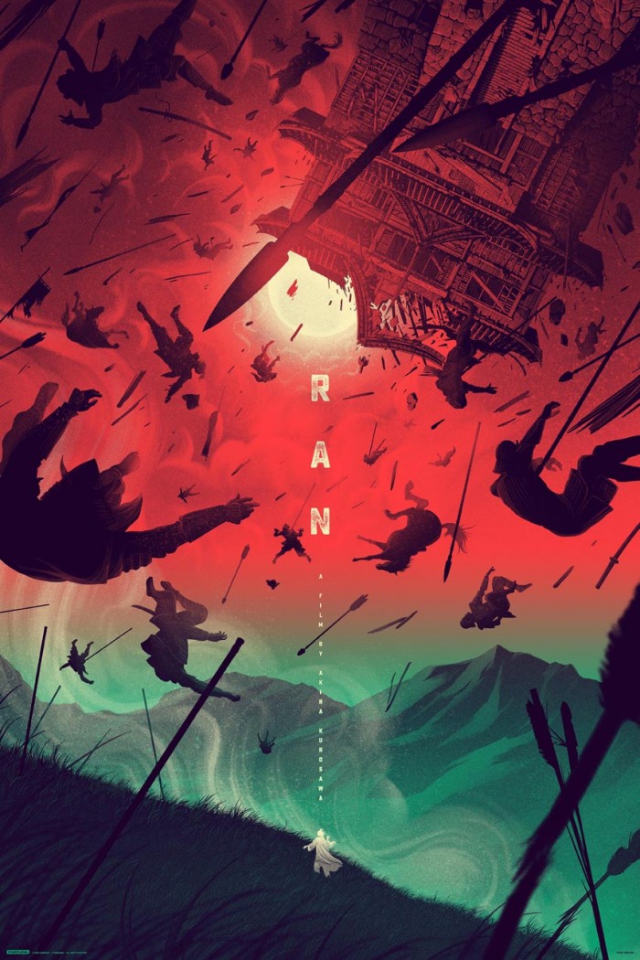
5. Ran by Kevin Tong
Akira Kurosawa's Ran is a masterpiece and Kevin Tong's poster for the film is the kind of art the film demands. Tong work takes the story of the film, a feudal Japan adaptation of William Shakespeare's King Lear, and makes the story's ideas literal: a kingdom has been turned upside down by war, great houses are being destroyed in senseless conflict, and the former ruler, who can do nothing but stand on the sidelines and lose his mind at the carnage his decisions has wrought, is a small figure, almost forgotten amidst the chaos. This is stunning work.
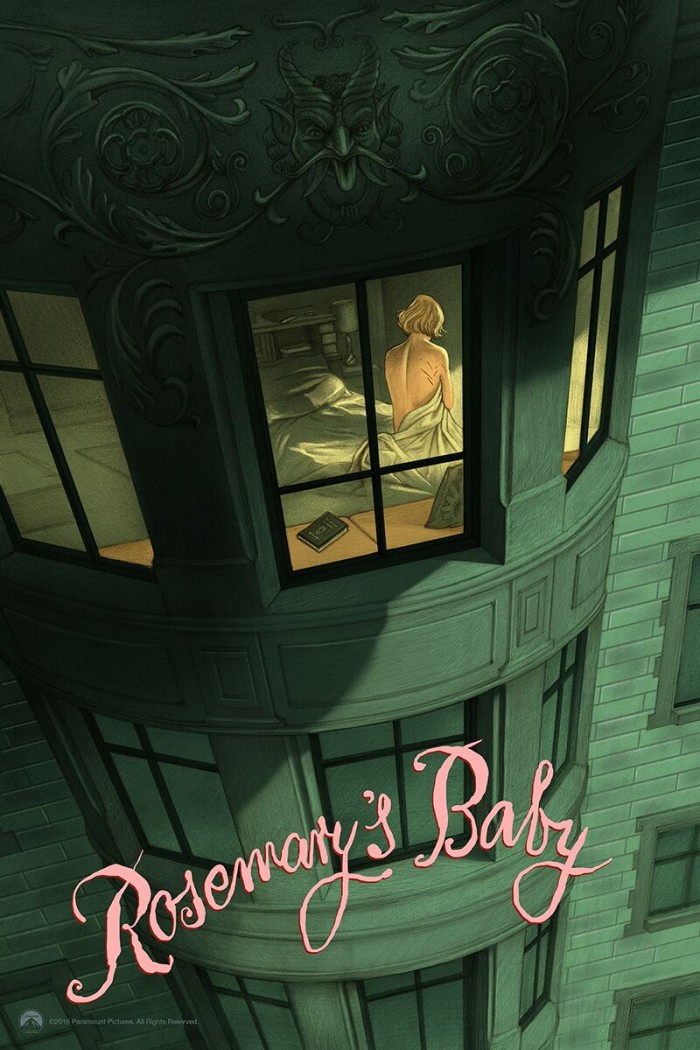
4. Rosemary's Baby by Jonathan Burton
There's something inherently classical about Jonathan Burton's work, a sense of cultural literacy that rings true in each of his pieces. Much of his work tells a story – to look upon his posters for movies as divergent House on Haunted Hill or Willy Wonka and the Chocolate Factory is to absorb what those films truly feel like in an instant.
His poster for Rosemary's Baby is a sublime encapsulation of the dread that permeates Roman Polanski's horror classic, framing the title character as a prisoner in her own home, still wearing the wounds of a supernatural assault, while the devil literal lurks over her, masked only by shadows. While that could be (and perhaps should be) a little too on the nose, Burton's straightforward style, the sense that he wants to tell you a story, lends the images a narrative hook. You stare at this poster and want to know what happens next.
3. Sleepy Hollow by J.C. Richard
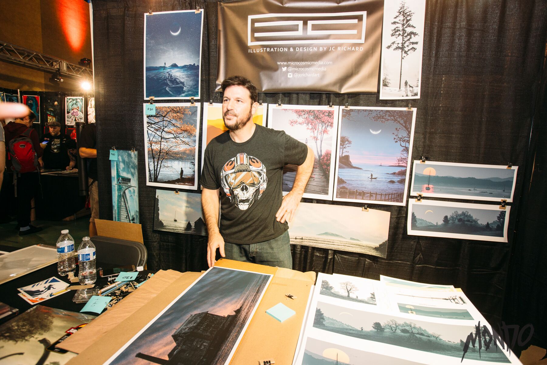
Few poster artists are as skilled as J.C. Richard at re-contextualizing the familiar. His obsession with landscapes means he tends to work in frames that are long and narrow, a widescreen panorama in which images we have grown accustomed to take on a new life inspired by their surroundings. Like so much of his best pop culture work, Richard's Sleepy Hollow perfectly blends his personal style with his subject matter.
The iconography here is clearly drawn from Walt Disney's 1949 animated jewel The Legend of Sleepy Hollow, with Richard even borrowing that film's exaggerated character style (just look at the horse's eyes!). But by pulling our view back, by treating this as a situation to be observed rather than a moment of action in which we're involved, Richard offers a riveting perspective on characters and ideas that have been absorbed into the collective pop culture consciousness.
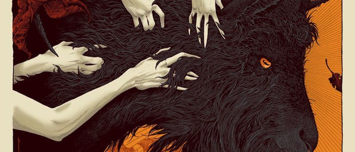
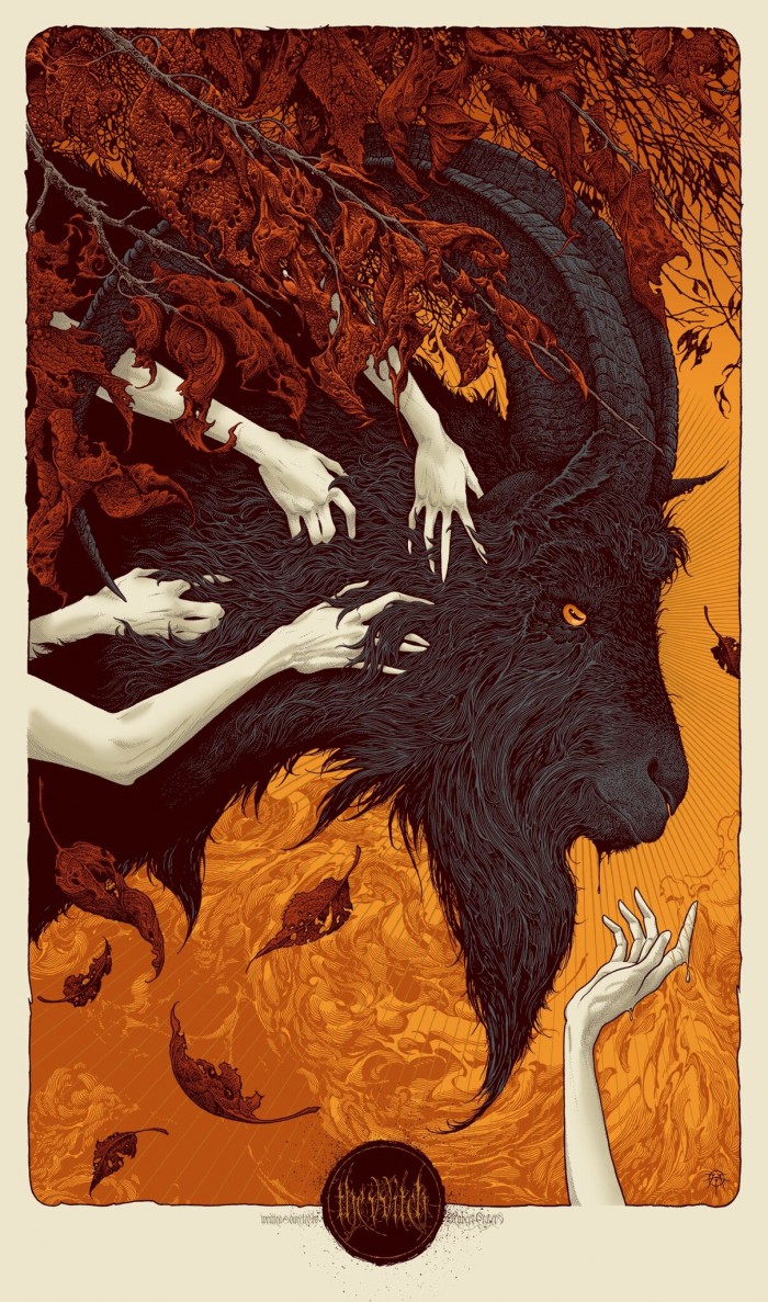
2. The Witch by Aaron Horkey
Here is where I get honest with you: I don't always love Aaron Horkey's pop culture work. He is undeniably one of the most talented artists working today, a man whose skill with a pencil is unmatched. The sheer number lines, the amount of detail, in every Horkey print is just plain unreal. From a purely technical standpoint, he's an all-time great. However, sometimes Horkey gets paired with the wrong material and his unbudging, unwavering style simply doesn't serve that subject, resulting in a gorgeous poster I have no interest in owning.
This is not the case with The Witch, a film whose subject matter so beautifully interlocks with Horkey's style that this poster feels like it was destined to exist. While the imagery is striking on its own, it's a genuinely perfect reflection of Robert Eggers' deeply frightening and spiritually unsettling movie: the Satanic goat Black Phillip, tangled with his servants in a New England Autumn, waits as a fifth woman reaches toward him. Wouldst thou want to live deliciously?
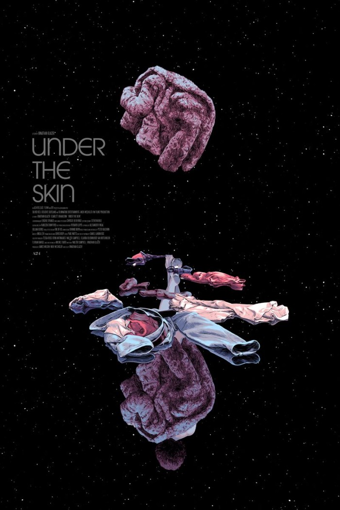
1. Under the Skin by Matthew Woodson
The best thing about Matthew Woodson's poster Under the Skin is that it is one of the most striking posters I have ever seen in person. The worst thing about Matthew Woodson's Under the Skin is that you really have to see it in person to appreciate it. You can get the basic gist from the image above, which recreates one of the most chilling sequences from Jonathan Glazer's beautiful and terrifying science fiction film with extraordinary color and line work.
But what you cannot see on a computer screen, and what you can only appreciate if you're lucky enough to see one of these in person, is how the poster itself is actually printed. That's not black ink on white paper, but colored ink on black paper. And those clothes scattered throughout The Female's lair are printed with glossy inks, allowing them to leap out from the abyssal background in a way that ignites the eye. And unless you see this print in person, it's hard to make out the silhouette of The Female herself, depicted in a black ink so dark that it actually leaps out from the black paper, putting on that pink coat. This is a remarkable poster in concept, executed with physical precision that demands to be seen in the flesh. It has truly gotten...under my skin. Sorry.
