Interview: 'Kubo And The Two Strings' Director Travis Knight Breaks Down Some Stunning Sequences
With Kubo and the Two Strings, the CEO & President of Laika, Travis Knight, makes his feature directorial debut. Knight's 3D stop-motion / CG hybrid follows a brave young hero named Kubo (Art Parkinson), as he goes on an epic quest to retrieve what's needed to defeat Raiden the Moon King (Ralph Fiennes). Along for the samurai's emotional adventure are Monkey (Charlize Theron) and Beetle (Matthew McConaughey).
The Japan-set film's style was inspired by ink wash paintings, Noh theater, and period doll making. One of the biggest influences for Knight, besides the famous woodblock painter Kiyoshi Saito, was ukiyo-e (translation: pictures of the floating world). The director was most drawn to the work of Hokusai and Hiroshige, and the former's "Great Wave off Kanagawa" clearly inspired the film's opening sequence, which we talked about with Knight.
During our time with the filmmaker, we discussed the work Laika put into crafting some of Kubo and the Two Strings' most visually stunning sequences, in addition to why they'll never make sequels. Below, read our Travis Knight interview.
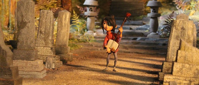 The opening does a nice job establishing the tone of the film.
Well, you know, we take our time early on in the film, getting to know these characters. Getting to know the world, and so it adds your structure of your first act. You want to make sure that you give the audience the information they need early on, what kind of story this is going to be.
With the beginning sequence, we wanted to make sure that we gave a hint of where we were going with this movie. That there is a little bit of mystery. There's some peril and danger, kind of a big epic sweep to the whole thing. This is a world where characters get hurt.
This is not a Wile E. Coyote universe where you fly into the side of a canyon, and you turn into a pancake, and then you dust yourself off, and you're ready for the next adventure. This is a world where if you smash your head on a rock, that hurts, and it's going to damage to your body.
The very next sequence we have Kubo preparing the morning meal for his mother, and he burns his hand on the boiling water as he's preparing the rice. It's a simple moment, but what it lets you know is that this is a world where people get hurt. If our characters get hurt, the stakes are real. And if they die, they die, and that's it. Just like real life, alas.
We wanted to communicate a number of different things within that one sequence that lets people know what kind of a world this was. It's a beautiful world, it's a stylized world, but it's the world that is much like our own. It's real life wrapped in metaphor. That's everything we do, it's definitely what we were approaching for this one here.
 At Laika, you'll first do physical tests that'll inform the digital effects. For the waves, you used rippled paints, shower glass, and cloth, right?
Absolutely. We use a blend of hand-drawn animation, stop-motion animation, CG animation. We take techniques from all different forms of filmmaking and things that don't come from filmmaking, including theater work, stage work. It really is a very unusual way of making films. It's a combination of art and craft and science and technology. There's no place on earth that make films the way we make them typically.
We want things to have a unified sensibly, aesthetically. We want things to look like they were shot at one moment in the stylized world. It's not the real world, it's a film that has a nodding acquaintance to the real world, but it is a stylized world. If you're going to do that, if you're going to mix techniques like stop-motion and CG, you want to make sure they don't stick out, that they feel like they perfectly blend together. Anytime that we do an effect that is digitally based, we always build it practically first, to see if we had all the time in the world, all the money in the world, how would we animate this practically.
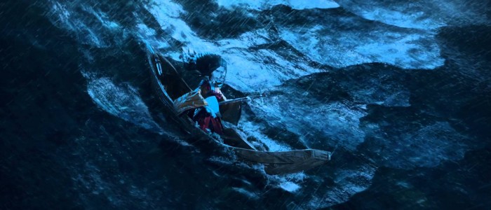
When we knew we were going to have these massive waves, it wasn't practical to shoot because of all the interactivity. It wouldn't be practical to shoot all that stuff on stage. We had to figure out a different way to do it. We started by shooting everything on the stage, and so we did exactly what you mentioned, we started using weird materials. We'd use different panes of different shower glass, torn bits of paper that are in a domino pattern, to try to see how we would potentially animate white caps in stop motion.
One of my favorite bits was when we took this ... Our head of rigging, Ollie Jones, created this entire grid of metal rods that he put shower curtains and garbage bags over. Then we'd animate that a frame at a time to see how those things would undulate as if they were waves. There were a lot of different things that we learned in that process.
We'd look at scoop patterning and geometric shapes, and the way the light interacts with these practical materials, and then how those things would move if we shot them in stop motion. We'd take all those tests that we shoot practically, we give that to our visual effects department and then they use that as a foundation for everything that we do.
We had an incredible artist on our water, a guy named David Horsley, who had previously done some exquisite work on the water in Life of Pi. The water in Life of Pi is very realistic. The water that we were going for, it had to be stylized. We needed something that behaved like water, so audiences understand what it is, and it's believable. But it had to have the same stylized look as everything else in the film.
It essentially had to look like it was a bunch of woodcut garbage bags. So that was a trick. It was eight months to develop a water system incorporating all those practical tests and explorations that we did on stage. It was about combining that with the stuff that we do on the computer. That's how we brought the water to life both in the beginning of the movie and midway through the film when we had this incredible raging battle at sea.
 During that battle at sea, we get to see the garden of eyes. What do you recall about the work that sequence took?
I mean, we're clearly masochists because it wasn't enough for us to be above the water, we had to go below the water as well, which created a whole new set of challenges. We have a trio of these massive mythological creatures in this movie, and more than anything else that was a nod to the great, beautiful creature features of Ray Harryhausen, who was an enormous influence on all of us.
I think you see that most pointedly in the giant skeleton sequence. Because that really was an homage to the work that Harryhausen had done in Jason and the Argonauts, where Jason goes up against an army of skeleton warriors brought to life in stop-motion by Ray Harryhausen. There's a lot of that kind of stuff happening, but we wanted each one to be surprising, each one of these creatures to feel like something you hadn't really seen before.
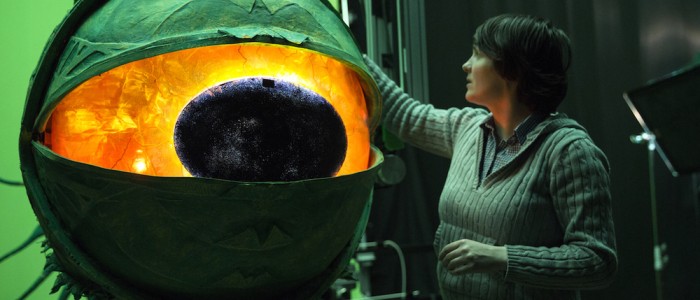
The very notion of this garden of eyes is fairly terrifying and horrific, but making it feel like this was all real and shot at the same time as everything else was a challenge because a lot of the stuff we had to shoot in pieces. We could only, even though there were supposed to be a host of these giant eyeballs on stalks, we didn't actually build more than one. The one that we built was 11 feet tall; it was made out of this squishy foam-like material. It felt like an H.R. Pufnstuff theater dream.
This thing was so big, it was 11 feet tall and suspended by motion control rig. The eyeball was about three ft in diameter. We had these little LEDs that were reflected with a steel mesh, and these rotating rippled balls of glass, all to get this crazy kind of electrifying, hypnotizing effect, which ultimately is supposed to hypnotize whatever creature that it holds in its thrall and drag it down to its watery grave.
The way we animated the creature was really interesting because the animators never actually physically touched this enormous puppet. They animate it across the room. We had to build effectively an enormous trackpad. We had two computer mice and put a bowling ball on top of it, and then we would move the bowling ball and it moved the giant eyeball.
The animator essentially was a proxy for what the body was like. The animator would animate that off to the side, and a series of cables connected that to a frame that would then be put into a motion control computer that would keep track of all the different movements and bring it to life a frame at a time.
Then we shot all the animation for the one creature, and we shot it over the course of about a year and a half. We shot it basically from every angle you can imagine, and then we composited all those pieces in the computer to make it look like there were dozens of these things, even though there was only one that was shot a bunch of different times.
Then the bottom of the monster, the mouth, the big gross, disgusting pulsing mouth at the bottom, that was actually a miniature that was a small scale thing with this kind of ribbed ball that the animator would move a frame at a time. It's super-gross. We had to dial back on that a little bit, 'cause it was nauseating. That's actually one of the places where you can see the influence of Star Wars in effects; it's clearly a nod to the Sarlacc from Return of the Jedi.
That was shot at small scale, and then all of the kelp, we shot those as physical items that were connected with fishing line and cables, and we moved those a frame at a time, and then put those all in the computer. There's so many different elements that we practically shot and then we assemble them in the computer and then put things like little bits of things, plankton and things floating in the water to make it feel like it's under water.
It was an enormous challenge, but I was incredibly proud of how the crew took it on because they were really excited about taking on a big epic fantasy, which we'd never even tried before. When they did it and when they pulled it off, it was definitely a moment of joy.
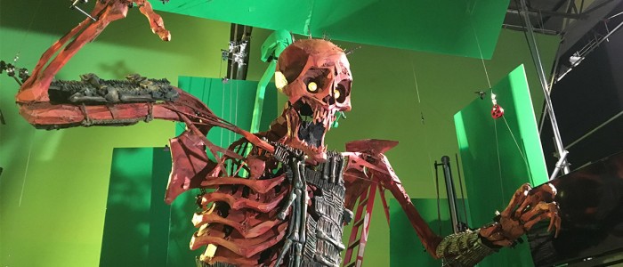 You mentioned the skeleton fight sequence earlier. I read that you developed new systems and gears for that scene.
Yeah, it was an evolution and extension of stuff that we had learned on the Boxtrolls. Basically, everything that we do, it's on a continuum. When we started on Coraline, there was a whole host of things that we had no idea how we were going to do. Because we were making films in a way that had never really been done before, we were taking this hundred-year-old art form and bringing it into a new era by embracing technology and innovation. Nobody ever made a movie like that before.
The ten years that we've been in existence we've kept our team together, our core creative team. We keep the band together. Which means that with every film we learn something artistically, we learn something technologically, and then we can apply that to the next movie. Which means our bag of tricks gets bigger.
That was certainly the case here. What we did with the giant skeleton monster was really an outgrowth of something that we'd learned on the Boxtrolls where we made, at the time, the biggest puppet that we'd ever made, which was a five-foot-tall puppet. It now pales in comparison to the giant monster, which was a 16-foot-tall puppet. It had a 22-foot wingspan, it weighed 400 pounds. What I love about it is it's a combination of everything that we do: it's super low-fi, but it's also a hot set. We developed a system to animate it when we put the torso on a base that we built in-house that was connected to a motion control rig.
Effectively, it's the same idea as what you find in a flight simulator, or in one of those theme park rides where they have the virtual reality rides. It's the same basic idea. It was the only way that we could figure out a way we can move the torso around and still make sure that weight was supported, that it wouldn't collapse.
We had this incredibly high-tech system that we developed to move the torso around, and yet at the same time, if you look at it and take a step back, you can see that it's essentially an enormous marionette. We had cables connected to the wrists that are attached to the ceiling and pulleys and drop back down and held it in place by big plastic buckets filled with sand bags.
I just love everything that's involved in bringing it to life. Then when you see it on screen, it really is insane. It's this incredible, beautiful but horrifying creature. You really feel the sense of scale, and weight of that thing, because it really is like a living set, and that's how we approached it. It's a big puppet, but it's also a set.
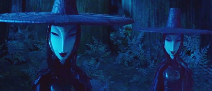 Another sequence that stands out is the arrival of the Sisters (played by Rooney Mara). What inspired those villains' design and movements?
The sisters are inspired by a couple of things. Tomoe Gozen was one of the inspirations. She was a 12th-century samurai, she was awesome and badass, and she was a huge inspiration for those characters. We also draw from an inspiration of Noh theater, which is, there's a tradition in Noh theater where characters wear masks.
The masks the sisters wear are meant to be evocative of Noh masks. There's a tradition of Noh theater about supernatural creatures that come down from the heavens and take human form. They wear these masks, and then they communicate. Because you can't see their faces or their expressions, they have to communicate everything through their body. They have to communicate all their emotions through physical gestures and with movement. That's effectively what we do as animators: we bring these characters to life, emotionally through physical movement. There's something balletic about it, something beautiful and graceful about it.
Even though these characters are terrifying, there is a beauty to them, an incredible grace to how they move. In the big fight sequence between Monkey and one of the sisters, I describe it like a ballet of death. At any given moment one of these characters could die. There's a beauty about it, something that's just incredibly graceful and exquisite about the way these creatures move.
That's something that was inspired by Noh theater. There's also an aspect of these creatures, and you see it particularly in their capes, that was inspired by predatory birds. In fact, the capes are meant to evoke feathers. There was this incredible grid that one of puppet makers made, where they laid out, essentially, a group of piano wire and held it together, and it could collapse and expand. Then we put something like 800 individual little features on those capes to make it all overlap in a perfect way, so they would bunch up against each other. I think that cape is just an exquisite aesthetic and technological marvel, and it moves beautifully.
That specific sequence where we're introduced to the sisters for the first time, that's really where we lean into what that part of the movie is, which is full on, white-knuckle, bowel-loosening, horror movie mode.
We cover a lot of ground in the movie. I suppose our overall point of view on films is trying to find that artful balance of lightness and dark of intensity and lots of humor and heart. That was something the classic Disney films understood, and it was something that they dealt with in fairy tales and fables. The great animated films of the '80s did that as well. That makes this journey meaningful, that makes the journey exciting and poignant. I really believe that spending some time in the shadows makes the light even brighter and more beautiful. Those are the stories that we want to tell. I think it makes it richer, more poignant, more evocative.
***
Kubo and the Two Strings is now in theaters.
