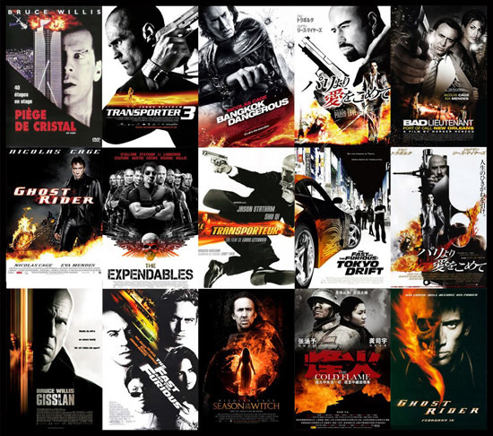
Gallery: Thirteen Hilarious Trends In Movie Posters
News flash: today's movie posters generally suck. The days of Drew Struzan or Saul Bass are long gone and, instead, we're left with bad Photoshop looking one sheets with a star's face, a title and a tag line. That unoriginality is part of the reason why niche vendors like Mondo are doing so well. They're bringing art back to the movie advertising.
Just how bad are today's movie posters? A French site has broken them down into thirteen trends and illustrated their point with elaborate collages that show dozens and dozens of posters that look exactly the same. It's both really funny and really not. Check them all out after the jump.
A big thanks to Christophe Courtois (via Movies.com) for these images. Their names of each trend are listed below. [Edit: The original version of this story linked to an incorrect source, our apologies.]
1. Tiny People On the Beach, Giant Heads in the Clouds
2. Sexy Back (Most Likely to Contain Weaponry)
3. Back to Back
4. The Bed
5. I've Got My Eye On You
6. Nature is Blue
7. Black/Orange
8. Run For Your Life
9. Legs Wide Spread
10. Is That Your Face Or Are the Drugs Kicking In?
11. The Red Dress Never Goes Out of Fashion
12. The Rip-Off
13. Text In Your Face (for this one, Oh No They Didn't has a handy chart breaking down the font uses)
Besides the crazy copying that's going on, what I take most from these images is that poster trends in Hollywood are decades old. If you look at these images, it's not like they're just from the last 5 years. There are movies from several decades Though, in the twelfth category, they're not saying Casablanca is a bad poster, they're saying The Good German blatantly ripped it off.
Which of these do you find the most despicable? Are there any you actually like?
