The 25 Best Movie Posters Of 2016
We're coming down to the end of 2016, and even though we've been starting to look forward to the movies of 2017 since as early as this past summer, it's about time we started to look back at the good stuff this year had to offer. We'll each be bringing you our personal Top 10 Films of 2016 leading up to a cumulative Top 15 (just like last year), but before that, we've got something else to kick off our look back at 2016.
Leading up to every movie, even before a trailer arrives, there's a movie poster. So it's time to check out a countdown of the 25 Best Movie Posters of 2016. Which of this year's one sheets made the cut? Find out after the jump.
In order to be considered for the list, each poster had to be an officially sanctioned movie poster release in conjunction with a film released in 2016. That means you won't find the posters for Wonder Woman or Guardians of the Galaxy Vol. 2 on this list because those are for 2017 movies. There are also no Mondo prints, screen prints, or giclées, but you will find posters that were created as official IMAX or promotional posters for theatrical promotion. Foreign posters also qualified.
Keep in mind this is completely subjective and not meant to be definitive. If you disagree, feel free respectfully say as much and chime in with your favorite posters in the comments. So without further adieu, let's get on with the countdown.
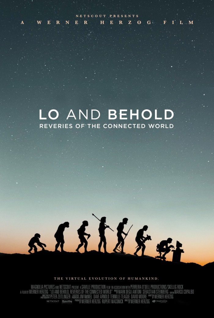
25. Lo and Behold: Reveries of the Connected World
24. Dirty Grandpa
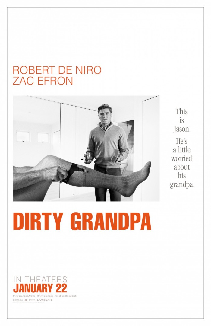
This is a fantastic parody of the original poster for the 1967 masterpiece The Graduate. Not only is the style a perfect recreation of that teaser poster, but I love how this puts a spin on it by making that famous leg belong to Robert De Niro, turning a sexy image into something that makes you cringe a bit.
23. Pride and Prejudice and Zombies
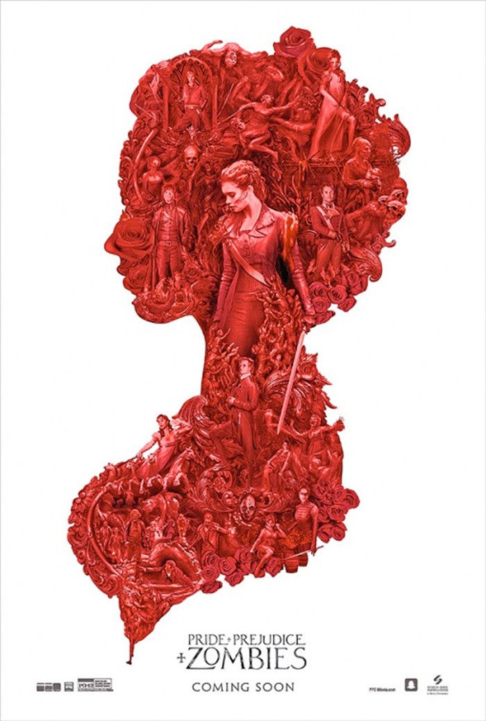
This poster design of putting smaller images inside of a larger portrait is getting a little tired in movie marketing, but it's how the images are arranged and presented inside the silhouette that can make or break it. For me, this was one that made it work by having precisely detailed illustrations throughout in that blood red color. Sadly, there's not a more high-resolution version to see it in greater detail, but you get the idea.
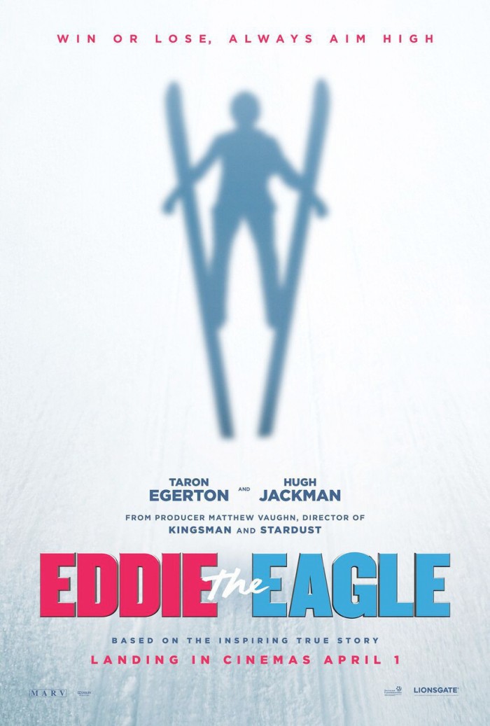
22. Eddie the Eagle
Sometimes simple is better, and this poster for the true underdog sports story starring Taron Egerton and Hugh Jackman takes that to heart. It doesn't need the images of its stars to sell the movie. Instead, it opts for a POV shot from the viewpoint of the titular Olympic ski jumper. It could maybe have used a shadow with a little less perfect form and a couple skis jutting out from the bottom, but the image itself is great.
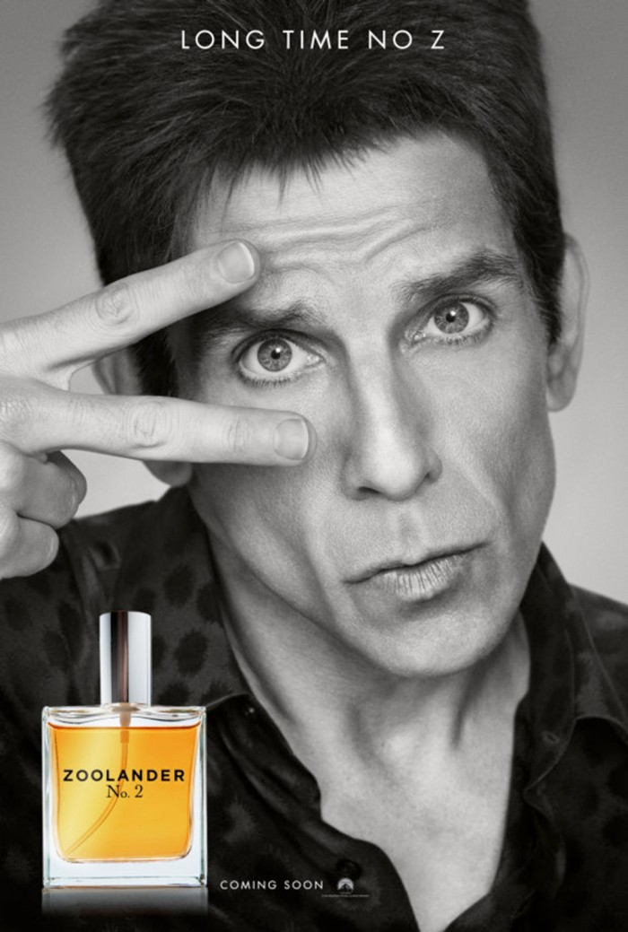
21. Zoolander 2
Though plenty despised this movie, I thought it delivered exactly what should have been expected from a sequel to Zoolander. Regardless, this poster is a great piece of marketing as it perfectly mimics the countless cologne ads that the fashion world is known for creating. If no one was familiar with this title, they might just think it was a real fragrance advertisement.
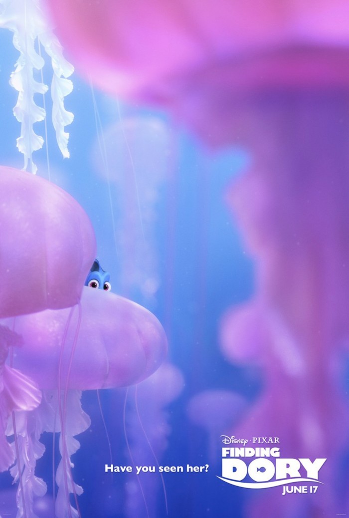
20 Finding Dory
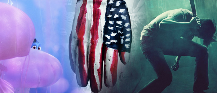
I could have picked one of any of the handful of teaser posters that featured the forgetful fish in the film's title hiding somewhere in the imagery of the deep sea, but this one was my favorite. I love the contrast the jellyfish have with the ocean and Dory's blue scales. It catches the eye, and it's a clever teaser poster.
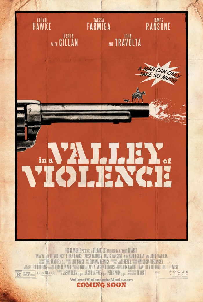
19. In A Valley of Violence
Opting to look more like a vintage movie poster, almost in the vein of the title designs of Saul Bass, this could easily have been a teaser poster for The Hateful Eight or any number of stylized westerns. Between the stains and the folds, not to mention that "A man can only take so much!" exclamation, it has a classic feel without looking artificial.
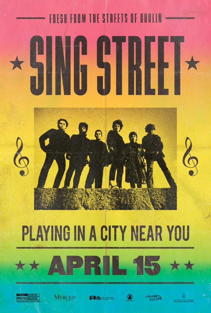
18. Sing Street
The design of this poster didn't take all that much effort since it's inspired by one of the most common posters used to promote bands. But it's more the thought of using this style to promote the indie about a little Irish teenage rock band, as if the title band were putting on a concert just down the street at the local pub.
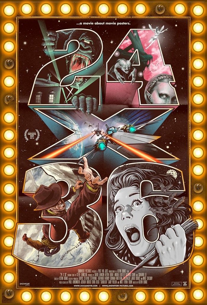
17. 24x36
It would be disappointing if a movie about movie posters didn't have a cool movie poster, and thankfully this poster for 24x36 (which was hopefully 27x40 when released) doesn't disappoint. It uses varied imagery inspired by various iconic films and their posters to fill in the giant letters of the title. But for me the best touch is the marquee light bulbs surrounding it, including the ones that are broken or just burnt out.
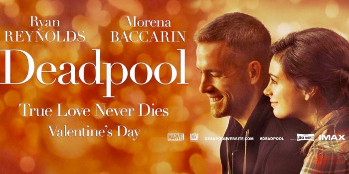
16. Deadpool
The entire marketing campaign for Deadpool was a triumph from front to back, but this was easily the best poster of them all. The poster itself is a gag as it tries to sell the raunchy, bloody, R-rated comic book flick as a romance that could have been written by Nicholas Sparks. It never got a proper one sheet, but this banner size image worked just as well.
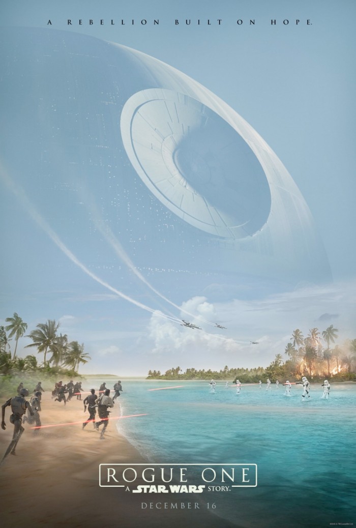
15. Rogue One: A Star Wars Story
It was refreshing to see that the teaser poster for this Star Wars spin-off didn't need any faces to tease the movie. Instead, we got a glimpse of the hard-hitting ground battle between Rebels and Stormtroopers on Scarif as the Death Star loomed in the background. The tropical setting delivered imagery that we hadn't yet seen in a Star Wars movie, and it really makes it pop.
14. Ghostbusters
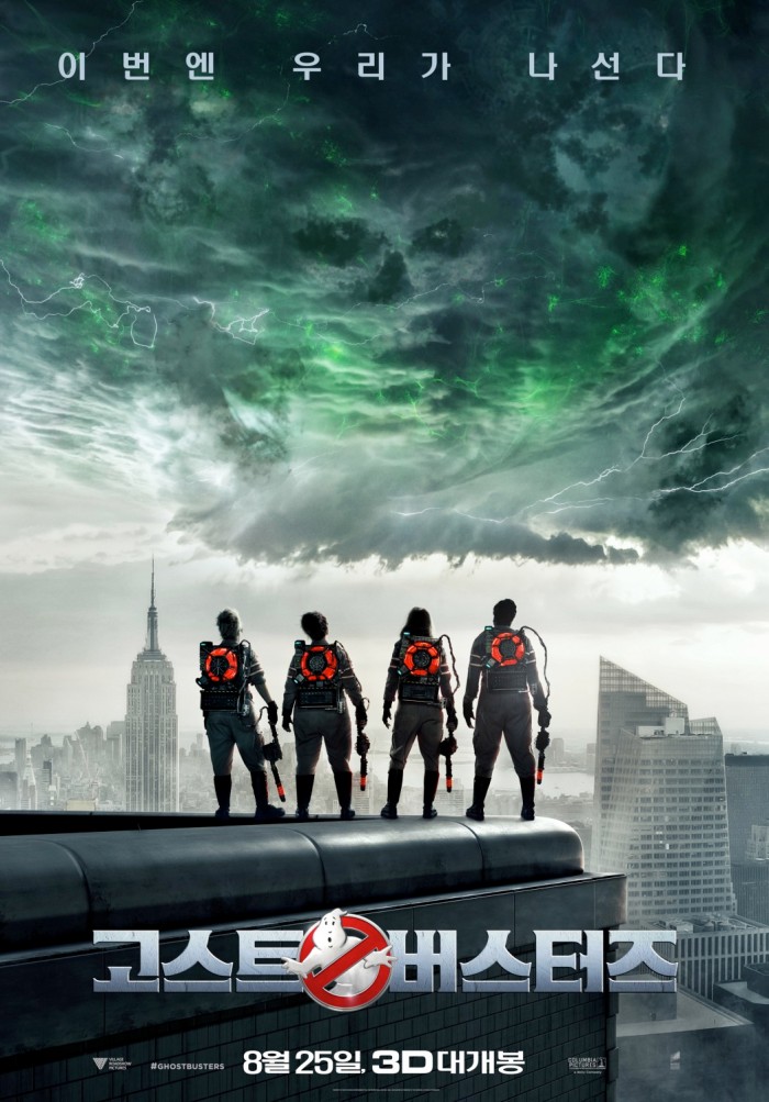
This poster is infinitely better than any of the usual Photoshopped collections of floating bodies and bright proton streams and ghosts. It's still clearly Photoshopped, but this international Ghostbusters poster feels like the kindred spirit of the original Ghostbusters poster from 1984. Instead of showing us the faces of the crew, it gives us their backs as they look up to a menacing cloud with several spooky faces in it. There was never a moment like this in the movie, but it makes for a slick poster.
13. Jackie
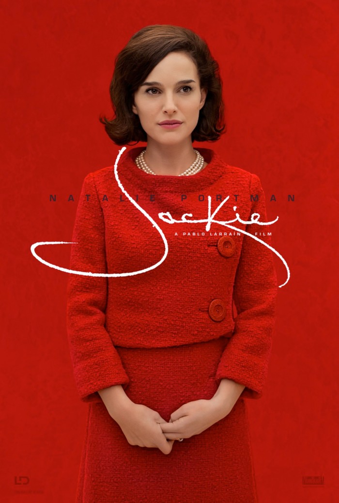
Here's another prime example of simplicity doing the trick. This time it's the color red that does all the heavy lifting by taking over the whole poster around Natalie Portman's timid face. A nice addition is the signature of Jackie wrapping around her figure, just like the grief and pressure that surrounds her following the death of her husband, John F. Kennedy.
12. Green Room
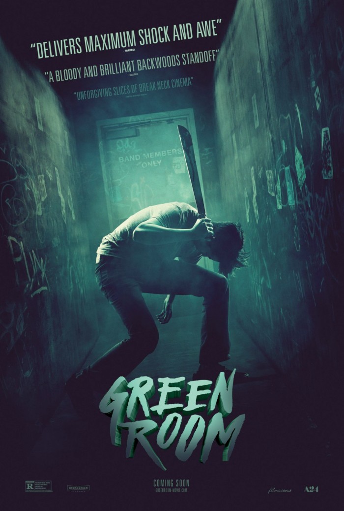
Considering the fact that the movie takes place in a rock club, it seems appropriate that it emulates the London Calling album cover from The Clash. Of course, this one substitutes a machete for a guitar. Another nice touch is how the quotes of critical acclaim fade away as they get further back down the hall.
11. La La Land
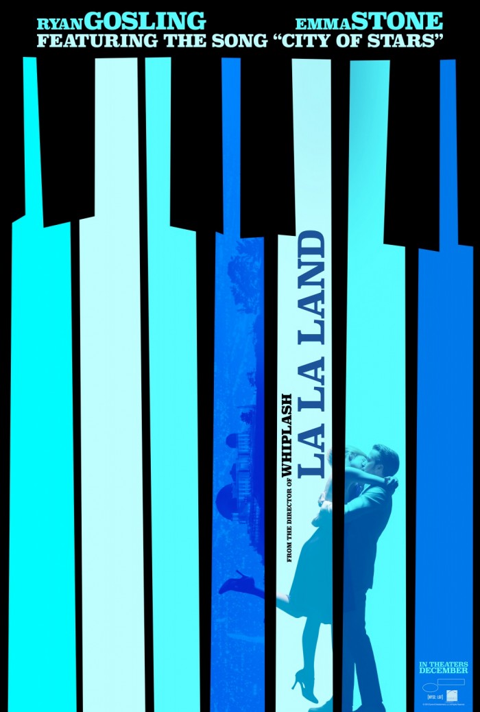
With La La Land honoring classic musicals from decades past, it only makes sense for the poster to do the same. This one also has some style inspired by Saul Bass with the uneven piano keys and the neat typeface to go along with them. The use of the Griffith Observatory on one of the keys and the fading image of Emma Stone and Ryan Gosling says things about the movie that you'll only understand after you see it.
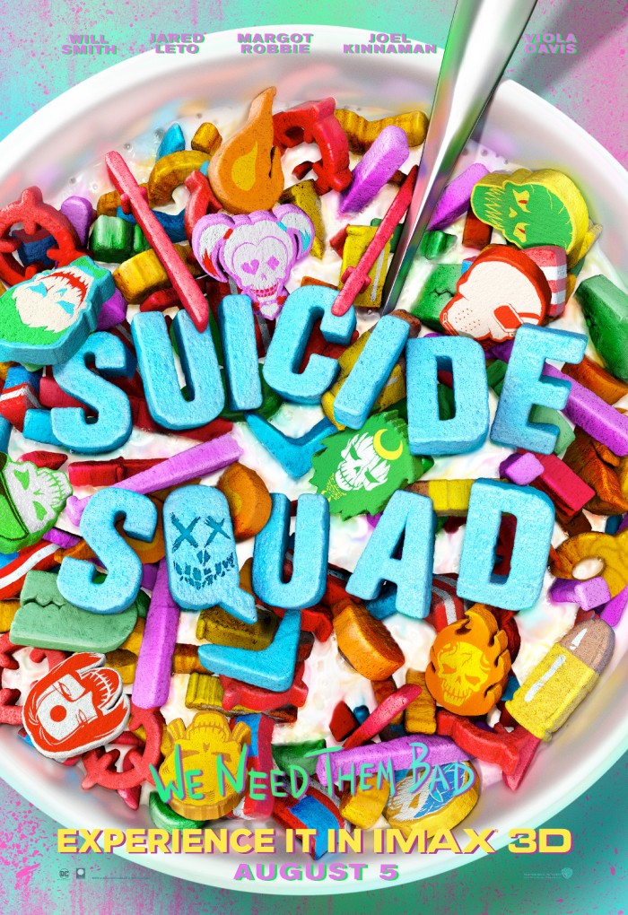
10. Suicide Squad
9. 10 Cloverfield Lane
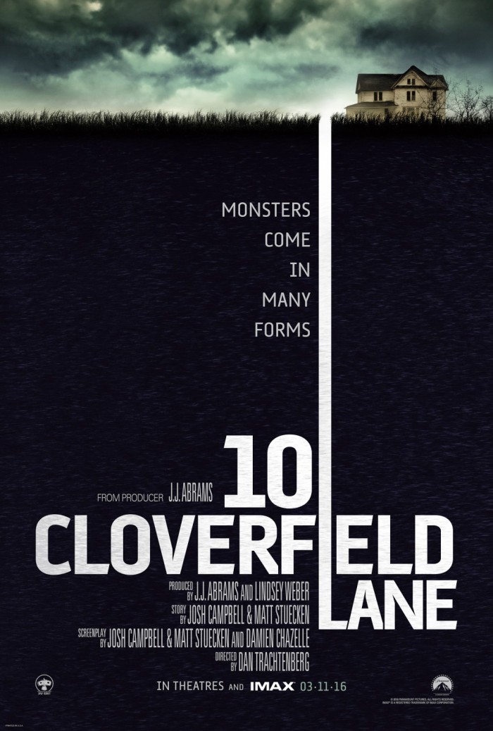
Most movie posters have a title that's not necessarily lined up with the rest of the design of the poster. It fits in with the style, but it stands on its own. This one appears to be just a way to make the name of the movie the most prominent part of the poster, but the use of the long line on the "L" in "Lane" actually signifies that the story will be taking place underground in a bunker, and I like that.
8. Kubo and the Two Strings
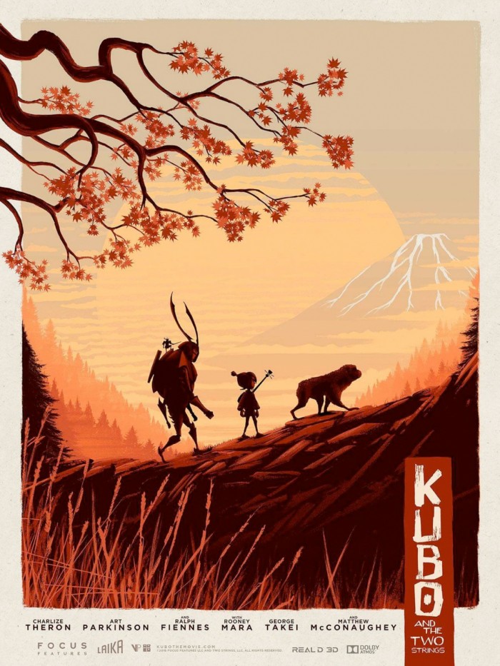
Inspired by the culture it emulates, this poster takes cues from Japanese art for its presentation of the three characters who share a much closer bond than we realize at first. The warm reds and oranges make the foreground pop right out of the lighter, creamy background in a way that's not jarring.
7. The Jungle Book
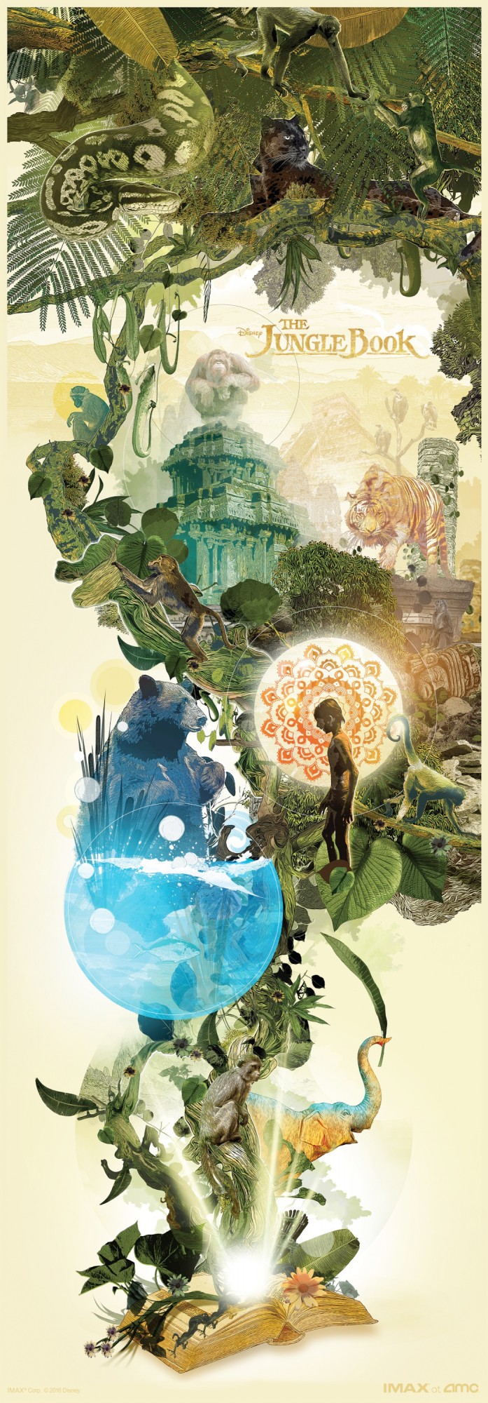
There's so much detail to appreciate about this poster as Mowgli and his animal friends (and enemies) pour out of Rudyard Kipling's book. The lines on the fur of Baloo, Shere Khan and King Louie are carefully drawn, and the way each layer stacks on top of another is very pleasing to the eye, blending everything together.
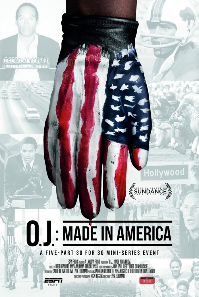
6. O.J.: Made in America
Even though there's some argument as to whether it's a movie or TV miniseries, this documentary is up for an Academy Award, so it's a movie for our purposes. Slapping a smeared American flag on the glove that was a key part of the murder investigation surrounding former athlete O.J. Simpson is powerful for a number of reasons, and that dripping of red at the end of one of the fingertips really drives it home.
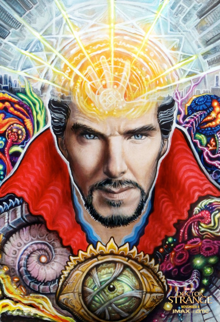
5. Doctor Strange
Almost resembling a stained glass window, the poster features bold, psychedelic colors and an airbrushed style that make it look a bit like a tattoo turned into a poster. The hand exploding out of Strange's head is quite a trippy image that perfectly encapsulates the wild visuals of the alternate dimensions from the movie.
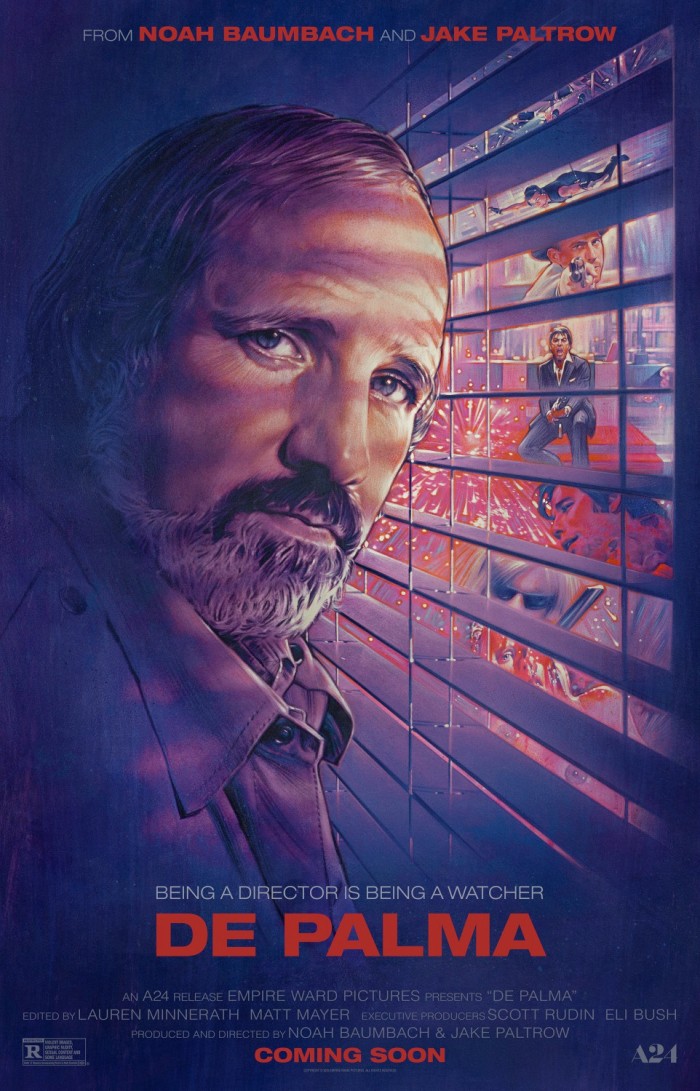
4. De Palma
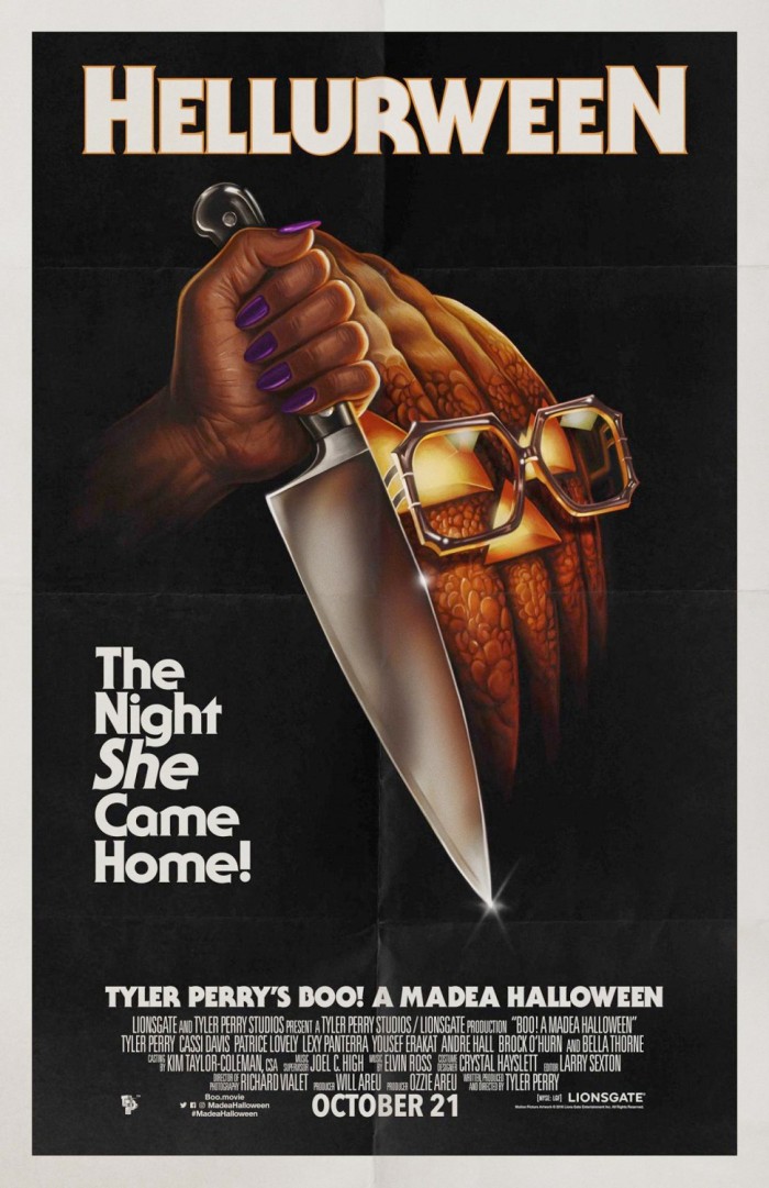
3. Boo! A Madea Halloween
We're not here to judge the movies, but just the posters themselves. And when it comes to movie poster parodies, this is simply one of the best. It looks so close to the original Halloween poster that you have to do a double take when you notice the trademark spectacles, purple nails and intentionally misspelled title.
2. Doctor Strange
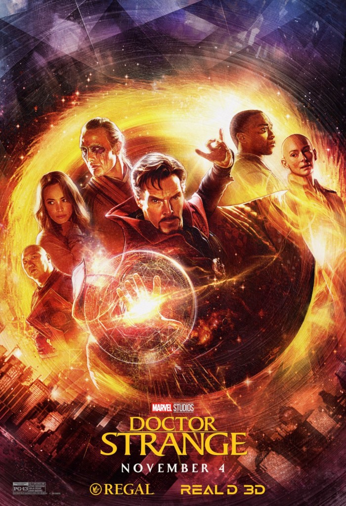
It's a shame that the artistic style of Drew Struzan has gone to the wayside in favor of lazy Photoshop. But artist Paul Shipper honors Struzan's style magnificently with this Doctor Strange poster that was available at certain theaters. Each of the characters is illustrated perfectly with the jeweled distortion of the Mirror Dimension surrounding them, and it looks spectacular.
1. Birth of a Nation
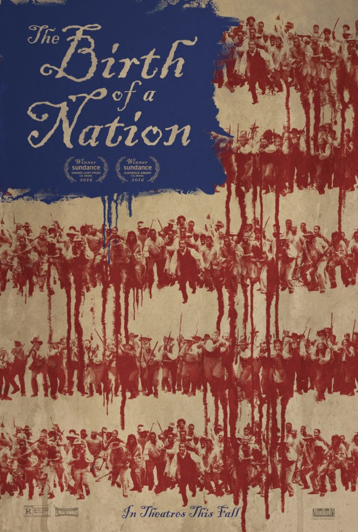
The American flag has been used in countless movie posters before, and it even appeared in one of the previous posters on our list. But the way it's used in the poster for Birth of a Nation is even more effective and unsettling. The red stripes of the American flag are made up of lines of slaves in Nat Turner's slave revolt from 1831. Blood drips from the stripes, from the slaves, representing how it was spilled by Americans in our nation's early days. It's a mark in our history that we must not forget and this poster makes damn sure of that.
***
Those are my picks for the Best Movie Posters of 2016. But surely you have your own opinions, so now it's your turn to sound off and let us know what you think of these picks and presumably offer your own favorites to go along with our list.
